Best practice
Visual hierarchy: make one thing the most important
Visual hierarchy tells people where to look first. How size, weight, colour, space and grouping create one focal point, and how the squint test checks it.
· 5 min read · Musab Alfawal
On this page
Visual hierarchy is the order in which people notice things on a screen. When it works, the eye lands on the most important element first and then moves to the next, without anyone having to think about it.
Most hierarchy problems come from too much emphasis. Each part of a screen has someone who wants it noticed, so headings, prices, offers and buttons all get bigger, bolder and brighter until none of them stand out. The fix is usually to take emphasis away.
How to create visual hierarchy in UI design
You have a small set of tools, and they work best when you use only a few at once.
Size is the strongest. The largest element on a screen is usually read first, and a clear jump in size says more than several small steps. Keep your type scale short, so that each size means something.
Weight comes next. Bold text draws the eye until there is too much of it, and then it reads as noise. Save bold for headings and for the one value in a group that matters most.
Colour and contrast pull attention towards whatever differs most from its surroundings. On a mostly neutral screen, a single accent colour is a strong signal, so spend it on the primary action and on real status, like an error. Make secondary text quieter with a softer grey, but keep it above the 4.5 : 1 contrast that body text needs.
Position sets the reading order. Apple’s Human Interface Guidelines note that people often start at the top and leading side of a screen, and advise placing the most important items there. In a left-to-right language, that is the top left.
Space and grouping tell people what belongs together. Items close to each other read as related, and space around an element makes it stand out without making it bigger. Space can do most of the work that borders and boxes are often asked to do, with less clutter.
The squint test
Squint at a screen, or step back until you can no longer read the words, and you see only its shapes and dark areas. Whatever still stands out is your real hierarchy. If that isn’t the thing you meant to be most important, the hierarchy needs work, however clear the words are.
Here are two versions of the same pricing card, blurred and then brought back into focus.
Blurred, the first card becomes a column of grey bars with two dark buttons competing at the bottom. The second still shows a large price at the top and a single button at the bottom, which are the two things a pricing card exists to show.
The same pricing card, fixed
Here is a typical pricing card, then the same card with four changes. The content is the same. Only the emphasis has moved.
Before
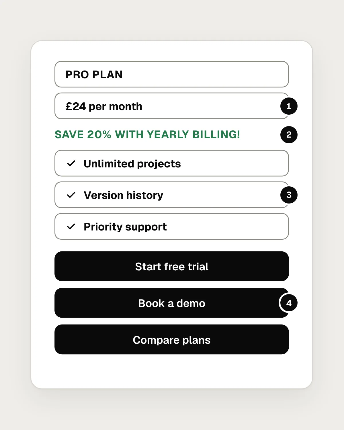
- The price is the same size and weight as everything else, so it doesn’t lead.
- A bold, green offer in capitals competes with the price for attention.
- Every feature sits in its own bold box. The boxes add lines without grouping anything.
- Three black buttons with equal weight, so none of them is the obvious next step.
After
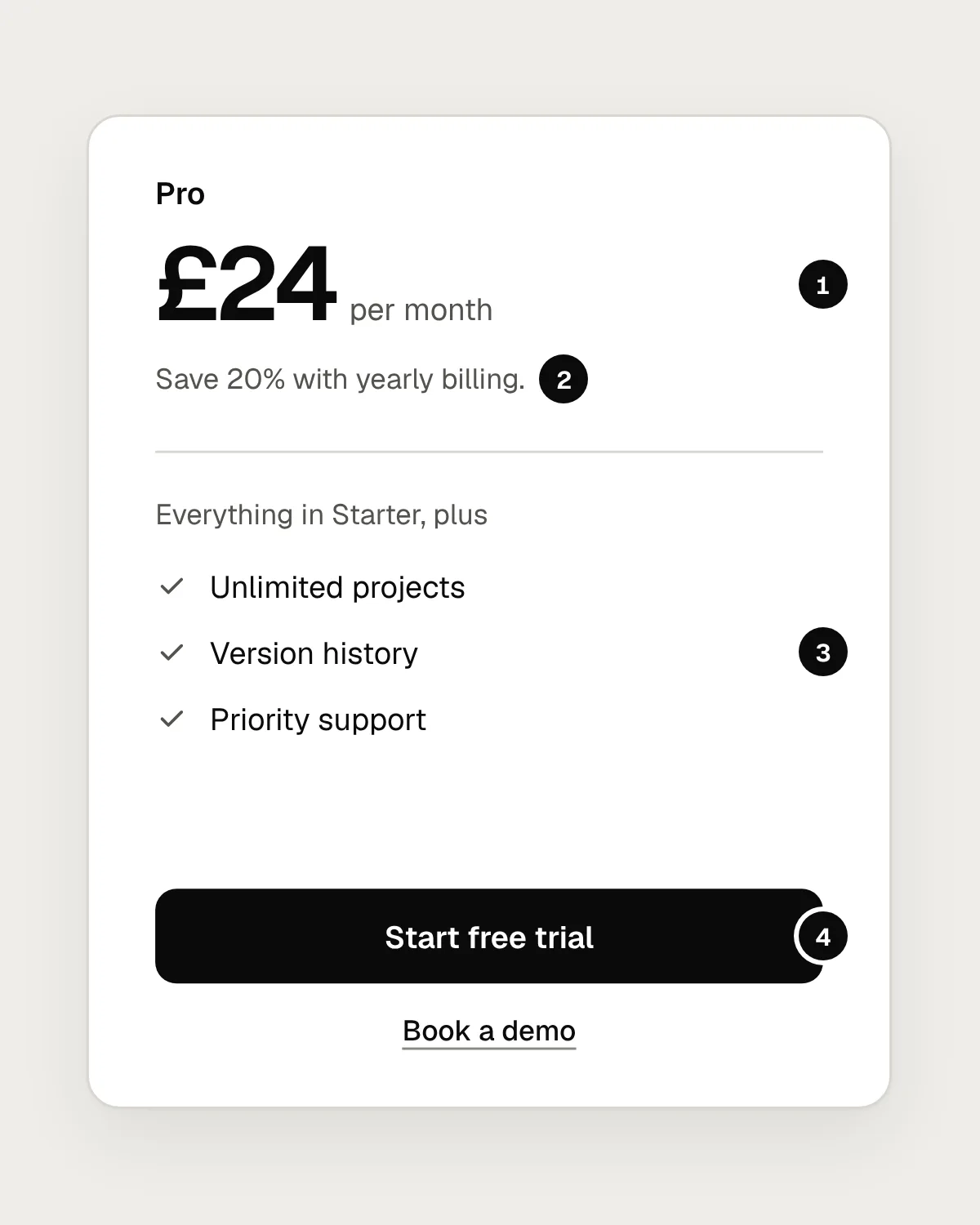
- The price is the focal point: the largest and heaviest element, at the top.
- The offer becomes small grey text under the price, where it supports it.
- The features are a plain list, grouped by space and a single divider.
- One primary button. The demo becomes a text link, and “Compare plans” moves to the page around the card.
Nothing in the fixed card is new. The price was always there, and the buttons were always buttons. Hierarchy came from making most things quieter so that two things could be louder.
One primary action per screen
Every screen should have one action that most people came to take, and that action deserves the strongest button. Other actions can be outline buttons or text links. The GOV.UK Design System gives the same advice for its buttons: use the primary style for the main call to action, and avoid more than one primary button on a page.
When two filled buttons sit side by side, people have to stop and compare them. That pause adds friction at the moment you want the least. Decide which action matters more, and let the design say so.
Mistakes, and what to do instead
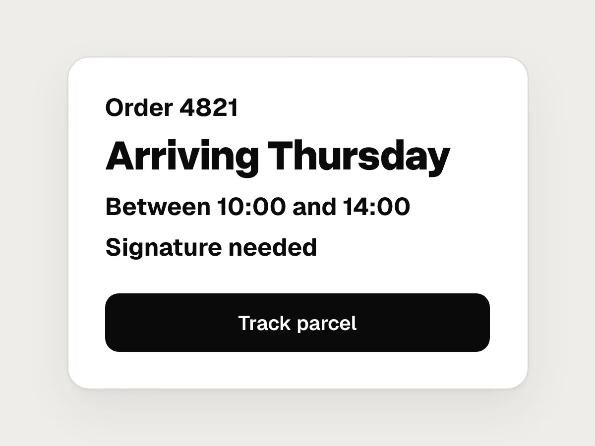
Don’t
Making something bigger or bolder each time someone says it isn’t noticed.
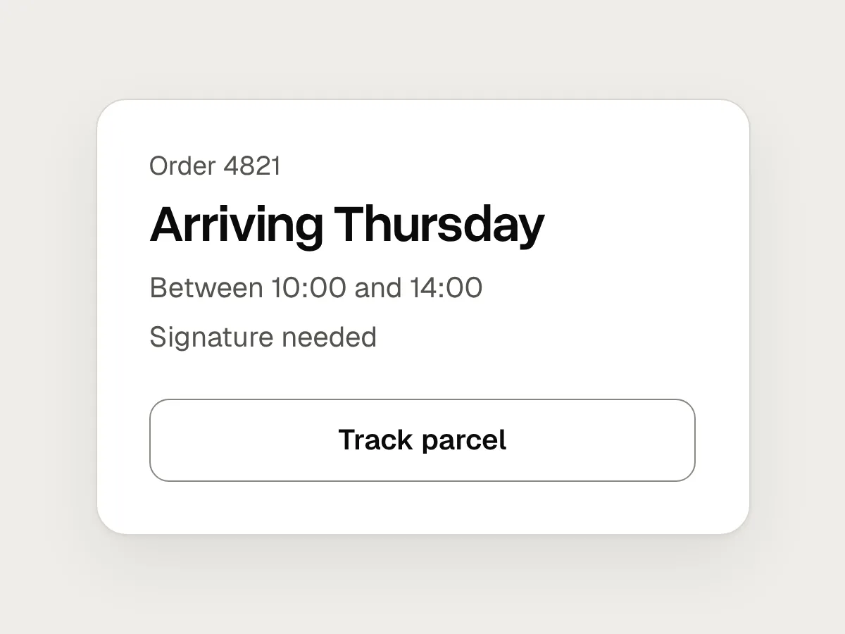
Do
Ask what can be quieter. Taking emphasis from everything else raises the important thing without touching it.
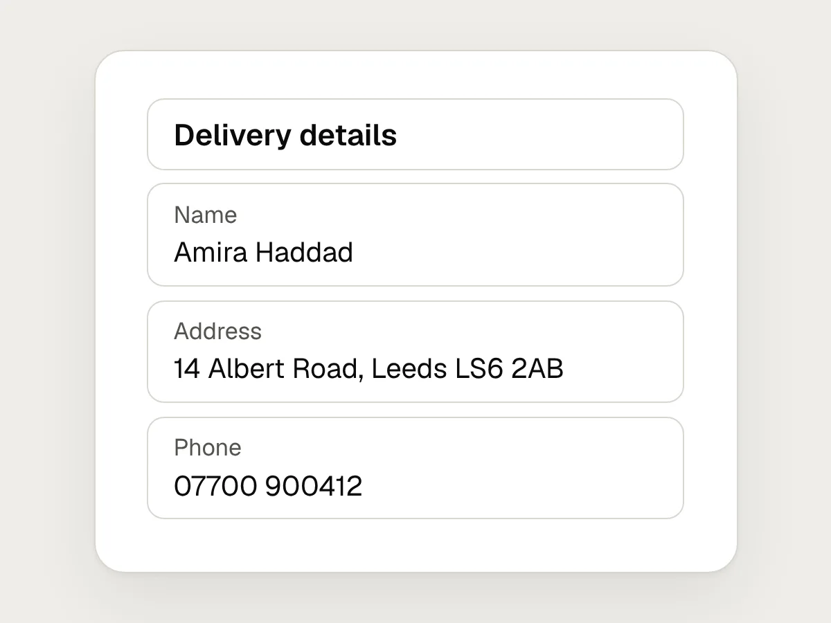
Don’t
A box or border around every item.
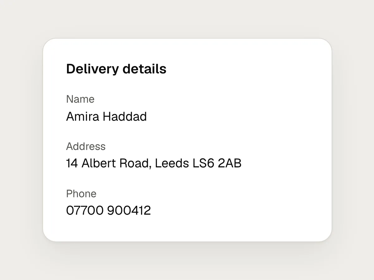
Do
Group with space first. Keep borders for real boundaries, like a card or a form field.
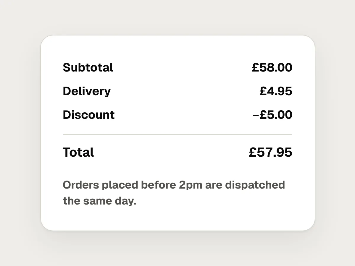
Don’t
Bold for whole lists and paragraphs.
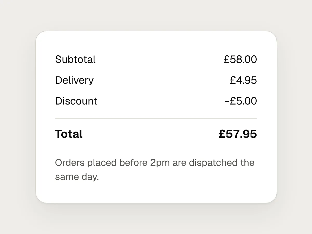
Do
Bold one heading or one value per group, at most.
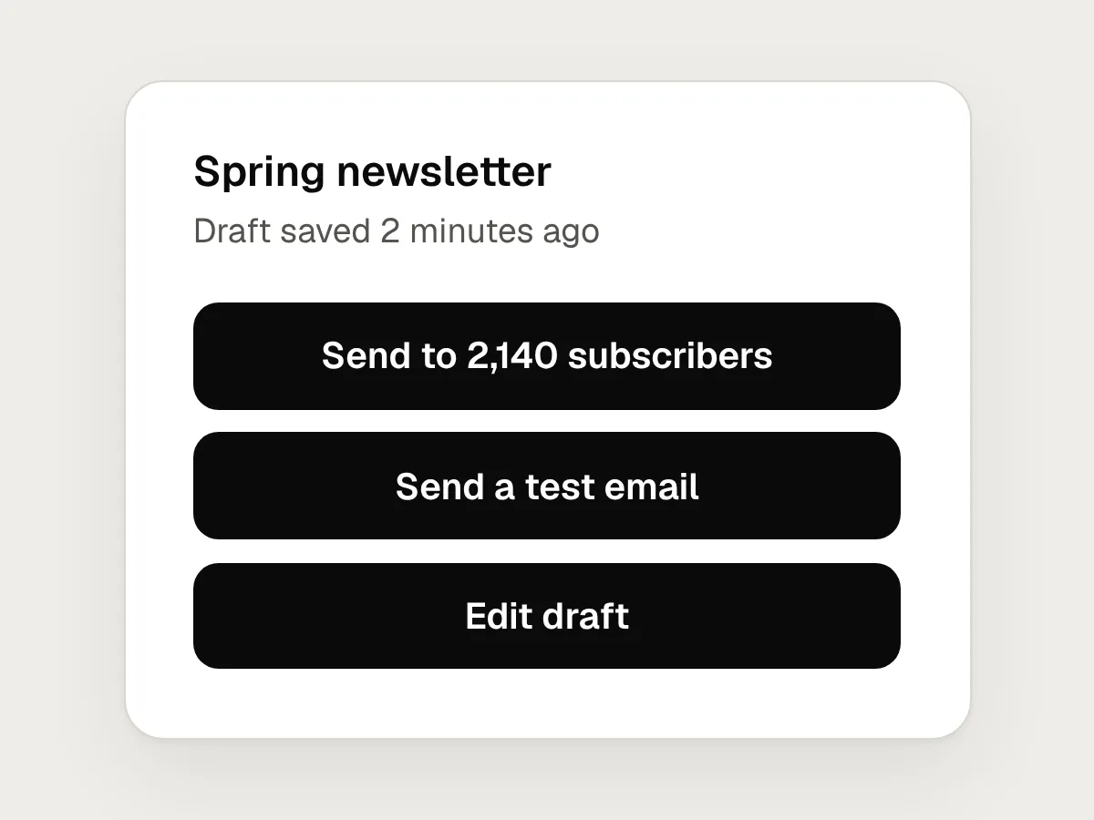
Don’t
Several filled buttons on one screen.
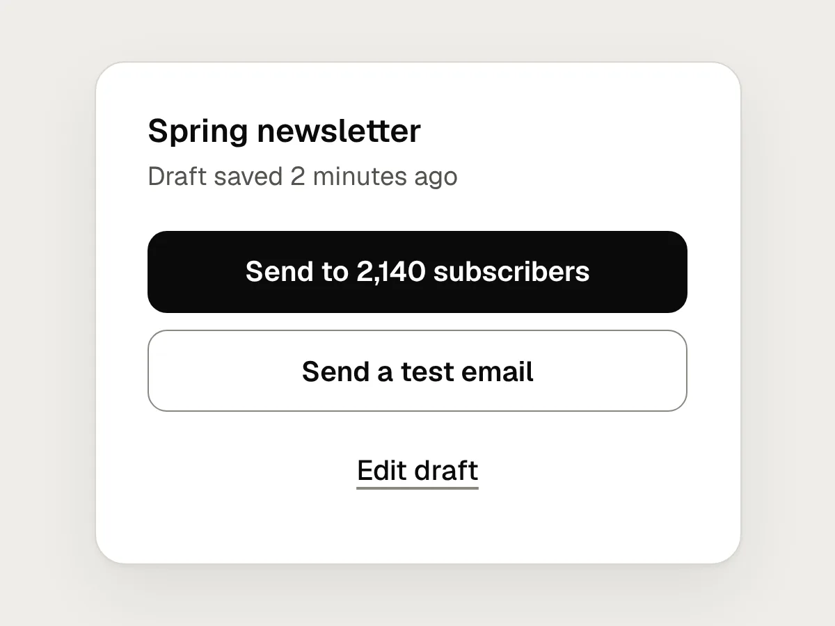
Do
One filled button for the main action, and outline buttons or text links for the rest.
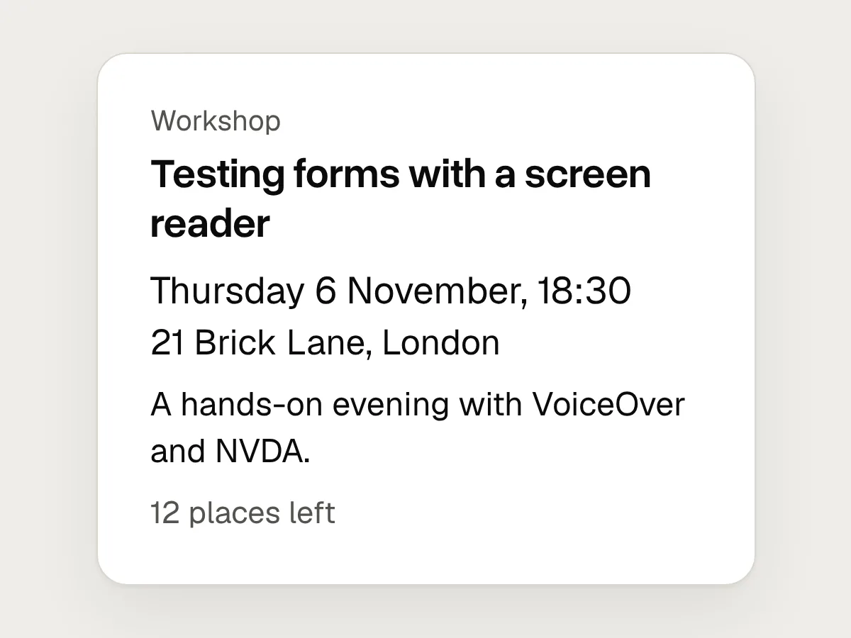
Don’t
Many type sizes, each slightly different.
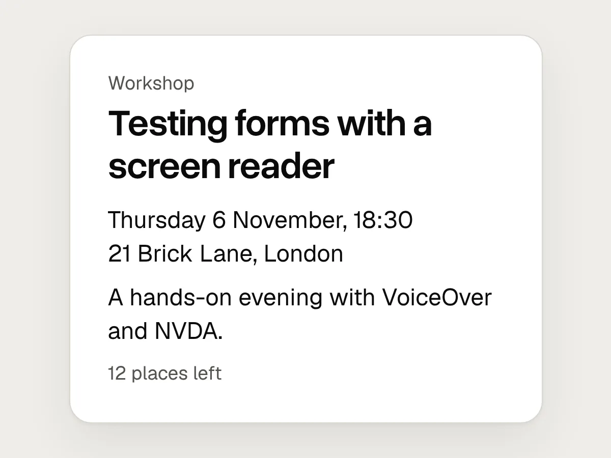
Do
A short scale where each step is clearly larger than the last.
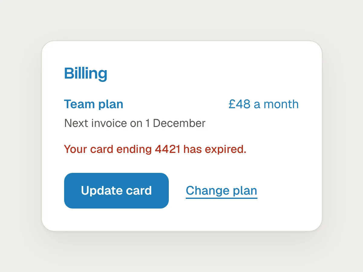
Don’t
The accent colour in five places at once.
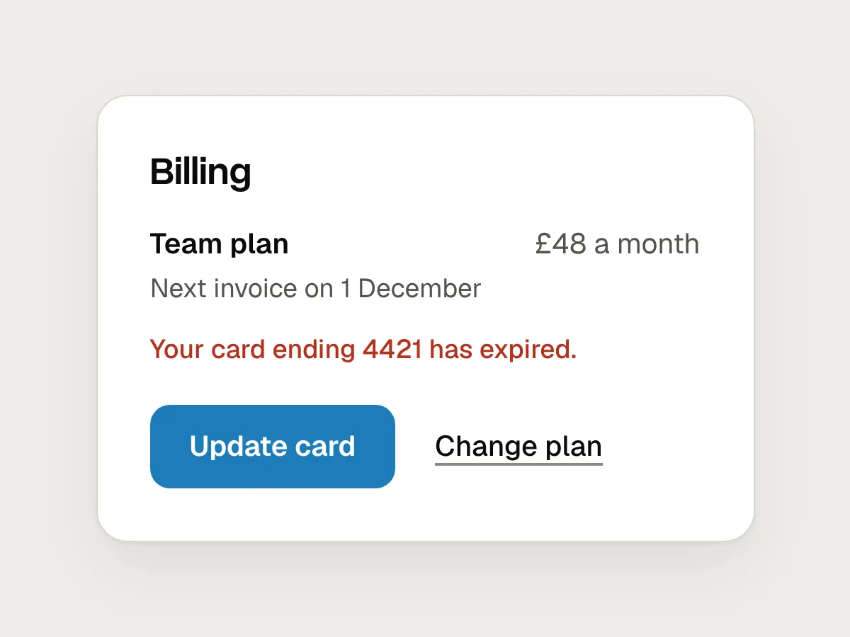
Do
Keep it for the primary action and for real status, like errors.
How to fix a cluttered screen
1. Name the one thing
Write down the single thing a person should see or do on this screen. If you can’t choose one, the screen may be doing two jobs.
2. Strip the emphasis
Set everything to one size, one weight and one colour, and remove the borders. It will look flat, which is the point.
3. Add it back in order
Make the most important element larger or heavier first, then the second most important. Stop as soon as the order is clear.
4. Group with space
Move related items closer together and unrelated groups further apart before you add any lines.
5. Squint
Blur the screen or step back from it, and check that the first thing you see is the thing you named.
Questions people ask
What is visual hierarchy in UI design?
It is the arrangement of elements so their importance shows in how they look. Larger, heavier, higher-contrast and better-placed elements are seen first, which guides people through a screen in the order you intend.
What is the squint test?
A quick check of hierarchy. You squint, blur or step back from a design until you can’t read the words, then note what still stands out. If that isn’t the most important element, the hierarchy needs work.
Can a screen have two primary buttons?
It usually shouldn’t. Two equal buttons make people stop and compare. If two choices really are equal, label them clearly and give them the same style, so neither looks like the default by accident.
Resources
- Visual hierarchy in UX: definition · Nielsen Norman Group
A short definition of visual hierarchy and the tools that create it.
- 5 principles of visual design in UX · Nielsen Norman Group
Scale, hierarchy, balance, contrast and Gestalt grouping, with examples.
- Layout · Apple Human Interface Guidelines
Where to place the most important content, and how alignment shows hierarchy.
- Button · GOV.UK Design System
When to use primary, secondary and warning buttons, and why to keep one primary button per page.
If this was useful, share it with someone it would help.