Best practice
Generative UI: how to design interfaces an AI builds on the fly
Generative UI design: when an AI should answer with a card instead of text, and how to keep the interfaces it builds consistent, usable and honest.
· 10 min read · Musab Alfawal
On this page
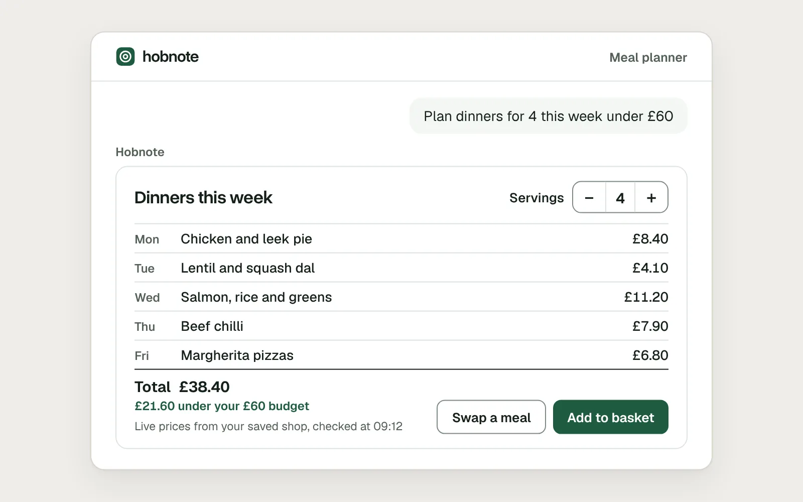
Generative UI is interface that an AI model puts together while it answers. Ask a meal-planning assistant for a week of dinners and, in place of five paragraphs, you get a card: the meals, their prices, a total and a control to change the servings. The model decides what to show and fills in the details. Your product decides what it looks like and what it can do.
It has moved quickly from research into products. Gemini, ChatGPT and Claude can all answer with interactive interface, and an open standard lets one company’s interface appear inside another’s chat. That means more screens nobody drew in advance, and new ways to go wrong: buttons that do nothing, numbers nobody can check, a layout that changes every time.
This guide covers where generative UI stands in late 2026, when an answer should be interface rather than text, and the rules that keep generated interface usable and honest.
Where generative UI shows up today
Google Research published its generative UI work in November 2025, alongside Gemini 3: the model designs and codes an interactive response for each prompt. It reached the Gemini app as two experiments, dynamic view and visual layout, and Google Search through AI Mode. Google is frank about the limits: a result can take a minute or more, and is sometimes inaccurate.
In January 2026, MCP Apps became the first official extension to the Model Context Protocol, the open standard that connects AI assistants to other software. It lets a tool send back an interactive interface, which the chat app shows in a sandboxed frame. Claude launched apps from Asana, Figma, Slack and others on it, and ChatGPT, VS Code and Goose support it too. OpenAI says the standard was based on its own Apps SDK.
Claude also draws charts and diagrams straight into a reply, in beta since March 2026, and builds larger pieces as artifacts in a panel beside the chat.
If you build your own assistant, there are three approaches. Vercel’s AI SDK describes generative UI as connecting the result of a tool call to a React component you wrote. CopilotKit, which runs on the AG-UI protocol, calls that static generative UI and names two more: declarative, where the agent sends a structured description your app draws, and open-ended, where it sends its own markup. Google’s A2UI is declarative: the agent describes the interface as data, and your app draws it only from components it has approved.
Decide when an answer should be interface
Interface earns its place when the person has to do something with the answer: compare options, choose one, or change a number and see what happens. Five dinners with prices are quicker to scan as rows than as sentences, and a running total beats asking again.
Explanation is different. “Why does my risotto go gluey?” needs two clear paragraphs, not a card with a slider. Wrapping an explanation in interface makes it slower to read and suggests there is something to do when there isn’t.
OpenAI’s checklist for ChatGPT apps puts it as one question: “Would replacing every custom widget with plain text meaningfully degrade the user experience?” If the honest answer is no, send text.
Here is the same answer to “Plan dinners for 4 this week under £60”, first as generated text, then as a card built from the product’s own components.
Before
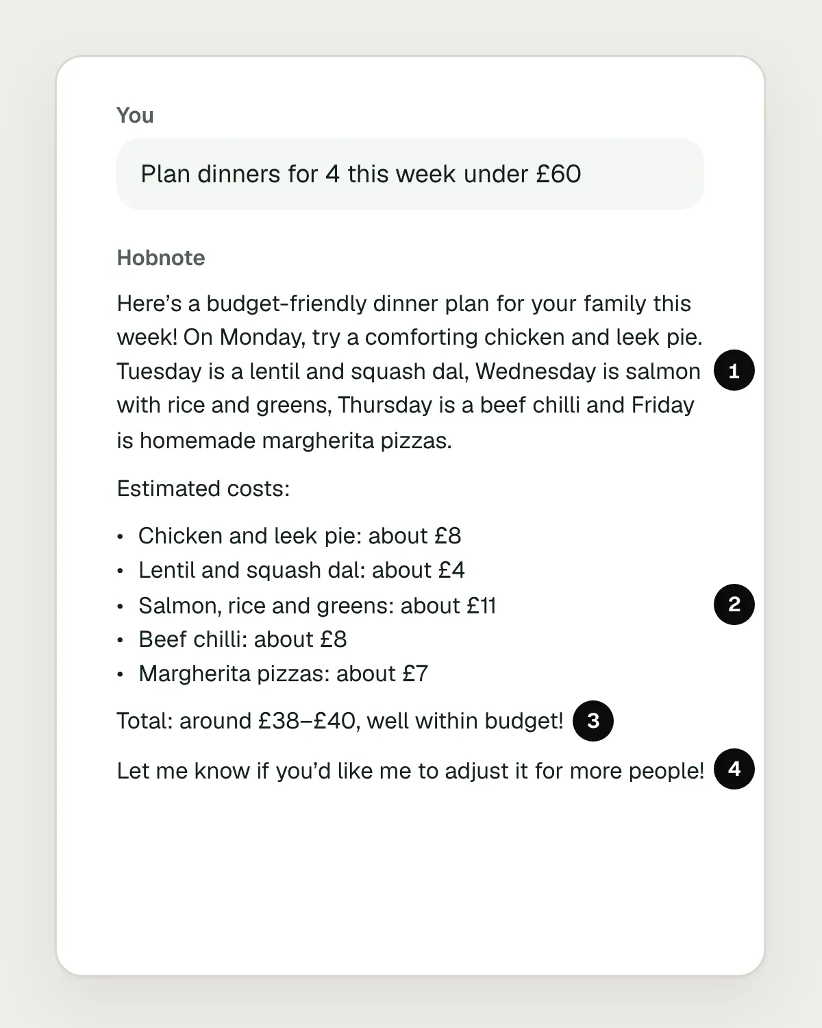
- The plan is buried in a paragraph, so the five dinners are hard to compare.
- Prices with no source or date, so nobody can tell whether they are real.
- A rough total that was never checked against the budget.
- Cooking for more people means typing a new request and reading a new answer.
After
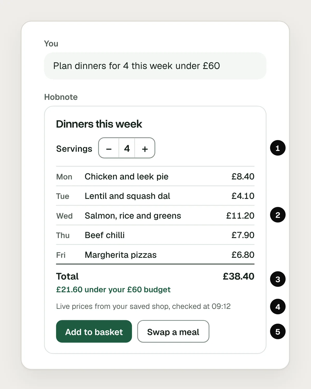
- Servings can be changed right in the answer.
- One row per dinner, from a component the team designed and tested.
- An exact total, checked against the £60 budget.
- A line saying where the prices come from and when they were checked.
- Buttons that do what they say.
Build it from your design system, not free-form HTML
Let the model choose and fill components your team designed, rather than write its own markup. The model is good at deciding what to show. It is not a reliable front-end developer. Free-form HTML comes out different every time, drifts from your type, colour and spacing, and nobody checks the parts a screenshot doesn’t show, such as labels, focus states and errors.
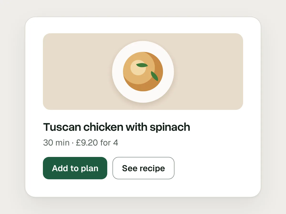
So give it a set of parts: a plan card, a price row, a servings stepper, a comparison table. Each is designed, built and tested once, with its states, accessibility and wording worked out. The model picks a component and supplies the data. When Google released A2UI v0.9 in April 2026, it renamed its starter catalogue from Standard to Basic, on the reasoning that most teams already have a design system of their own.
Inside someone else’s chat, fit in with the host too: OpenAI asks ChatGPT apps to use system colours and not to restyle core components. Open-ended generation still has a place for one-off visuals, such as a chart nobody planned for, but keep anything people act on, such as a basket or a payment, in components you control.
Make every control work, for everyone
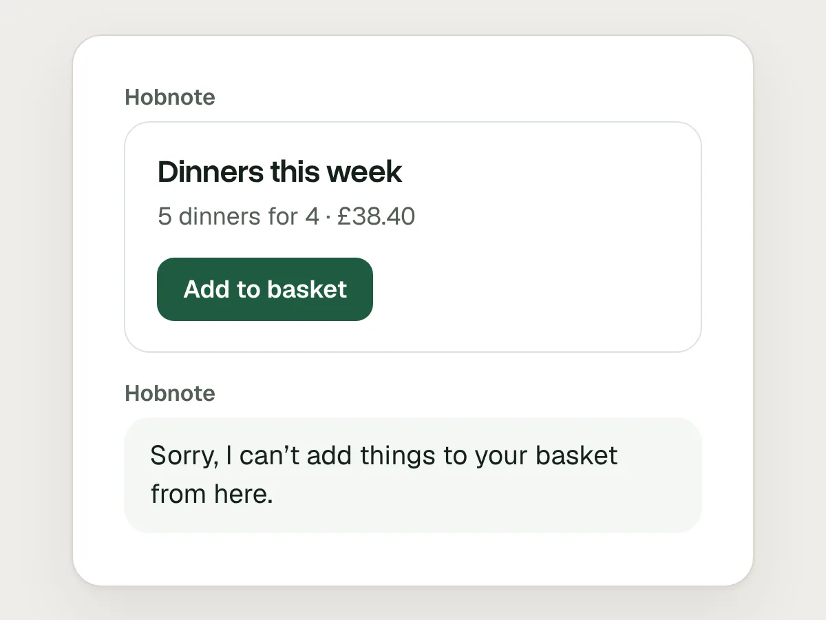
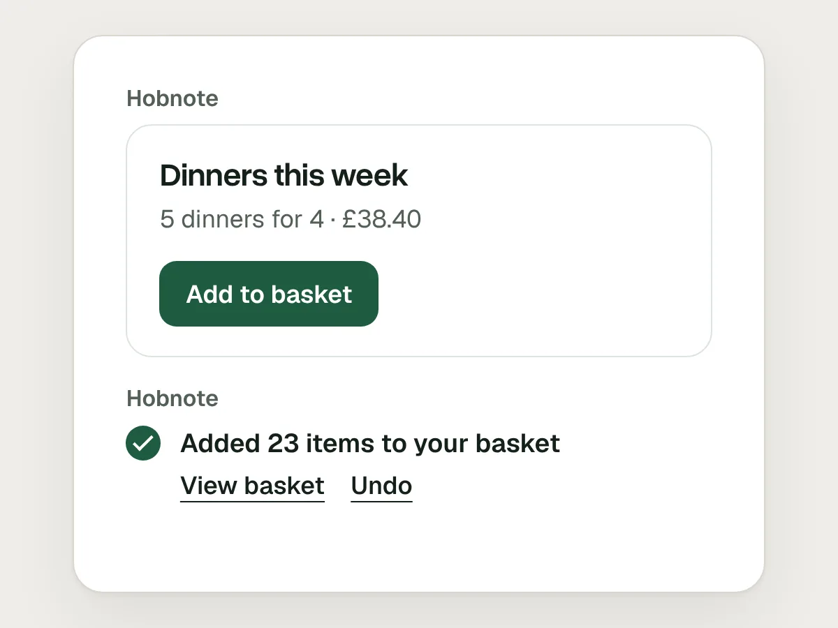
Anything drawn as a control has to do what it says. An Add to basket button that leads to “Sorry, I can’t add things to your basket from here” teaches people not to trust anything in the answer. If the assistant can’t act on something, don’t draw a button for it. When a button does work, confirm what happened: “Added 23 items to your basket”, with a way to undo it.
Every control also has to work without a mouse and without sight: a visible label, a sensible focus order, a visible focus ring and full keyboard use. A stepper needs a name a screen reader can announce, such as “Servings, 4”, which is what WCAG 4.1.2 Name, Role, Value asks for. When the total changes, announce the new figure without moving focus, which is what WCAG 4.1.3 Status Messages covers.
This is the strongest case for components: you can test a stepper once with a keyboard and a screen reader, and know it works in every answer. You can’t do that for markup written fresh each time.
Same kind of question, same kind of layout
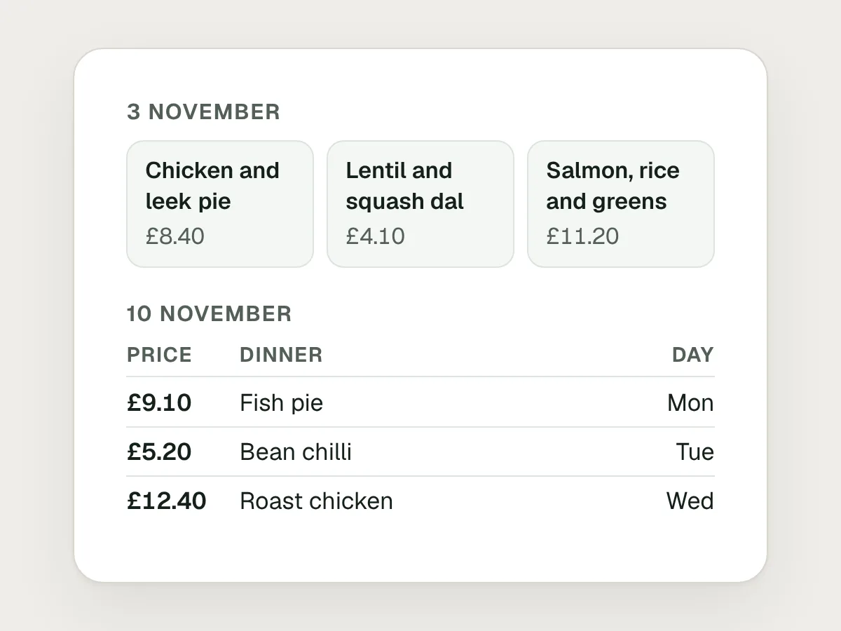
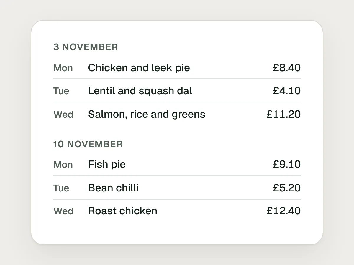
People learn where things are. If “Plan dinners for this week” comes back as tiles one week and as a table the next, they have to work out the layout before they can read the answer. Give each kind of request one component.
Vary what goes inside it, not the frame. A vegetarian week drops the meat, but the total stays in the same place, the source line stays at the bottom and the buttons say the same things. A fixed set of layouts can also go through design review, usability testing and accessibility checks like any other screen.
Let people change the inputs directly
Retyping a request to change one number is slow, and gives the model a chance to change things nobody asked it to. If an answer depends on a number, a date or a choice, put a control for it in the answer: servings, dates, the budget, the diet.
Then update the answer in place. When someone moves servings from 4 to 6, the quantities, prices and total should change in the same card, with no new message. Scaling a recipe is arithmetic, so do it in code rather than asking the model again, and tell the model what changed so its next answer starts from the new numbers.
Here the person changes servings from 4 to 6. The quantities, prices and total update in the card, and nothing new appears in the chat.
Keep people’s edits when the answer changes
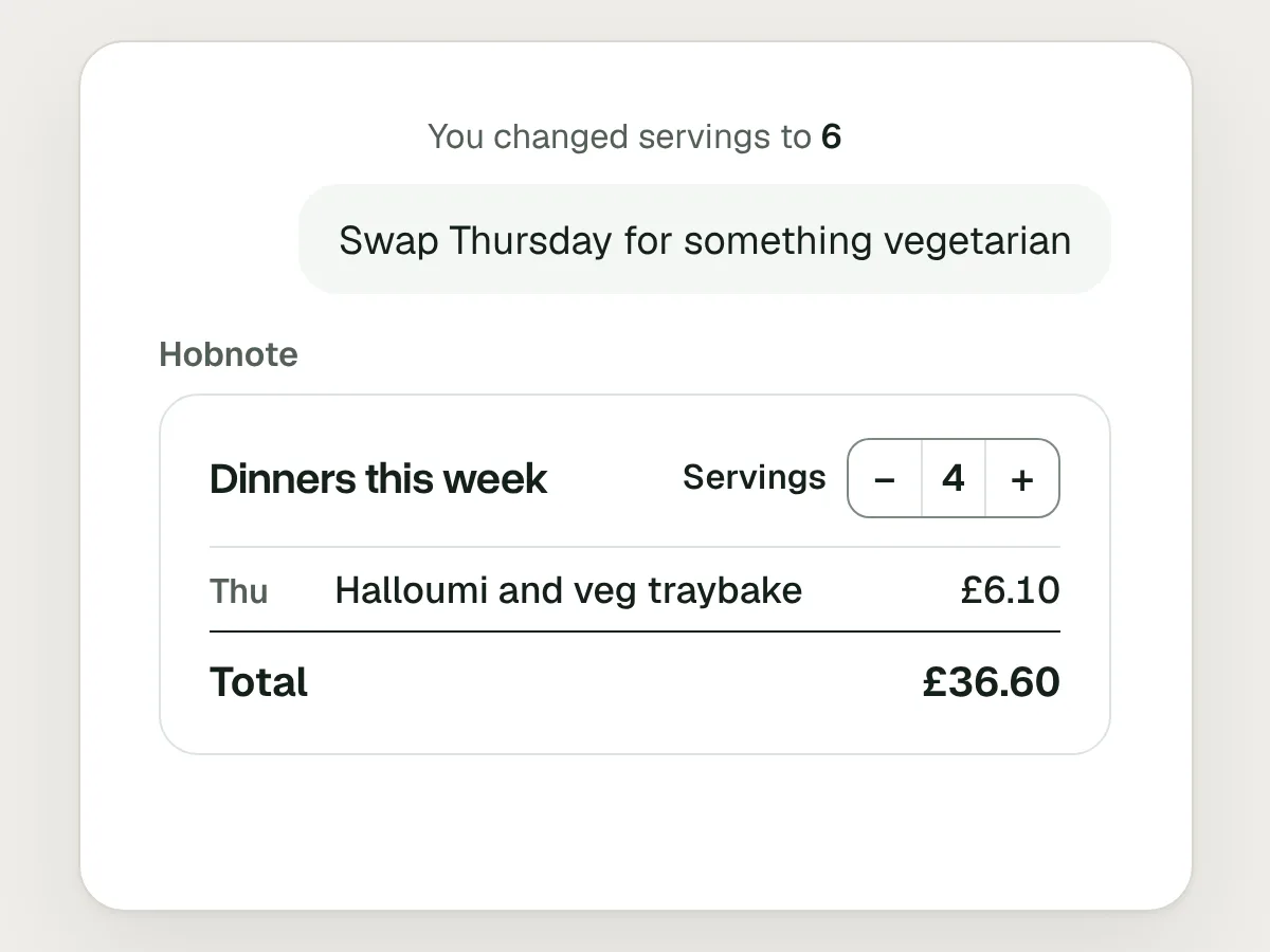
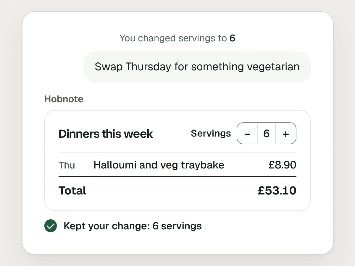
Once someone has changed an answer, their change is part of the request. If they set servings to 6 and then ask to swap Thursday for something vegetarian, the new plan should still be for 6. Snapping back to 4 means they have to check every number again, and some won’t notice until the shopping arrives.
Keep what the person set separate from what the model generates, pass it into the next request, and say you kept it: “Kept your change: 6 servings.” If a new request overrides an edit, such as “just plan for the two of us”, the new request wins, and the card says what changed.
Show what is live data and what the model wrote
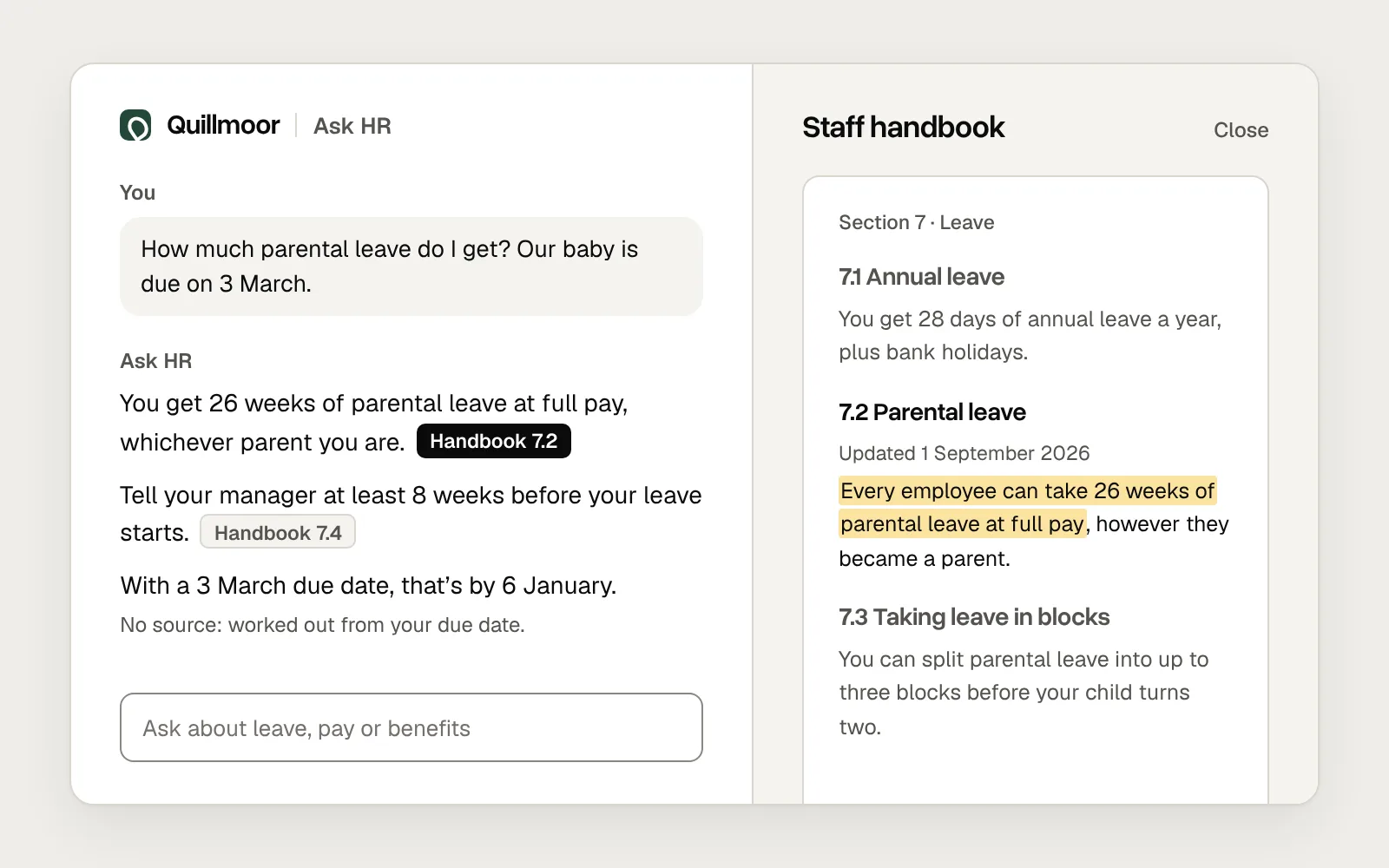
A generated answer mixes facts from a system, such as today’s prices, with text the model wrote. On screen they look the same, but only one of them is data.
Say where the numbers come from and when they were fetched: “Live prices from your saved shop, checked at 09:12.” Put numbers from your systems into the component straight from code, not retyped by the model, where a digit can slip. Label estimates as estimates. If a price can’t be fetched, say so in that row rather than letting the model guess one.
Models get things wrong, and Nielsen Norman Group points out that a generated interface inherits the model’s mistakes. A source line helps people decide how far to trust a figure.
Always have a text version
Components don’t always render. A chat app may not support yours, the data may arrive late, or the answer may be read somewhere that shows only text, such as a notification.
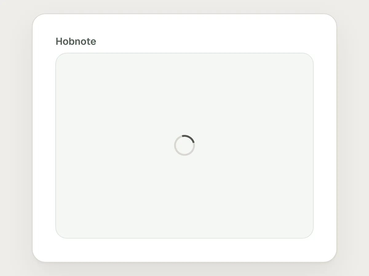
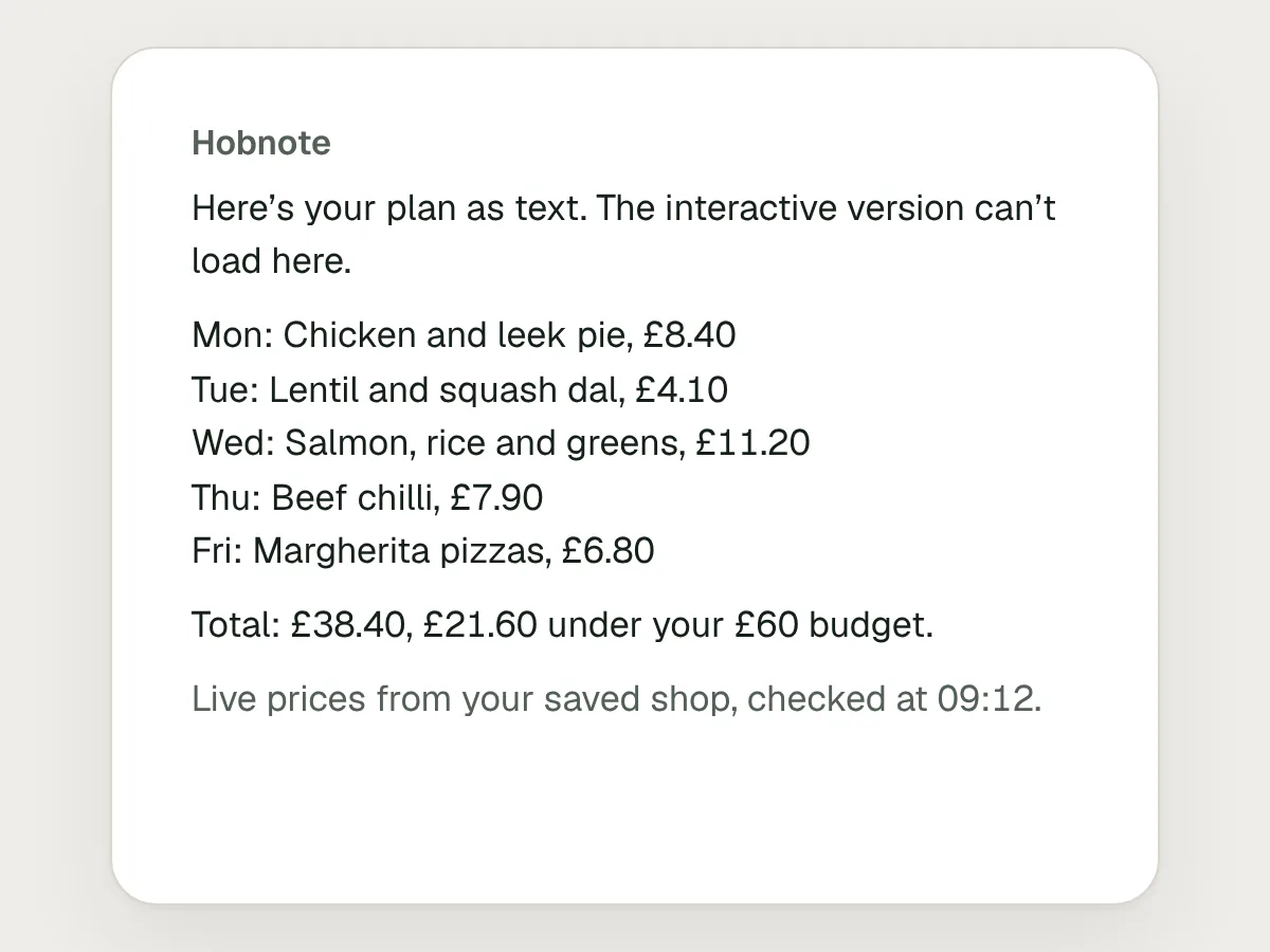
Write a text version of every component as part of the same answer: the same dinners, the same total, the same source line. If the component fails, show the text in its place and say the interactive version isn’t available here. A blank box or a spinner that never stops is the worst result, because the answer exists and the person can’t see it.
The text version is also a useful check. If it doesn’t make sense on its own, the component probably doesn’t either.
Mistakes, and what to do instead
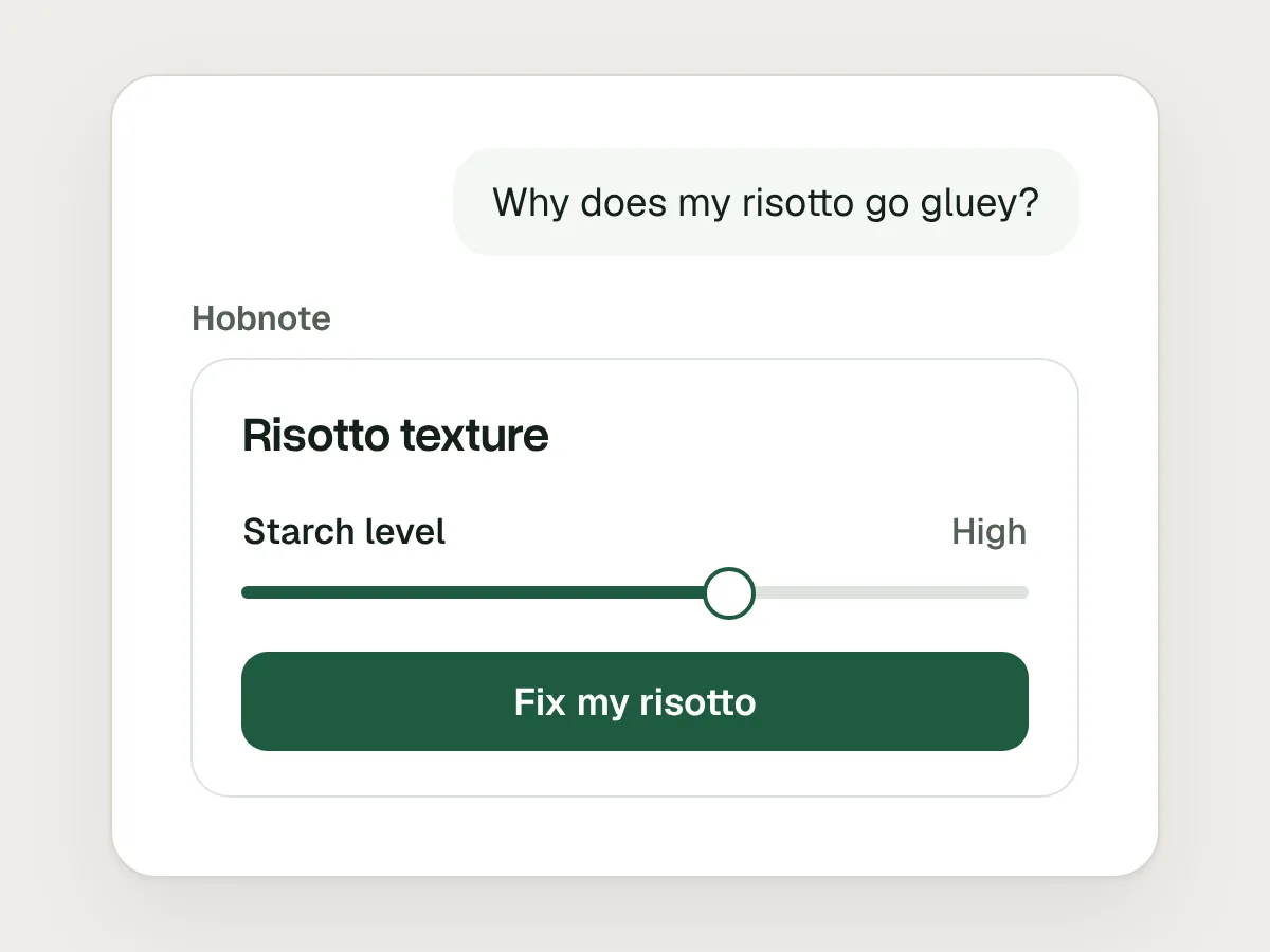
Don’t
Turning an explanation into a card with controls.
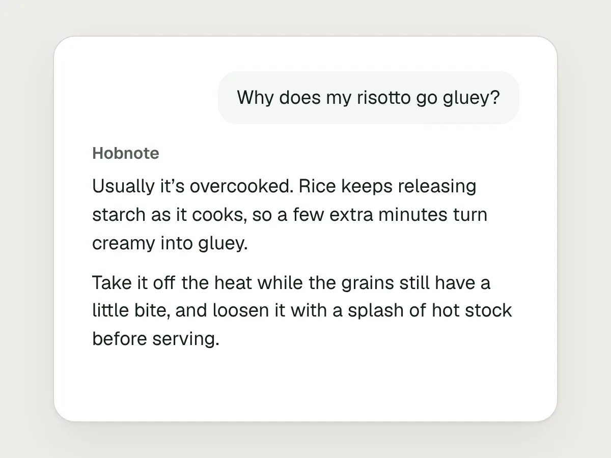
Do
Answer explanations in text. Save interface for comparing, choosing and adjusting.
Don’t
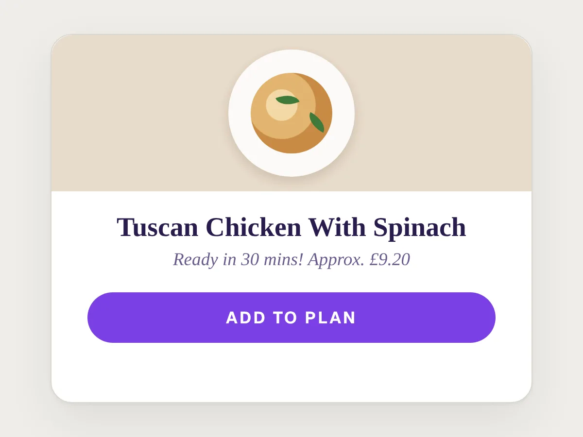
Letting the model write its own HTML for each answer.
Do
Have it choose and fill components from your design system.
Don’t
Drawing a button the assistant can’t act on.
Do
Draw only controls that work, and confirm what they did.
Don’t
A different layout each time the same question is asked.
Do
Give each kind of request one layout, and let only the content change.
Don’t
Resetting the person’s changes when the answer is regenerated.
Do
Keep their changes, carry them into the next answer and say so.
Don’t
An empty box when the component can’t load.
Do
Send a text version with every component, and show it when the component fails.
Before you ship: a checklist
Questions people ask
What is generative UI?
Interface that an AI model puts together while it answers, such as a card, table, chart or form. Usually the model picks and fills components a team has built. Sometimes it writes the interface itself.
Is generative UI the same as using AI to design screens?
No. AI design tools help a designer make screens before anything ships. Generative UI is assembled when someone asks, inside the product, and no designer sees that result first. That is why the components and rules have to be designed in advance.
Should the model write its own HTML or use our components?
Your components, for anything people act on, such as a basket or a payment. Free-form HTML can work for a one-off chart in a sandbox, but it can’t be tested in advance the way a component can.
What are MCP Apps?
The first official extension to the Model Context Protocol, released in January 2026. A tool can send back an interactive interface that a chat app such as Claude or ChatGPT shows inside the conversation, in a sandboxed frame.
How do you test an interface that is different every time?
Make it less different. Test each component with a keyboard and a screen reader, test the rules that pick components against a set of real requests, and regularly review real answers for wrong numbers, dead controls and the wrong layout.
Resources
- Generative UI: A rich, custom, visual interactive user experience for any prompt · Google Research
How Gemini designs and codes an interface for each prompt, and where it still falls short.
- MCP Apps: Bringing UI Capabilities To MCP Clients · Model Context Protocol
The open standard behind interactive interfaces in Claude, ChatGPT and other chat apps.
- UX principles · OpenAI Apps SDK
When interface helps inside a chat, with a checklist to run before you publish.
- Generative User Interfaces · Vercel AI SDK
How to connect a tool’s result to a React component you designed.
- A2UI v0.9: The New Standard for Portable, Framework-Agnostic Generative UI · Google Developers Blog
A declarative format in which agents can use only the components your app has approved.
- Generative UI and Outcome-Oriented Design · Nielsen Norman Group
Where generative UI may lead, and why it inherits the model’s mistakes.
If this was useful, share it with someone it would help.