Best practice
Touch target size: why 44 pixels keeps coming up
Touch target size decides whether a tap hits the right button. What WCAG, Apple and Material ask for, and how to grow a target without growing the icon.
· 6 min read · Musab Alfawal
On this page
Touch target size is how much of the screen responds when someone taps a control. On many interfaces it is exactly as big as the icon, which works for a mouse pointer and is too small for a finger.
Small targets cause wrong taps, repeated taps and accidental deletes. They are harder still for people with a tremor or limited dexterity, and for anyone using a phone one-handed on a moving train. The fix rarely changes how a screen looks.
Touch target size in WCAG, Apple and Material
WCAG 2.2 has two criteria for target size. SC 2.5.8 Target Size (Minimum), at level AA, asks for targets of at least 24 × 24 CSS pixels. A smaller target can still pass if it has enough space around it: draw a circle 24 pixels across, centred on the target, and it must not overlap another target or another small target’s circle. There are also exceptions for links inside a sentence, for browser controls you haven’t restyled, for a control that has a full-size equivalent elsewhere on the page, and for cases where a particular size is essential or legally required.
SC 2.5.5 Target Size (Enhanced), at level AAA, asks for at least 44 × 44 CSS pixels. It has the same exceptions apart from spacing.
The platform guidelines land in the same place. Apple’s Human Interface Guidelines say a button needs a hit region of at least 44 × 44 points. Material Design recommends touch targets of at least 48 × 48 dp.
That is why 44 keeps coming up. On a phone, a CSS pixel, an iOS point and an Android dp are close to the same physical size, so the three figures describe roughly the same area of glass. Treat 24 as the floor you must not go under, and 44 as the size to design for.
Why small targets miss
A fingertip is wider than most icons, and it hides the very thing it is aiming at. People tap where they think the centre is, and the touch lands somewhere in a patch around that point. When two small targets sit close together, part of that patch falls on each.
Here is the same tap on two versions of a task list.
On the left, the fingertip covers both icons at once, and the phone has to guess. On the right, the same tap falls inside one target, even though the icons are drawn at the same size.
The same screen, fixed
Here is a typical task list, then the same list with larger targets. The light squares show the area that responds to a tap. In the real interface they are invisible.
Before
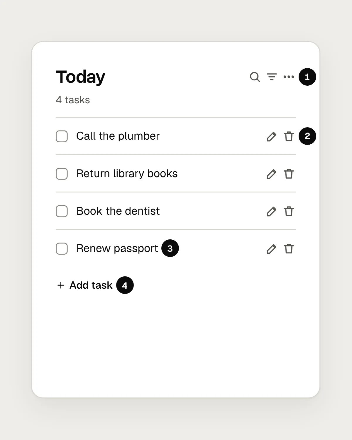
- Three 16 px icons, 4 px apart. Their centres are 20 px apart, so they fail SC 2.5.8.
- Edit and Delete sit side by side at 16 px. A slip deletes the task you meant to change.
- Only the 14 px box responds. Tapping the words beside it does nothing.
- “Add task” is a short line of small text, only as tall as its letters.
After
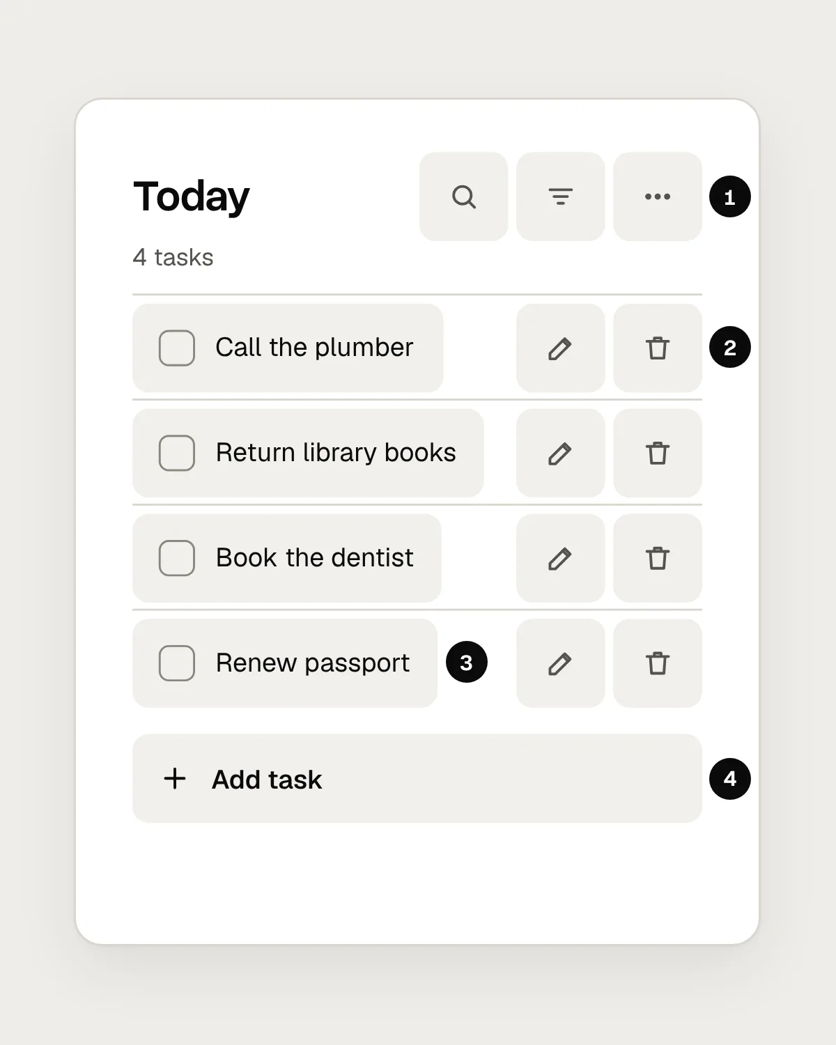
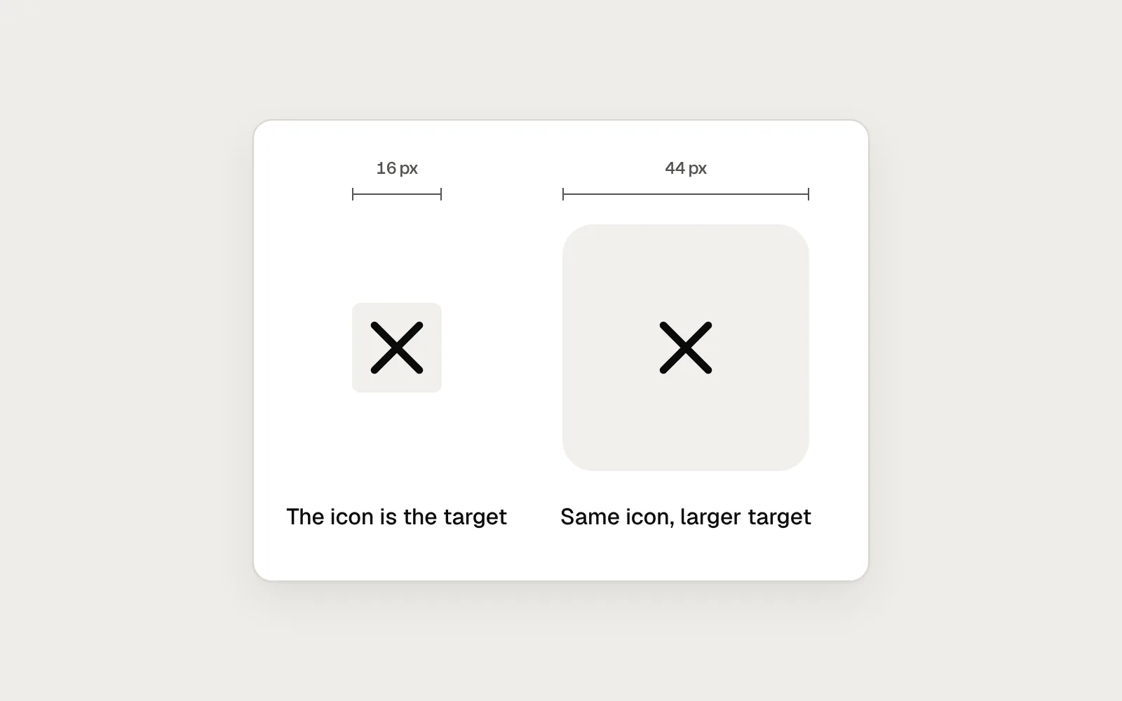
- Each icon stays at 16 px inside a 44 px target.
- Edit and Delete each get a 44 px target, so a tap belongs to one or the other.
- The checkbox and its label share one target, so tapping the words ticks the task.
- “Add task” becomes a full-width row, 44 px tall.
The icons, text and layout are almost unchanged. What changed is the area around each control that listens for a tap.
Grow the target, keep the icon
A 16 or 20 pixel icon is a sensible size to look at. Keep it, and add padding so the button around it reaches 44 pixels. A 16 pixel icon with 14 pixels of padding on every side is a 44 pixel square.
Do the same for text buttons and links that stand on their own, like “Forgot password?” or “Cancel”. Give them a minimum height of 44 pixels and some horizontal padding, so the tappable area is larger than the words.
For checkboxes, radio buttons and switches, connect the label to the control in code. Tapping the words then works as well as tapping the box, which turns a 14 pixel target into one as wide as the text.
In design files, draw icon buttons as 44 pixel frames with the icon centred inside. Developers inherit the size from the frame, and nobody has to remember to add it later.
Spacing, thumbs and links in text
Apple’s guidelines put it plainly: consider spacing between controls as important as size. Space between targets catches the taps that drift. When two actions sit side by side, put the one that destroys something further away, or let people undo it.
Think about reach as well. On a large phone held in one hand, the top of the screen, and the corner furthest from the thumb, are the hardest places to reach. Keep frequent actions in the lower half of the screen where you can, and don’t put a small target in a corner.
Links inside a paragraph are exempt from SC 2.5.8, because their size is set by the line height of the text around them. You can still help. Give body text a comfortable line height, and avoid placing two short links next to each other on the same line.
Mistakes, and what to do instead
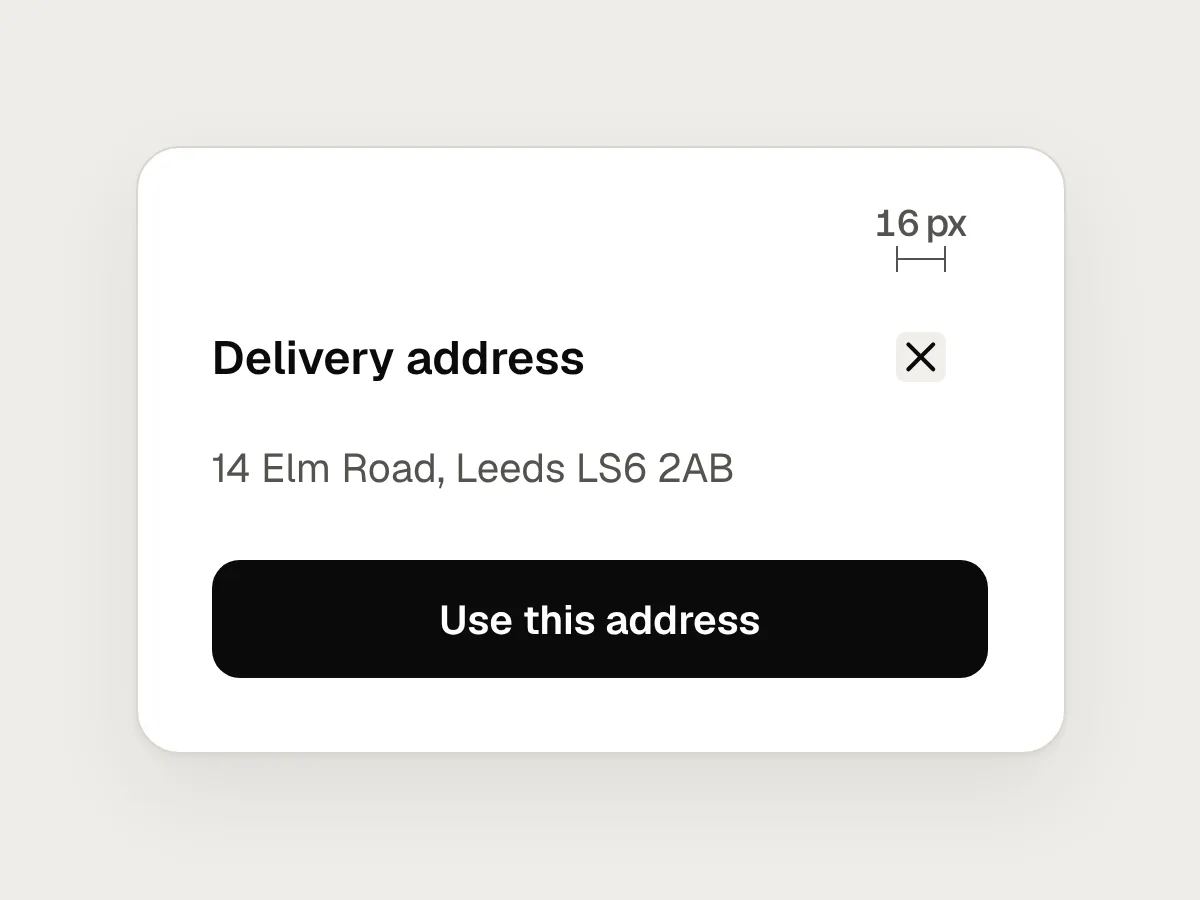
Don’t
The icon is the button, so a 16 px icon has a 16 px target.
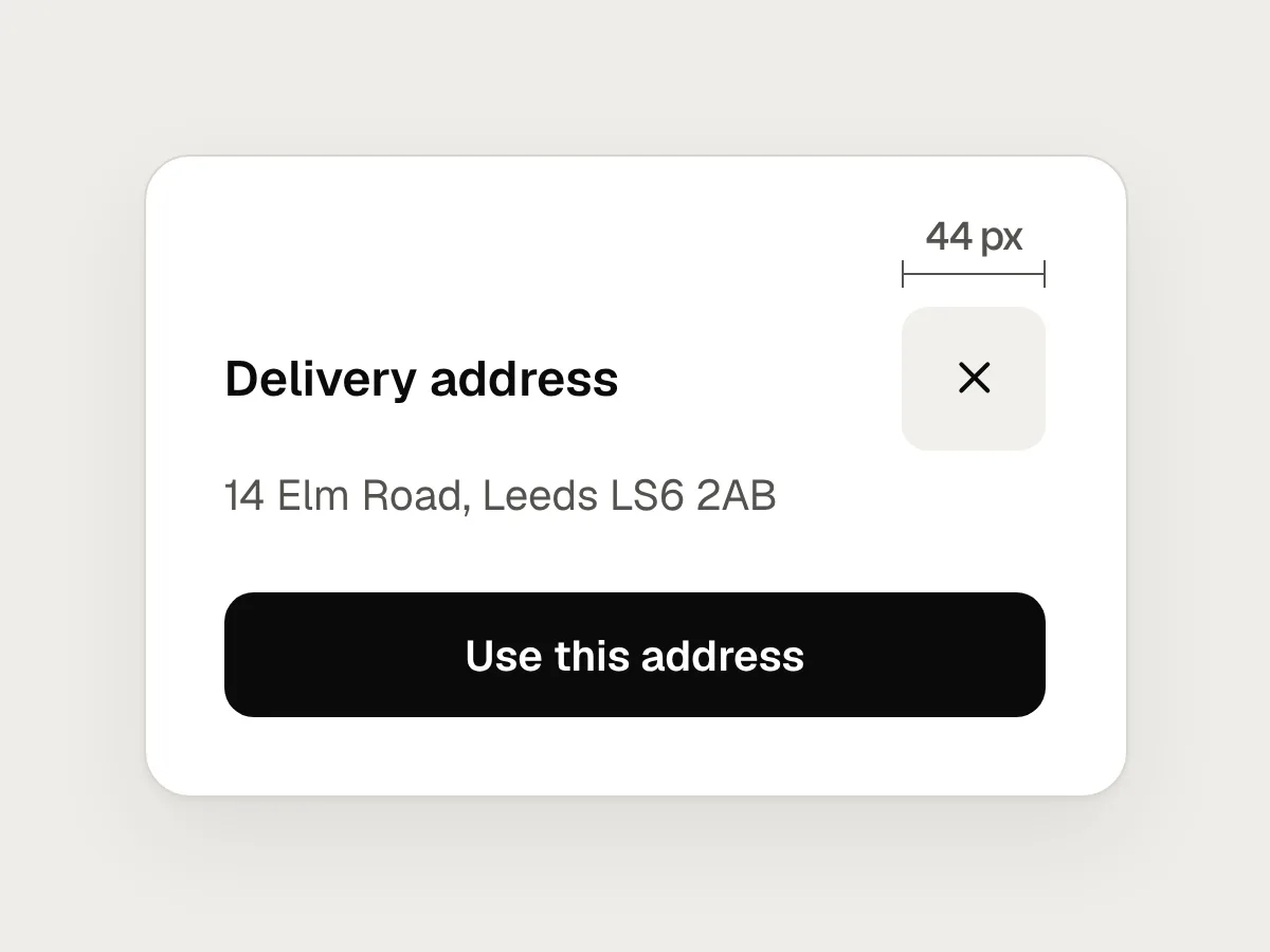
Do
Keep the icon at 16 or 20 px and pad the button around it to 44 × 44.
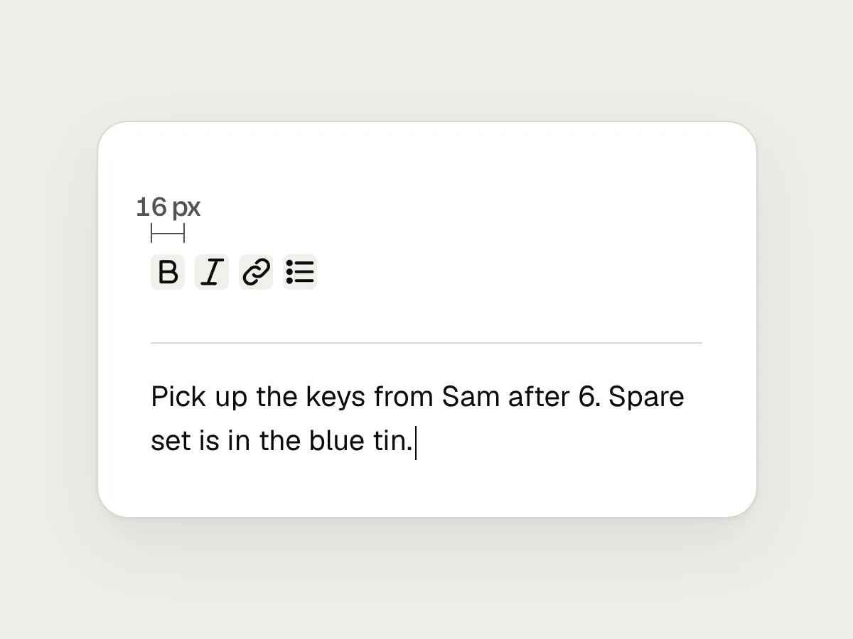
Don’t
Toolbar icons a few pixels apart.
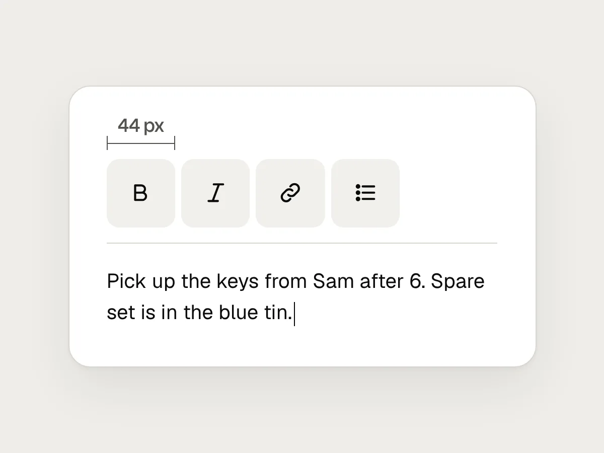
Do
Give each its own 44 px target, so a tap belongs to one button.
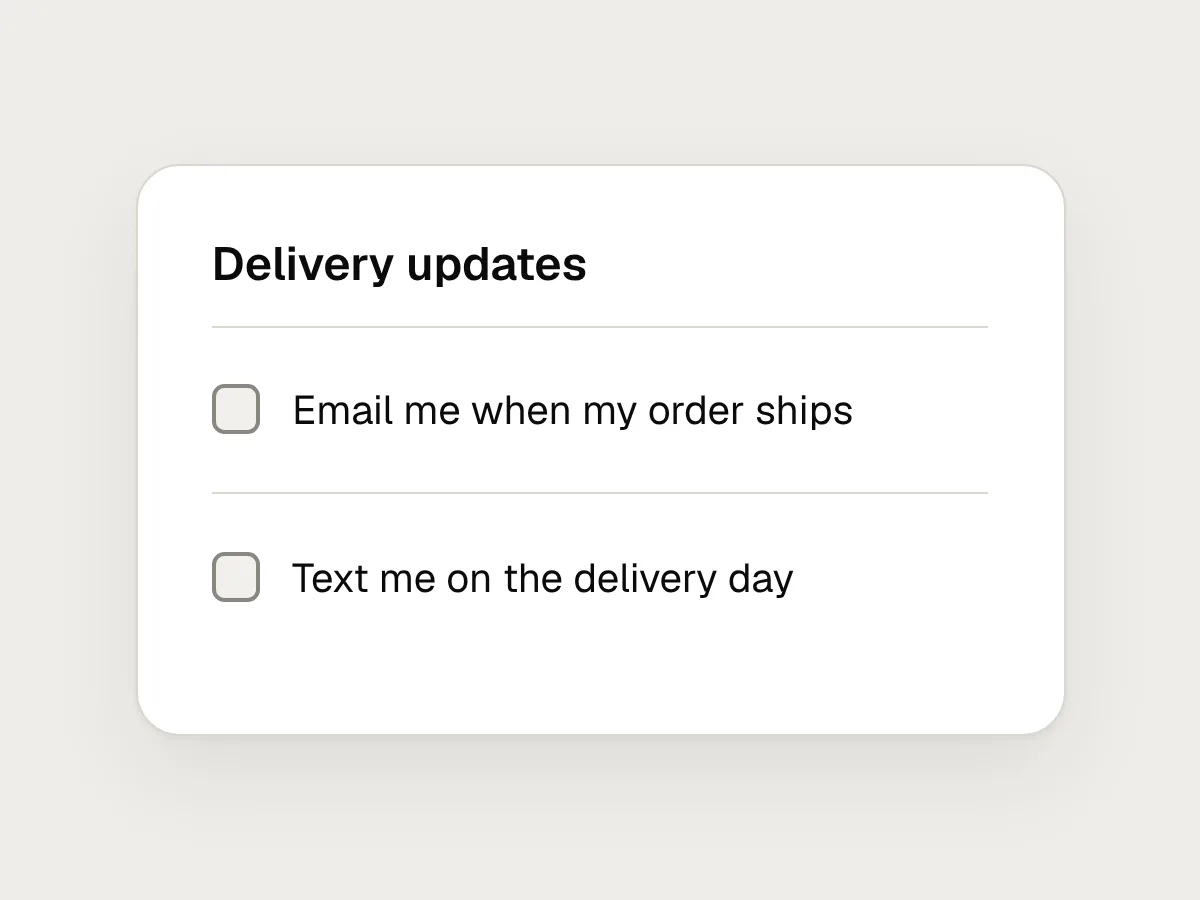
Don’t
Only the checkbox square responds to a tap.
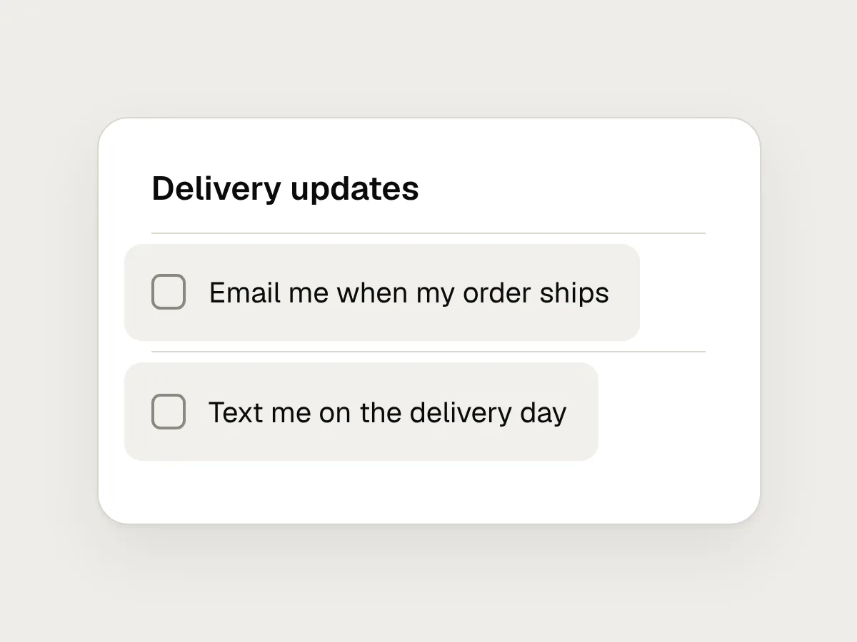
Do
Connect the label to the control, so the words are part of the target.
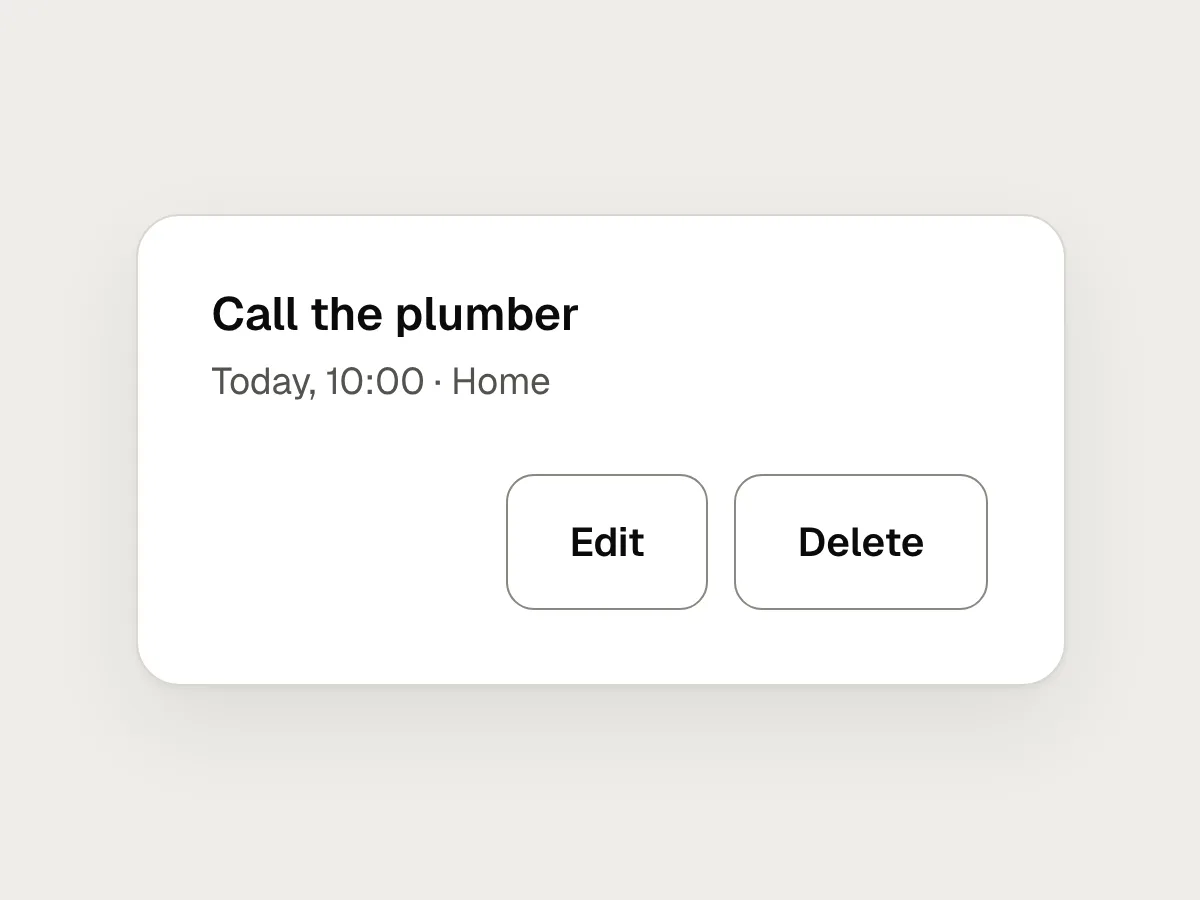
Don’t
Delete right next to Edit, the same size and colour.
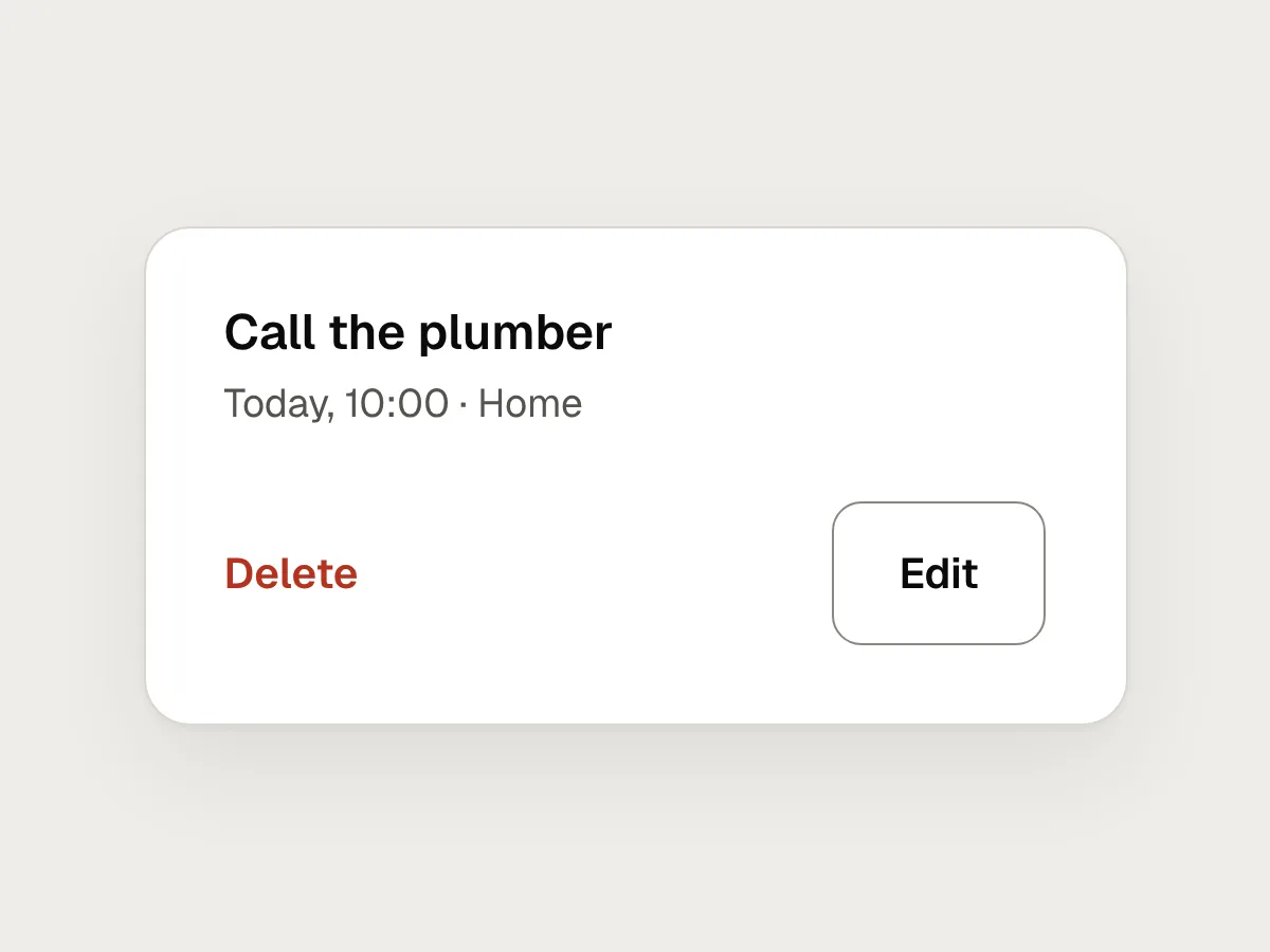
Do
Move destructive actions away from frequent ones, or offer undo.
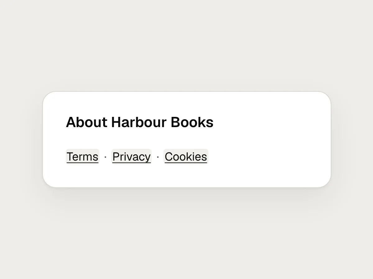
Don’t
A row of small text links, like “Terms · Privacy · Cookies”.
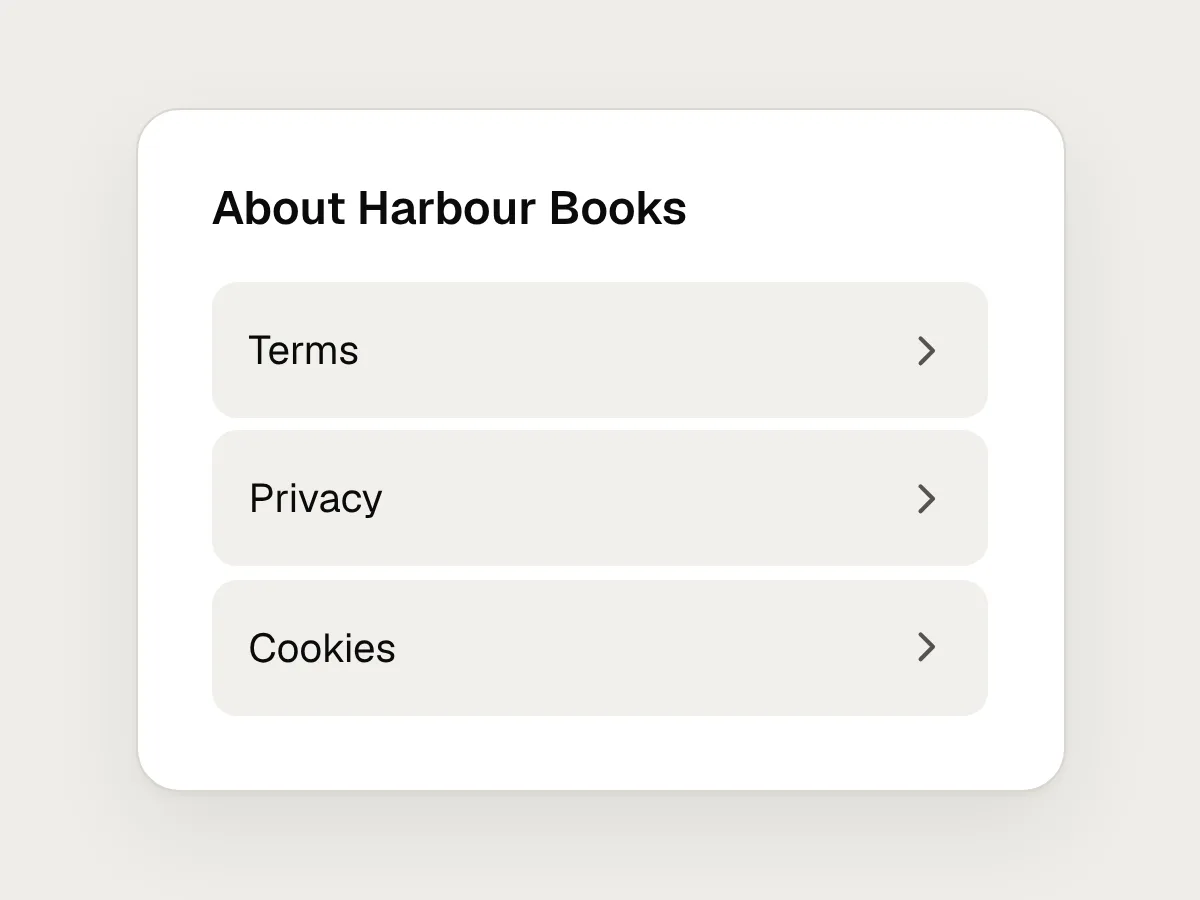
Do
Space them out, or stack them as rows at least 44 px tall on touch screens.
How to check touch target size
1. Show the real targets
In your design file, draw each control’s tappable area as its own layer. In the browser, inspect a button to see its real box, padding included.
2. Measure against 24 and 44
Anything smaller than 24 × 24 CSS pixels needs the spacing exception to pass AA. Aim for 44 × 44 for anything people tap often.
3. Check the spacing of small targets
Centre a 24 px circle on each small target. If two circles overlap, or a circle covers another target, the pair fails SC 2.5.8.
4. Test on a real phone, one-handed
Use your thumb, and try it while walking. Note every wrong tap and every target you had to stretch for.
Questions people ask
Is it 44 or 48 pixels?
Both are common. Apple recommends at least 44 × 44 points, and WCAG’s AAA criterion asks for 44 × 44 CSS pixels. Material Design recommends 48 × 48 dp. On phones these units are close in size, so pick one for your design system and use it everywhere.
Do links in a paragraph need to be 44 pixels tall?
No. SC 2.5.8 exempts targets inside a sentence, because their size is set by the line height of the text. Give body text a comfortable line height, and avoid two short links close together.
Does target size matter on desktop?
Yes. SC 2.5.8 applies to any pointer, including a mouse or trackpad, and small targets are hard for anyone with a tremor on any device. 24 × 24 is the minimum everywhere. On touch screens, aim for 44.
Resources
- Understanding SC 2.5.8: Target Size (Minimum) · W3C
The AA rule, its exceptions, and how the 24 px spacing circle works.
- Understanding SC 2.5.5: Target Size (Enhanced) · W3C
The AAA rule behind the 44 px figure.
- Buttons · Apple Human Interface Guidelines
Apple’s 44 × 44 point hit region, and advice on spacing.
- Accessibility basics · Material Design 3
Google’s guidance on 48 dp touch targets.
- Touch targets on touchscreens · Nielsen Norman Group
Why fingers need larger targets than pointers, with examples.
If this was useful, share it with someone it would help.