Best practice
Navigation labels people understand
How to write navigation labels in your visitors’ words, show people where they are, keep the menu visible on desktop and test the labels before you build.
· 7 min read · Musab Alfawal
On this page
Navigation labels are the few words people read before they decide where to click. If those words make sense to them, they find what they came for. If they don’t, people guess, go back or leave.
Most unclear menus start inside the company. The team names sections after its own departments, or picks a word that sounded good in a brand workshop. Both make sense in a meeting and say very little to someone visiting for the first time.
How to write navigation labels people understand
Start with the words your visitors already use. You will find them in your site search logs, your support emails and the questions people ask on sales calls. If people search for “prices”, a label that says “Plans and packages” makes them translate before they click.
Labels like “Solutions”, “Explore” and “Resources” could sit on almost any website, which is why they tell a visitor nothing about yours. Someone looking for your rates has no reason to open “Solutions” before “Resources”. A plain label such as “Prices” or “Case studies” answers the question before the click.
Internal names fail in the same way. “Client Hub”, “Learning Centre” or the name of a product team mean something to the people who chose them. To a visitor they are a puzzle to solve before they can move on.
Keep the top level short. Every extra item makes the others slower to scan, and five or six is enough for most small sites. Make the labels parallel too: all nouns, or all short phrases of the same kind. “Work, Services, Prices, About, Contact” reads as one set. “Our work, What we do, Pricing info, Blog, Get in touch” reads as five different voices.
Put the word that carries the meaning first. People scan the start of each label and skip the rest, so “Prices for teams” works better than “For teams: our prices”.
Show people where they are
A good menu tells people two things: where they can go, and where they are now. The second matters most to people who arrive from a search result or a shared link, deep inside your site, without passing the home page.
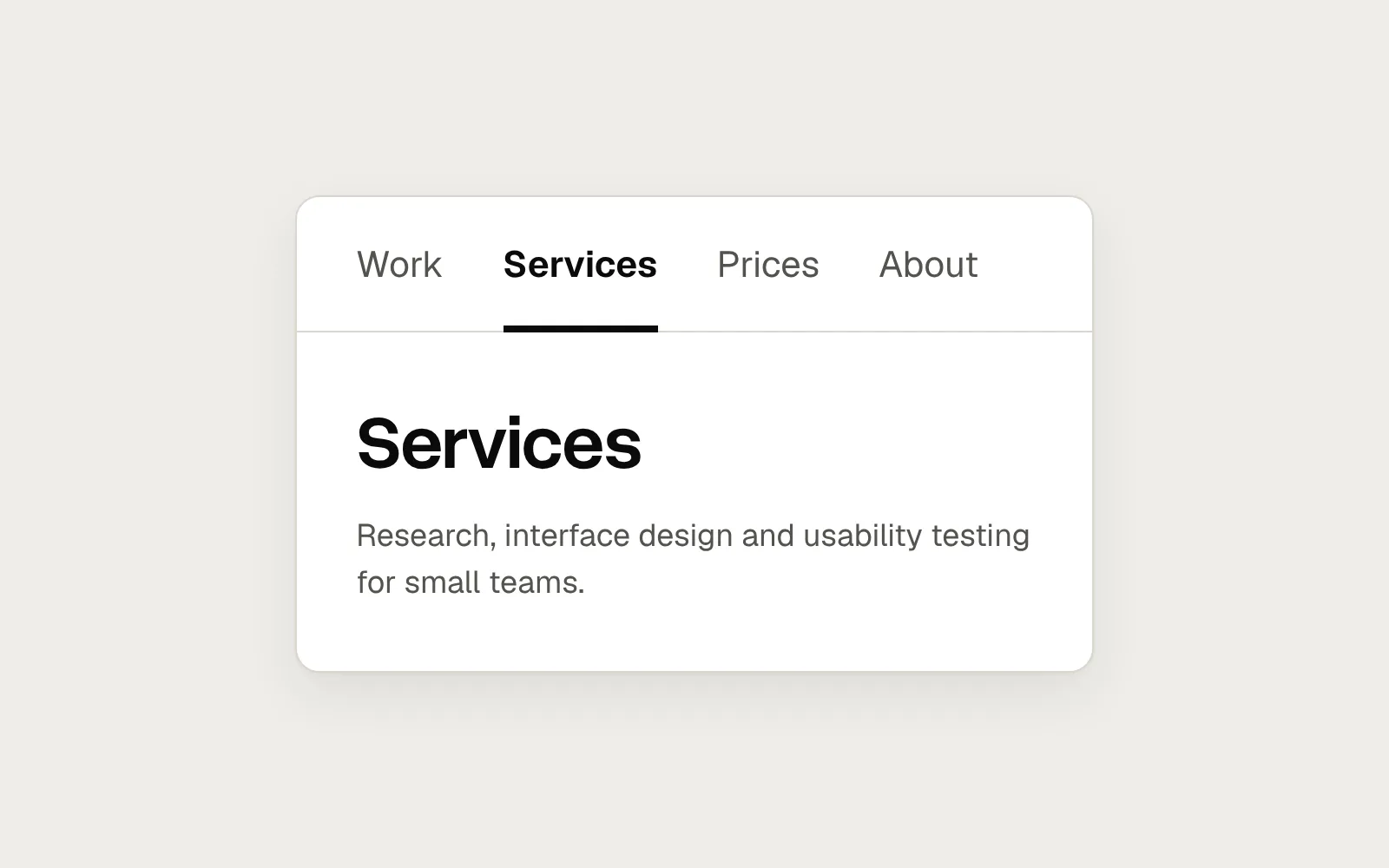
Mark the current page in the navigation, and make the page title match the label that leads to it. If someone clicks “Prices”, the page they land on should say “Prices” at the top, not “Plans built for growth”. WCAG covers this in Success Criterion 2.4.8, Location, at level AAA: people should be able to tell where they are within a set of pages.
Use more than colour to mark the current item. A link that is only a different shade is easy to miss with colour blindness, on a washed-out screen or in bright sun. Success Criterion 1.4.1, Use of Color, asks that colour is never the only way information is shown. A heavier weight with an underline works on any screen. In the code, add aria-current="page" to the current link so screen readers announce it as well.
Hover shows what you can click, and after the click the marker and the page title move together.
The same header, fixed
Here is a studio website with a menu icon on a desktop screen and four brand words behind it, then the same header with its sections in view. The page content is the same in both. Only the navigation changed.
Before
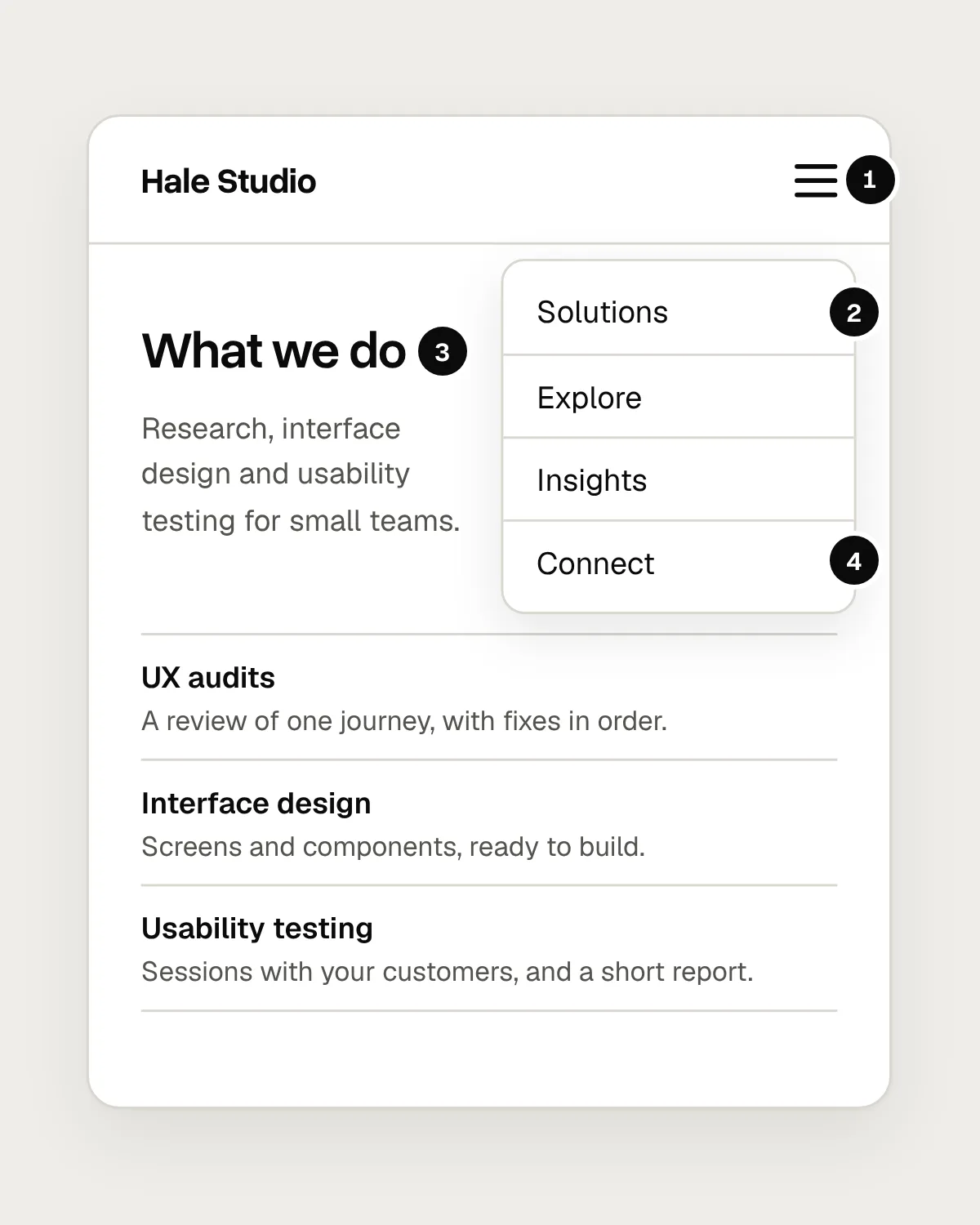
- On a desktop screen, every section hides behind a menu icon.
- “Solutions”, “Explore” and “Insights” could belong to any company. None says what is inside.
- The page title matches no label, so nothing tells you where you are.
- “Connect” is a clever word for Contact. People scan straight past it.
After
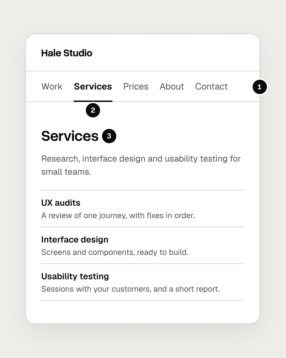
- Every section is on screen, named in the words visitors use.
- The current page is bold and underlined, so it doesn’t rely on colour.
- The page title repeats the label you clicked.
Keep the navigation visible on desktop
A menu icon saves space on a phone, where space is short. On a desktop screen there is usually room for five or six links, and hiding them costs more than it saves. Research by Nielsen Norman Group found that people use hidden navigation less, and find things less often, than navigation they can see. The effect was strongest on desktop.
Visible links do a second job as well. They tell a new visitor, at a glance, what the site offers. A closed menu hides that summary behind a click that many people never make.
On phones, a menu button is a fair trade. Put the word “Menu” next to the icon, keep the button in the same place on every page, and mark the current page inside the menu when it opens.
Mistakes, and what to do instead
Don’t
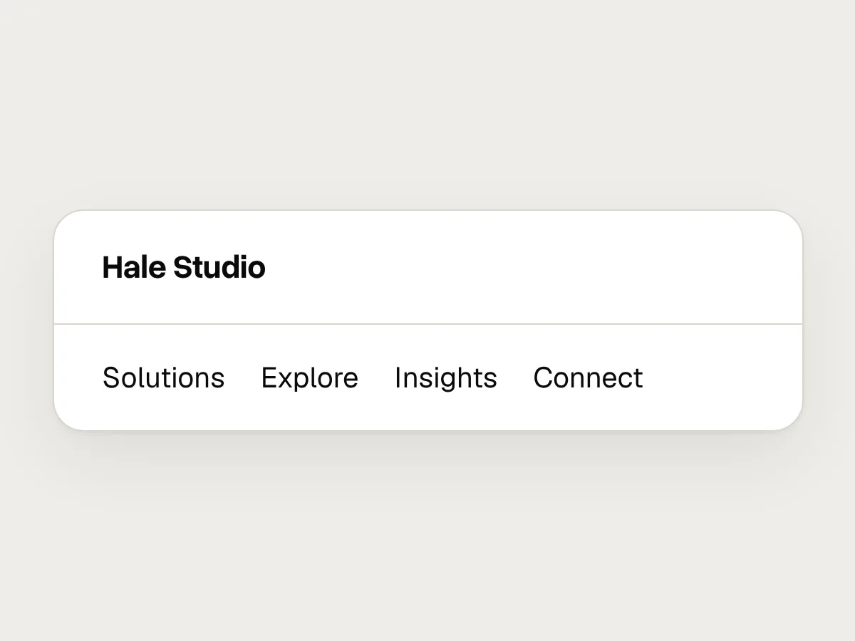
Brand words like “Solutions”, “Explore” or “Insights”.
Do
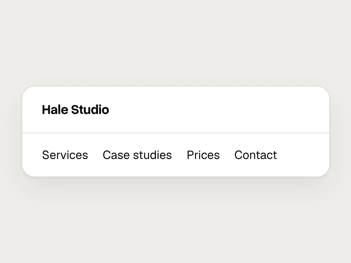
Plain words visitors use: “Services”, “Case studies”, “Prices”.
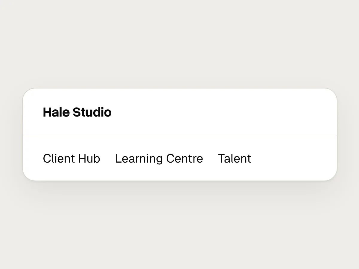
Don’t
Sections named after your teams or internal projects.
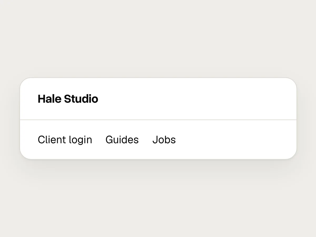
Do
Sections named after what visitors want to find or do.
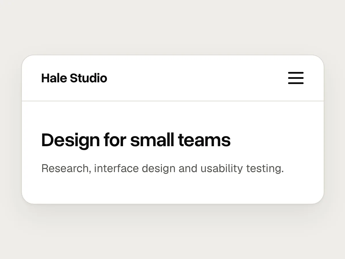
Don’t
A menu icon on a wide desktop screen.
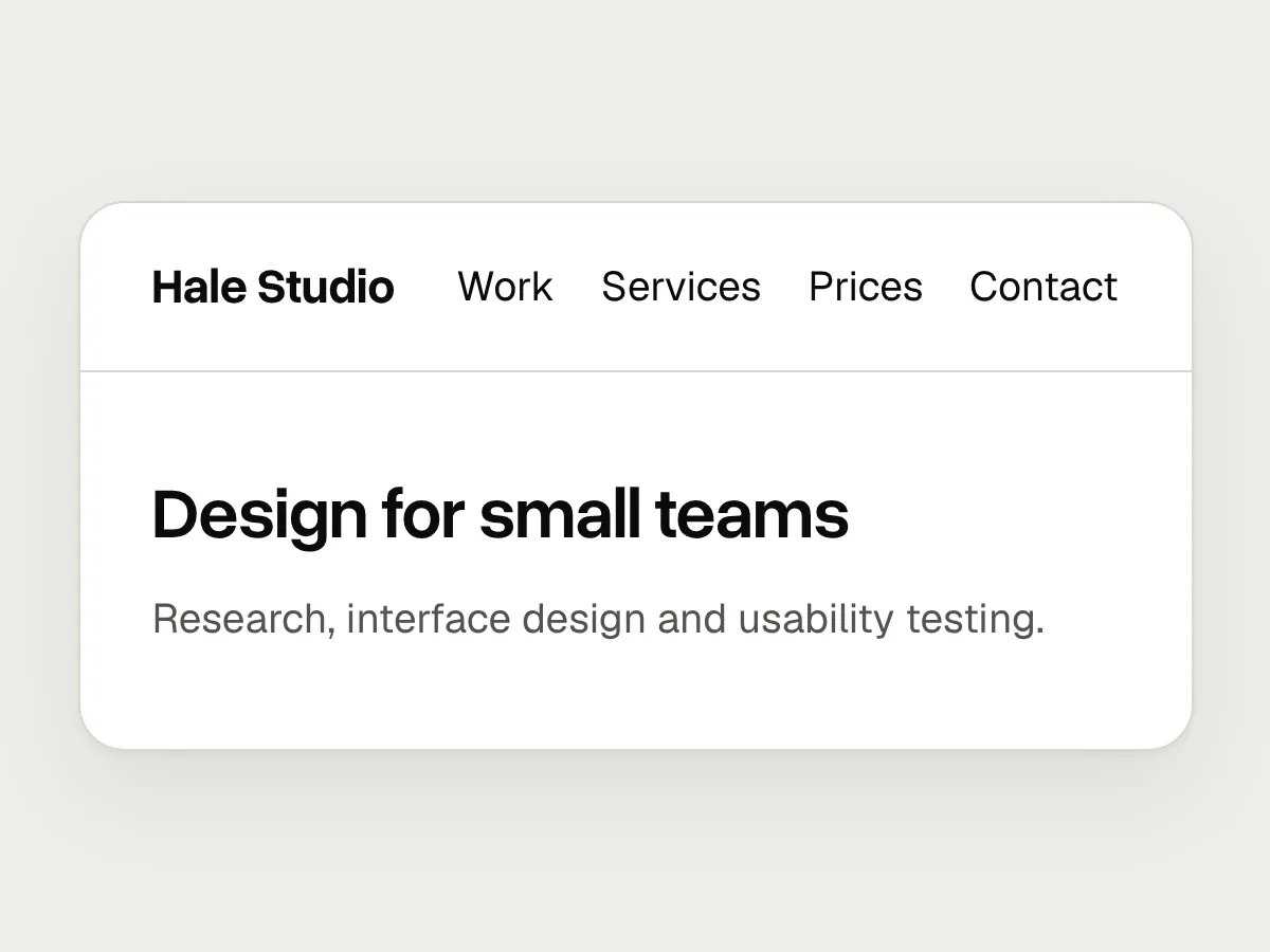
Do
Show the links. Keep the icon for narrow screens, with the word “Menu” beside it.
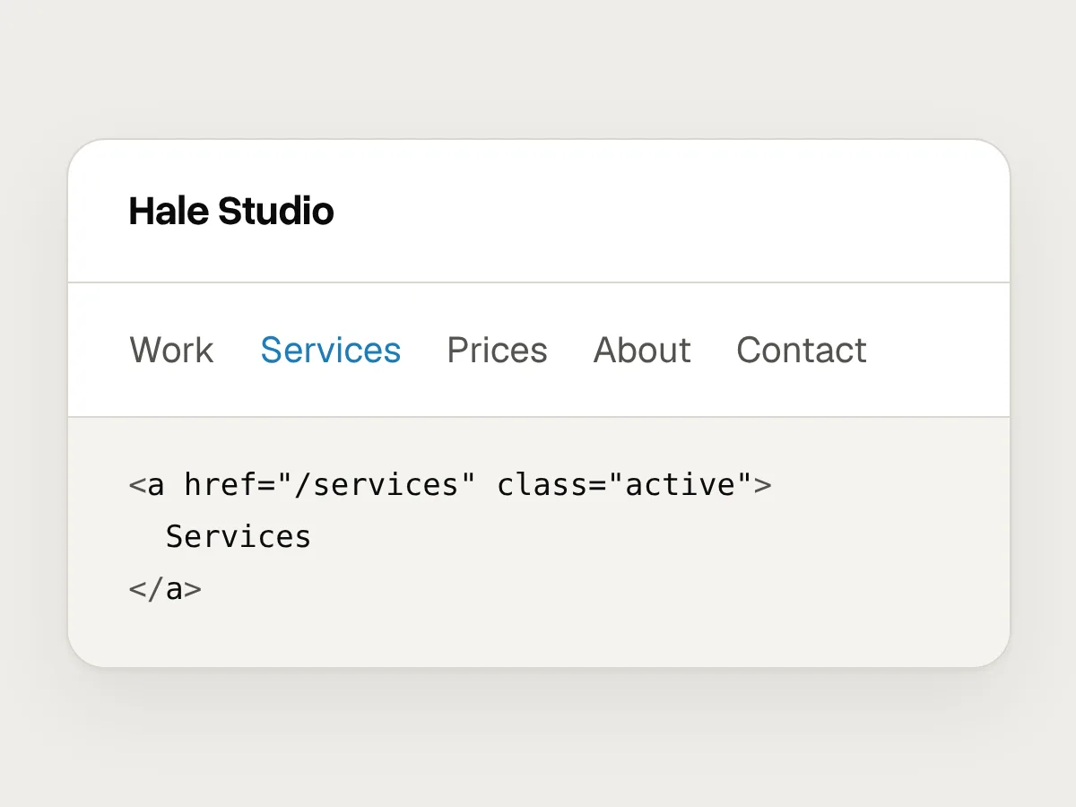
Don’t
The current page shown by colour alone.
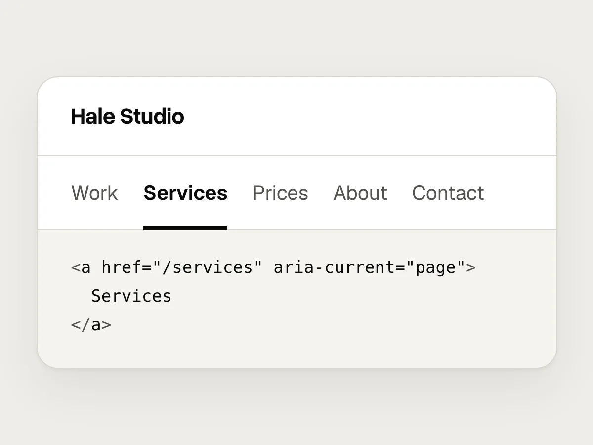
Do
Bold weight and an underline, plus aria-current="page" in the code.
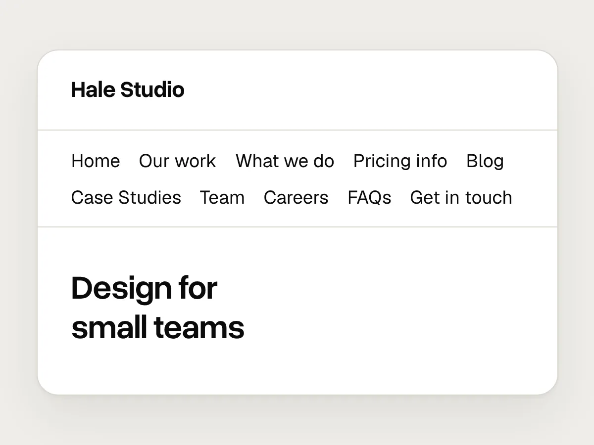
Don’t
Ten top-level items written in mixed styles.
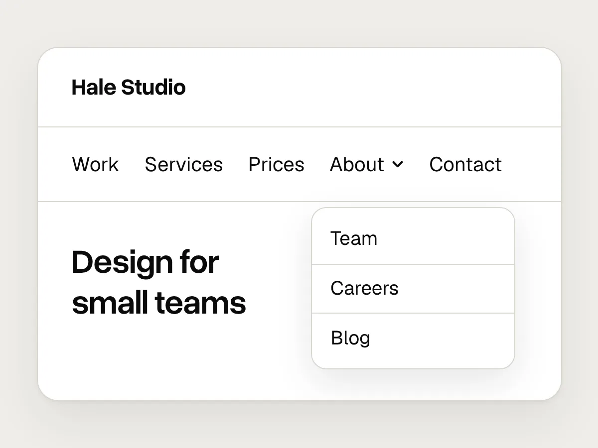
Do
A handful of parallel labels, with the rest grouped one level down.
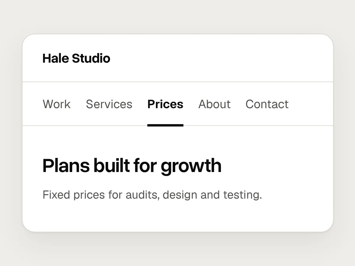
Don’t
A page title that doesn’t match the label.
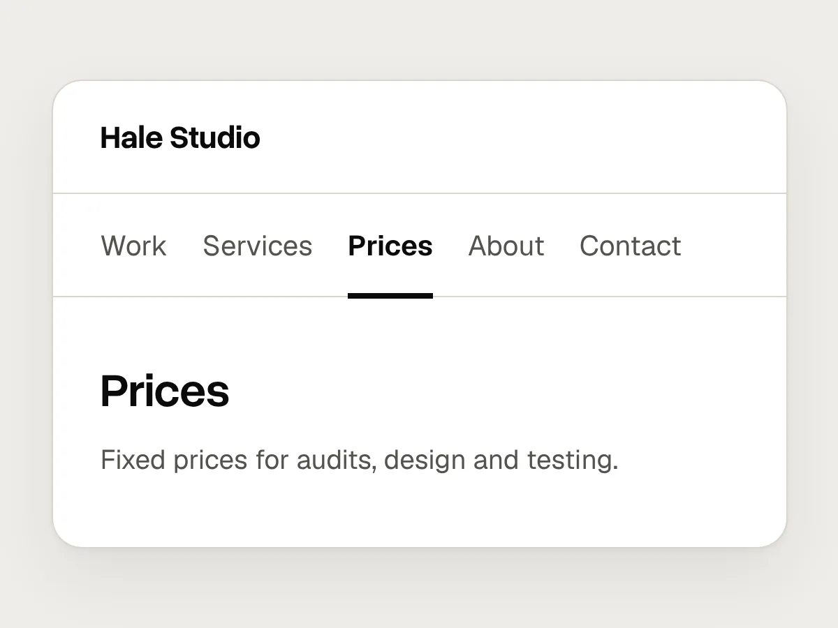
Do
The same words in the menu and at the top of the page.
Test your labels before you build
You can test navigation labels before a single page exists. Two methods cover most of what you need to know.
A tree test shows people your menu as a plain text list, with no design, and asks where they would look for something. It tells you whether the labels and groups make sense on their own. A first-click test shows a screen and asks people where they would click to start a task. It tells you whether the labels still work once they sit in a real layout, next to everything else competing for attention.
Write the tasks with care. If you ask “Where would you find our prices?”, people will click “Prices” because the words match. Ask instead “Where would you find out what a website review costs?”, and you learn whether the label works for someone who doesn’t know your vocabulary.
1. Collect the words visitors use
Read site search logs, support emails and sales notes. List the words people use for the things they want.
2. Draft the menu as a plain list
Write the top level and one level below it, with every label in the same form.
3. Write tasks in everyday words
Ask people to find something real, without using the words in your labels.
4. Run a tree test, then a first-click test
Note where people look first and where they back out. The tree test checks the words, and the first-click test checks them in your layout.
5. Fix what failed and test again
Rename or move whatever sends people the wrong way, then run the same tasks again.
Before you ship: a checklist
Questions people ask
Is the hamburger menu bad for UX?
Not on a phone, where space is short and most people know the icon. On desktop it hides options you have room to show, and people use hidden navigation less. If you use it, put the word “Menu” next to the icon.
How many items should a navigation bar have?
As few as your content allows. Five or six works for most small sites. If you need more, group the extras one level down instead of squeezing them into the top bar.
What is the difference between a tree test and a card sort?
A card sort asks people to group your content, which helps you find categories and the words for them. A tree test checks a menu you have already drafted, by asking people where they would look for things. Use the card sort to build the menu and the tree test to check it.
Resources
- Hamburger menus and hidden navigation hurt UX metrics · Nielsen Norman Group
The study behind keeping desktop navigation visible.
- Tree testing: fast, iterative evaluation of menu labels and categories · Nielsen Norman Group
How to plan a tree test and write tasks for it.
- Understanding SC 2.4.8: Location · W3C
Why people need to know where they are within a site.
- Understanding SC 1.4.1: Use of Color · W3C
Why colour can’t be the only way to mark the current page.
- Service navigation · GOV.UK Design System
A tested pattern for a header with a few visible links.
If this was useful, share it with someone it would help.