Best practice
Loading states: skeletons, spinners and progress bars
How to match loading states to the wait: nothing, a skeleton screen, a spinner or a progress bar. The timings that matter, and the mistakes to avoid.
· 6 min read · Musab Alfawal

On this page
Every product has loading states, whether or not anyone designed them. A good one tells people that something is happening, roughly how long it will take, and what they will see when it’s done.
The choice comes down to how long the wait is and how much you know about it. Spinners, skeleton screens and progress bars each suit a different wait, and using the wrong one can make a fast product feel slow.
How long people will wait
Jakob Nielsen’s article “Response Times: The 3 Important Limits” is a good place to start. About 0.1 seconds is the limit for a response to feel instant, so the result can simply appear. About 1 second is the limit for someone’s flow of thought to stay unbroken: they notice the delay, but they stay with the task. About 10 seconds is the limit for keeping their attention on the screen. Beyond that, people start doing something else while they wait, and they need to know when it will be done.
Those limits give you a simple rule for loading states.
1. Under about a second: show nothing
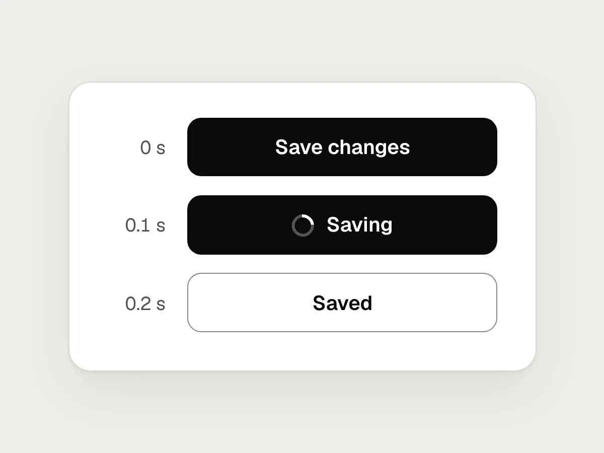
The result arrives fast enough to feel like a response. An indicator that flashes on and off is more distracting than the wait it covers.
2. One to about ten seconds: a skeleton or a spinner
Use a skeleton when a page or a section is loading and you know its layout. Use a small spinner for an action in one place, such as a button that is saving.
3. Longer than about ten seconds: a progress bar
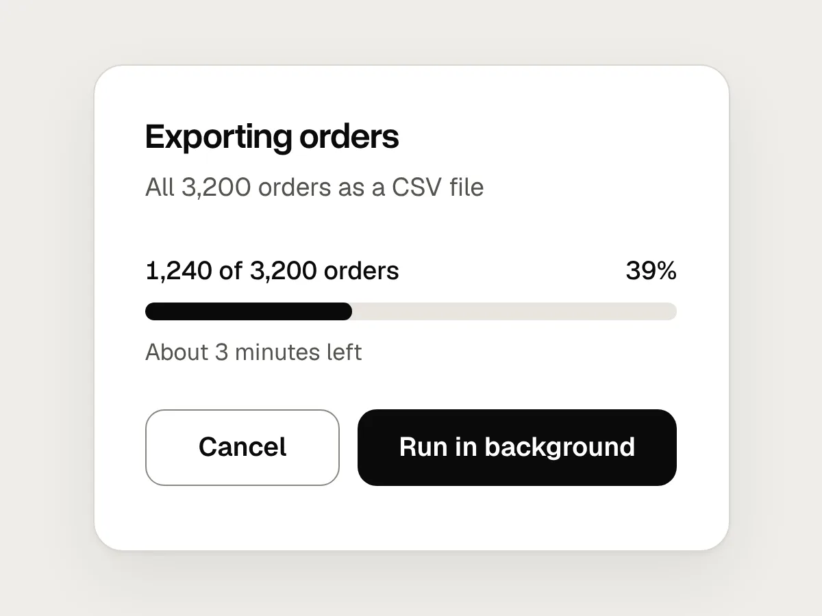
Show how far the task has got and what it is doing, such as “Uploading 3 of 12 photos”. Let people cancel, or carry on with something else while it runs.
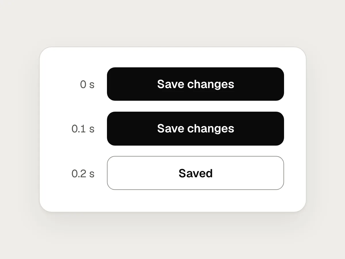
When a request usually finishes quickly but sometimes doesn’t, wait a moment before showing any indicator. Fast responses then just appear, and slow ones still get feedback.
Why skeleton screens feel calmer
The same list, loading two ways. On the left, a spinner gives way to the rows and the link below jumps down.
A spinner in an empty area says that something is happening, but nothing about what is coming. When the content arrives it takes up more room than the spinner did, and everything below it moves. Anyone about to tap the link at the bottom now taps something else.
A skeleton screen draws the page in outline before the data is there: blocks where the images will be, bars where the text will go. The content then fills in where people were already looking. If the skeleton matches the real layout, nothing moves at all.
That movement has a name and a measure. Cumulative Layout Shift is one of Google’s Core Web Vitals, and a score of 0.1 or less counts as good. Skeletons drawn at the real size are one of the simplest ways to keep it there.
The same dashboard, fixed
Here is a dashboard behind a full-page spinner, then the same dashboard loading in parts.
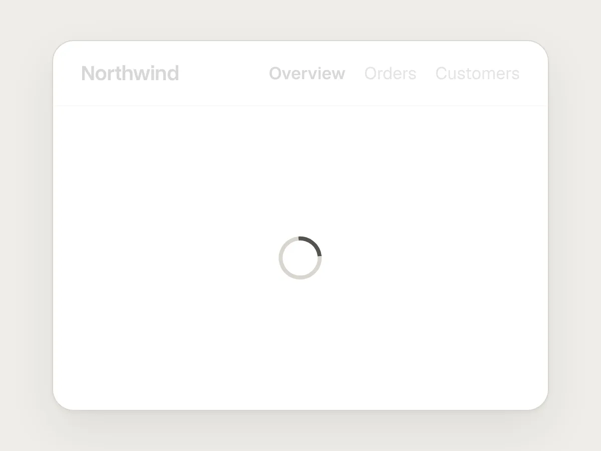
Before
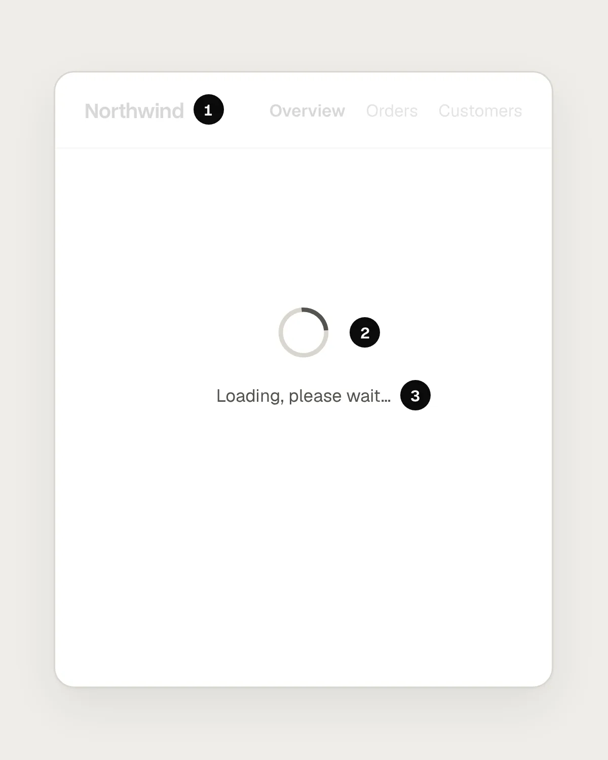
- The header and navigation are ready, but a white layer covers them, so nothing can be used.
- A spinner in the middle of an empty page. No sign of what is coming, or how long it will take.
- “Loading, please wait” adds words and no information.
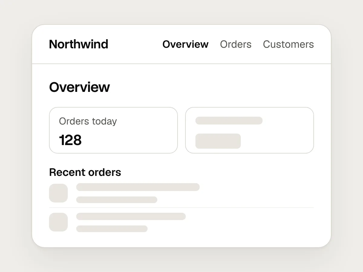
After
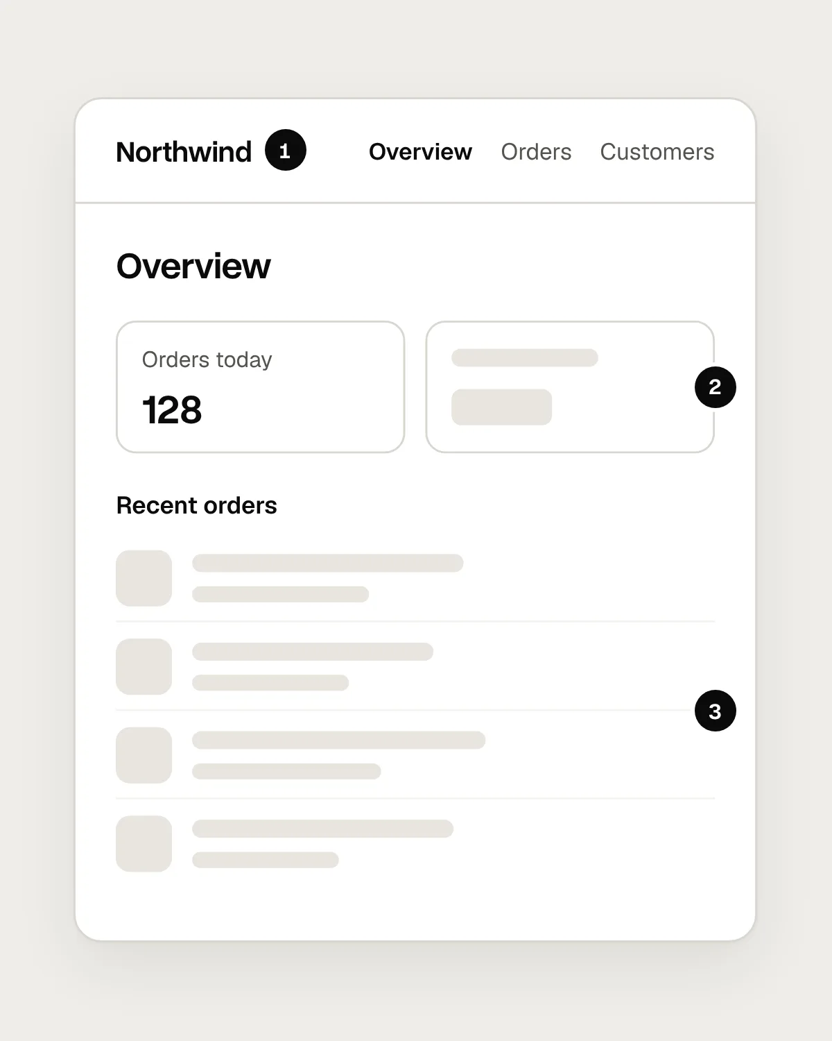
- The header, navigation and page title appear straight away, and they work.
- Each part fills in as its data arrives. Here, the first figure is already in.
- Skeleton rows have the size and spacing of the real rows, so nothing moves when they load.
Load the page in parts
A full-page spinner hides everything until the slowest request has finished. Most pages have parts that are ready almost at once: the header, the navigation, the page title, anything the app already has in memory. Show those straight away, and give each region that is still loading its own skeleton or spinner.
This keeps the page usable. People can read what has arrived, open the menu or go somewhere else, instead of waiting for permission to do anything. Save blocking overlays for the rare moments when nothing else should happen, such as while a payment is being confirmed.
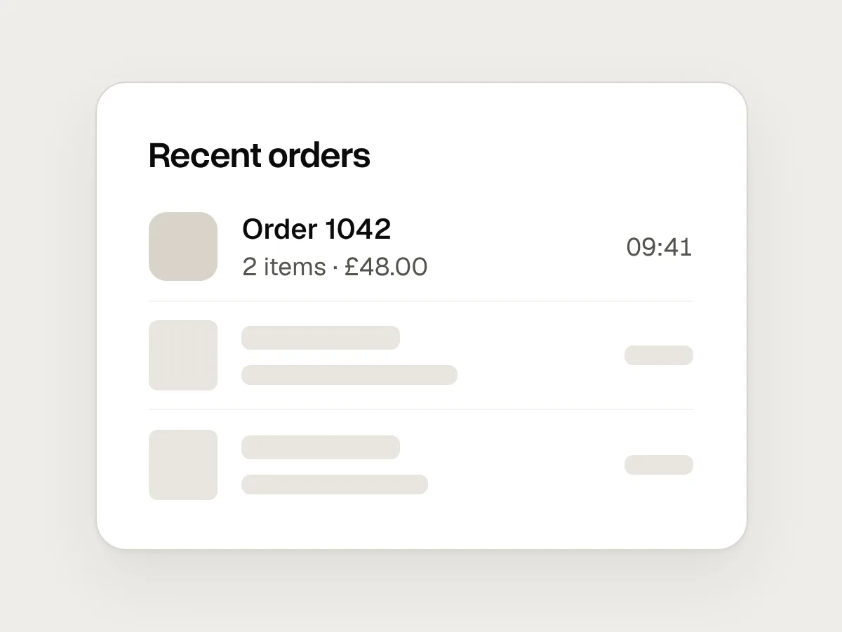
When you design skeletons, draw them from the real components at their real sizes. A skeleton that is shorter than the content it stands for still causes a jump, just a smaller one. Keep the number of skeleton rows close to what usually loads, and use the real headings and labels, since you already know them.
When to use a progress bar
A progress bar tells people how far along a task is, which a spinner can’t. That lets them decide whether to wait, do something else, or come back later. Use one whenever you can measure progress, and pair it with a short description of what is happening: “Uploading 3 of 12 photos” helps far more than “Loading”.
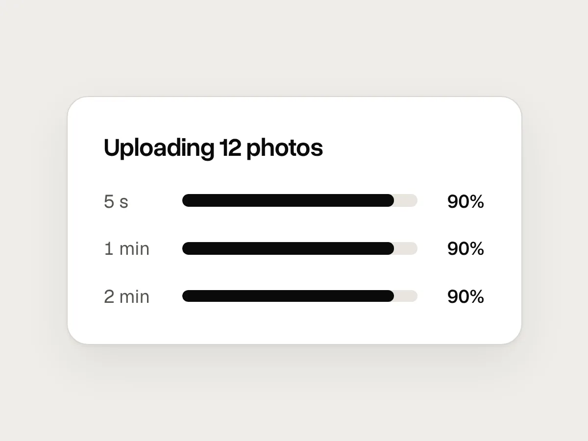
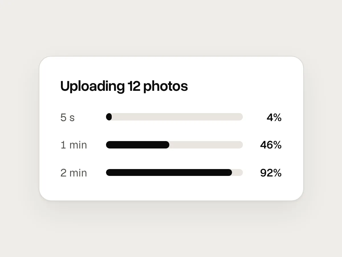
Report progress honestly. A bar that races to 90 percent and then sits there for a minute feels worse than a slow, steady one. If a task starts without a known length and you learn it part-way through, switch from an indeterminate indicator to a determinate one. For anything long, let people cancel, or let them keep working while the task runs in the background.
Loading states and accessibility
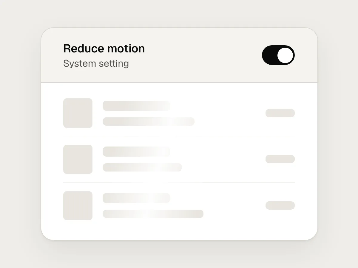
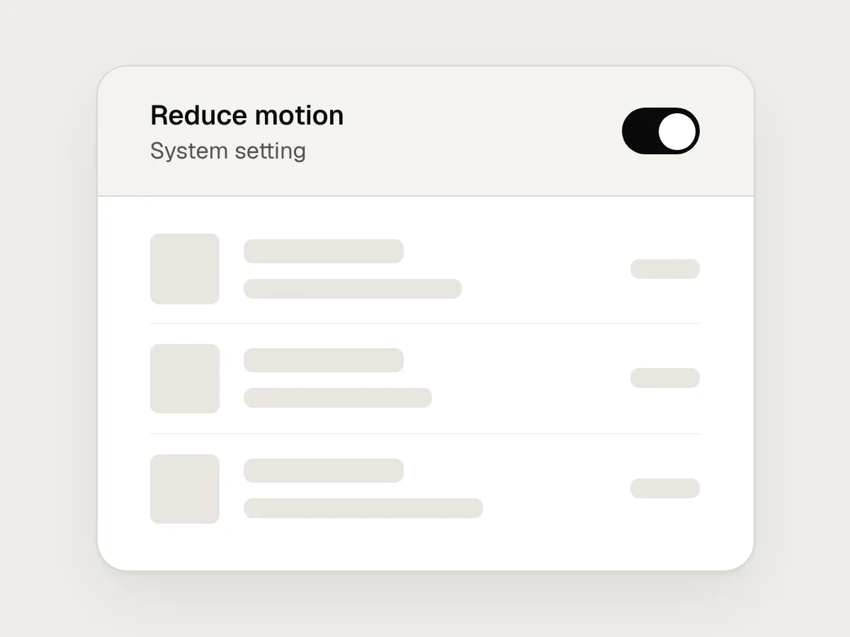
Some people set their device to reduce motion. Under the prefers-reduced-motion media query, replace shimmering or pulsing skeletons with still ones, and keep any spinner small. The loading state still works without the movement.
Screen reader users can’t see a skeleton. Mark a region that is loading with aria-busy, and announce when it has finished or how far a long task has got, without moving focus. WCAG SC 4.1.3 Status Messages covers this, and its definition of a status message includes the waiting state of an application and the progress of a process. For a determinate bar, the HTML progress element exposes its value to assistive technology without extra work.
Mistakes, and what to do instead
Don’t
A full-page spinner for every request.
Do
Show the parts you already have, and load each region in place.
Don’t
A spinner that flashes up for a fraction of a second.
Do
Wait a moment before showing any indicator, so fast responses just appear.
Don’t
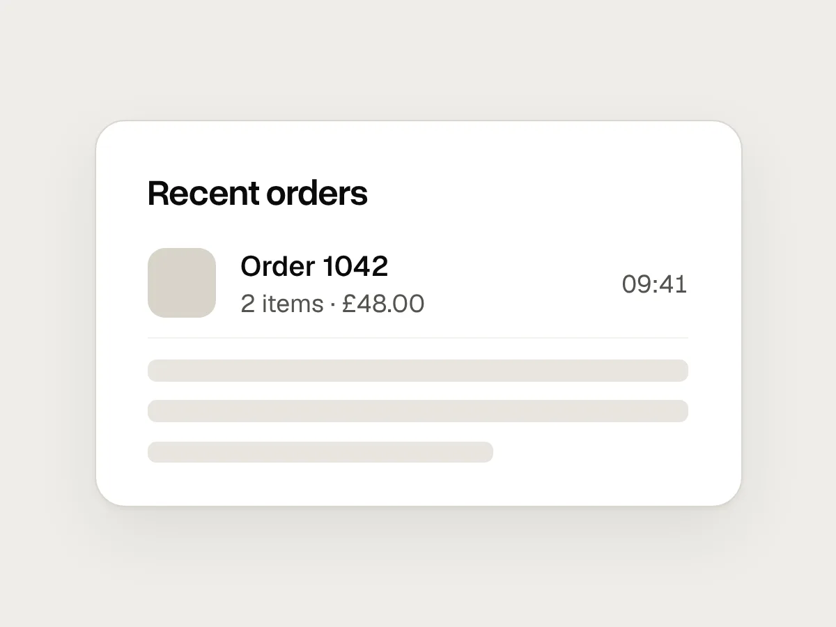
Skeleton blocks that don’t match the real layout.
Do
Draw skeletons from the real components, at the real sizes, so nothing moves when data arrives.
Don’t
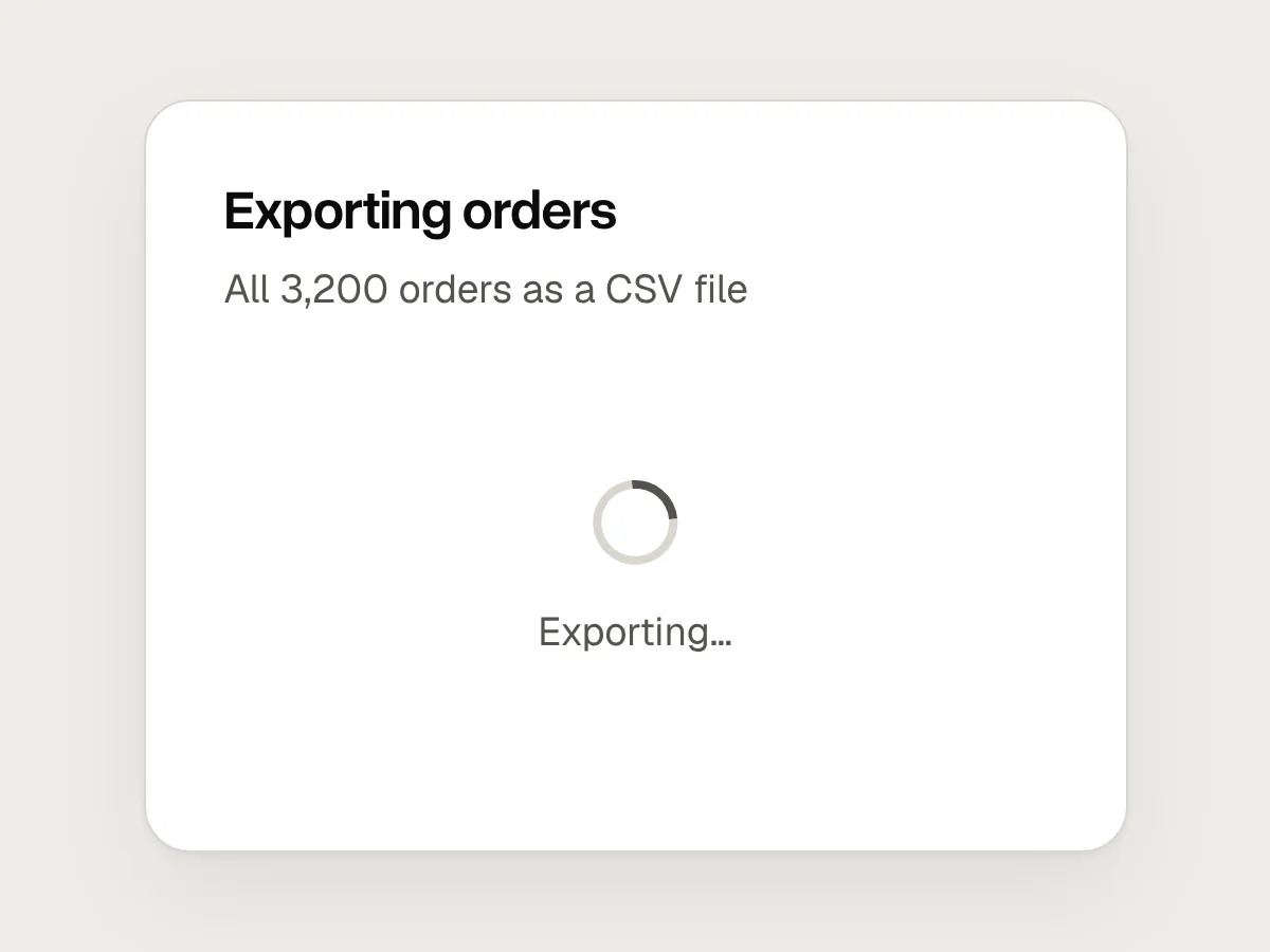
A spinner for a five-minute export.
Do
A progress bar that says what is happening, with a way to cancel or leave it running.
Don’t
A progress bar that races to 90 percent and then stalls.
Do
Report progress as evenly and honestly as you can.
Don’t
A shimmer that keeps moving for people who asked for less motion.
Do
A still skeleton under prefers-reduced-motion.
Questions people ask
Are skeleton screens better than spinners?
For a page or section with a known layout, usually yes: they show the shape of what is coming and avoid layout jumps. For a small action in one place, such as saving a form, a spinner on the button is simpler and clearer.
Should a skeleton screen shimmer?
A gentle pulse or shimmer shows that the page is still working, which helps on slow connections. Keep it subtle, and turn it off for people who have asked their system for reduced motion.
How do I show progress when I don’t know how long something will take?
Use an indeterminate indicator and say what is happening, step by step if you can: “Checking your details”, then “Creating your account”. If you learn the length part-way through, switch to a determinate bar.
Resources
- Response times: the 3 important limits · Nielsen Norman Group
The source of the 0.1, 1 and 10 second limits.
- Skeleton screens 101 · Nielsen Norman Group
When skeletons help, and how they compare with spinners.
- Progress indicators · Apple Human Interface Guidelines
Determinate and indeterminate indicators, and how to describe progress.
- Cumulative Layout Shift (CLS) · web.dev
How layout movement is measured, and what counts as a good score.
- prefers-reduced-motion · MDN
The media query for turning down motion.
If this was useful, share it with someone it would help.