Best practice
Liquid Glass: designing translucent UI that stays readable
How to design with Liquid Glass and keep it readable: test over the worst photo, dim the glass, tint sparingly and design the Reduce Transparency state.
· 11 min read · Musab Alfawal
On this page
Liquid Glass is the translucent material Apple introduced at WWDC on 9 June 2025 and shipped across its platforms, including iOS 26, iPadOS 26 and macOS Tahoe 26. Tab bars, toolbars, sidebars, sheets and many controls are now made of it. It blurs and bends the content behind it, catches light at its edges and changes its shading as that content moves.
Over a calm photo it looks lovely. Over a bright or busy one it can be hard to read, because the background of every label changes as people scroll. Readability was the loudest complaint about it in its first year. Apple made the glass less transparent during the beta, added a choice between Clear and Tinted in iOS 26.1 in November 2025, and in iOS 27, released in September 2026, replaced that choice with a slider and gave the glass darker edges. Glass is staying. The design work is keeping it readable.
This guide is for anyone drawing translucent UI, on Apple’s platforms or anywhere else: a frosted header on a website, a floating player in an Android app. It covers where glass belongs, how to test it, how to keep text and icons above the WCAG contrast minimums, and how to design the states people switch on when glass is hard for them to read.
Glass is for controls, not content
Use Liquid Glass for the layer that floats above your content: tab bars, toolbars, sidebars, floating buttons and sheets. Keep the content itself solid: photos, text, lists and cards.
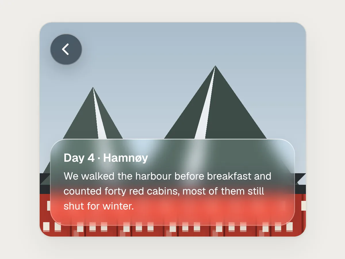
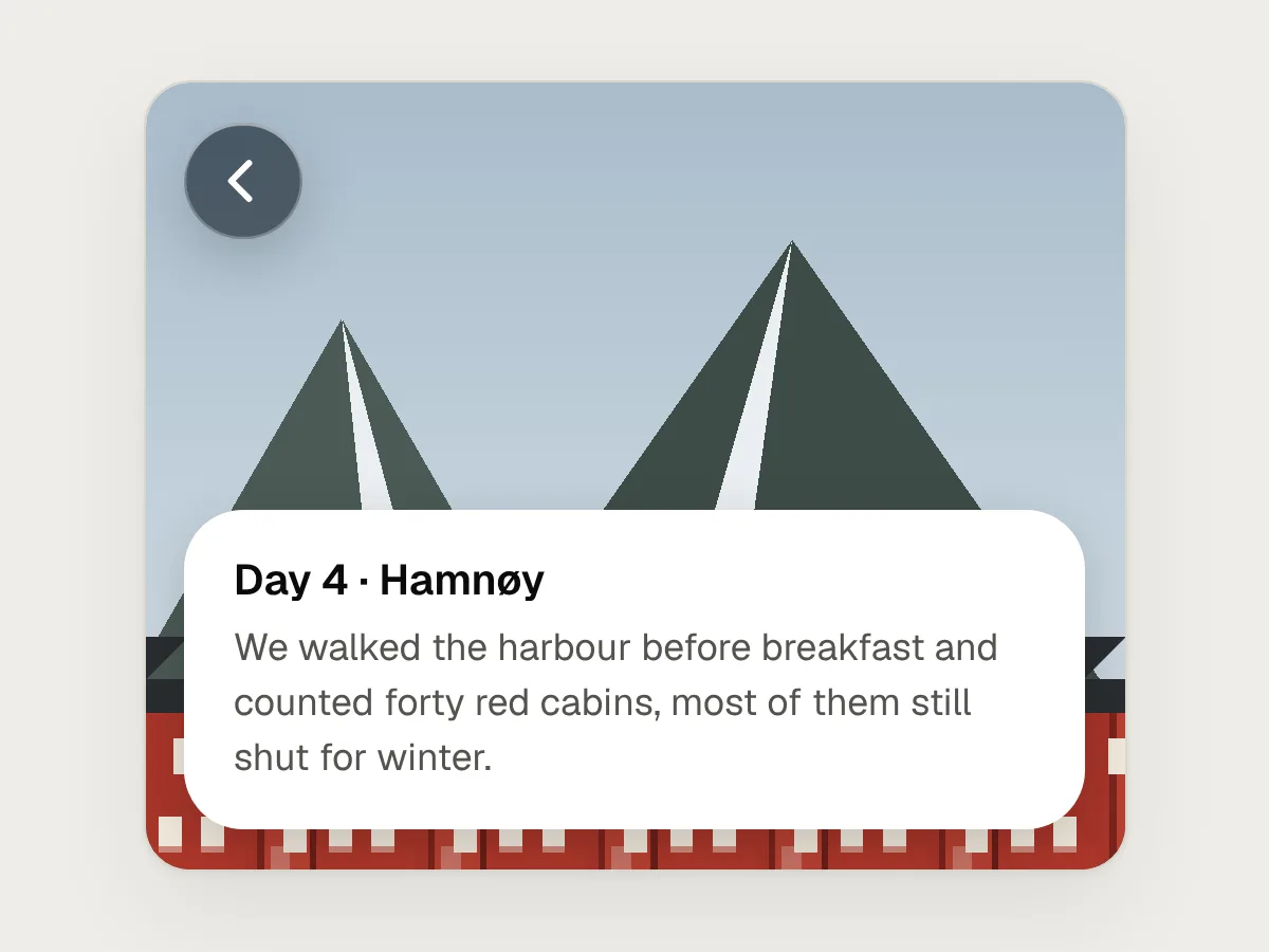
Apple’s Human Interface Guidelines describe Liquid Glass as a separate layer for controls and navigation, and say not to use it in the content layer. The material only reads as being above something if that something is solid. When a card of text is glass too, people can’t tell what scrolls from what they can tap, and the text sits on whatever happens to be behind it.
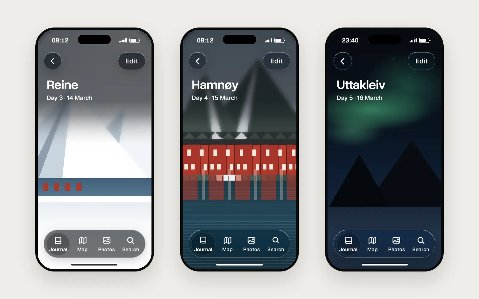
Take a travel journal. The photo of the harbour at Hamnøy, and the paragraph you wrote about it, are content. They scroll. The Back button, the Edit button and the tab bar with Journal, Map, Photos and Search are controls. They float, and they are the only things made of glass. If you want a softer look for part of the content, Apple points you to its standard materials, the older blurs, rather than Liquid Glass.
Test it over the worst thing that can scroll underneath
Glass has no fixed background, so you can’t judge it over one good photo. Test every glass control over three: a white or very bright image, a busy pattern and a dark image. Then scroll.
A label colour picked over a dark harbour can vanish over a snowfield. Nielsen Norman Group’s review of iOS 26 found this in Apple’s own apps: translucent controls that were hard to see over busy backgrounds, and text sitting on text, such as the search field in Mail over the messages beneath it.
Make a test board in your design file with the tab bar over a snowy peak, a row of red cabins with white windows, and the northern lights at night. Check light and dark mode. Then scroll a long feed in the prototype, so you also see the moments between photos, when a white caption or a bright edge slides under the bar.
Here is the travel journal’s tab bar as three photos scroll beneath it. The glass dims more over the snow and less over the night sky, and the labels stay above the minimum the whole way.
Contrast rules still apply on glass
WCAG makes no exception for translucent controls. Text on glass needs 4.5 : 1 against what is behind it, or 3 : 1 if it is large (SC 1.4.3). Icons, and the edges people need in order to find a control, need 3 : 1 (SC 1.4.11).
The hard part is that the background changes. Measure against the worst point that can sit behind a label, not the average: for white text, the brightest part of the brightest image, after the blur. The W3C’s failure technique F83 covers this case for text over background images, and suggests a quick check against the lightest area when the text is light.
The numbers move a lot. In the pictures in this guide, white labels on clear glass over a white sky measure about 1 : 1. Dim the same glass by 60% and the labels measure 4.9 : 1 over pure white. You can’t promise a ratio over any photo unless something limits how bright the backdrop can get. The next section is about that something.
Give the glass a floor
When labels fail, limit how bright the backdrop can get, rather than hoping the photo cooperates. There are a few tools, and most screens need more than one.
Start with the right variant. Apple’s regular glass is the default and adapts to what is behind it. The clear variant is more transparent and doesn’t adapt, and Apple says it needs a dimming layer. It suggests using clear only over media-rich content, where dimming won’t spoil the content, and where the symbols and labels on top are bold and bright. For a small control, Apple suggests dimming just the area around it, so the rest of the photo keeps its colour.
Where content scrolls under a bar, use a scroll edge effect: a soft blur and fade that separates the bar from what passes beneath it. Apple’s bars use one. If you draw a custom bar over photos, draw one too, and make it dark enough at the point where your labels sit.
Finally, use weight. Semibold or bold labels hold up on glass better than regular ones, because thin strokes break up against the blur behind them. Make icons a size up from what you would use on a solid bar.
Here is the same screen over a bright sky, before and after. The first was designed over a dark photo. The second has a floor under every label.
Before
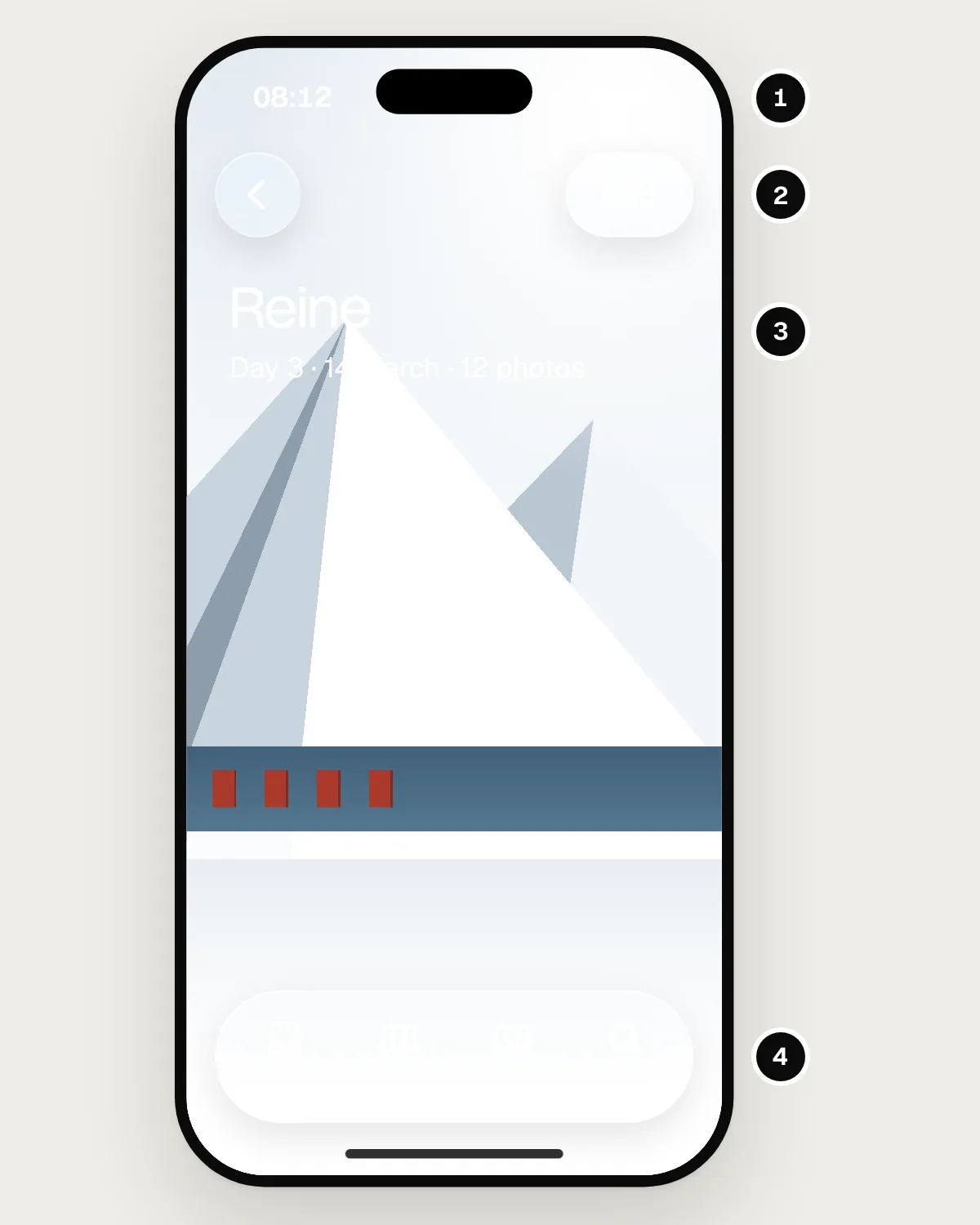
- The time and battery are white on a white sky.
- Edit is a white label on clear glass, and it disappears.
- The title and date are thin white text over a white sky.
- The tab bar labels vanish into the snowfield.
After
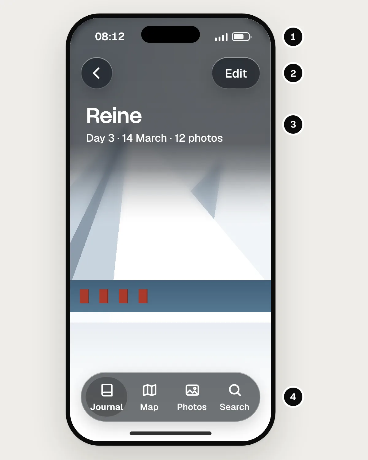
- A soft scroll edge effect darkens the top of the photo, so the status bar can be read.
- Back and Edit sit on dimmed glass with a visible edge.
- The title is semibold and sits on the same edge effect.
- The tab bar’s glass is dimmed, and its labels pass 4.5 : 1 over white snow.
Design the fallback states, not just the glass
Reduce Transparency, Increase Contrast and the Liquid Glass setting are choices people make because glass is hard for them to read. Draw and test each one as a real state of every glass component.
Apple says Reduce Transparency makes Liquid Glass frostier and hides more of the content behind it, and Increase Contrast makes controls mostly black or white with a contrasting border. Since iOS 26.1, people can also choose Tinted instead of Clear, under Display & Brightness, for more opacity and contrast. iOS 27 turned that choice into a slider, under Appearance, that runs from clear to fully tinted. Reduce Transparency still goes further than the slider’s most tinted end.
Apple’s own components respond to these settings for you. Custom glass doesn’t, unless you read the settings and change it. On the web, the prefers-contrast and prefers-reduced-transparency media queries do this job, though support for the second is patchier, so check it before you rely on it.
In the travel journal, the opaque tab bar is a solid charcoal capsule with white labels and a darker well on the selected tab. It is not the glass bar with the blur switched off, which leaves pale labels on a mid grey that nobody chose.
Tint the primary action, and only that
Colour on glass should mark the one thing you most want people to do. Leave every other control neutral.
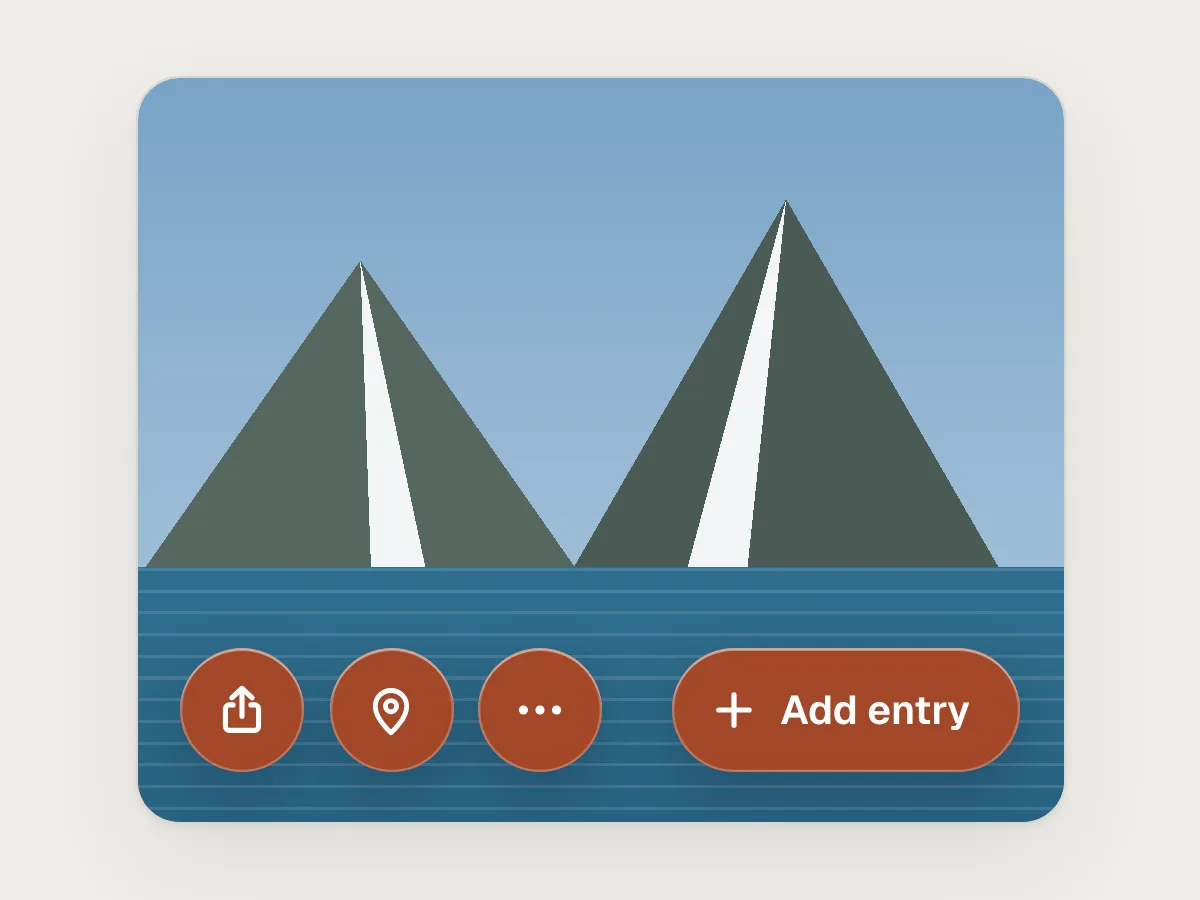
This is Apple’s own advice: use tint sparingly, for primary actions. Tint is a signal. If Share, Location and More are as orange as Add entry, nothing stands out. And every tinted control needs its own contrast check, against a colour that now shifts with the photo behind it.
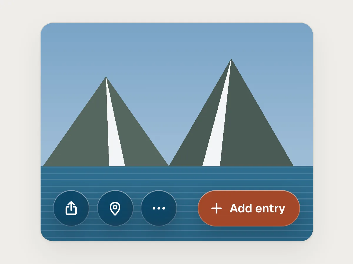
On the journal’s entry screen, Add entry is the only tinted control. Its glass is the app’s rust colour, nearly opaque, so the white label on it holds about 6 : 1. Share, Location and More are neutral glass. If the app needs more colour, let the content carry it. A photo of red cabins already has plenty.
Don’t stack glass on glass, and keep long text off it
Use one layer of glass at a time. Inside a glass bar, use plain symbols and labels, not more glass. Keep paragraphs on solid surfaces.
Apple’s Meet Liquid Glass session advises against glass on glass. Each layer blurs and tints what is already blurred and tinted, so edges double up and the contrast you measured for one layer no longer holds. Long text is worse still. A sentence takes several seconds to read, and the background behind every word is different.
The journal’s photo toolbar is one glass capsule holding four symbols. The entry you wrote about Hamnøy sits on a white sheet, not a glass card, so it reads the same over any photo.
Keep the motion calm, and honour Reduce Motion
Glass moves. It bends light at its edges, stretches when pressed and changes shape as controls appear and disappear. Use that motion to show what changed, not as decoration, and turn it down when people ask.
Apple says Reduce Motion lowers the intensity of some of these effects and turns off the material’s elastic behaviour. Nielsen Norman Group’s review criticised controls that animate when the person gains nothing from it, and toolbars that appear, collapse and disappear so often that people can’t predict where things are.
If the journal’s tab bar shrinks as you scroll, keep it in the same place and keep its labels. With Reduce Motion on, swap the change of shape for a short cross-fade and drop any wobble on press. On the web, put custom glass animation behind the prefers-reduced-motion media query.
Mistakes, and what to do instead
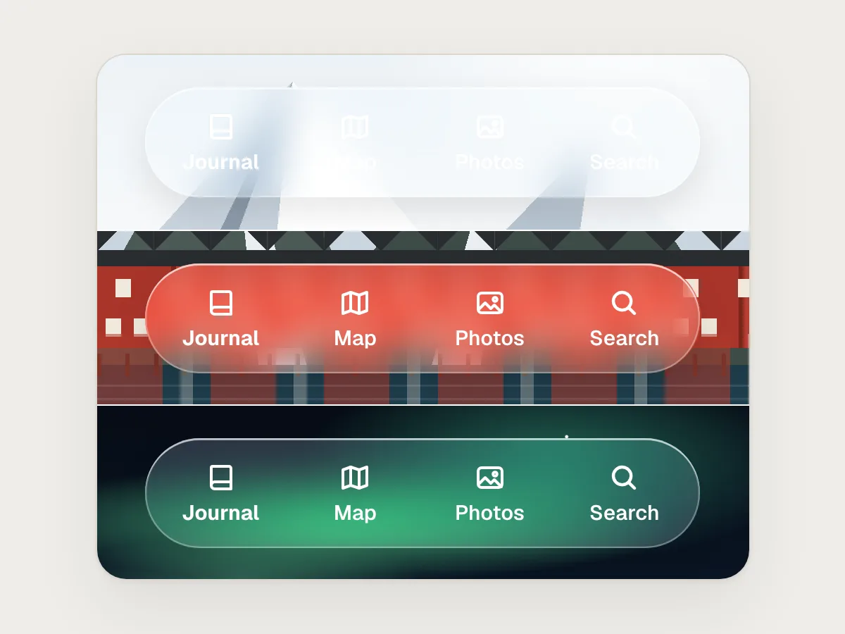
Don’t
Checking the tab bar over one friendly photo.
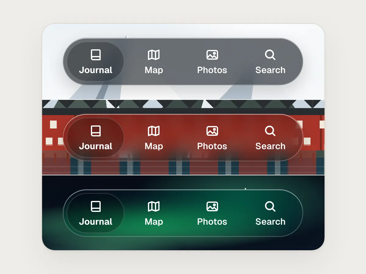
Do
Test it over a white photo, a busy one and a dark one, and fix the worst.
Don’t
Writing a journal entry on a glass card.
Do
Put content on a solid surface, and keep glass for the controls.
Don’t
Tinting every glass button in the brand colour.
Do
Tint the primary action only, and leave the rest neutral.
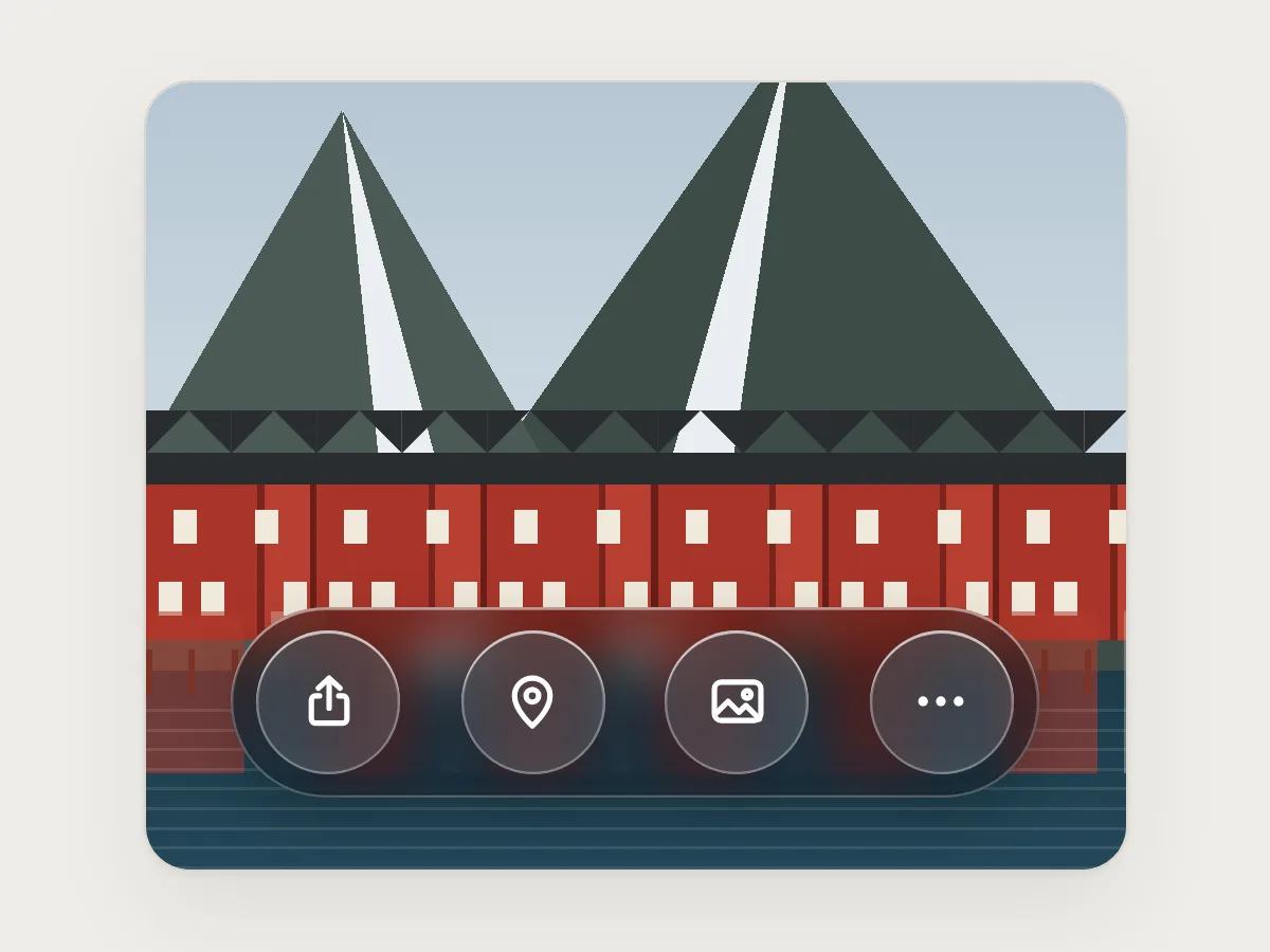
Don’t
Glass buttons inside a glass bar.
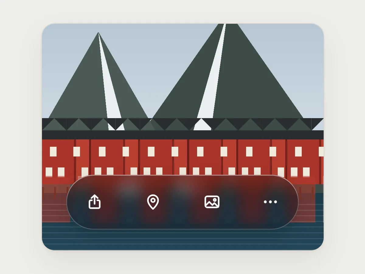
Do
Use one layer of glass, with plain symbols inside it.
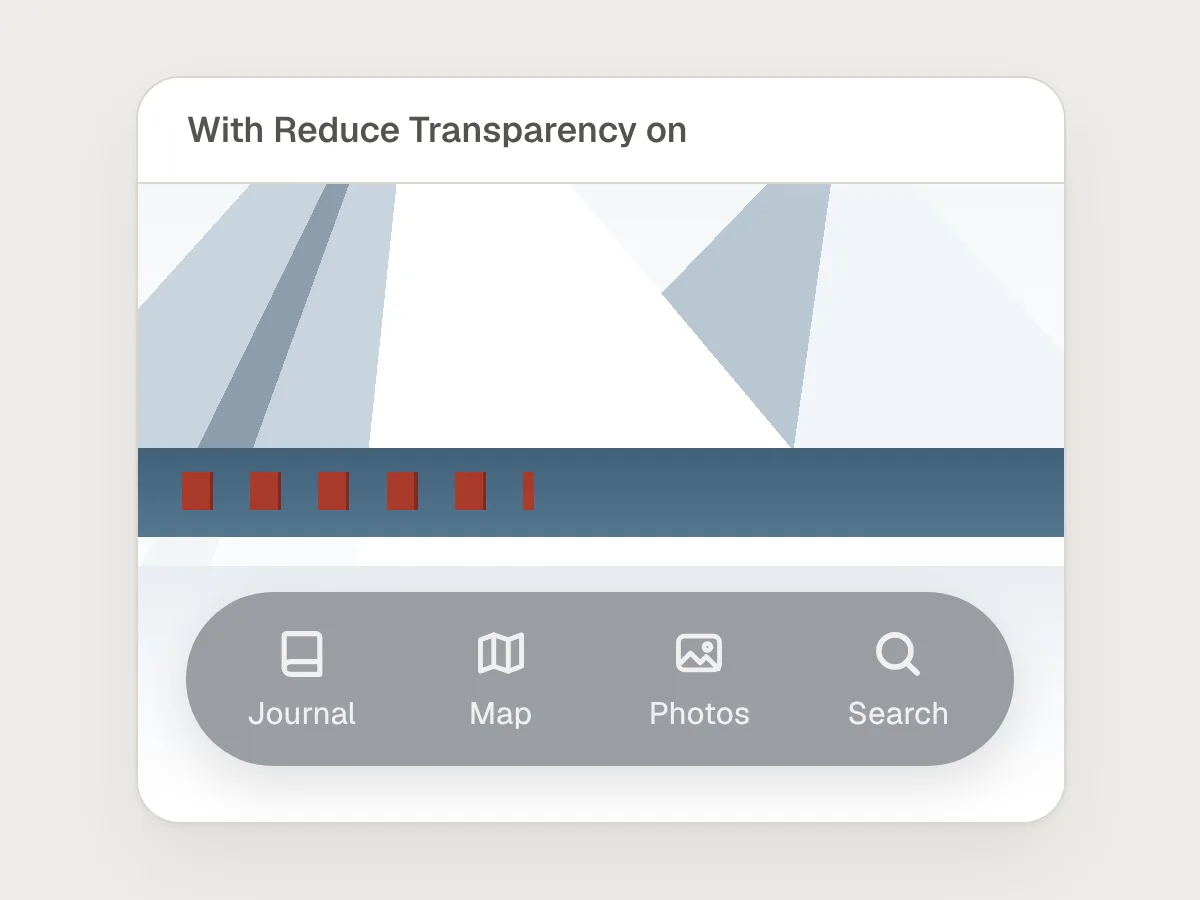
Don’t
Leaving the Reduce Transparency version undesigned.
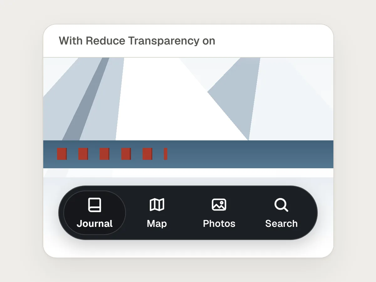
Do
Design the opaque state on purpose: a solid surface and full-contrast labels.
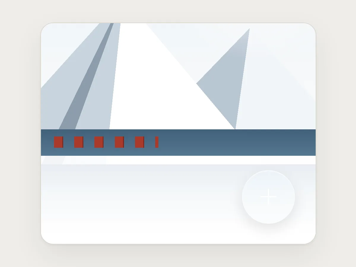
Don’t
A floating button whose symbol fades into a bright photo.
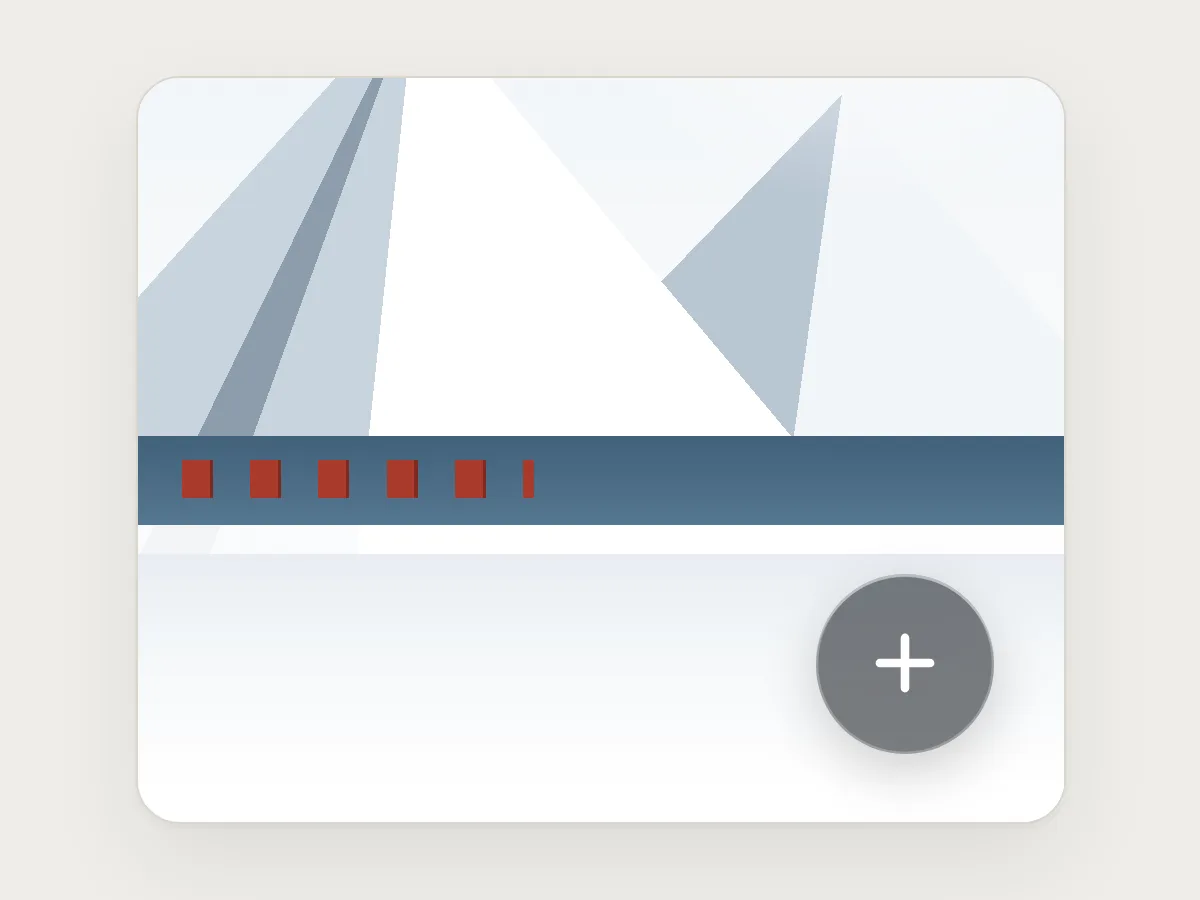
Do
Dim the glass until the symbol and the button’s edge reach 3 : 1 over the brightest photo.
Before you ship: a checklist
Questions people ask
What is Liquid Glass?
The translucent material Apple introduced in June 2025 for iOS 26, iPadOS 26, macOS Tahoe 26 and its other platforms. It is used for controls and navigation, such as tab bars, toolbars and sidebars, which float above the content and blur, bend and reflect what is behind them.
Can people turn Liquid Glass off?
Not completely. Since iOS 26.1 they can choose a more opaque Tinted look, and iOS 27 turned that into a slider from clear to fully tinted. Reduce Transparency, in the accessibility settings, goes furthest and makes the glass frostier and far less see-through. Your interface has to read well in every one of these.
Does WCAG apply to translucent UI?
Yes. Text needs 4.5 : 1 against what is behind it, or 3 : 1 if it is large, and icons and control edges need 3 : 1. On glass, measure against the worst background the control can sit over, not the one in your mock-up.
Can I opt my app out of Liquid Glass?
Not for long. iOS 26 honoured a compatibility setting that kept the older look, but according to Apple’s developer forums it is ignored once an app is built with the iOS 27 SDK. Plan to design for glass rather than around it.
How do I keep text readable over a photo?
Limit how bright the backdrop can get behind the text: a dimming layer, a soft dark edge where the text sits, or a solid surface for anything longer than a label. Then check the ratio against the brightest part of the brightest photo the text can sit on.
Resources
- Materials · Apple Human Interface Guidelines
Where Liquid Glass belongs, and which materials to use in the content layer instead.
- Meet Liquid Glass · Apple, WWDC25
The regular and clear variants, dimming, tint, and how the accessibility settings change the glass.
- Liquid Glass Is Cracked, and Usability Suffers in iOS 26 · Nielsen Norman Group
A critical review of where translucent controls hurt legibility in Apple’s own apps.
- Glassmorphism: Definition and Best Practices · Nielsen Norman Group
Blur, background and contrast advice for any frosted-glass interface.
- F83: Failure due to background images with insufficient contrast · W3C
How to test text over a background that changes, and what counts as a failure.
- iOS 27: Tone Down Liquid Glass Transparency · MacRumors
Where the 2026 Liquid Glass slider lives, and how it relates to Reduce Transparency.
If this was useful, share it with someone it would help.