How-to
How to run a heuristic evaluation
How to run a heuristic evaluation: set a scope, review alone against Nielsen’s ten heuristics, write findings people can act on, then merge them.
· 7 min read · Musab Alfawal
On this page
A heuristic evaluation is a structured review of an interface against a short list of usability principles. A few people go through the same screens on their own, note every place where the design breaks a principle, and then combine their notes. You can run a heuristic evaluation in a couple of days without recruiting anyone, which makes it one of the cheapest ways to catch problems before they reach users.
Most teams use Jakob Nielsen’s ten usability heuristics. The list is short and general, and it covers a large share of what goes wrong in real products. The harder part is writing down what you find so that someone can fix it. A note that says “UI is confusing” gets nodded at and forgotten.
What is a heuristic evaluation?
A heuristic is a rule of thumb. Nielsen’s ten describe what usable interfaces tend to have in common: they show what is going on, speak the user’s language, let people undo mistakes, behave consistently, and so on. They are broad on purpose, so they apply to a checkout, a settings page or a booking app alike.
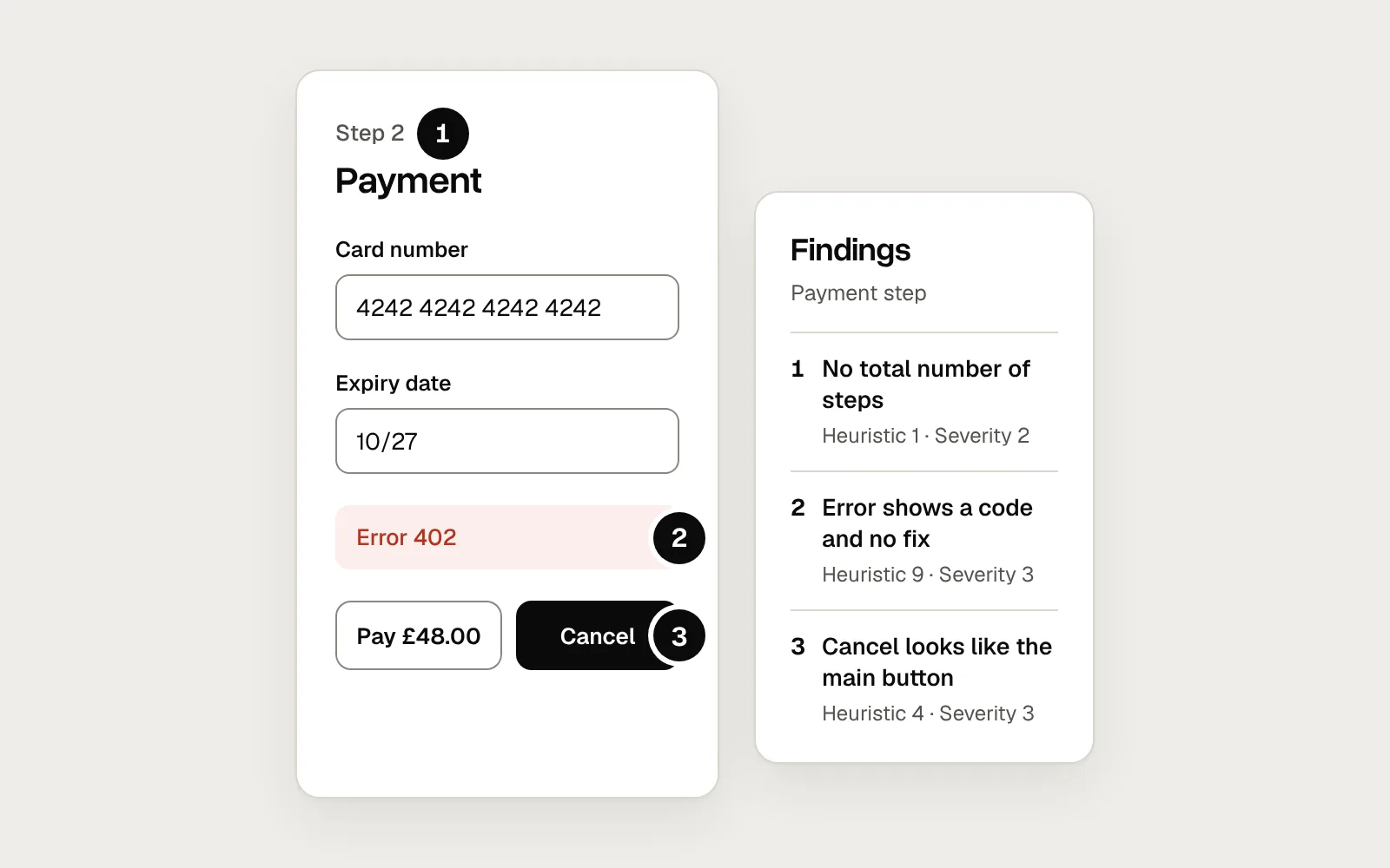
During an evaluation, each evaluator works through a set of realistic tasks and asks, at every step, whether the screen breaks one of the ten. Each problem becomes a finding, tied to the place where it happens and to the heuristic it breaks.
Each finding gets a pin on the screen and a line in the list.
Nielsen’s 10 usability heuristics
Keep the list open while you evaluate. The question after each name is a short prompt to use on every screen. Nielsen Norman Group’s article explains each heuristic in full, with examples.
Write findings someone can act on
The output of an evaluation is a list of findings, and the way each one is written decides whether anything changes. Here is a typical first set of notes from a checkout review, then the same review written up as findings.
Before
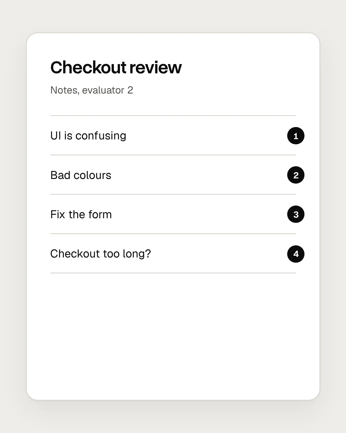
- “UI is confusing” doesn’t say where, or which heuristic. Nobody knows where to start.
- “Bad colours” is a matter of taste until it says which colours and what goes wrong.
- “Fix the form” jumps to a solution and skips the problem.
- A hunch with no severity. Is it a footnote or a reason to delay the release?
After
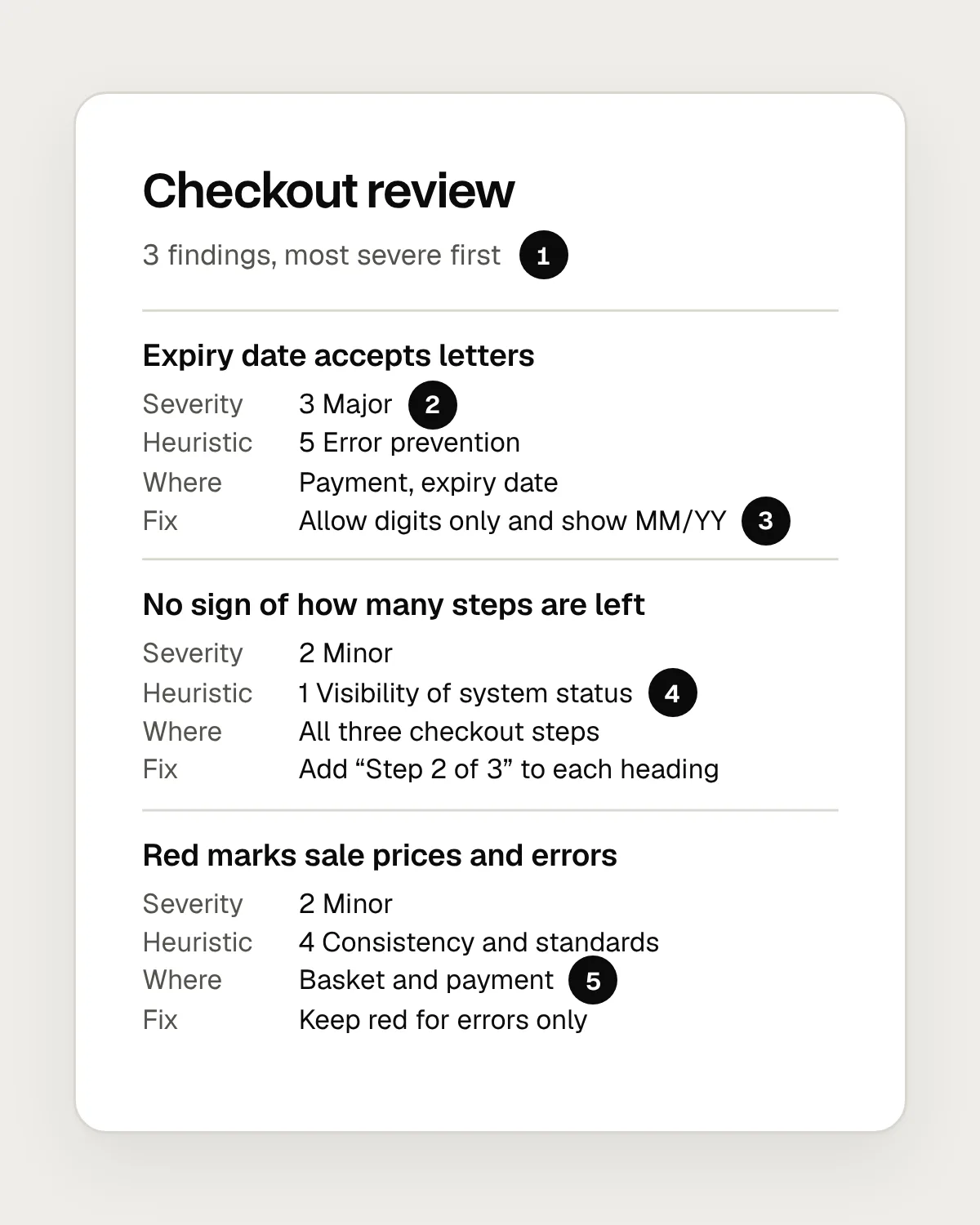
- Sorted by severity, so the worst problem is read first.
- A severity from Nielsen’s 0 to 4 scale, agreed after merging.
- A recommendation written as something to do.
- Each finding names the heuristic it breaks.
- Where it happens, precise enough to find again.
A useful finding has the same parts every time. A short title that states the problem. The heuristic it breaks. Where it happens: the screen, the step and the element. The evidence, meaning what you did and what you saw, ideally with a screenshot. A severity rating. And a recommendation, written as something a designer or developer could start on tomorrow.
Writing all of that takes a minute longer per finding. It saves far more time later, because nobody has to come back and ask what you meant.
How to run a heuristic evaluation
1. Set the scope and the tasks
Decide what you are reviewing and for whom: one flow, one device, one type of user. Then write three to six tasks that cover what people come to do, such as “Buy a gift and send it to a different address.” A narrow scope gives you deeper findings.
2. Brief the evaluators
Pick three to five people who know the heuristics. Give everyone the same tasks, the same build and the same template for findings, so the lists are easy to merge later.
3. Evaluate on your own, twice
Go through the tasks once to learn how the product works. Then go through them again, slowly, checking each screen against the ten heuristics. Don’t compare notes yet. Independent lists are the point.
4. Record each finding as you go
Write down the heuristic, the location, what you saw and a recommendation, and take a screenshot. Keep to one problem per finding. If the same problem appears on five screens, it is one finding with five locations.
5. Merge the lists
Put every evaluator’s findings in one place and combine the duplicates. Talk through the ones you disagree about. Some will turn out to be deliberate trade-offs, and some will need testing with users before anyone can say.
6. Rate severity and prioritise
Each evaluator rates every merged finding on their own, and you take the average. Sort by severity, then turn the top of the list into work: tickets, design changes or questions for your next usability test.
How to rate severity
Nielsen’s severity scale runs from 0 to 4. A 0 means you don’t think it is a usability problem at all. A 1 is cosmetic, worth fixing only if there is time. A 2 is a minor problem with a low priority. A 3 is a major problem that should be fixed soon. A 4 is a usability catastrophe that has to be fixed before release.
To choose a number, weigh three things: how often the problem happens, how hard it is to get past when it does, and whether it keeps getting in the way after people have learned about it. A rare problem that blocks a payment can deserve a higher rating than a common one that costs a second.
Rate after the evaluation, once the lists are merged, so every evaluator sees every finding. One person’s ratings are unreliable on their own. Averaging several evens out the outliers.
How many evaluators do you need?
One evaluator misses a lot. Different people notice different problems, so each extra evaluator adds findings the others missed, with fewer new ones each time. Three to five evaluators is the usual advice. Beyond that, most of what another person finds is already on the list.
Independence matters as much as the number. If evaluators review together in a room, the loudest opinion steers what everyone looks for. Working alone first and merging afterwards gives you the widest list.
What a heuristic evaluation can’t tell you
A heuristic evaluation is an expert review. It predicts where people are likely to struggle, based on principles, and evaluators aren’t your users. They know the jargon, and they can’t forget what they already know about the design. Some findings will turn out to be harmless, and some real problems will be invisible to anyone who already knows how the product works.
A broken heuristic isn’t automatically a bug, either. A navigation menu hidden behind a button makes people recall where things are, but on a small screen it may still be the right trade-off. Record it, rate it, and let the team decide.
So treat the evaluation as a first pass that complements testing with users and doesn’t replace it. Use it to clear the obvious problems before a usability test, so the sessions can spend their time on what only real users can show you. Then use what you learn in testing to check which findings mattered.
Questions people ask
What’s the difference between a heuristic evaluation and a usability test?
In a heuristic evaluation, people who know usability principles review the design. In a usability test, you watch real users try to complete tasks. The evaluation is faster and needs no recruiting. The test shows what actually happens. They work best together, with the evaluation first.
Can one person do a heuristic evaluation?
Yes, and it is better than none, but expect to miss a lot. If you are on your own, leave a gap between your two passes, and ask a colleague to check your top findings before you share them.
When should you run a heuristic evaluation?
Whenever there is something to click through, from a rough prototype to a live product. Early on, it catches problems while they are cheap to fix. Just before a usability test, it clears away the obvious issues so the sessions can go further.
Resources
- 10 usability heuristics for user interface design · Nielsen Norman Group
The ten heuristics, each explained with examples.
- How to conduct a heuristic evaluation · Nielsen Norman Group
A step-by-step guide to planning, running and merging an evaluation.
- Severity ratings for usability problems · Nielsen Norman Group
The 0 to 4 scale, and what to weigh when you rate.
- Usability (user) testing 101 · Nielsen Norman Group
The method to pair with an evaluation.
If this was useful, share it with someone it would help.