Best practice
Error messages that tell people what to do next
A good error message says what happened and what to do next, in plain words, next to the problem. How to write one, where to put it and when to show it.
· 6 min read · Musab Alfawal
On this page
An error message turns up at an awkward moment. Someone was trying to get something done, it didn’t work, and the next sentence they read decides whether they fix it in seconds or give up.
Most bad error messages fail in a few familiar ways. They describe the system instead of the problem, they appear far from the thing that needs fixing, they arrive too early, or they throw away work. Each of these is a decision about words, placement or timing, so each one is yours to fix.
When to show an error message
The same date of birth, typed into two forms. On the left, the field turns red before the person has finished typing.
A half-typed date isn’t wrong yet. Checking on every keystroke tells people they have failed at something they haven’t finished, and it pulls their attention away from the field they are working in.
A calmer default is to check each field when the person leaves it, and check the whole form again when they submit it. Once a field is showing an error, re-check it as they type, so the message goes away the moment the problem is fixed. You stay quiet while people work, and you confirm quickly when they have put something right.
Some checks can only happen on submit, such as whether a username is taken or a card has been declined. Those messages still belong next to the field or step they are about, not only in a banner at the top of the page.
The same upload, fixed
Here is an upload dialog after the connection drops, then the same dialog rewritten. Both use the same layout. The second says what happened, keeps the file and offers a way forward.
Before
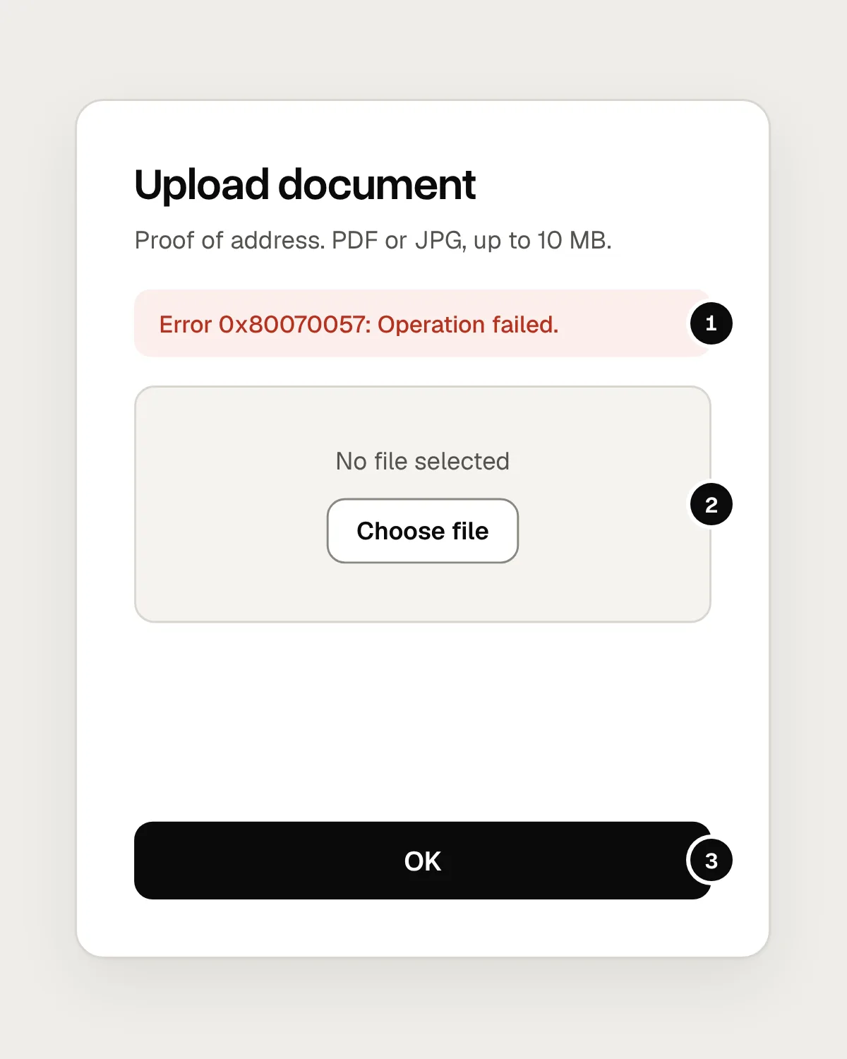
- A code and a phrase that describe the system. Nobody can act on “0x80070057”.
- The file has gone, so the person has to find it again before they can retry.
- One button, and all it does is close the dialog.
After
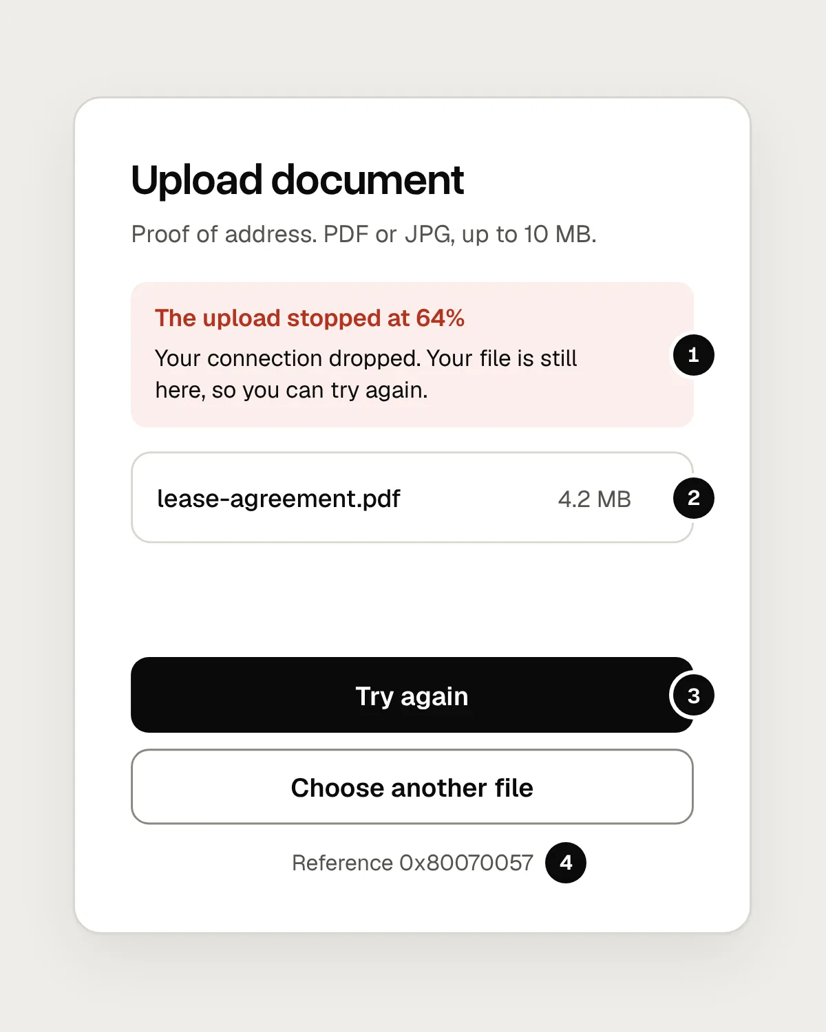
- What happened and why, in plain words, and a reassurance that the file is safe.
- The file the person chose is still selected.
- The likely next step is the main button, with a second route under it.
- The code is still there, as small print for anyone who contacts support.
How to write an error message
A useful error message answers three questions, in this order: what happened, why it happened if knowing that helps, and what to do now. “The upload stopped because your connection dropped. Try again.” covers all three in two short sentences.
Write in the words your users would use. “Session token expired” means something to a developer. “You were signed out after 30 minutes without activity. Sign in again to carry on.” means something to everyone. Leave out codes, exception names and status numbers. If your support team needs a reference, show it after the message in smaller text, where it helps the person who gets in touch and stays out of everyone else’s way.
Describe the problem, never the person. “You entered an invalid email” reads as an accusation. “Enter an email address like name@example.com” asks for the same thing and tells people how to give it. Leave out “Oops”, exclamation marks and jokes too. Someone who has just lost a form is not in the mood for them.
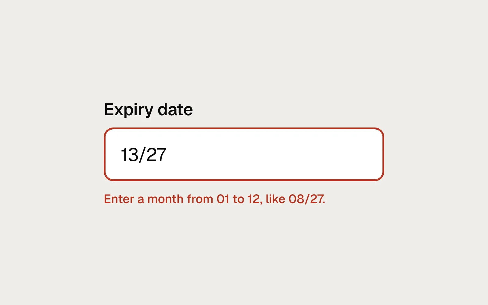
Be specific. “Invalid date” is true and no help. “Enter a date in the past” or “Enter the year in full, like 1992” is a fix someone can make without guessing. When you know what a correct answer looks like, say so.
Put the message where the problem is
An error belongs next to the thing that needs fixing: under the field, beside the file, inside the payment step that failed. People look where they were working, and a message at the top of a long page is easy to miss.
On a long form, a short summary at the top helps as well, as long as each item links to its field and the message is repeated on the field itself. The GOV.UK error summary is a well-tested version of this pattern.
Keep everything the person has entered. Clearing a form because one field failed turns a small correction into starting again. The same goes for uploads, baskets and drafts: keep the file, the items and the text, and let people fix the one thing that went wrong.
What WCAG asks for
Two success criteria cover most of this. SC 3.3.1 Error Identification (Level A) says that when an input error is detected automatically, the item in error is identified and the error is described to the user in text. SC 3.3.3 Error Suggestion (Level AA) adds that when suggestions for correcting the error are known, you provide them, unless that would put the security or purpose of the content at risk.
The words “in text” matter. A red border on its own fails 3.3.1, and it also fails SC 1.4.1 Use of Color, which says colour can’t be the only visual means of conveying information.
Mistakes, and what to do instead
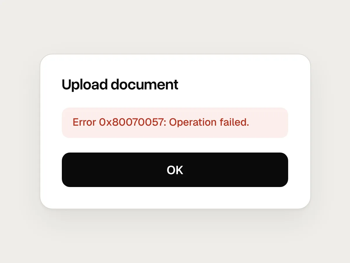
Don’t
“Error 0x80070057: Operation failed.”
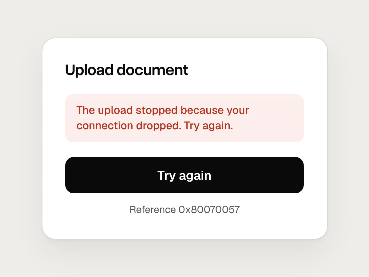
Do
Say what happened and what to do: “The upload stopped because your connection dropped. Try again.” Keep the code as small print.
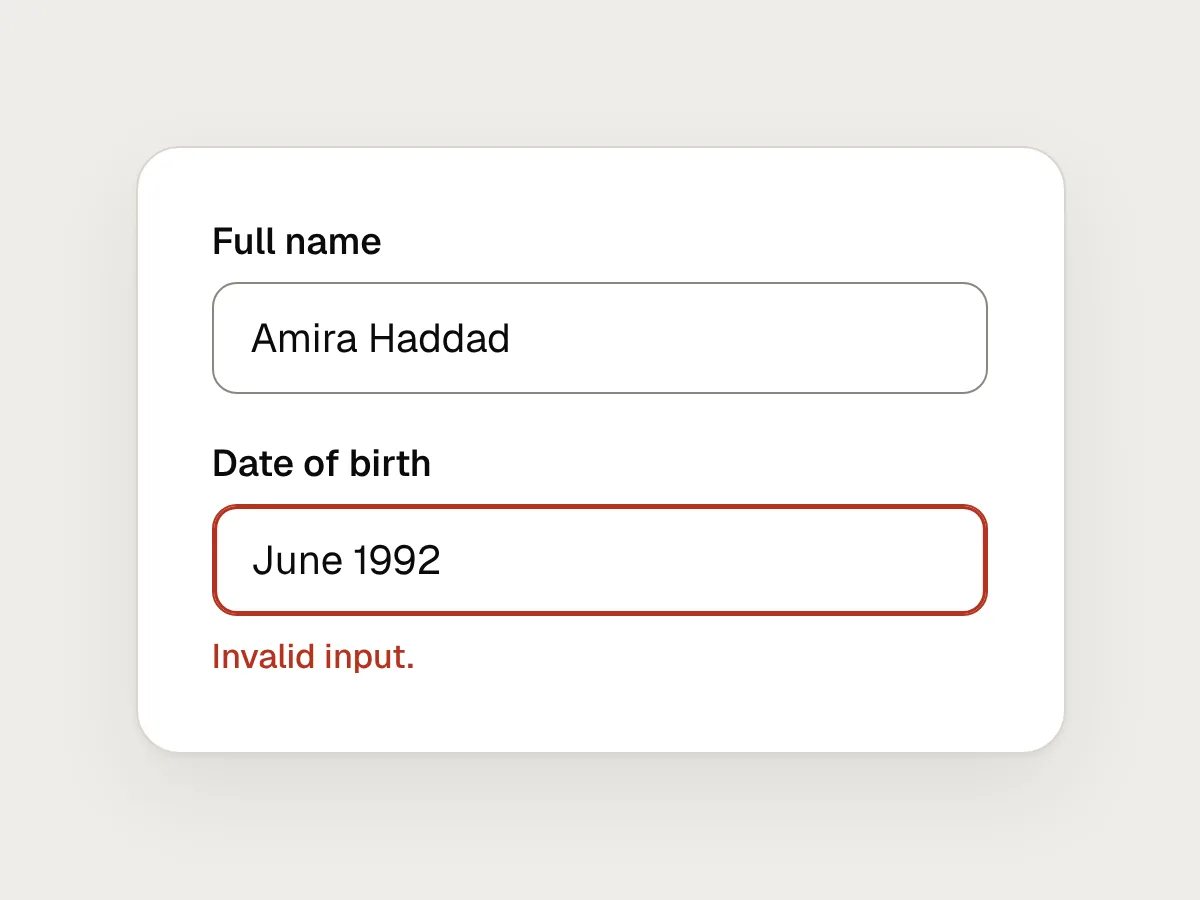
Don’t
“Invalid input.”
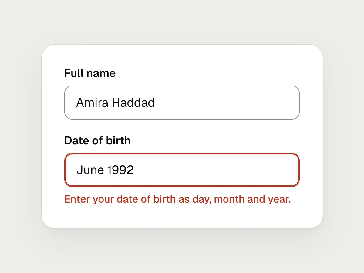
Do
Name the field and the fix: “Enter your date of birth as day, month and year.”
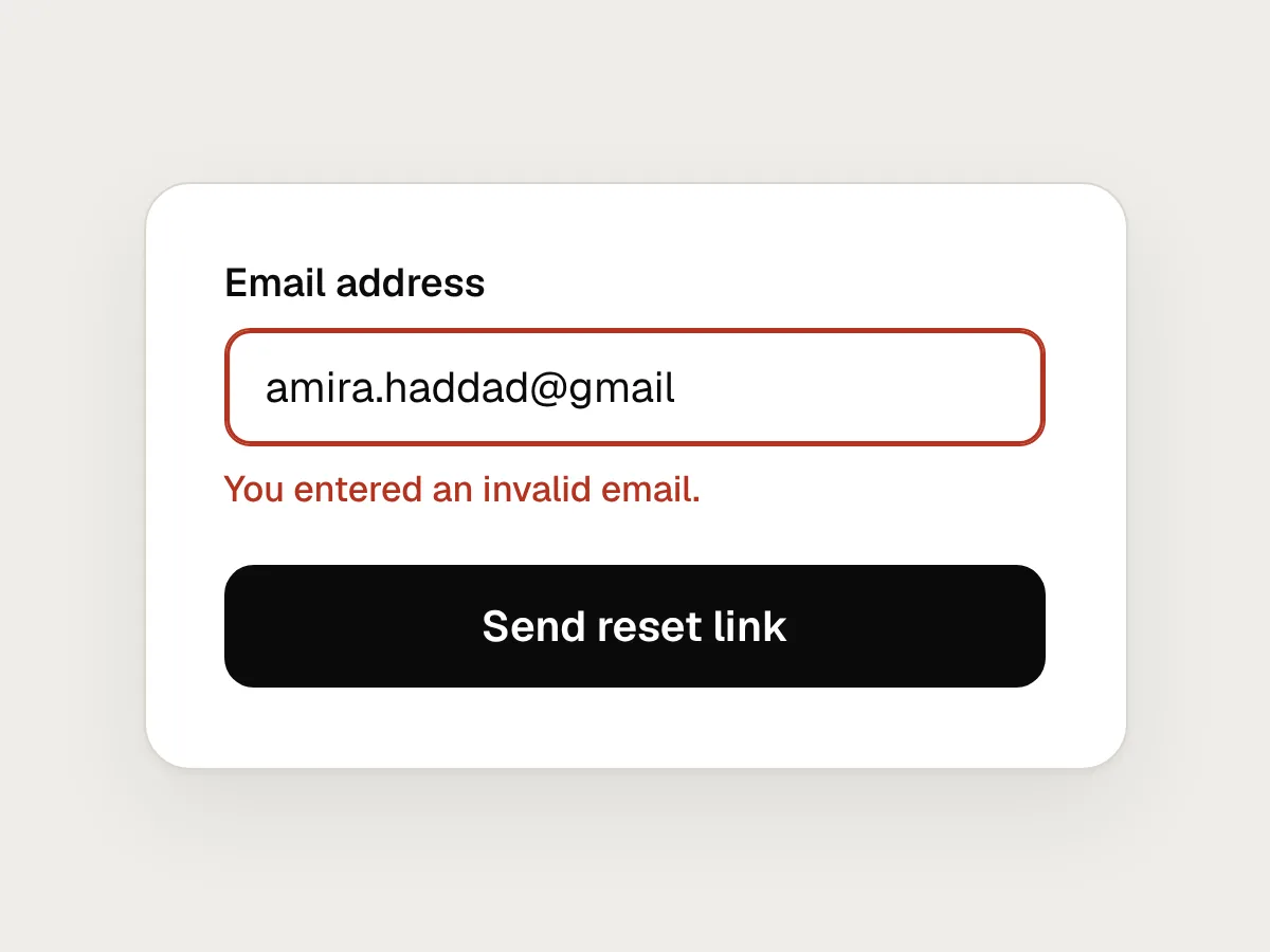
Don’t
“You entered an invalid email.”
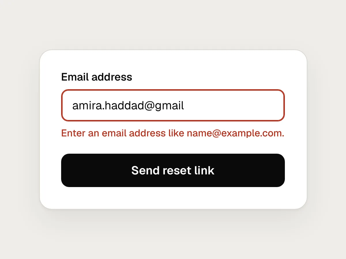
Do
Describe what is needed, not what the person did: “Enter an email address like name@example.com.”
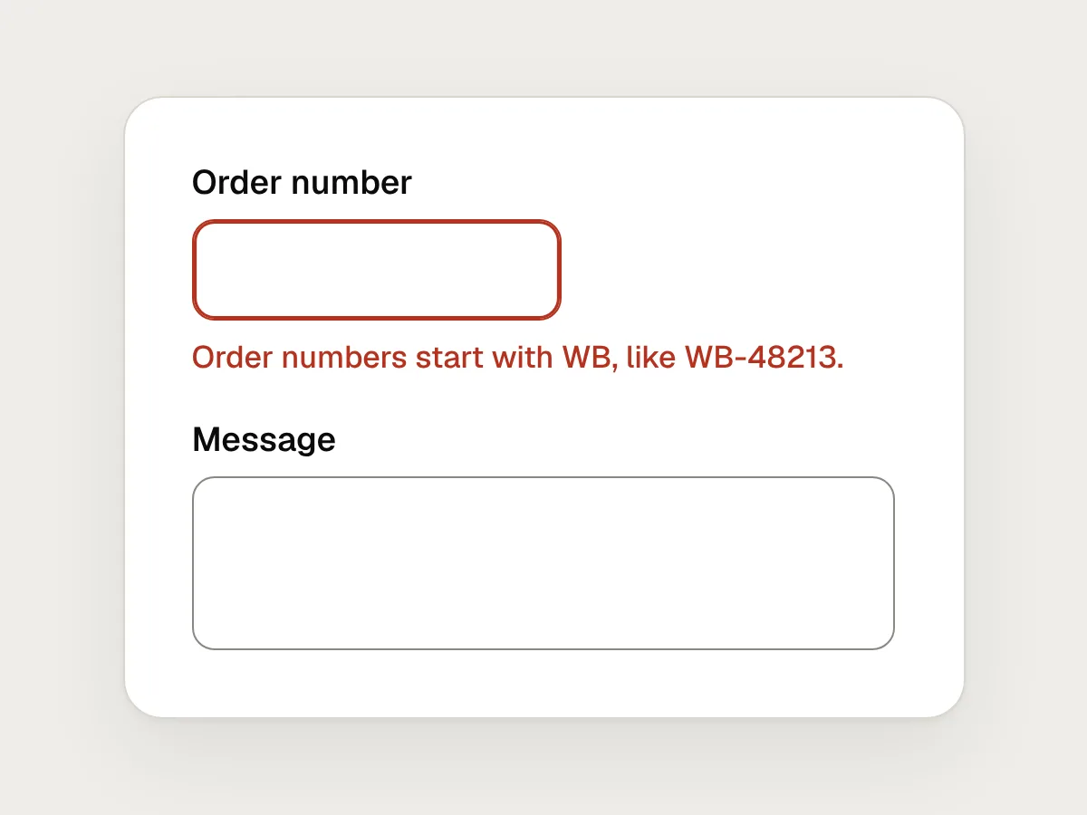
Don’t
Clearing the form after a failed submit.
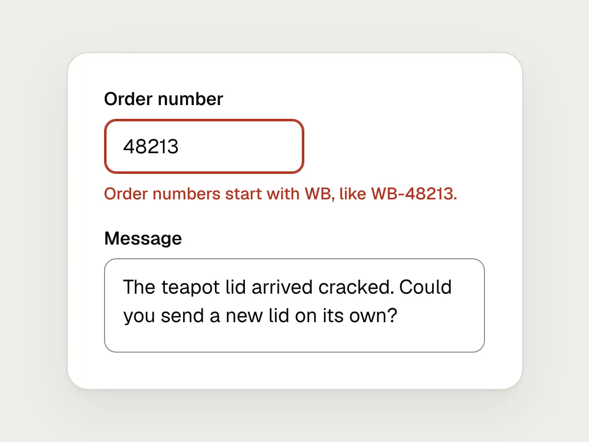
Do
Keep every value. Mark only the fields that need attention.
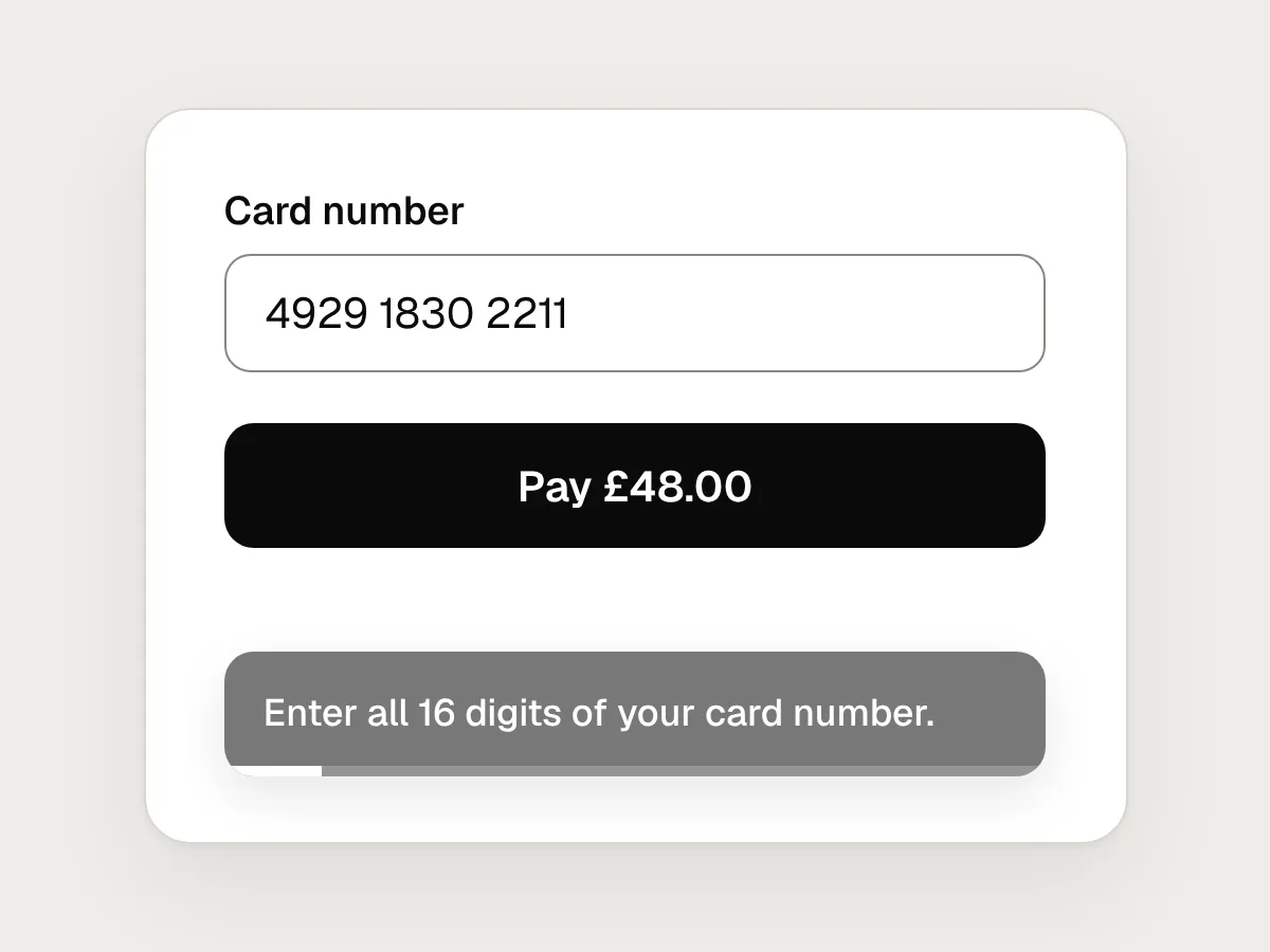
Don’t
A toast that disappears before anyone has read it.
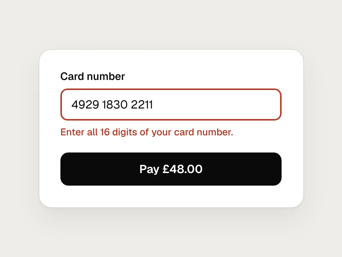
Do
A message that stays next to the problem until it is fixed.
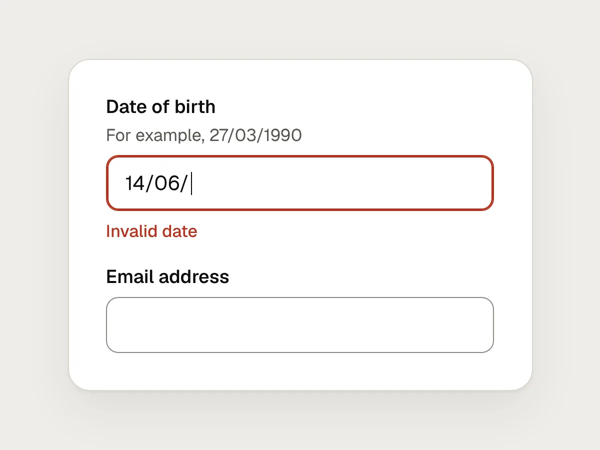
Don’t
Turning a field red while someone is still typing.
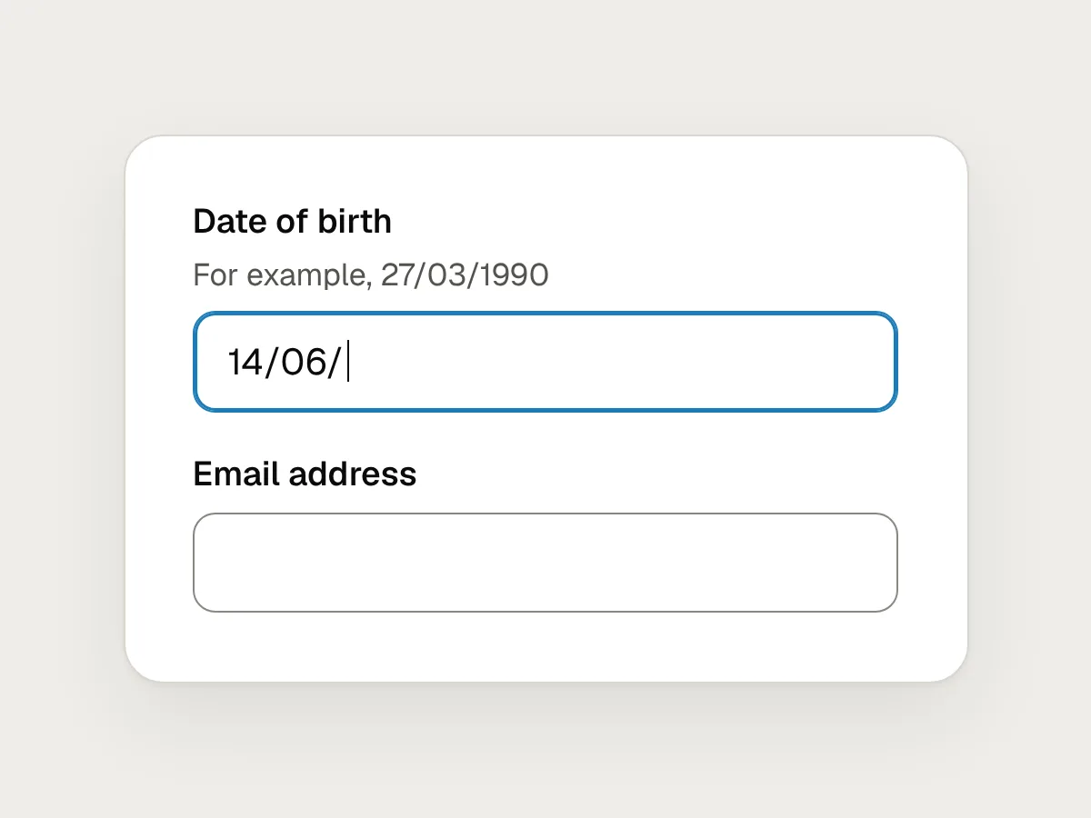
Do
Check when they leave the field or submit, then re-check as they correct it.
Prevent the error instead
An error you prevent is better than the best message you could write for it. Accept the formats people actually type: dates with slashes or spaces, phone numbers with spaces, postcodes in lower case. Show rules, such as a minimum password length, before anyone types. Offer a short list when the set of possible answers is small and known.
For actions that are hard to undo, WCAG SC 3.3.4 Error Prevention (Legal, Financial, Data) asks that submissions which commit people to something legal or financial, or change or delete data they have stored, are reversible, checked for errors, or confirmed before they are final. A review step before payment is the familiar example.
Before you ship: a checklist
Questions people ask
Should an error message apologise?
Only when the fault is clearly yours, such as an outage or a payment that failed on your side. For a mistyped date, “sorry” adds words without helping. When you do apologise, keep it to one word and move straight on to the fix.
Should errors appear in a toast or a pop-up?
Not usually. Toasts disappear on a timer, often before people have read them, and they appear away from the thing that needs fixing. A pop-up blocks the very thing people need to look at. Keep the message next to the problem until it is resolved.
How do screen reader users find out about an error?
Connect each message to its field in code with aria-describedby, and mark the field with aria-invalid. After a failed submit, move focus to the error summary or to the first field with a problem. If a message appears without moving focus, such as an upload failing in the background, use a live region so it is announced. WCAG SC 4.1.3 Status Messages covers this.
Resources
- Understanding SC 3.3.1: Error identification · W3C
What the standard asks for when an error is detected, with examples.
- Understanding SC 3.3.3: Error suggestion · W3C
When you must suggest a fix, and the exceptions.
- Error-message guidelines · Nielsen Norman Group
Visibility, wording and placement, with examples.
- Error message · GOV.UK Design System
Tested wording for common form errors.
- Writing · Apple Human Interface Guidelines
Short advice on tone, blame and placement in error messages.
If this was useful, share it with someone it would help.