Best practice
Empty states that help people start
An empty state is often the first screen people see. How to design one for first use, no results and cleared lists, with clear words and one action.
· 6 min read · Musab Alfawal
On this page
An empty state is what a screen shows when there is nothing to show: a new account with no projects, a search with no results, an inbox that has just been cleared. It is often the first screen someone sees in a new product, and too often all it says is “No data”.
Empty screens tend to be designed last, because mock-ups are drawn full of tidy sample content. The fix is to design them on purpose, with a few words that explain the screen and a button that fills it.
What an empty state is for
Here is a first-use empty state doing its job: one button, a short form, and the first project in the list.
A first-use empty state has one task: get the first item onto the screen. It explains what will appear, offers the action that makes it appear, and then gets out of the way. Once there is a row in the list, the explanation has done its work and the screen becomes the list it was meant to be.
Keep the action inside the empty state, next to the explanation. A small “New” button in the corner of an empty table asks people to find the way in on their own, at the moment they know least about the product. After they create something, bring them back to the list with the new item in it, so they can see the result of what they did.
The same screen, fixed
Here is a projects page for a brand-new account, then the same page with an empty state designed for first use.
Before
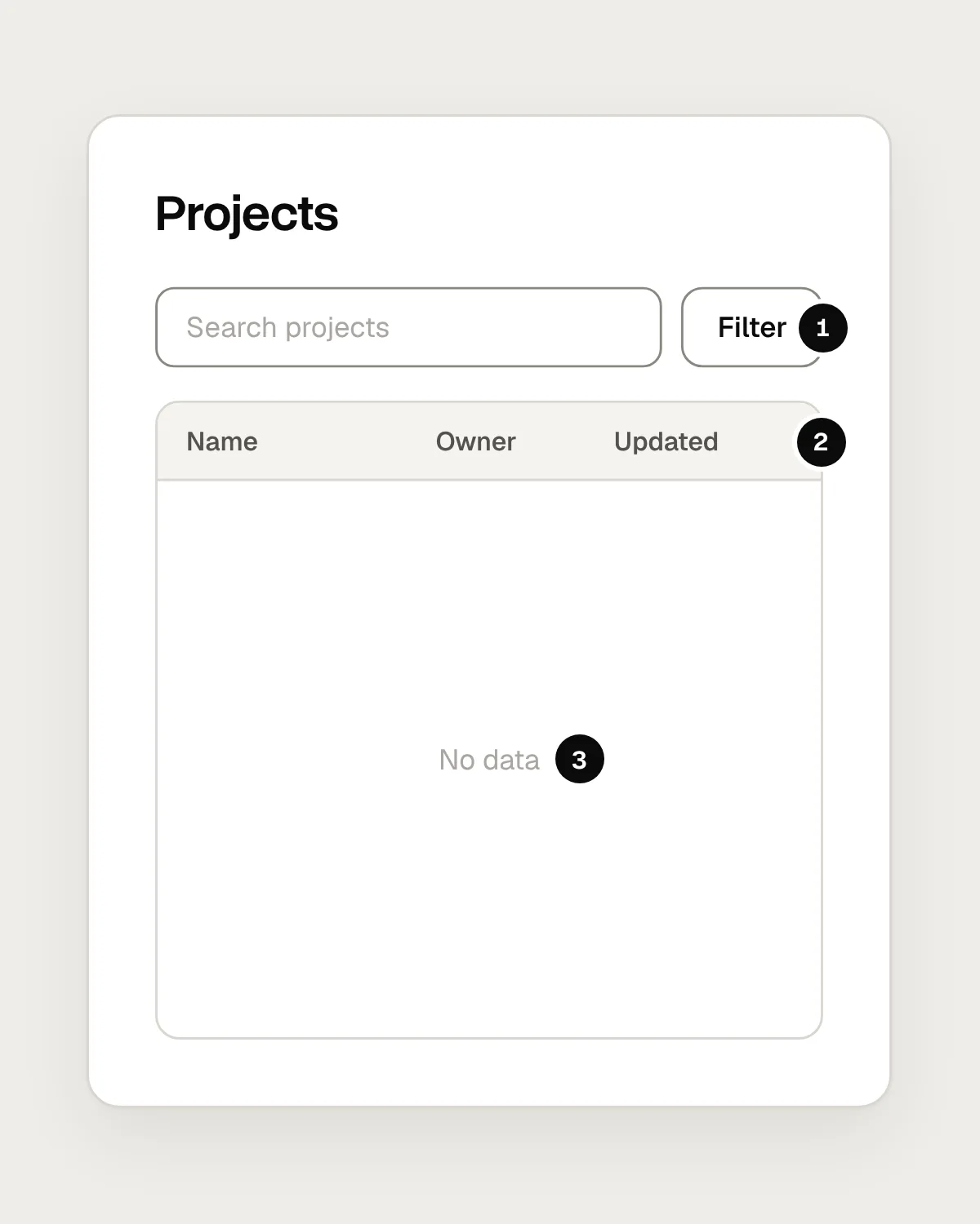
- Search and a filter, with nothing to search or filter yet.
- Column headings for data that doesn’t exist.
- “No data” says neither what belongs here nor how to add it.
After
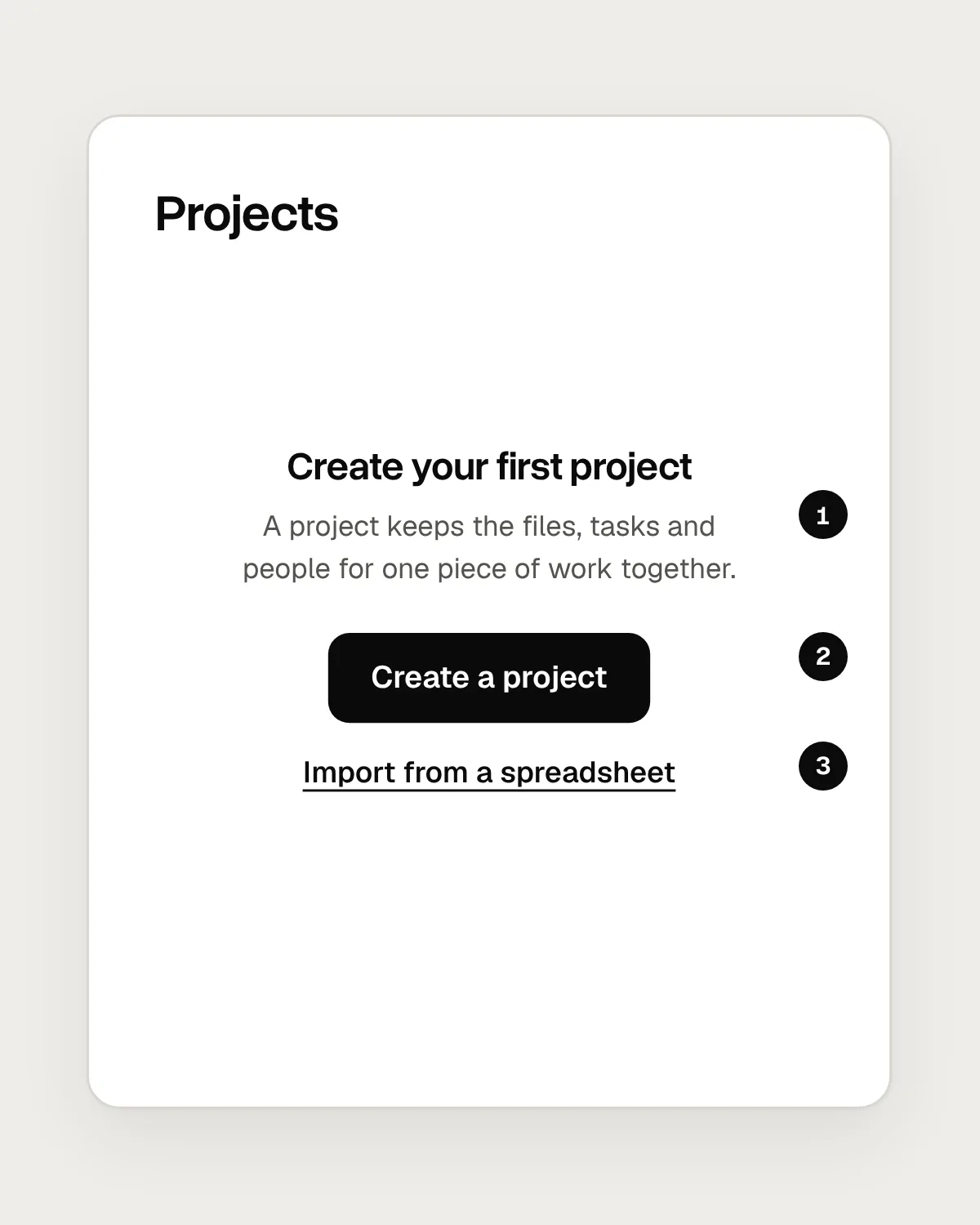
- A heading and one sentence that say what a project is for.
- One primary action that fills the page.
- A second route for people whose projects already live in a spreadsheet.
Three kinds of empty state
The word “empty” covers at least three situations, and each needs different words.
First use is when nothing has been created yet. This is your chance to explain the screen: what will appear here, why it is useful, and how to add the first item. Where it helps, offer a starting point, such as a template, an example to copy, or an import from the tool people use today.
No results means the person searched or filtered, and nothing matched. Tell them plainly that the search worked and found nothing. Repeat what they searched for, show any filters that are switched on, and offer a way to widen the search: check the spelling, clear a filter, or search everywhere instead of one folder.
A cleared state comes after the person has finished something: every task done, every message read. Confirm it plainly and say what happens next, for example “New messages will appear here.” This isn’t the moment to push them into creating more.
A list that failed to load is a fourth case, and it belongs in an error message. Showing “No projects yet” when the server didn’t answer tells people their work has disappeared.
How to design an empty state
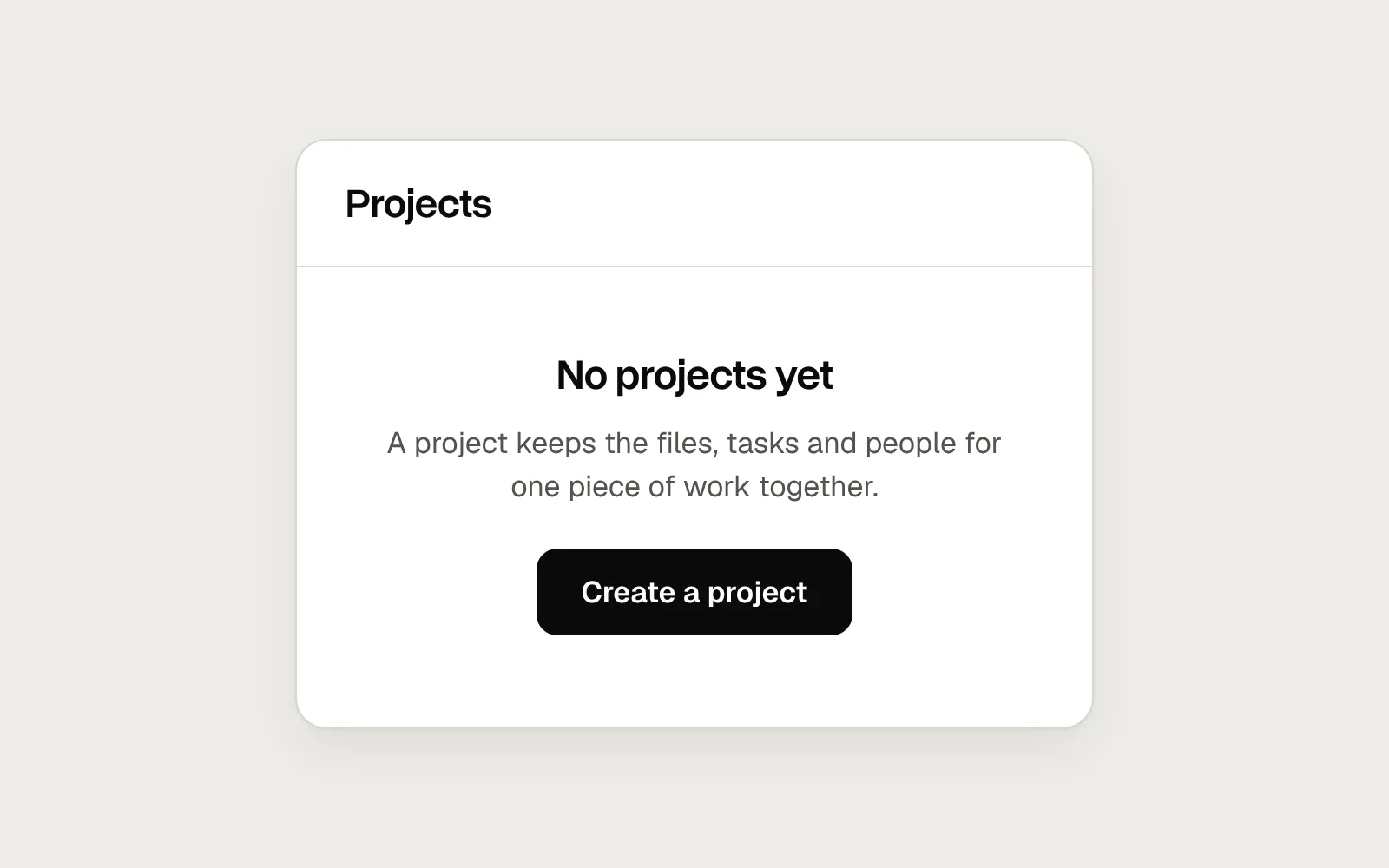
Start with the words. The heading should name what belongs on this screen, as in “No projects yet”. Follow it with one sentence on why that thing is useful. If you need a second sentence, the screen is probably trying to teach too much.
Then choose one action. Pick the one that most often fills the screen and make it the primary button, named with a verb and the thing it makes: “Create a project”, “Add a customer”, “Upload a file”. A second, quieter route is fine when a real group of people needs it, such as importing existing data. Three or four buttons of equal weight leave people to work out which one matters.
An illustration is optional. If you use one, keep it small enough that the heading and the button stay in view on a laptop screen. The words and the action do the work, and a picture with no words leaves people guessing what the screen is for.
Finally, check the state in context. An empty panel inside a busy dashboard needs fewer words than an empty page on its own, and an empty state on a phone needs its action within easy reach.
Mistakes, and what to do instead
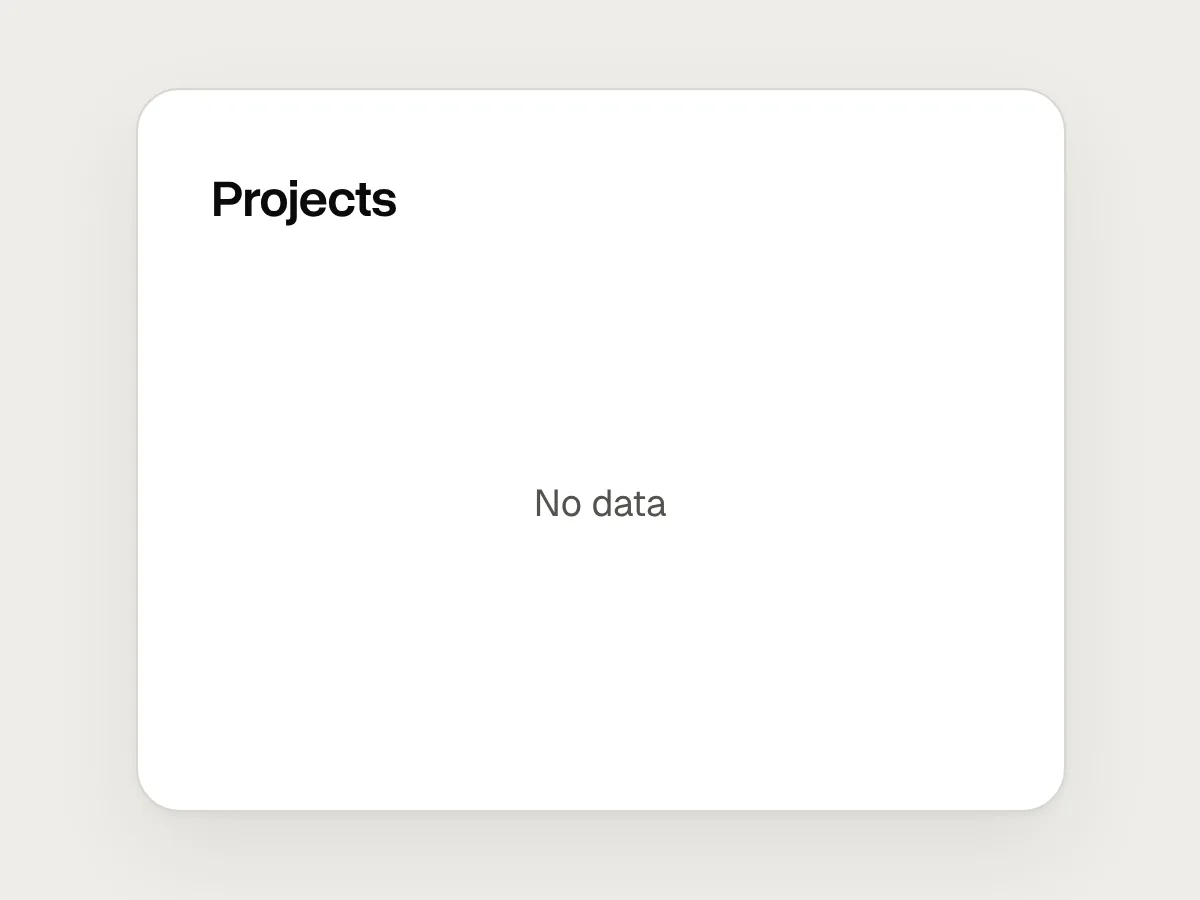
Don’t
“No data.”
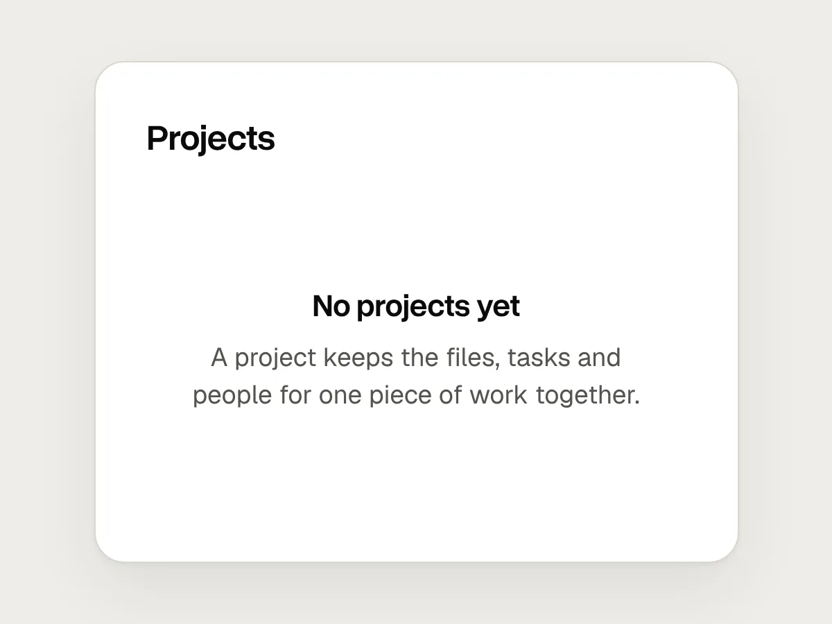
Do
A heading that says what will appear, like “No projects yet”, and one line on what a project is for.
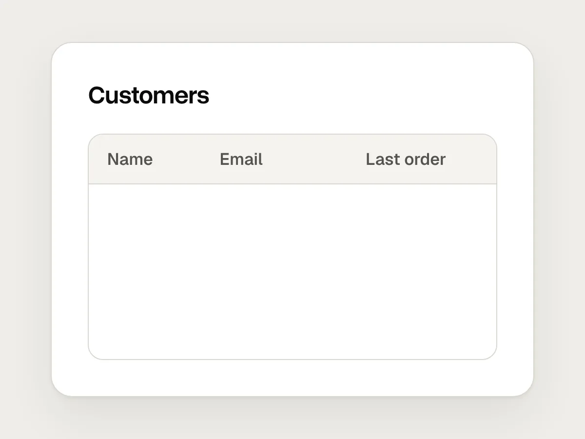
Don’t
An empty table with column headings and nothing else.
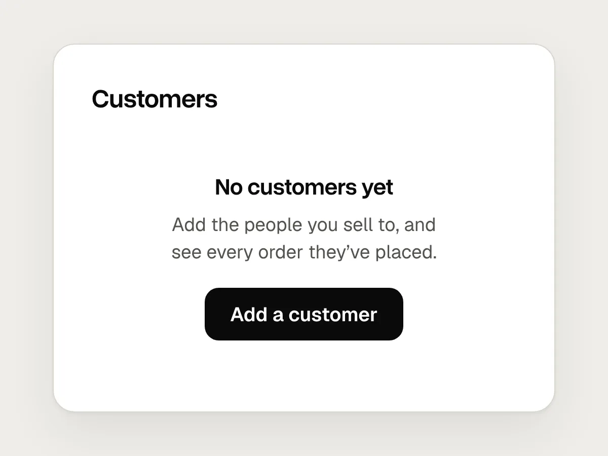
Do
Show the empty state in place of the table until there is a first row.
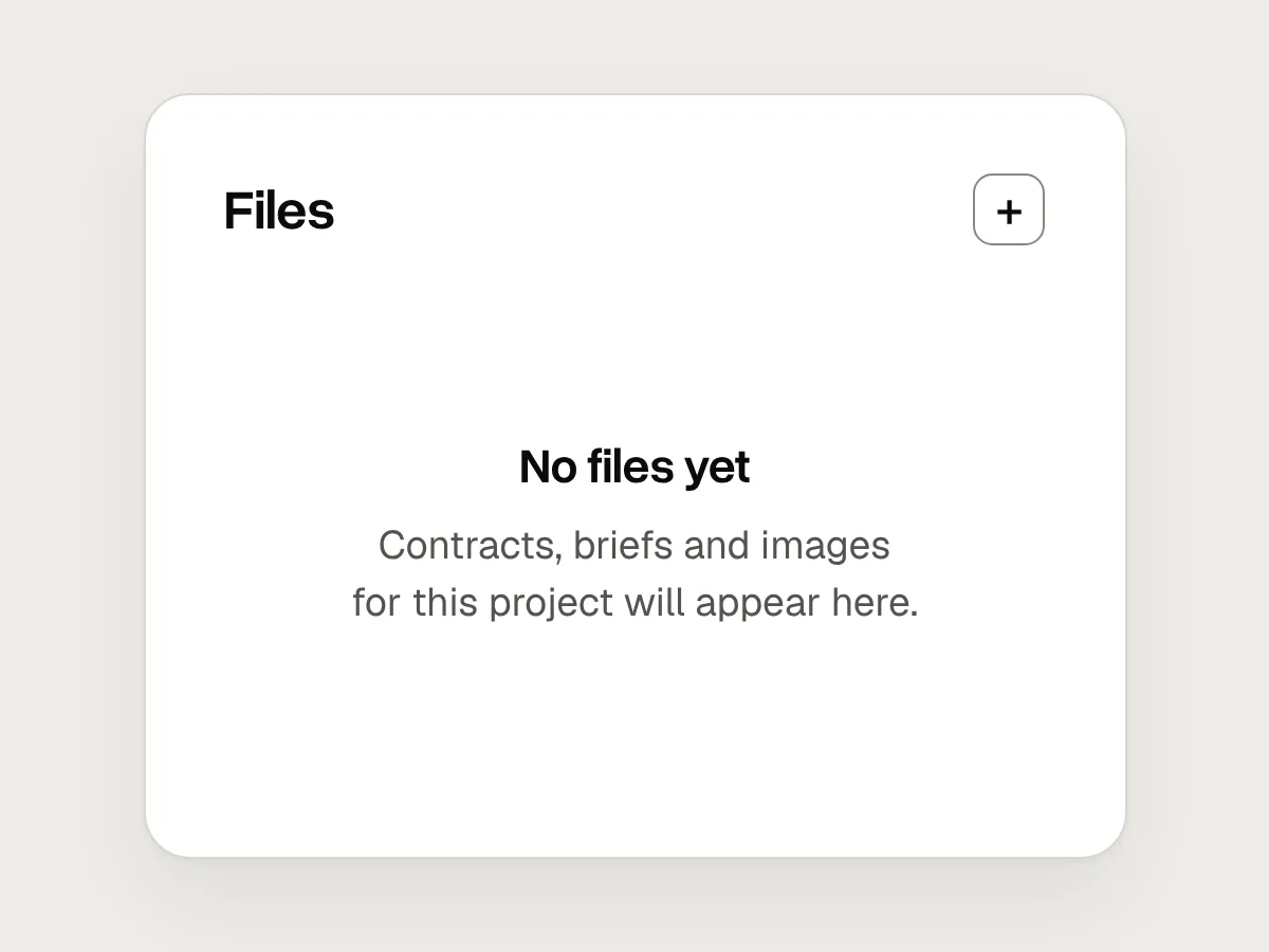
Don’t
The only way to add something is a small “+” in a corner.
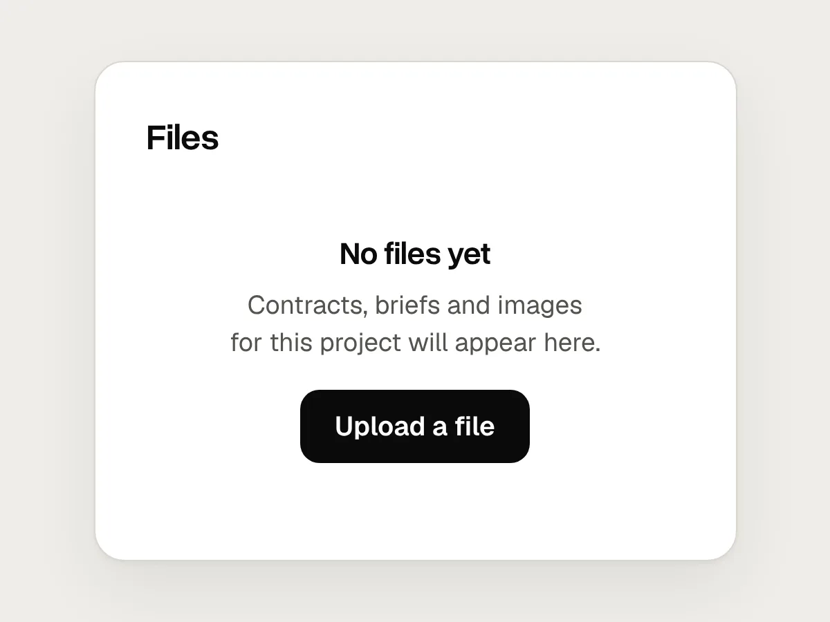
Do
Put the primary action inside the empty state, next to the explanation.
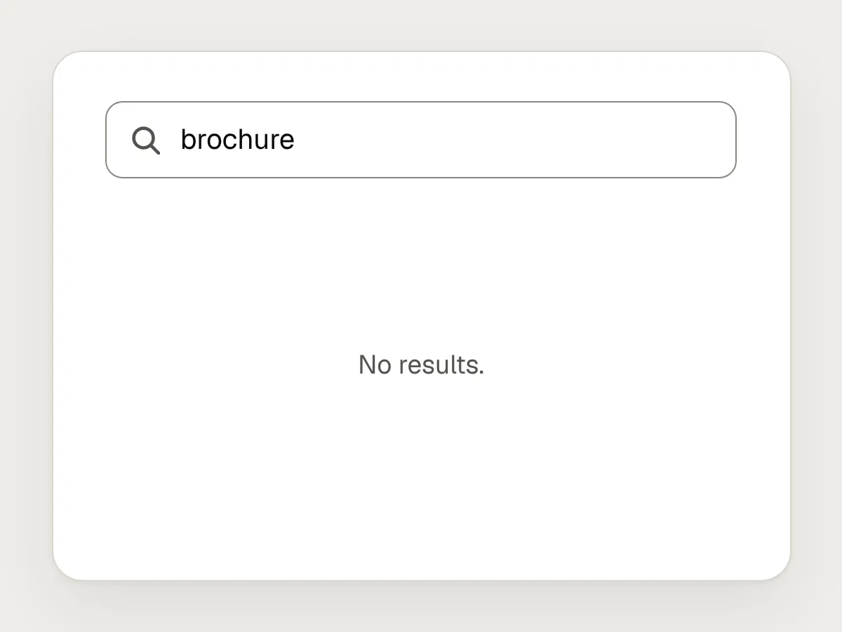
Don’t
“No results.” and an otherwise blank page.
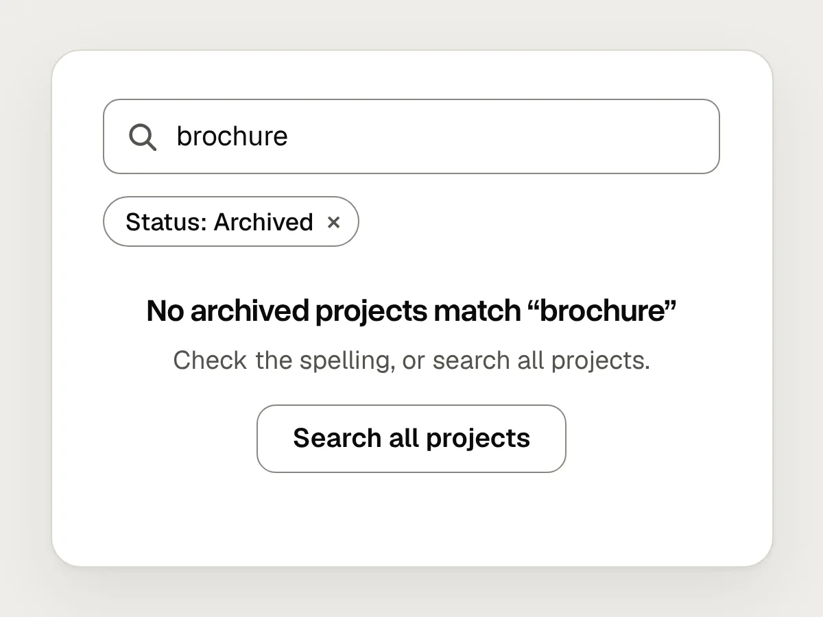
Do
Repeat the search, show the active filters and offer a way to widen it.
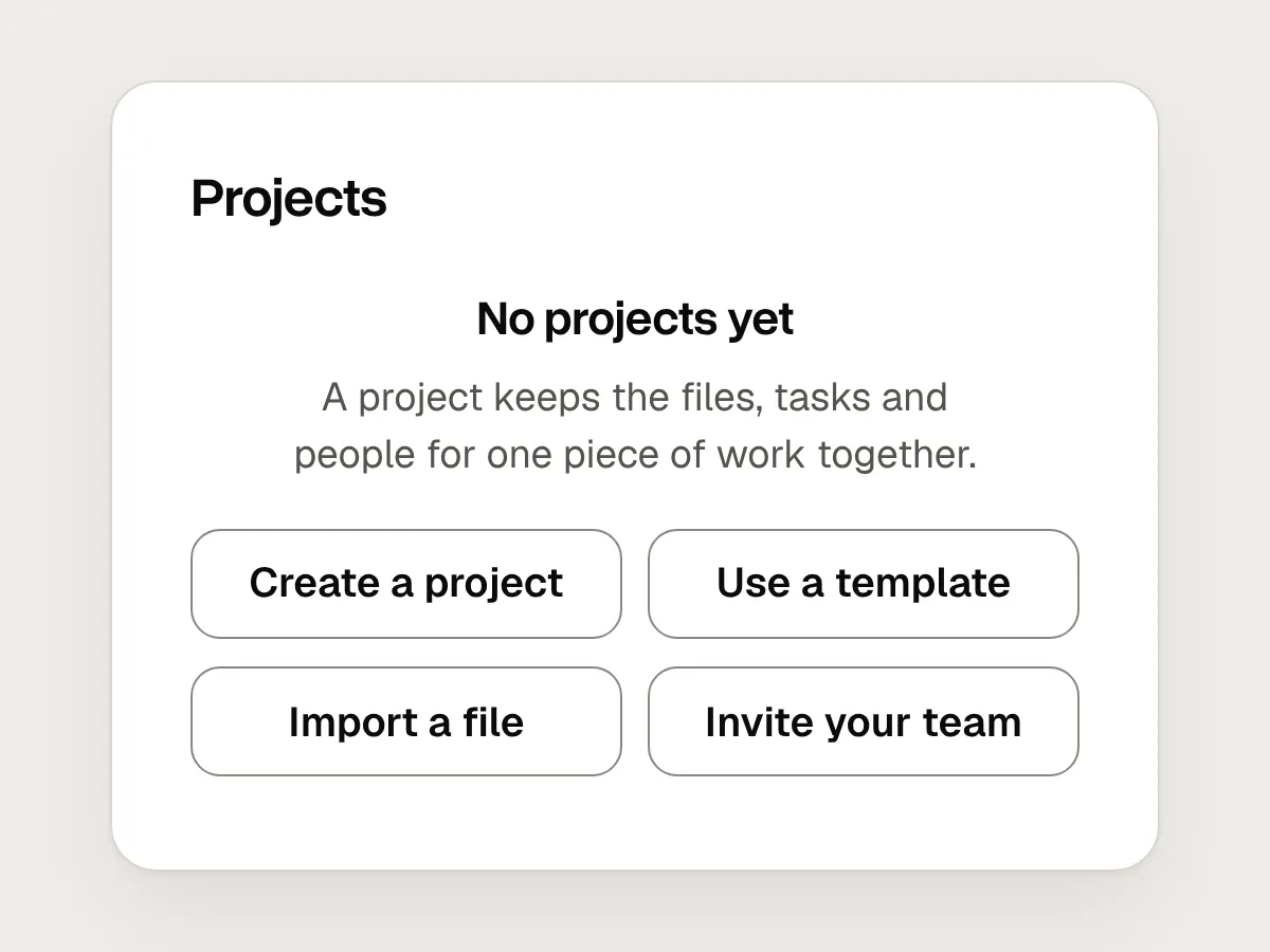
Don’t
Three or four buttons of equal weight.
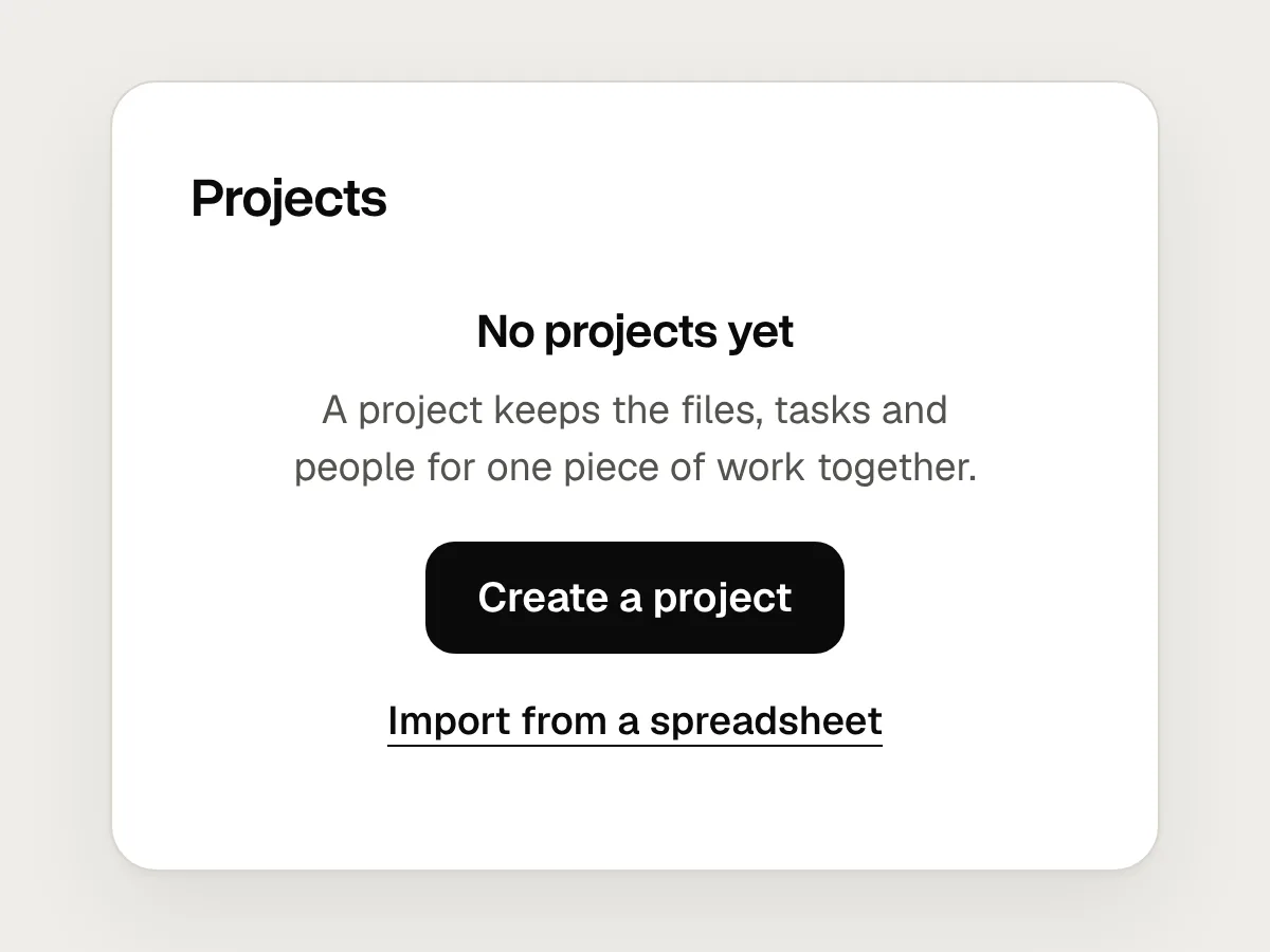
Do
One primary action, and at most one quieter second route.
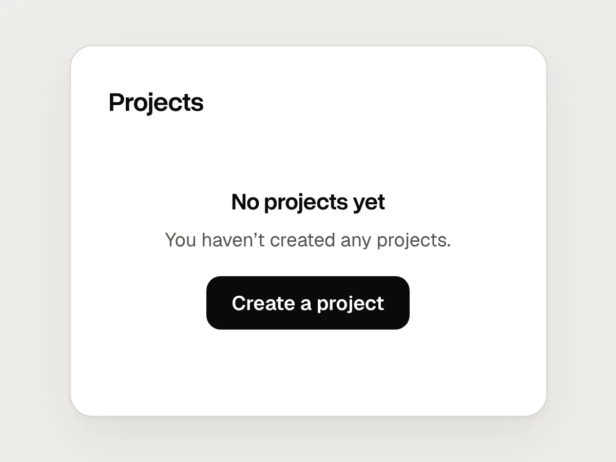
Don’t
“No projects yet” when the list failed to load.
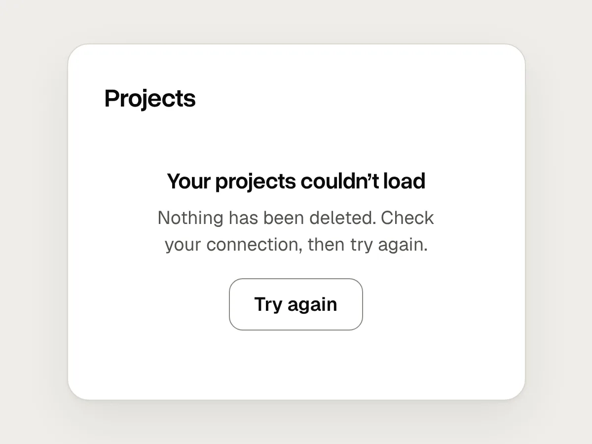
Do
An error message that says the list couldn’t load, with a way to try again.
Design your empty states in an afternoon
1. List every screen that can be empty
Lists, tables, dashboards, search results, inboxes and folders. Note which of the three kinds each one can be.
2. Write the words first
For each one, write a heading that says what will appear and one sentence on why it is useful.
3. Choose one action
Pick the action that most often fills the screen and make it the primary button. Add a second only if many people need it.
4. Walk through as a new user
Create a fresh account and use the product before adding anything. Then search for something that doesn’t exist, and clear a list.
Accessible empty states
An empty state is ordinary content, so it needs a real heading and a real button, not text drawn into an image. When a search or filter updates the page without loading a new one, announce the result, including when there are none, so screen reader users know the search has finished. WCAG SC 4.1.3 Status Messages covers this, and a count of search results is one of its examples.
Questions people ask
Should an empty state include an illustration?
It can, if it is small and doesn’t push the action out of view. The heading and the button do the work. An illustration without words leaves people to guess what the screen is for.
Should I show sample data instead of an empty state?
Sample data can show what a full screen looks like, which helps with dashboards and reports. Label it clearly as an example and make it easy to remove, so nobody mistakes it for their own data.
What should a search with no results say?
Repeat what was searched, say where you looked, and offer the next step: check the spelling, remove a filter or search everywhere. Keep the search box filled in, so people can edit their query instead of typing it again.
Resources
- Designing empty states in complex applications · Nielsen Norman Group
Three guidelines for empty states in data-heavy products.
- Writing · Apple Human Interface Guidelines
Includes advice on giving every blank screen a clear next step.
- Searching · Apple Human Interface Guidelines
On showing the scope of a search and suggesting what to try.
- Understanding SC 4.1.3: Status messages · W3C
How to announce results, including none, without moving focus.
If this was useful, share it with someone it would help.