How-to
How to hand off designs to developers
How to hand off designs to developers: every state, edge case and breakpoint, named tokens, real content, and a walkthrough to finish.
· 6 min read · Musab Alfawal
On this page
A design handoff is the point where a design leaves your files and becomes a developer’s work. Most of the trouble starts with what the files leave out: the error message nobody wrote, the name twice as long as the mock-up allowed, the layout at a width nobody checked. Each gap becomes a guess, and the guess is what ships.
This guide covers what to include when you hand off designs to developers, and how to stay involved once the build starts. The advice works with any tool. Figma’s Dev Mode is one way to share measurements and specs, and a tidy file with clear notes does the same job anywhere.
Every component has states
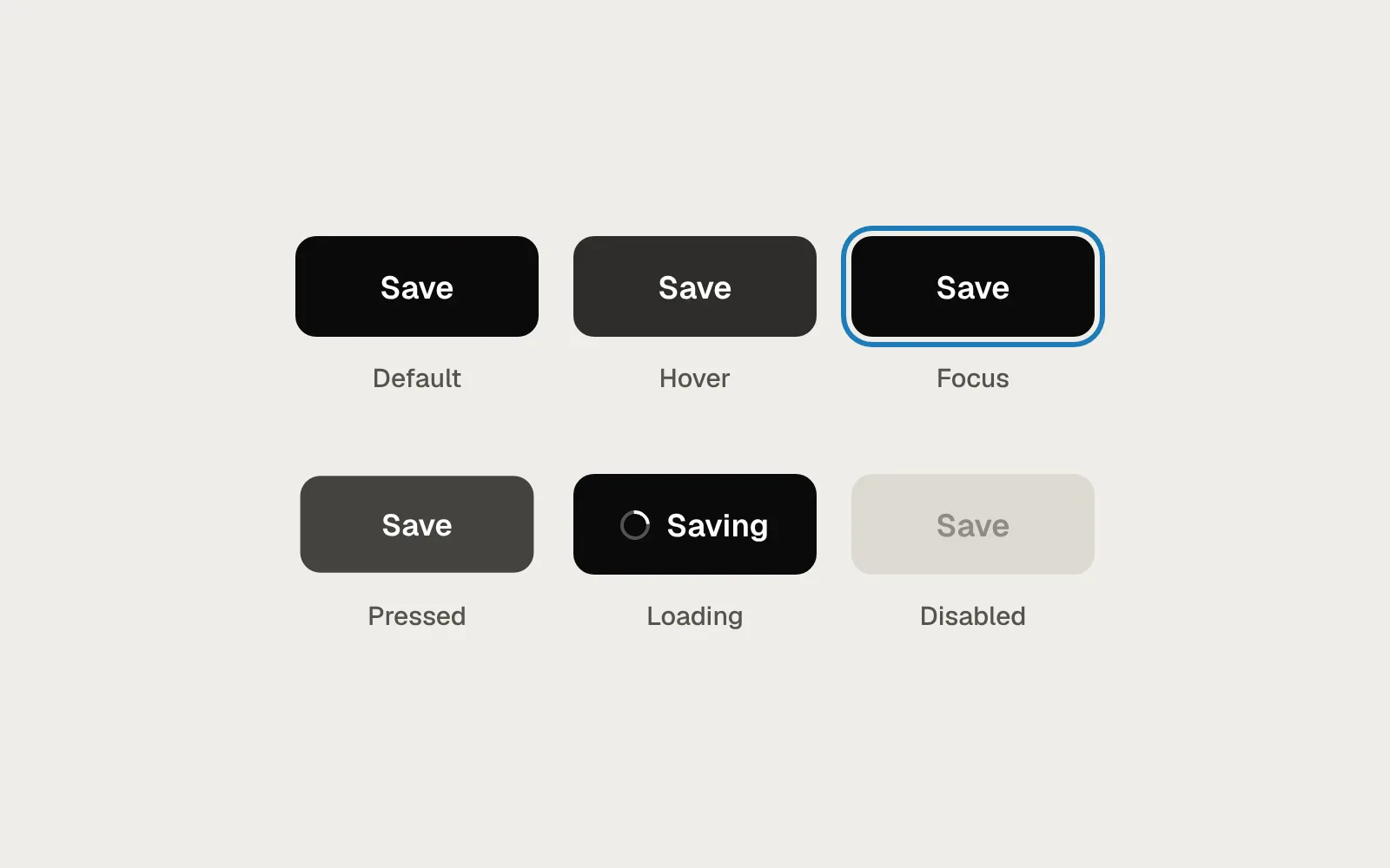
A mock-up shows each screen once, on a good day, with everything loaded. The real interface spends much of its time somewhere else. For every interactive element, draw and name the states it can be in: default, hover, focus, pressed (often called active) and disabled. Anything that fetches or saves data also needs loading, empty and error states.
Focus deserves its own drawing. Keyboard users rely on it to see where they are on the page. If the mock-up doesn’t show a focus style, it is easy for the browser’s default outline to be removed to match the picture, and nothing replaces it.
One button, and the six states it needs before it can ship.
Design the edge cases
Real data is messier than mock-up data. Before you hand over a component, push it with the content it will actually meet. Names much longer than “Ana Silva”. Translations, which are often longer than the English. Images that fail to load or were never uploaded. Numbers at both ends: zero, one, and a count with six digits. A list with one row and a list with a thousand.
For each case, decide what happens and draw the answer. Does the name wrap or get cut off? Does the image area keep its size when the picture is missing? Does a large number shorten to “1.2k”? A developer can build any of these. They can’t know which one you meant.
Here is a team card as it often arrives, then the same card with its states and one edge case added.
Before
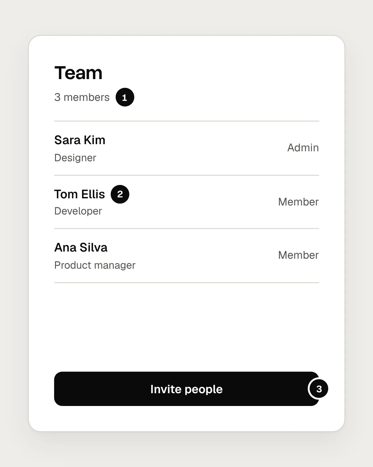
- Always three members. What does a new team see, or one that fails to load?
- Short names only. A long one will run into “Member” on the right.
- One state of the button. Hover, focus, loading and disabled are left to guess.
After
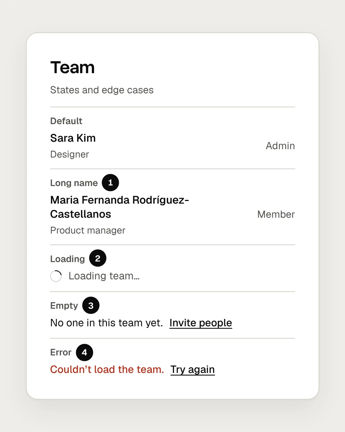
- A long name wraps onto a second line, and the role stays where it is.
- Loading: a spinner and a line of text, in the space the list will fill.
- Empty: says what’s missing and offers the next step.
- Error: says what went wrong and offers a retry.
Show how the layout responds
Draw the key screens at each of your breakpoints, usually a phone, a tablet and a desktop width, and write down what changes between them. Does the navigation collapse into a menu? Do three columns of cards become two, then one? Which elements stretch, which keep a fixed width, and what has a maximum width so lines of text stay readable?
Say what happens between the breakpoints as well. People will see your layout at widths you didn’t draw. A short note such as “cards: three columns above 1024px, two above 640px, one below” answers questions before anyone has to ask them.
How to hand off designs to developers, step by step
1. Draw every state
For each component, show default, hover, focus, pressed and disabled, and for anything that loads data, loading, empty and error. Put them next to the screen with plain names, so nobody has to hunt for them.
2. Design the edge cases
Try the longest real name you can find, a translation, a missing image, and zero, one and a very large number. Decide whether text wraps or gets cut off, and draw the answer.
3. Show each breakpoint
Draw the key screens at phone, tablet and desktop widths, and note what changes: columns, navigation, image crops and maximum widths.
4. Name spacing and colour as tokens
Refer to spacing, colour and type by name, such as space-4 or text-secondary, instead of raw pixel values and hex codes. If the codebase already has tokens, use the same names, so the design and the build share one vocabulary.
5. Use real content
Real headings, real prices, real product names. Placeholder text hides the wrapping, cut-off and alignment problems you most need to see before the build. If final copy isn’t ready, write a realistic draft.
6. Describe interaction and motion
Say what triggers each change and what happens: what opens, what moves, how long it takes and with what easing. A short screen recording of a prototype explains timing better than a paragraph. Note what happens when someone has asked their device to reduce motion.
7. Add accessibility notes
Mark the focus order on each screen, write a label for every field and every button that only has an icon, and say which colour pairs you have checked for contrast. Note which heading is which level. None of this can be read from a picture.
8. Walk through it, then stay available
Book half an hour with the developers to go through the flows, the states and the open questions. Agree where questions go, answer them quickly during the build, and review the result in a browser before it ships.
Stay involved during the build
The walkthrough is where most questions get answered. Going through the design together, with the people who will build it, surfaces the questions a file can’t answer: what is hard to build, which component already exists in the codebase, which edge case nobody had considered. It also gives developers a sense of what you care about most, so they know where to take extra care.
After that, stay close. Questions come up every day of a build, and a developer who waits a day for an answer will often guess instead. Check the work in a real browser as it comes together, at real widths, with the keyboard as well as the mouse. Small fixes are cheap while the code is fresh.
When a decision changes during the build, update the design file too. A file that no longer matches the product misleads the next person who opens it.
Before you hand off: a checklist
Questions people ask
What should a design handoff include?
Every state of each component, the edge cases, the layout at each breakpoint, named tokens for spacing and colour, real content, notes on interaction and motion, and accessibility notes. Then a walkthrough with the developers who will build it.
Do you need Figma’s Dev Mode for a good handoff?
No. Dev Mode is a convenient way to share measurements, tokens and code snippets. What decides whether a handoff works is what it contains and the conversation around it, and that applies in any tool.
When should developers first see a design?
Early, well before the handoff. A developer who sees rough sketches can point out what will be hard to build while it is still cheap to change. The handoff then confirms decisions you made together.
Resources
- Guide to Dev Mode · Figma Help Center
One way to share specs, variables and annotations from a Figma file.
- States · Material Design 3
How hover, focus, pressed and disabled states are defined and shown.
- Spacing · GOV.UK Design System
A worked example of a named, responsive spacing scale.
- Understanding focus visible · W3C
Why a visible focus state is required.
- Understanding contrast (minimum) · W3C
The contrast ratios text needs, and how they are measured.
If this was useful, share it with someone it would help.