Best practice
Colour contrast: passing WCAG without a dull palette
Colour contrast decides whether people can read your interface. How to meet the WCAG ratios for text, borders and focus rings and keep your brand colour.
· 7 min read · Musab Alfawal
On this page
Colour contrast is the difference in brightness between text and the surface behind it. When there is too little, people with low vision, people reading a phone in sunlight and many older readers have to work to read your interface, and some can’t read it at all.
You rarely need to drain the colour out of a brand to fix it. Most failures come from a handful of pale greys and a single brand shade used for everything. Give each colour a range of shades, assign each shade a job, and you can pass WCAG with a palette that still looks like yours.
What WCAG asks for
WCAG measures contrast as a ratio between two colours, from 1 : 1 for two identical colours up to 21 : 1 for black on white. The number comes from the relative brightness of each colour, so hue and saturation only count for as much as they change how light a colour is.
Four success criteria matter most here. SC 1.4.3 Contrast (Minimum), at level AA, asks for 4.5 : 1 for normal text and 3 : 1 for large text. Large means at least 18 point, or 14 point bold, which is about 24 CSS pixels, or about 18.7 pixels in bold. SC 1.4.6 Contrast (Enhanced), at AAA, raises those to 7 : 1 and 4.5 : 1.
SC 1.4.11 Non-text Contrast, also AA, asks for 3 : 1 for the parts of a control that people need to see in order to find it and read its state, such as a field’s border or a focus ring. The same 3 : 1 applies to graphics needed to understand the content, like the lines in a chart. SC 1.4.1 Use of Color, at level A, adds that colour must never be the only way you show something, so an error needs words as well as red.
Keep the brand colour, change the shade
A brand colour is usually chosen to look good as a fill: on a logo, a button, a hero panel. That shade is often too light for text on white. A mid teal is a typical case. At 3.5 : 1 it is fine for a large heading or a field border, and it fails for a sentence of body text.
The fix is usually the same hue at a darker step. Build a scale for each colour, say from 50 to 900, and write the contrast ratio against white next to every step. Then give the steps jobs: the lightest for backgrounds, the middle for fills and large type, the darker steps for text and links. The colour keeps its character, and nobody has to guess which shade is safe.
Here is one line of text stepping through a teal scale, with its contrast against white measured at each shade.
Teal 500, the brand shade, measures 3.5 : 1. One step darker, Teal 600 reaches 4.8 : 1 and passes for body text. It is still recognisably the same teal. The same reasoning applies to white text on a teal button: the ratio is the same in either direction, so a Teal 500 button with a normal-size white label fails, and a Teal 600 one passes.
The greys that quietly fail
Bright brand colours get checked because they stand out. The greys usually don’t, which is how they slip through. Interfaces use them for everything meant to sit in the background: helper text, timestamps, captions, placeholders, borders and secondary buttons. Each one gets a little paler in review because it “looks cleaner”, until none of them pass.
Placeholder text is still text that people need to read, so hold it to 4.5 : 1. Text that looks disabled but isn’t needs the same treatment. SC 1.4.3 exempts text in controls that really are inactive, but a working Cancel button styled in pale grey is simply a button that fails.
Borders and focus rings are where SC 1.4.11 applies. If a field’s border is the only thing that shows where the field is, that border needs 3 : 1 against the background. A focus ring tells keyboard users where they are on the page, so a pale glow that is hard to see leaves them lost.
The same panel, fixed
Here is a typical settings panel, then the same panel with each colour moved one or two steps darker. The layout, type sizes and weights are unchanged.
Before
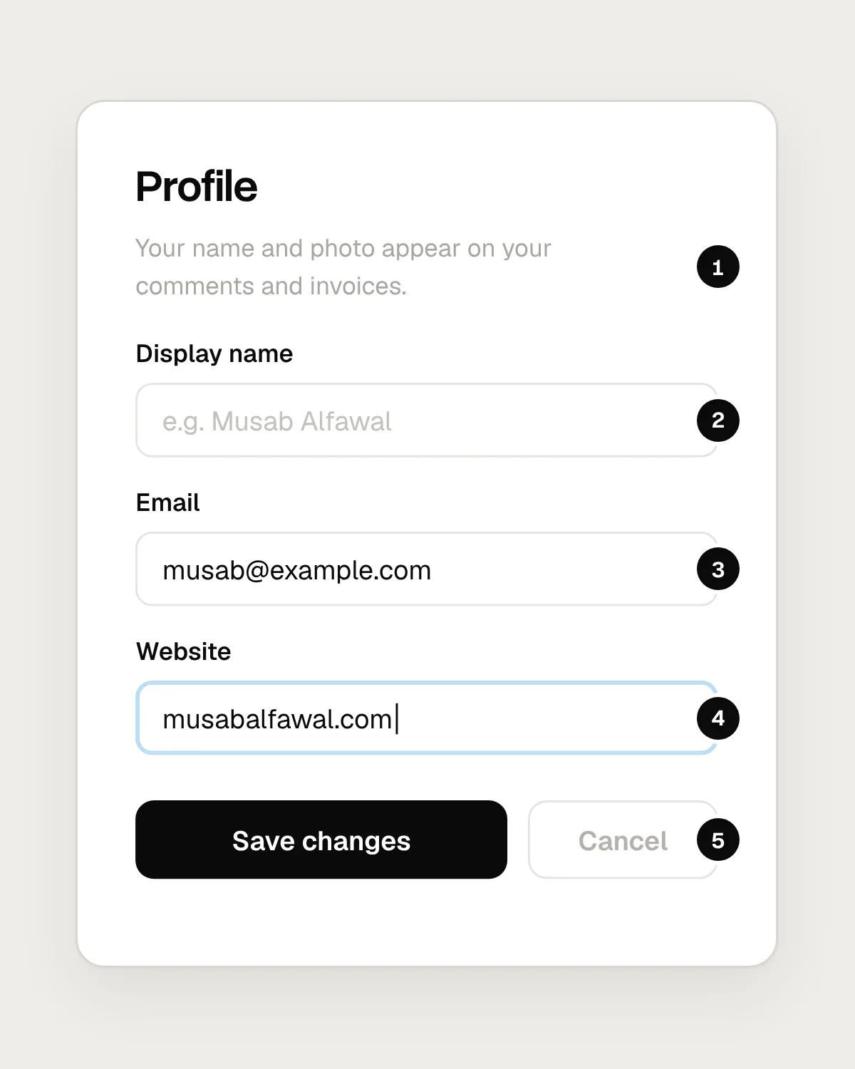
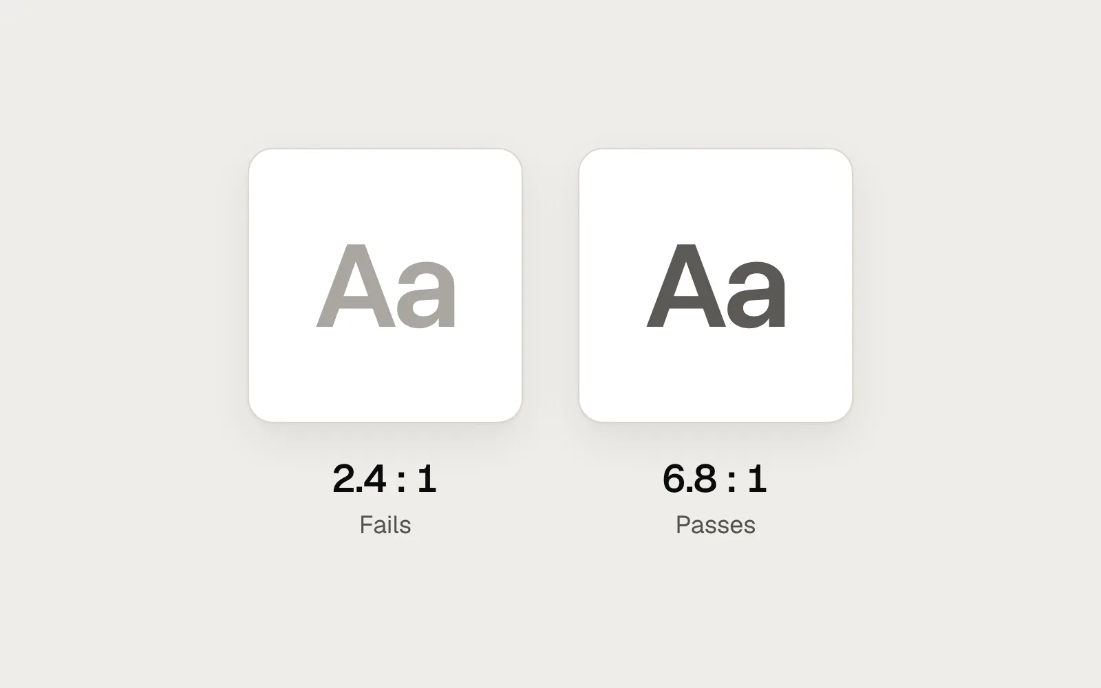
- The intro text measures 2.4 : 1. It looks calm and fails the 4.5 : 1 body text needs.
- The placeholder measures 1.7 : 1, so the example is close to invisible.
- Input borders at 1.2 : 1. The edges of each field almost disappear.
- A pale blue focus ring at 1.4 : 1. Keyboard users can’t see where they are.
- “Cancel” at 2.1 : 1. It looks disabled, but it works.
After
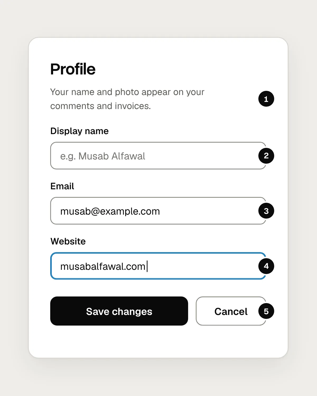
- The intro text moves to 6.8 : 1 and still reads as softer than the heading.
- The placeholder meets the same 4.5 : 1 as other text, at 4.7 : 1.
- Borders at 3.5 : 1, above the 3 : 1 that SC 1.4.11 asks for.
- A two-pixel focus ring in the interface blue, at 4.5 : 1.
- “Cancel” in full-strength text with a 3.5 : 1 border. Clearly a button, and clearly second to Save.
The panel still has a hierarchy. The heading is the darkest thing on it, the intro is a softer grey, and Save is the only filled button. Contrast and hierarchy work together: you make text quieter with size, weight and position, and keep every colour above the line.
Mistakes, and what to do instead
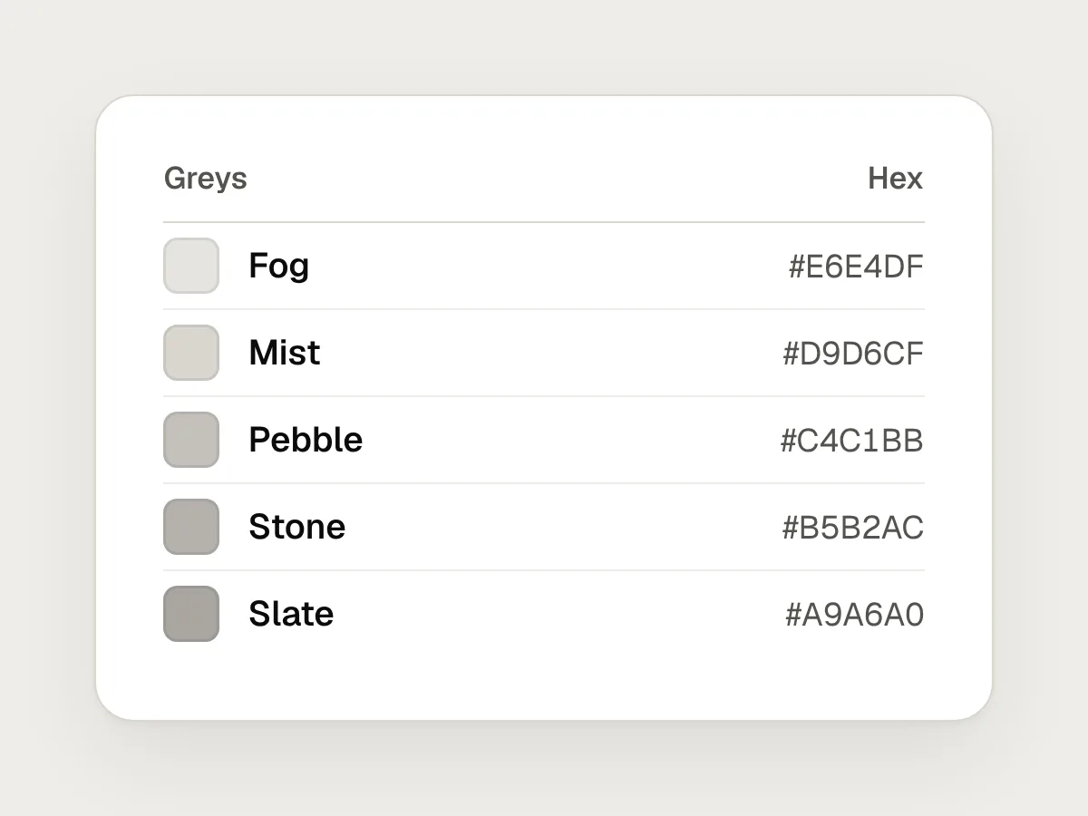
Don’t
Choosing greys by eye on a bright, high-quality monitor.
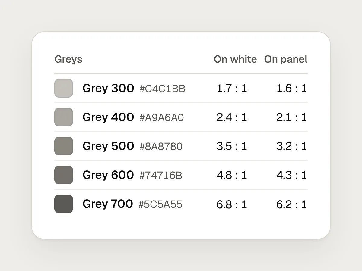
Do
Pick greys from a scale where every step has a measured ratio against your backgrounds.

Don’t
Using the brand shade for body text and button labels.

Do
Use a darker step of the same hue for text. Keep the brand shade for fills, large type and borders, where 3 : 1 is enough.
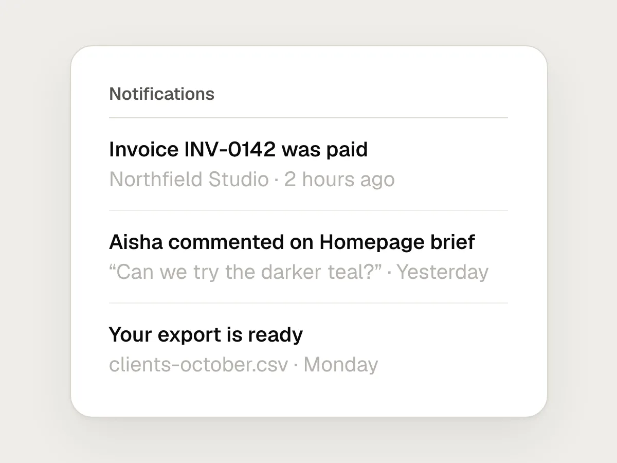
Don’t
Making secondary text paler until it feels quiet.
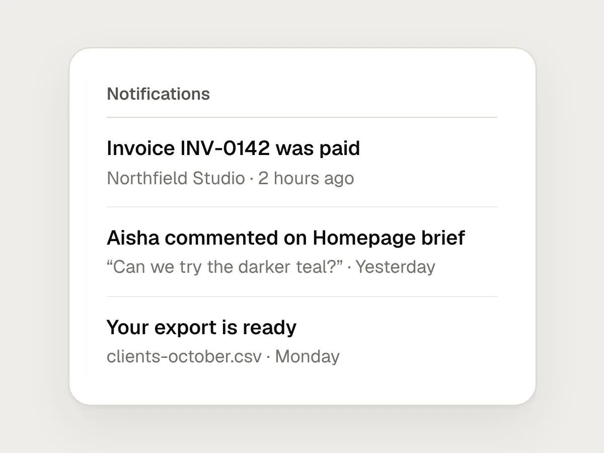
Do
Make it smaller, lighter in weight or lower on the page, and keep its colour at 4.5 : 1 or above.
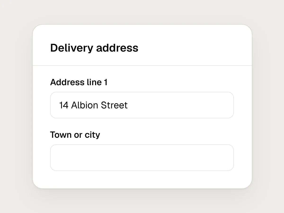
Don’t
Hairline input borders in the same colour as card dividers.
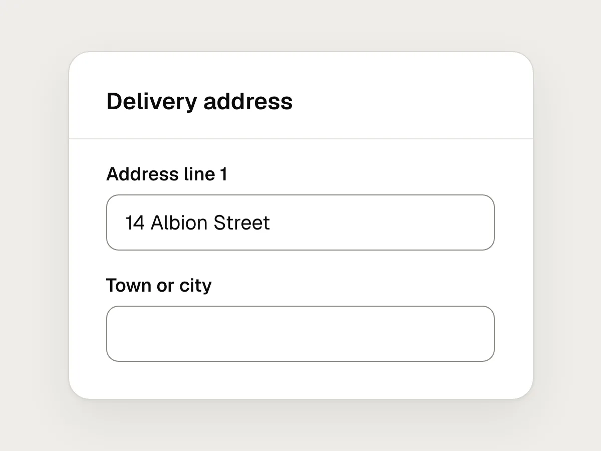
Do
Give field borders at least 3 : 1 against the background, or use a filled field that has that contrast itself.
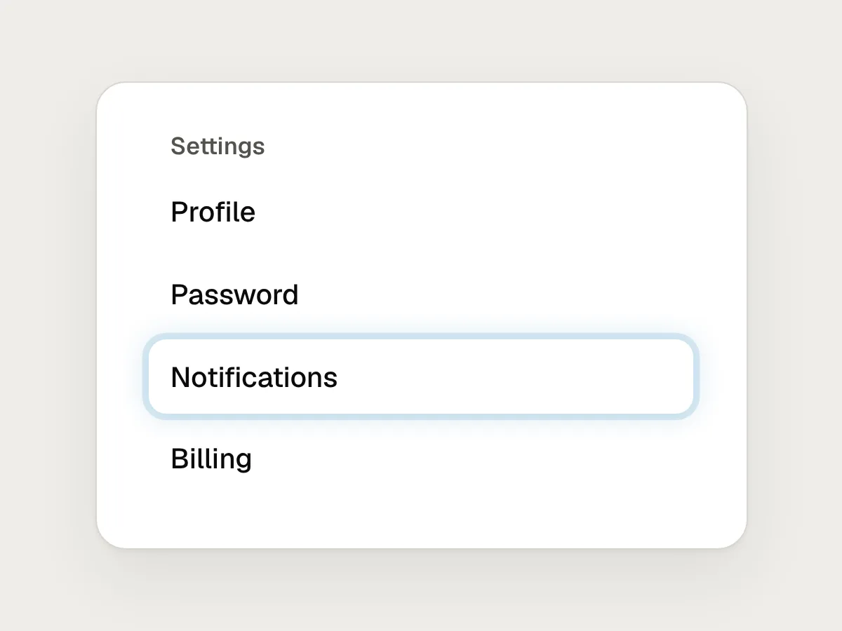
Don’t
Replacing the browser’s focus outline with a soft, pale glow.
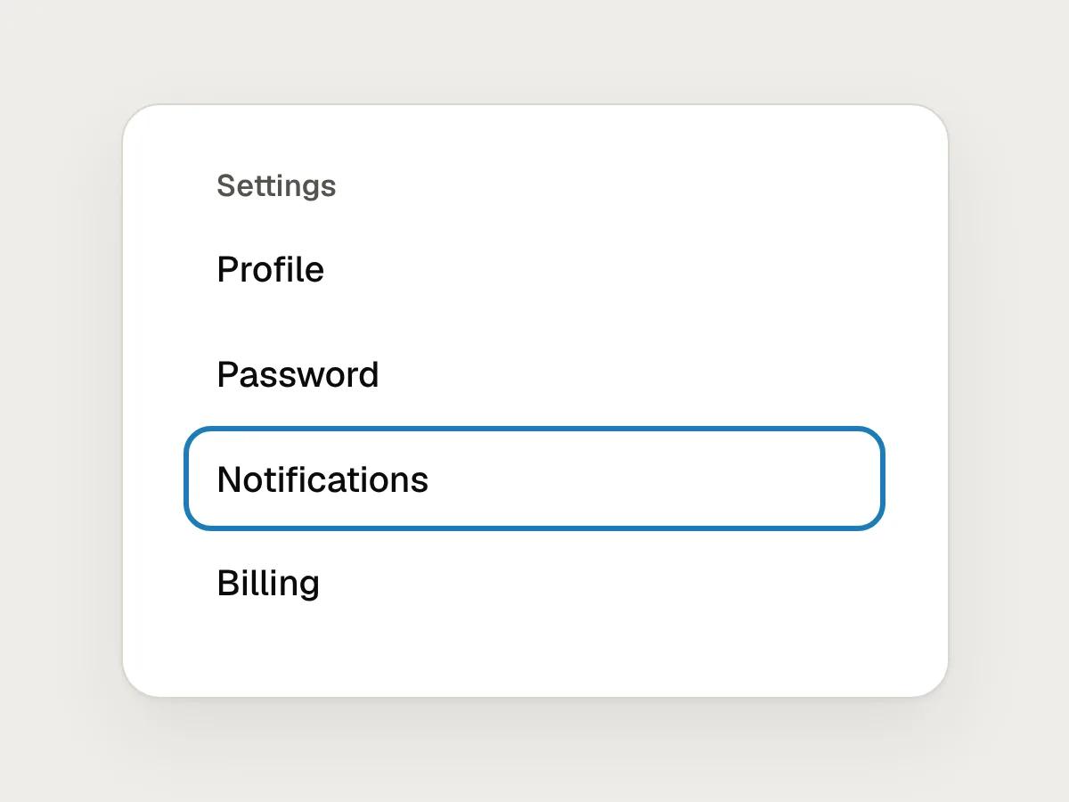
Do
A solid ring, two pixels or more, with at least 3 : 1 against the colours next to it.
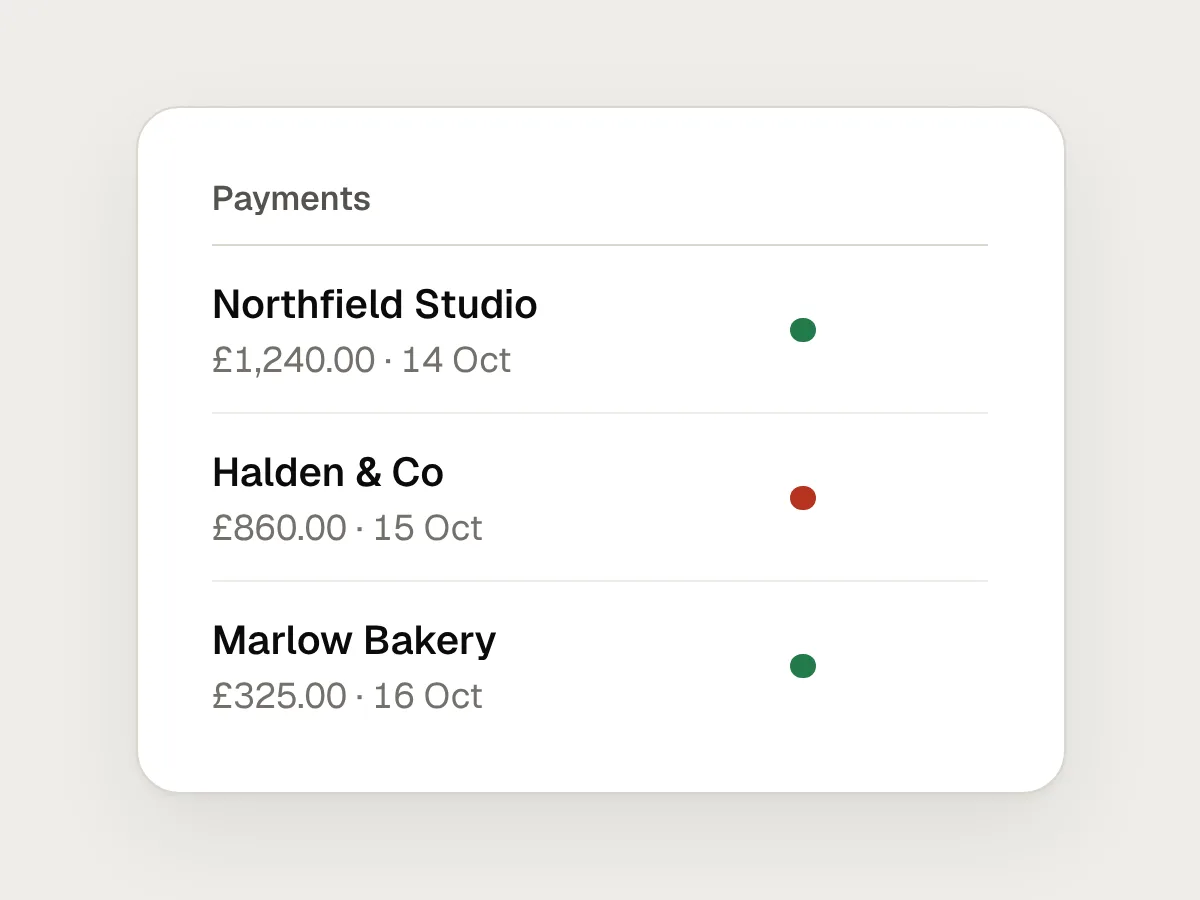
Don’t
Showing errors and success with red and green alone.
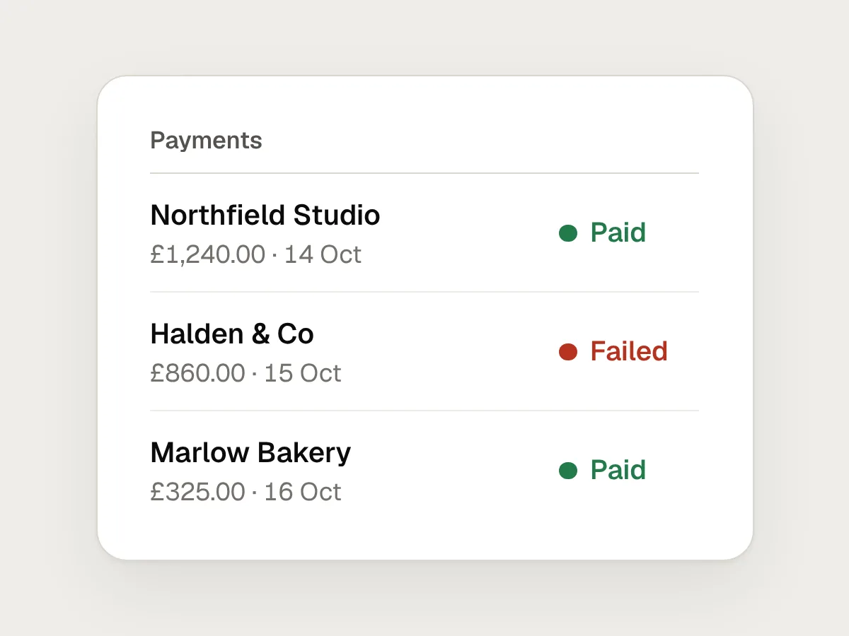
Do
Pair the colour with words, so the message survives colour blindness and a greyscale screen.
How to check colour contrast
1. List every colour pair that carries text
Body text, secondary text, placeholders, links, button labels and any text on a tinted panel or image. Each foreground and background pair is a separate check.
2. Measure each pair
Use a contrast checker, or the one built into your browser’s developer tools. Write the ratio next to the colour in your design file so nobody has to measure it again.
3. Check the parts that aren’t text
Field borders, checkbox and radio outlines, focus rings, icons that carry meaning and chart lines. These need 3 : 1 against whatever sits next to them.
4. Check every state and surface
Hover, focus, selected, error and disabled, on white and on every tinted background you use. A pass on white is not a pass on a light grey card.
5. Fix with the scale
When a pair fails, move it one or two steps darker on the same scale and measure again, before reaching for a new colour.
Questions people ask
What contrast ratio do I need for text?
For WCAG AA, 4.5 : 1 for normal text and 3 : 1 for large text, which is at least 18 point, or 14 point bold. For AAA, 7 : 1 and 4.5 : 1. Accessibility laws and policies usually point to AA.
Do disabled buttons need to meet contrast?
No. SC 1.4.3 and SC 1.4.11 both exempt components that are inactive. People still need to recognise the control and understand why it is off, so don’t let it vanish, and never style a working control to look disabled.
Do icons and borders need contrast too?
Yes, when they carry meaning. SC 1.4.11 asks for 3 : 1 for the parts of a control people need to see, like a field’s border or a focus ring, and for graphics needed to understand the content. Purely decorative graphics have no requirement.
Resources
- Understanding SC 1.4.3: Contrast (Minimum) · W3C
The text rule in full, with what counts as large text and what is exempt.
- Understanding SC 1.4.11: Non-text Contrast · W3C
How the 3 : 1 rule applies to borders, focus indicators and graphics.
- Understanding SC 1.4.1: Use of Color · W3C
Why colour can’t be the only way you show an error, a link or a state.
- Accessibility · Apple Human Interface Guidelines
Apple’s contrast guidance for apps, with minimum ratios by text size.
If this was useful, share it with someone it would help.