How-to
How to build a design system in Claude Design
How to build a design system in Claude Design from your code, decks and brand files, check it with test designs, and keep every new design on brand.
· 7 min read · Musab Alfawal
On this page
Claude Design is Anthropic’s tool for making designs, prototypes, slides and one-pagers by working with Claude. Without help, it picks fonts, colours and components that look tidy but don’t look like your product. A design system fixes that. It is a reference Claude reads before every design: your colours, your type, your components and how you space things out.
This guide shows how to build one, how to check that it’s right, and how to keep it current. Claude Design is changing quickly, so the menus you see may be named differently. Anthropic’s help centre, linked at the end, has the current steps.
What a design system in Claude Design holds
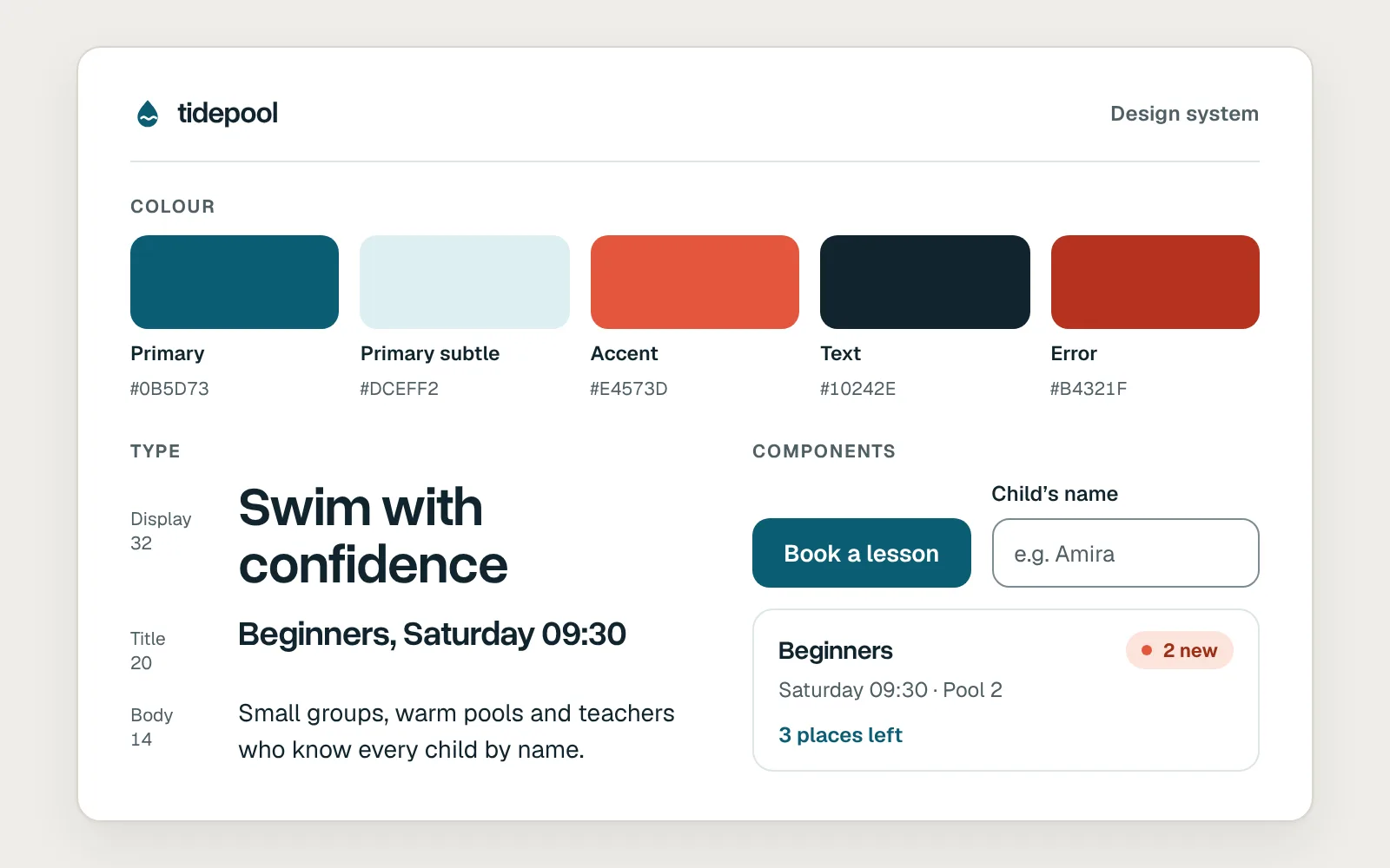
A design system in Claude Design usually covers four things: a colour palette; typography, meaning the families, sizes and weights; components, such as buttons, fields, cards and navigation; and layout patterns, such as spacing, grids and how pages are put together.
Each design system is saved as an artifact that Claude can use in any chat, including in Claude Code. Once it is set up, new designs and slide decks pick up your colours, fonts and components without you asking.
It doesn’t replace your real design system in Figma or in code. It is Claude’s copy of it, built from what you give it, so it is only as good as that material.
The difference it makes
Here is the same request, “Design the home screen of a swim-school booking app”, made twice: first with no design system, then with the school’s own.
Before
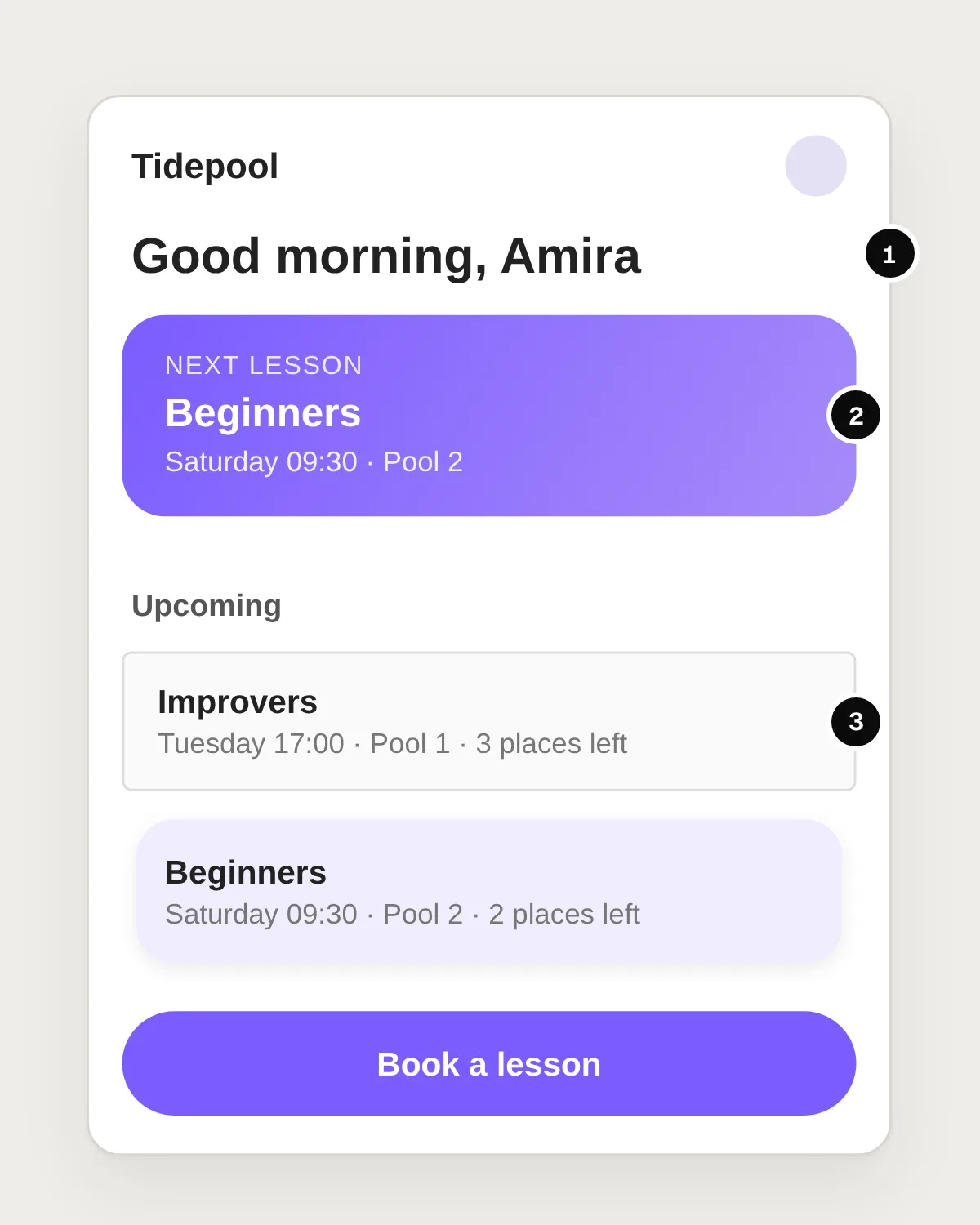
- A default typeface, not the brand’s.
- Colours Claude chose for itself.
- A button and cards that look nothing like the real app.
After
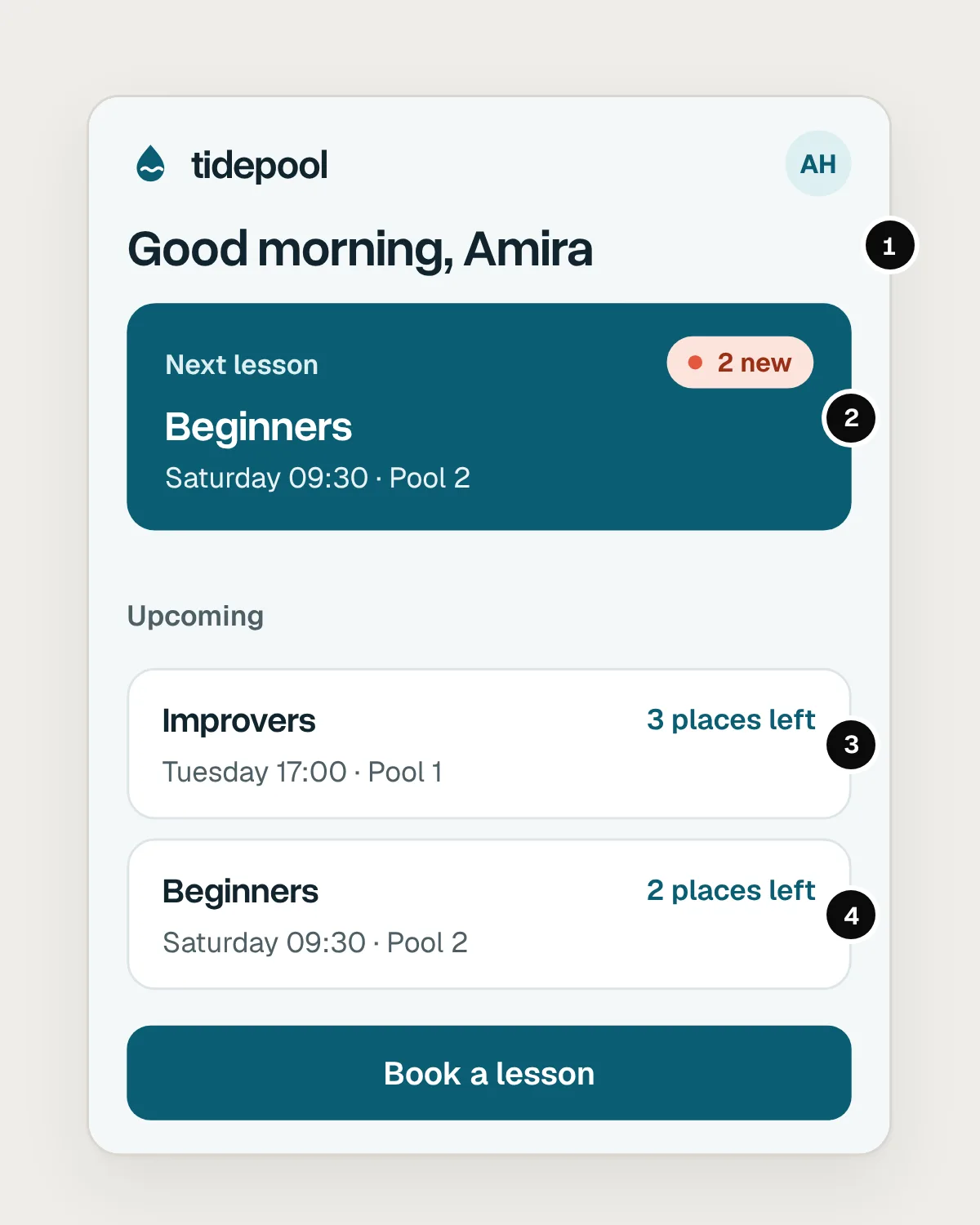
- The brand’s typeface and type scale.
- The brand’s colours, each used for its job.
- The app’s own lesson card and button.
- The same spacing and corner radius as the real product.
Gather your source material
Claude builds the system from what you give it, so this step matters most. You need at least one of three kinds of material.
Code: a repository with your component library or design tokens. This gives Claude the most exact components, sizes and colours.
Finished work: a landing page, a well-made slide deck or PDF, or screenshots of your product. These show how the parts are used together, which a list of colours can’t.
Brand assets: your logo files, colour palette and type specimens.
One source is enough to start, and more give Claude more to work with. Anthropic’s own advice is to include real examples, such as a finished landing page, and not only specs. A palette tells Claude which colours you have. A finished page shows it how you use them.
How to create the design system
There are two ways to create one, depending on where your design system lives today.
If your brand lives in files, start from a chat. Attach your brand files, decks, logos, fonts and screenshots, or point Claude at them in your connected apps or in Figma, and ask it to build a design system from them. This works best for brand design systems: fonts, colours and guidelines.
If your design system lives in code, start from Claude Code. When your components are written in React, run /design-sync in Claude Code from your repository. It reads your tokens and components directly, which suits a product design system that already exists in code.
Either way, say what each file is for. A prompt for the first way might read: “Build a design system for Tidepool, our swim-school booking app, from these files. Take colours and type from the brand guidelines PDF. Take components and spacing from the app screenshots. The logo comes in two versions, for light and dark backgrounds.”
Here is that build, from files to a finished system.
Check it with test designs
Before anyone relies on the system, test it the way your team will use it. Start a few designs with ordinary requests, such as “Create a landing page for Tidepool”, “Design a dashboard showing this week’s lesson bookings” or “Make a one-pager about our summer courses”.
Then put each result next to your real product and look closely. Are the typefaces and weights right? Is each colour used for its job, such as the brand colour only on main buttons and links? Do buttons, fields and cards match yours, in every state? Are spacing and corner radius the same? Is the logo used the right way, with room around it? Does all body text reach a contrast of at least 4.5 to 1?
Fix problems in the system, not in each design
When a test design is wrong, it’s tempting to fix that design and move on. But the next design will make the same mistake. Fix the system instead, and every design after it gets the fix.
If something is missing or wrong, add better source material and ask Claude to rebuild that part, or open the design system and ask Claude to change it. Write rules Claude can check. “Use the accent colour sparingly” can’t be checked. “Coral is only for new and unread badges” can.
Mistakes, and what to do instead
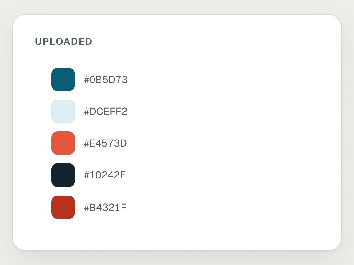
Don’t
Uploading only a colour palette.
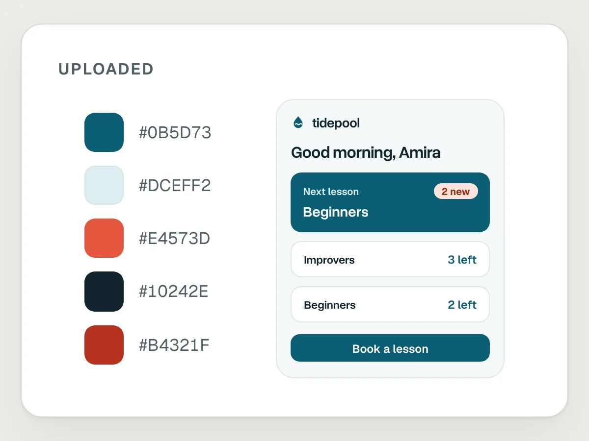
Do
Add a finished page or deck as well, so Claude can see how the colours are used.
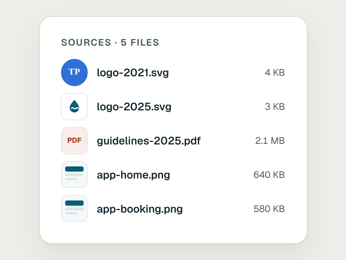
Don’t
Old and new brand files in the same upload.
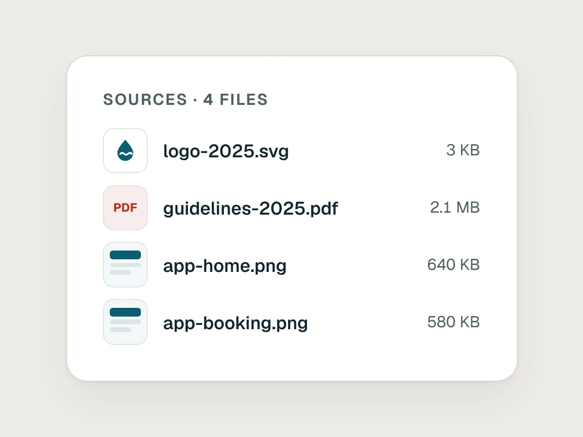
Do
Upload only what is current, and leave retired logos and colours out.
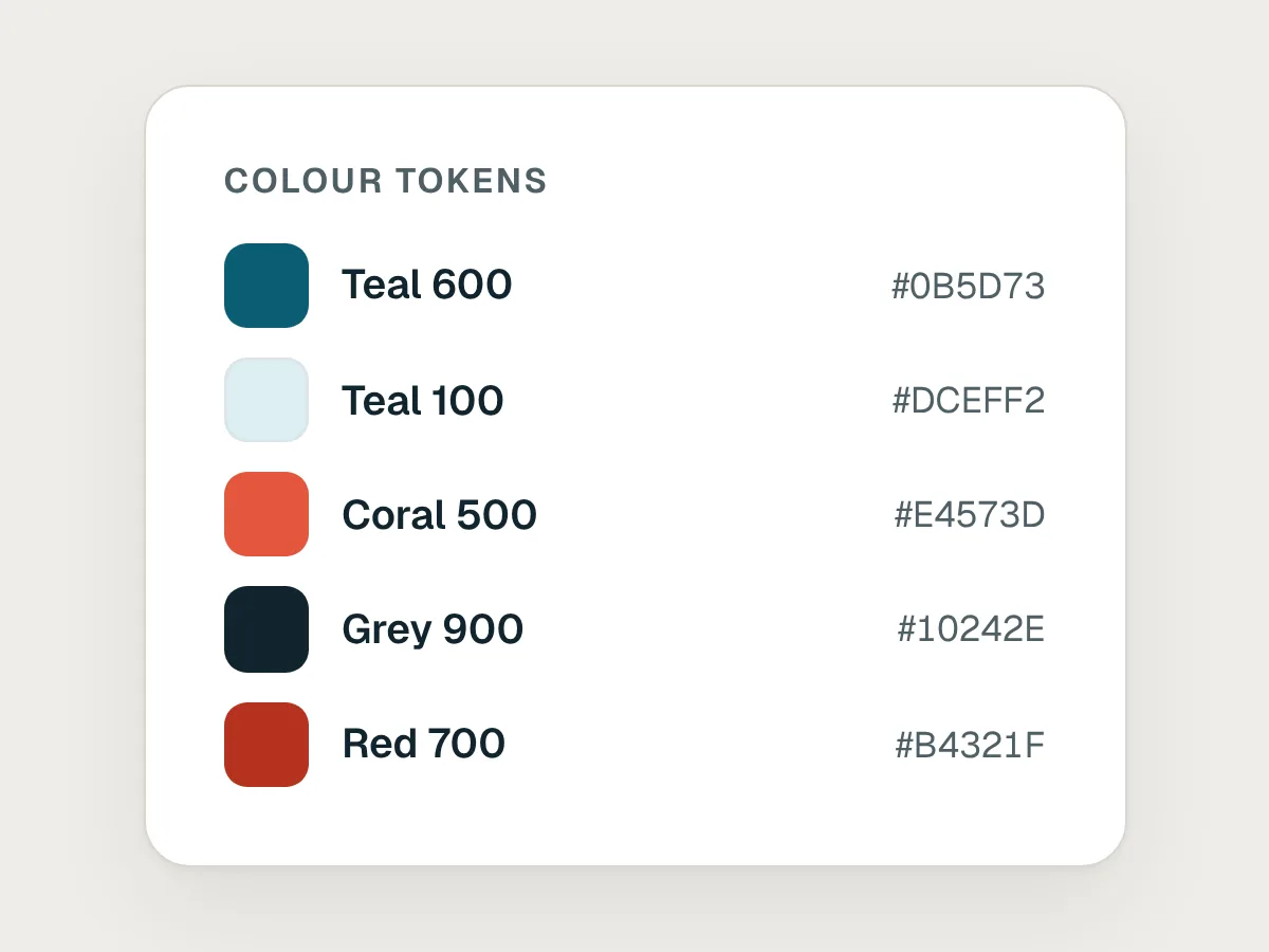
Don’t
Colours named by what they look like: “Teal 600”.
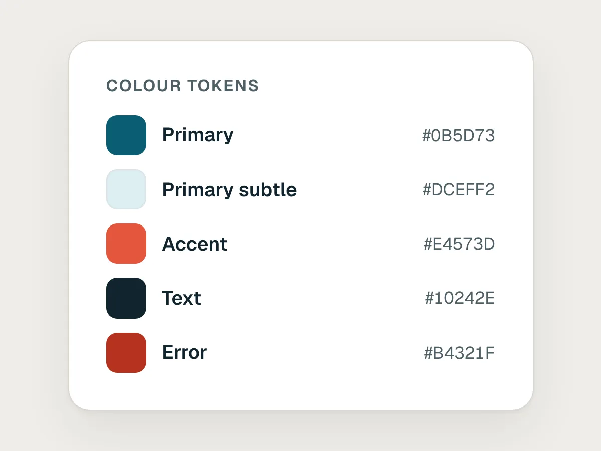
Do
Name colours by their job: Primary, Text, Surface, Error.
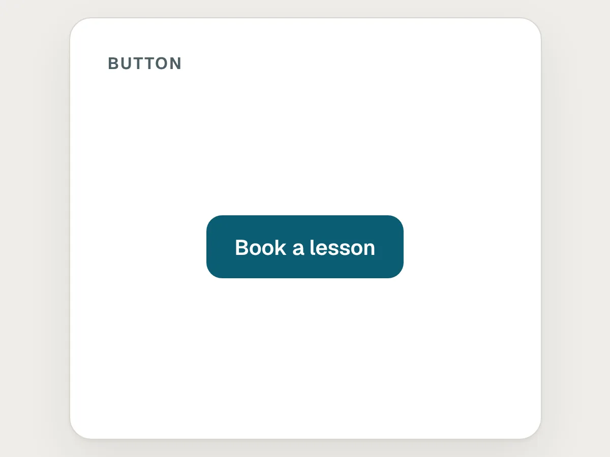
Don’t
A component with only its default state.
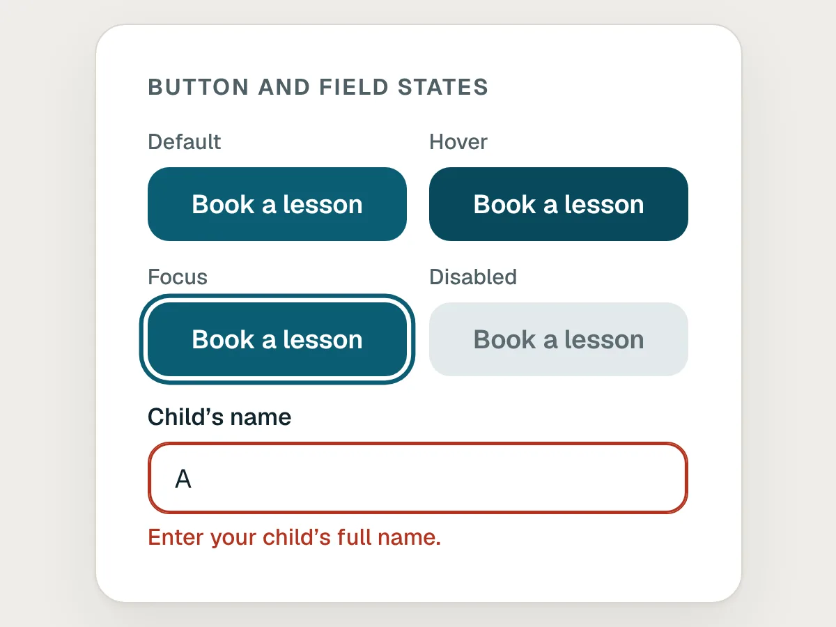
Do
Include its hover, focus, disabled and error states too.
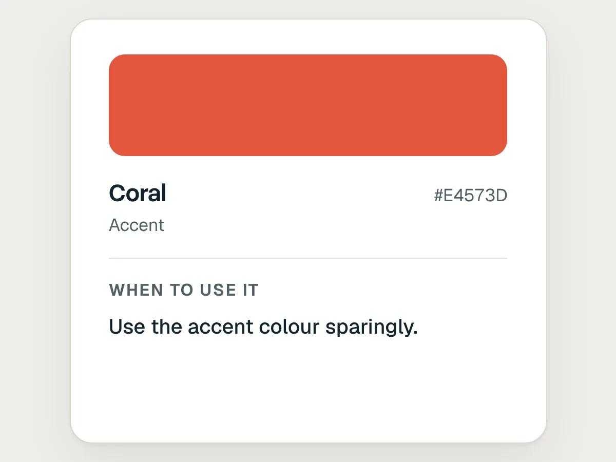
Don’t
Rules that can’t be checked: “Use the accent colour sparingly.”
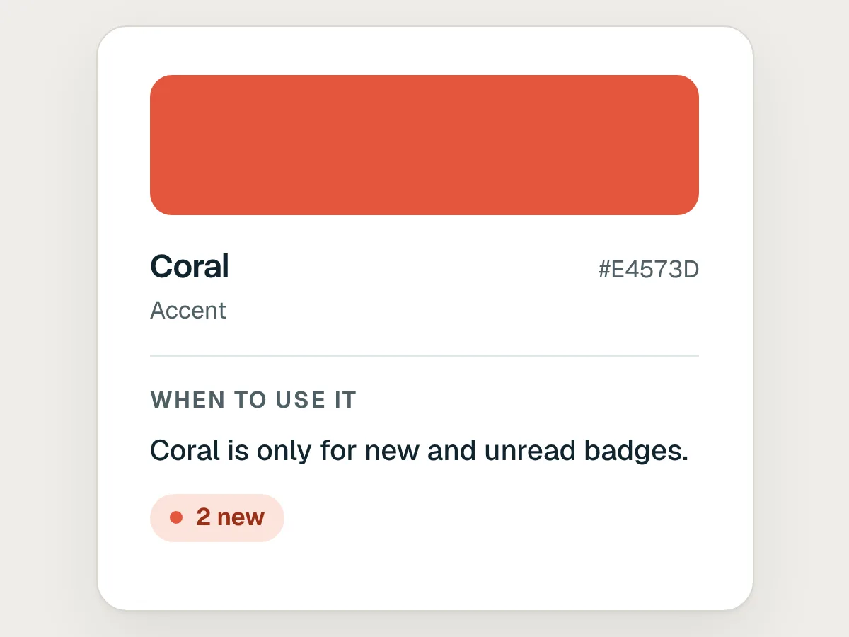
Do
Write rules you could check: “Coral is only for new and unread badges.”
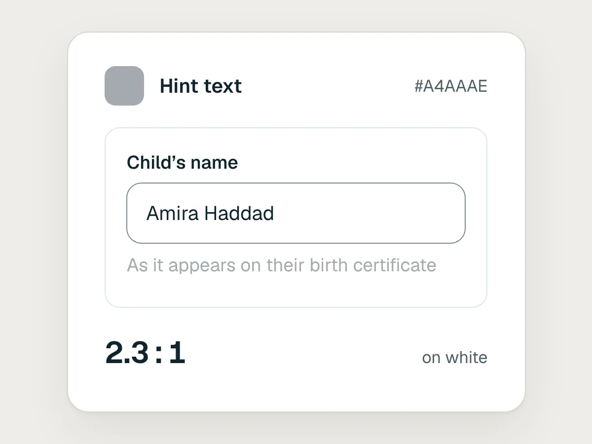
Don’t
A text colour that fails contrast on its background.
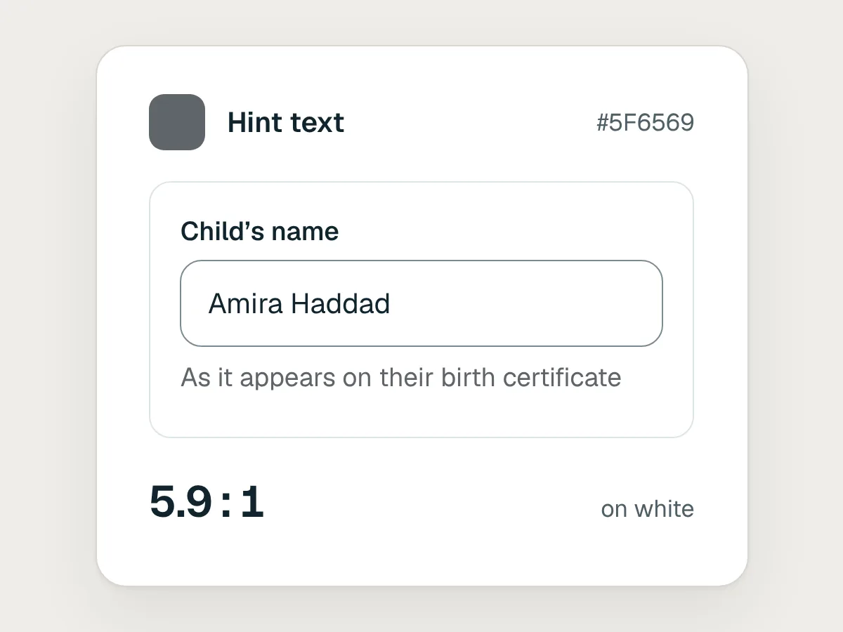
Do
Check every text and background pair in the system: at least 4.5 to 1 for body text.
Make it your team’s default
When the test designs look right, make the system the one new work starts from. Design systems are listed in Settings, under Design systems. Open a system’s menu there and choose Set as default. On Team and Enterprise plans, an owner may need to do this, and owners can limit who publishes design systems or changes the default.
You can keep more than one design system, for example one for the product and one for marketing pages. When you start a design or a slide deck, you can pick which one it uses.
Keep it up to date
A design system goes stale as soon as your product changes and the system doesn’t. Give one person the job of keeping it current. When components change in code, run /design-sync again. When the brand changes, upload the new files and ask Claude to update the system. Then run the same test designs again, so you know the update worked.
Hand designs over to development
Designs made with your system hand over cleanly, because they already use your components. When a design is ready to build, send it to Claude Code, which receives the design and its files together, or export it as a .zip, PDF, PowerPoint or standalone HTML. Developers then start from your tokens and components rather than from a picture they have to rebuild.
Before you share it with your team: a checklist
Questions people ask
Do I need a design system in code to start?
No. A slide deck, a PDF or your brand guidelines are enough to start. Code gives Claude the most exact components, so add it when you have it.
Can I have more than one design system?
Yes. Teams often keep one for the product and one for marketing. Pick which one a design uses when you start it, and set the one most people need as the default.
Does it replace our design system in Figma or in code?
No. It is Claude’s copy, built from your material. Keep your real design system as the source of truth, and update the copy when the real one changes.
Which plans include design systems?
Design systems are in beta on paid plans, and on Enterprise plans an owner has to turn them on first. Check Anthropic’s help centre for your plan, because this is changing quickly.
Resources
- Set up your design system in Claude Design · Anthropic Help Centre
The current steps, menus and plan requirements.
- Get started with Claude Design · Anthropic Help Centre
How to make, edit, export and hand off a design.
- Introducing Claude Design by Anthropic Labs · Anthropic
What Claude Design is for, from its launch.
- Design systems 101 · Nielsen Norman Group
What a design system is, and what goes into one.
- Design tokens · Design Tokens Community Group
The shared format for naming colours, type and spacing as tokens.
- Understanding SC 1.4.3: Contrast (minimum) · W3C
The contrast ratios to check every text colour against.
If this was useful, share it with someone it would help.