Robot Vacuum App
The map is the interface.
Product UX · Interface Design · 2026
- Role
- Context
- Team
- Timeline
- Tools
A robot that works where you are not
A robot vacuum does its job in rooms you are not in. Every complaint about these products is really the same complaint — you cannot tell what it is doing, where it has been, or why it stopped.
So the map is the interface. Every screen below is shown whole and in the order a real owner meets it, from the first launch to the report that arrives when the robot docks itself.
First run
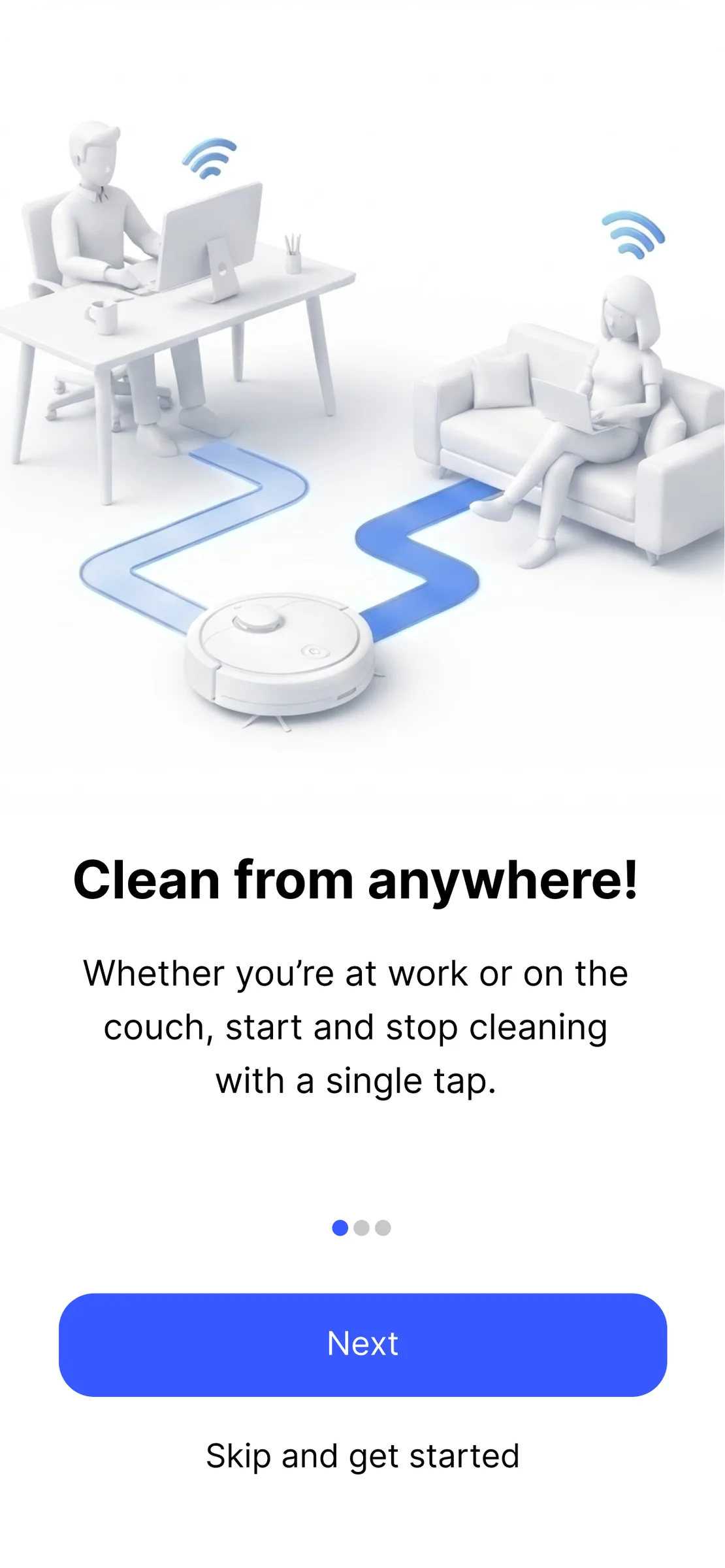
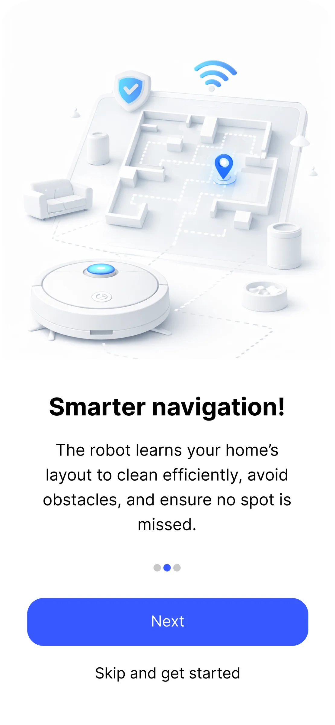
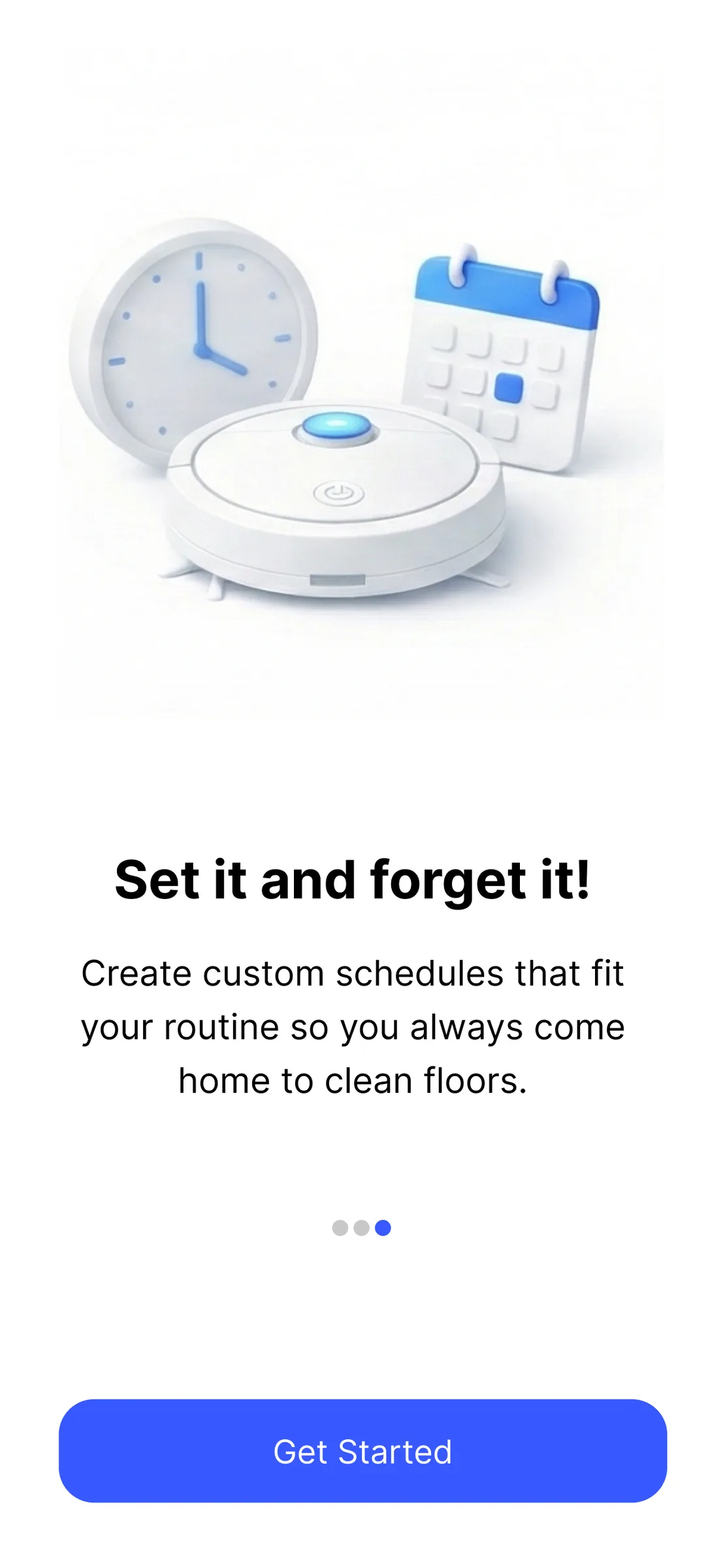
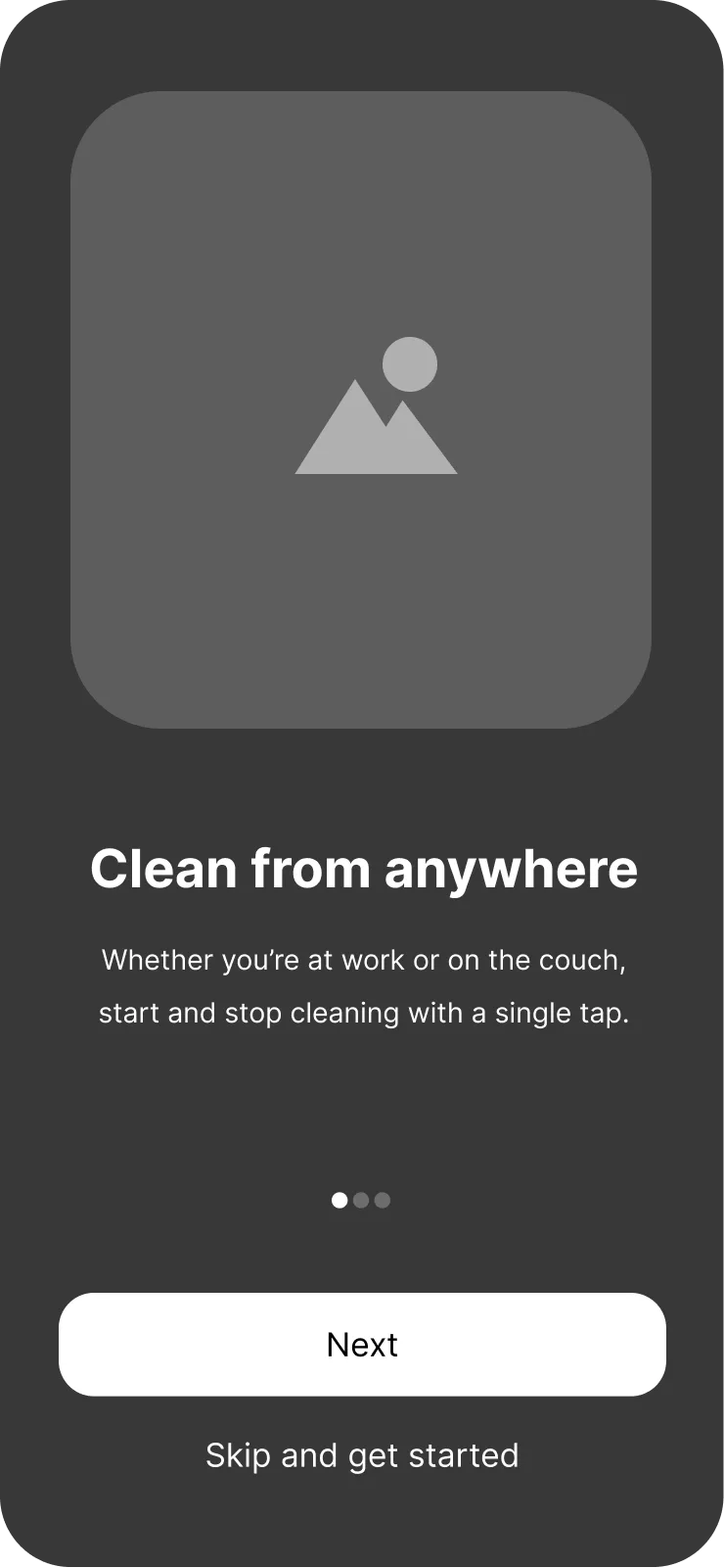
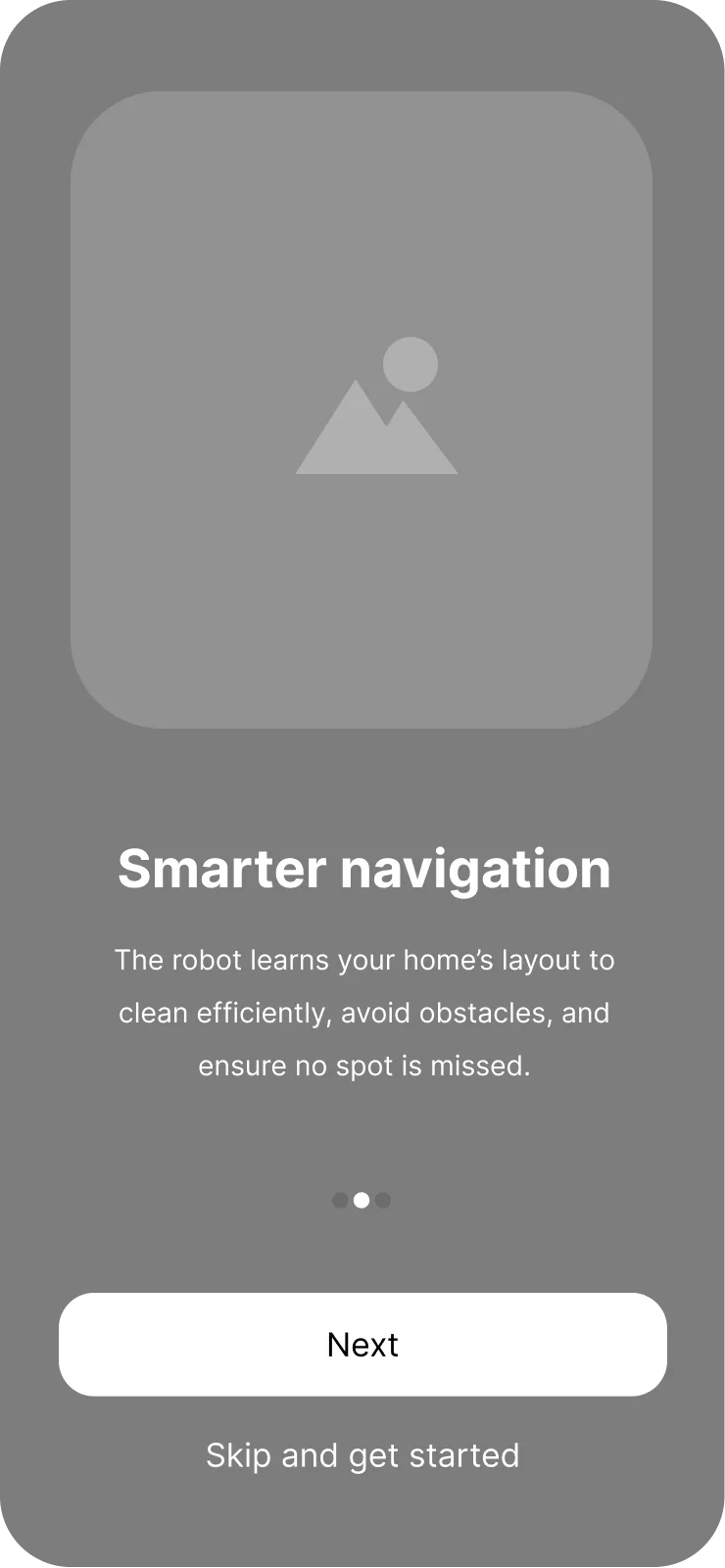
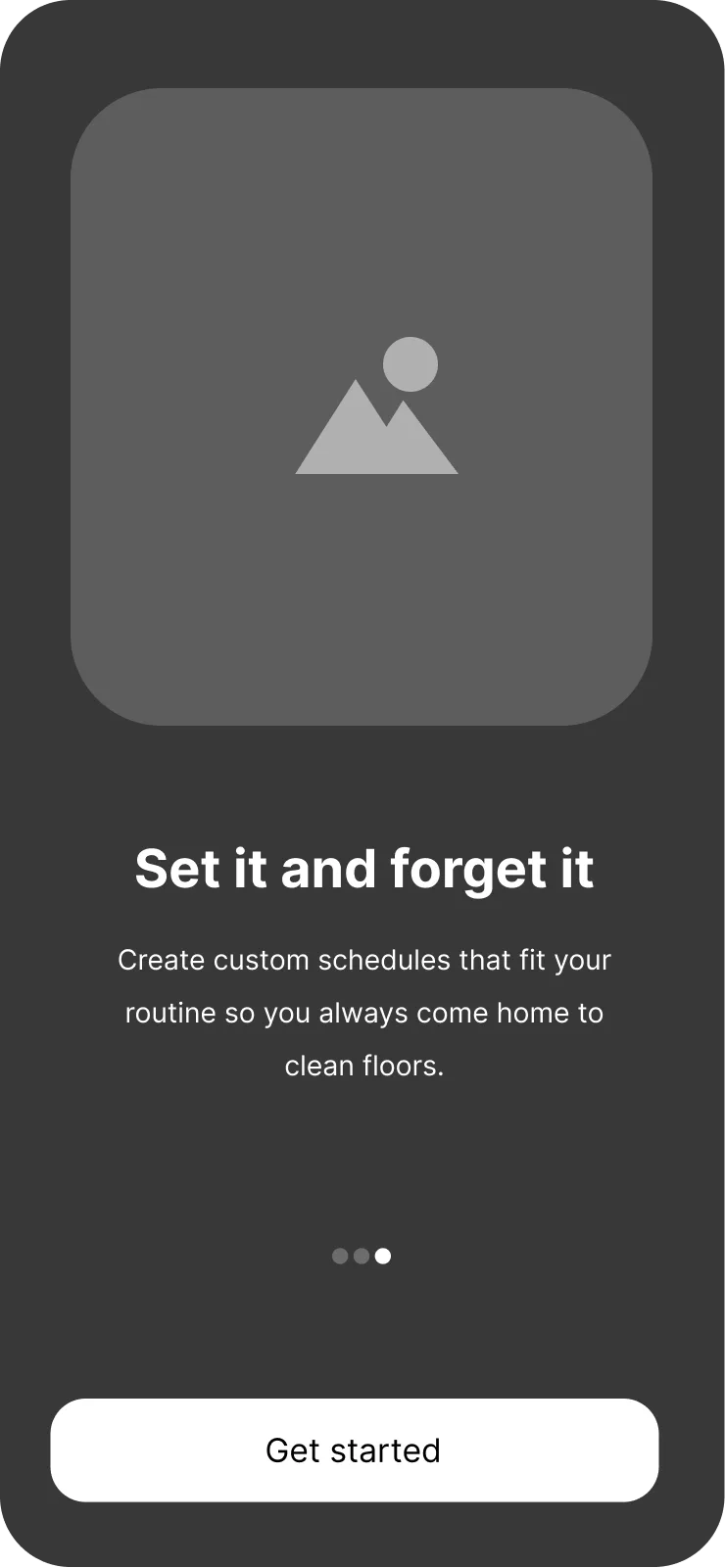
Three slides, then out of the way. Onboarding earns about fifteen seconds of attention, so it makes three promises and stops.

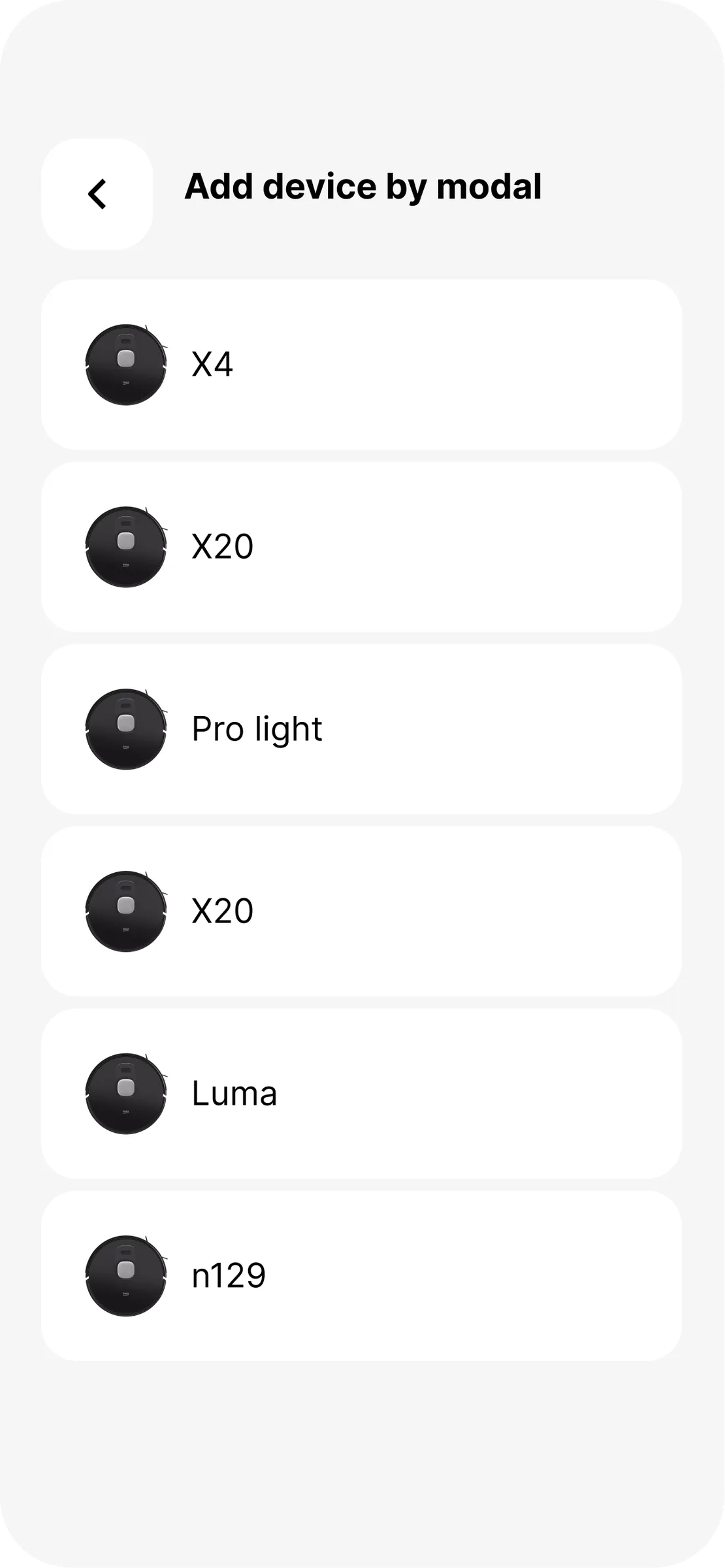
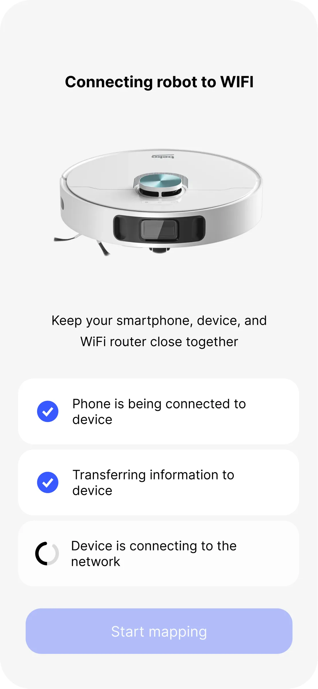
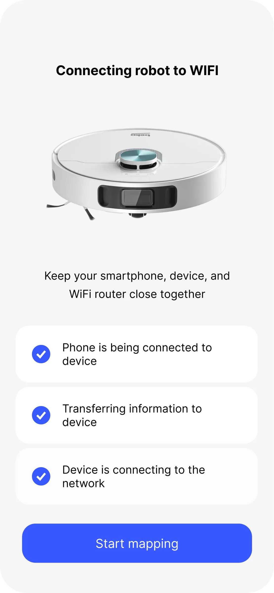
Pairing the robot
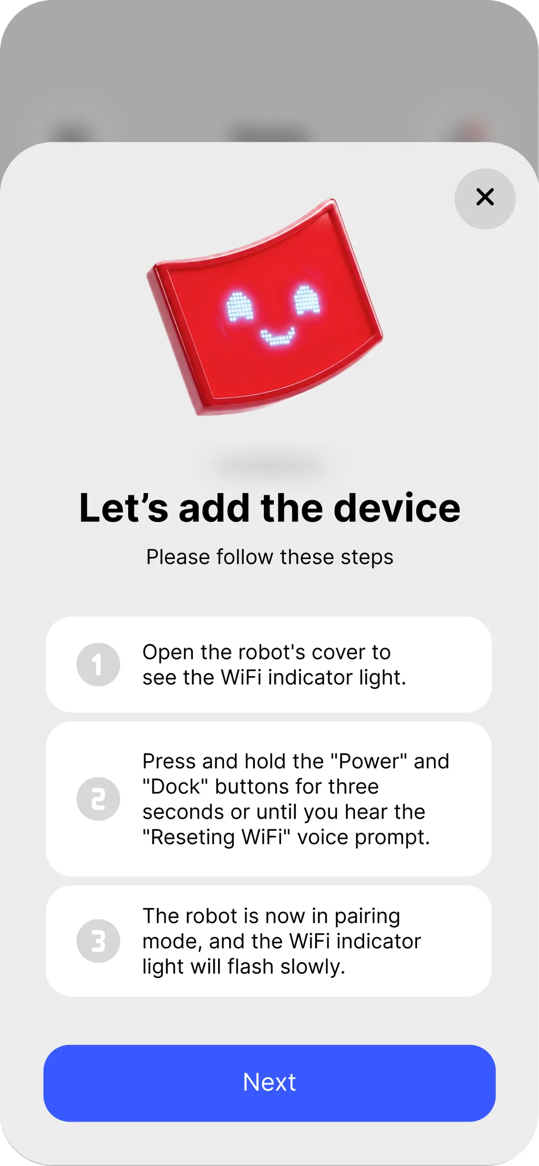
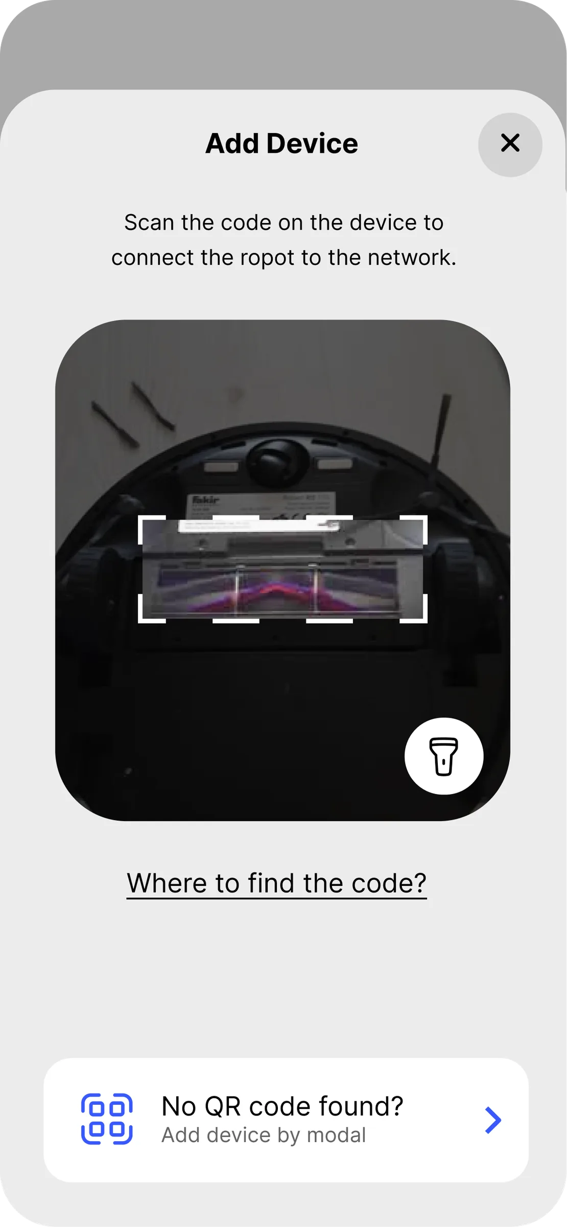
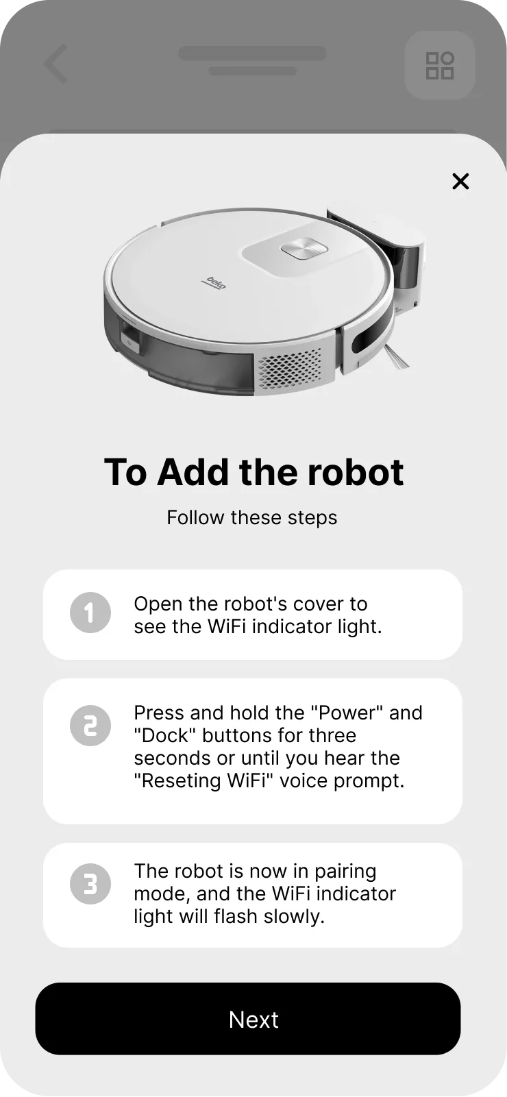
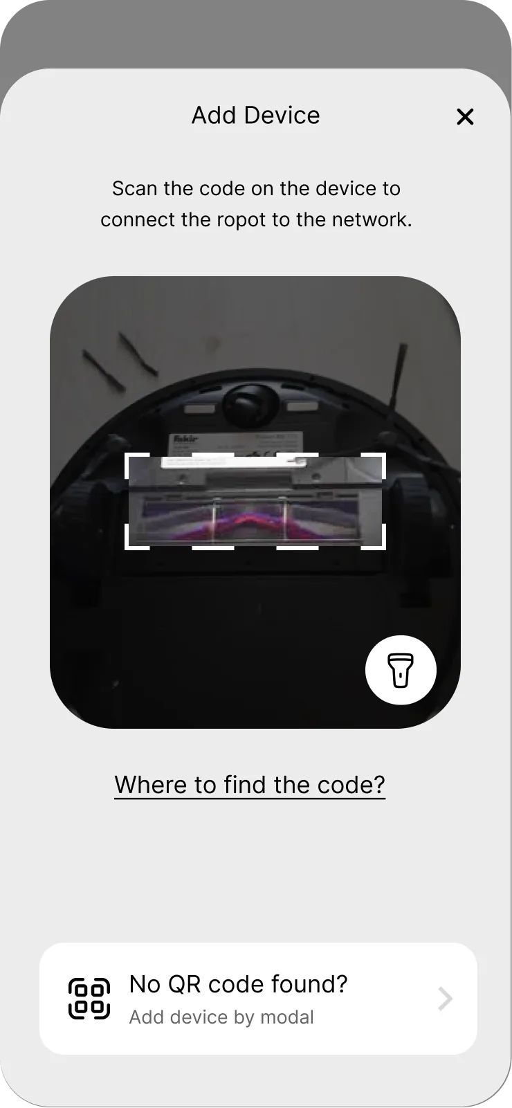
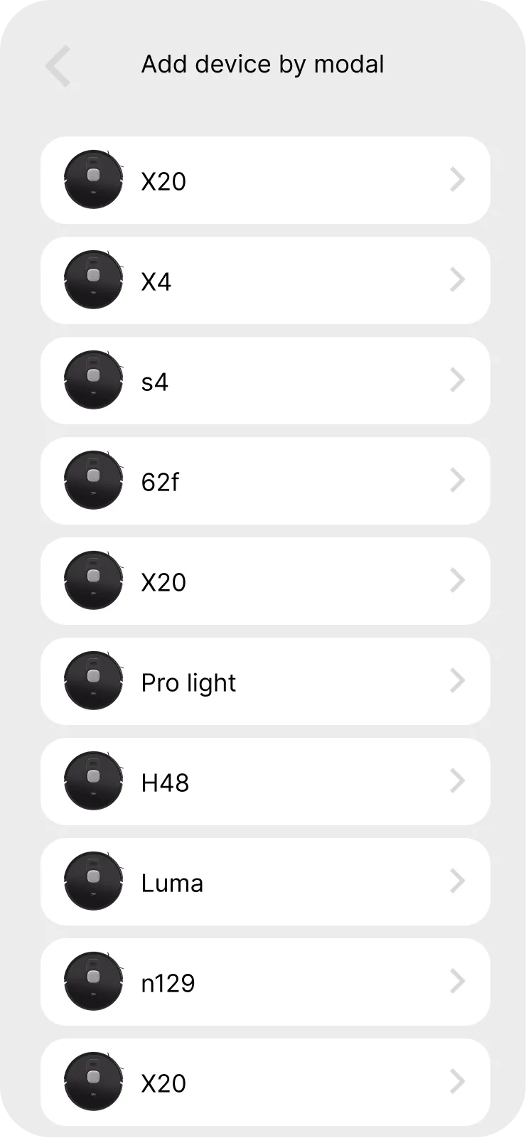
The riskiest five minutes of ownership. Every step says what is happening and what to do if it doesn't — including the escape hatch for a QR code that has already worn off the underside of the unit.
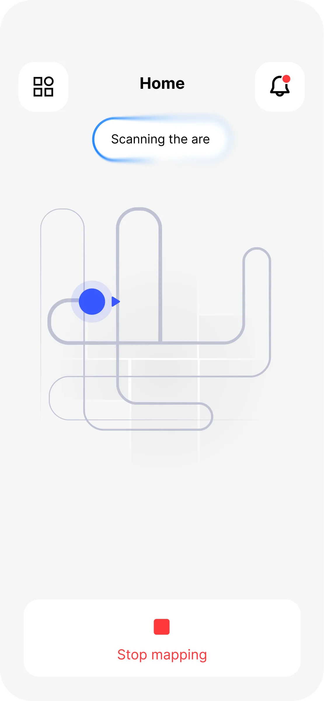
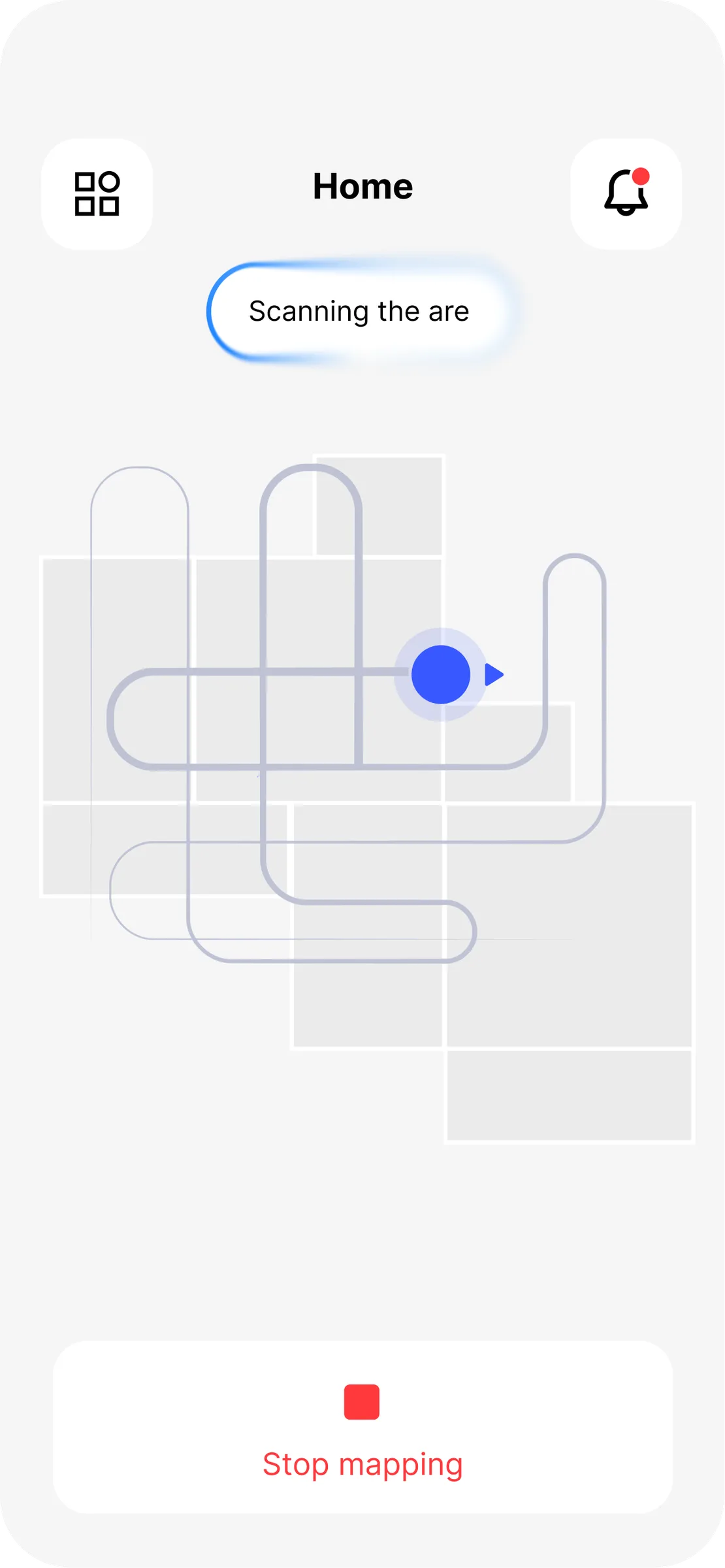
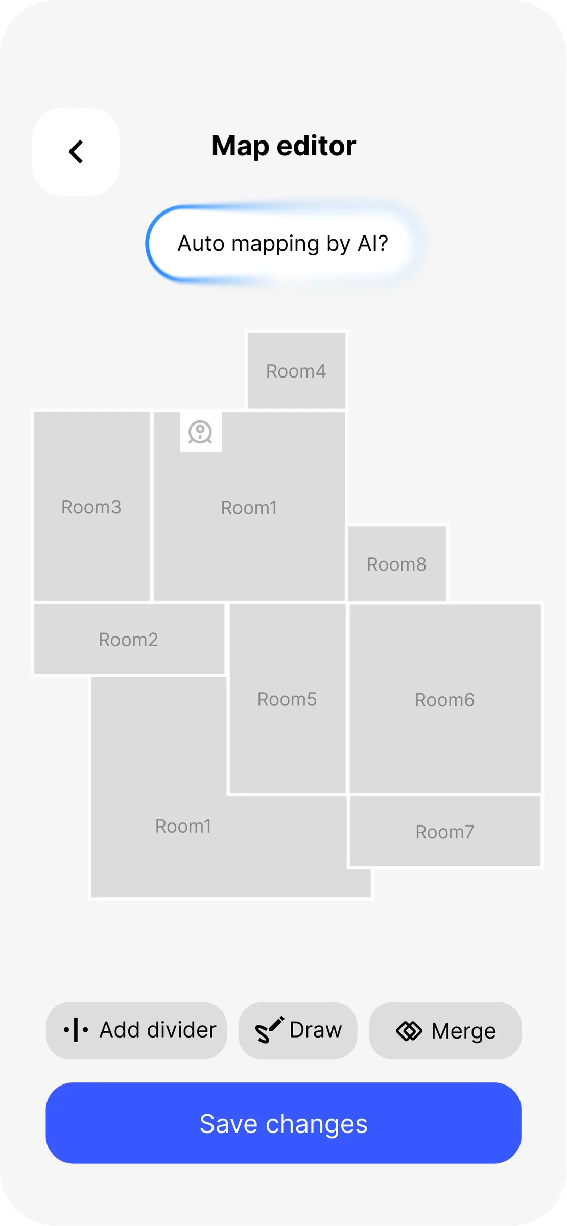
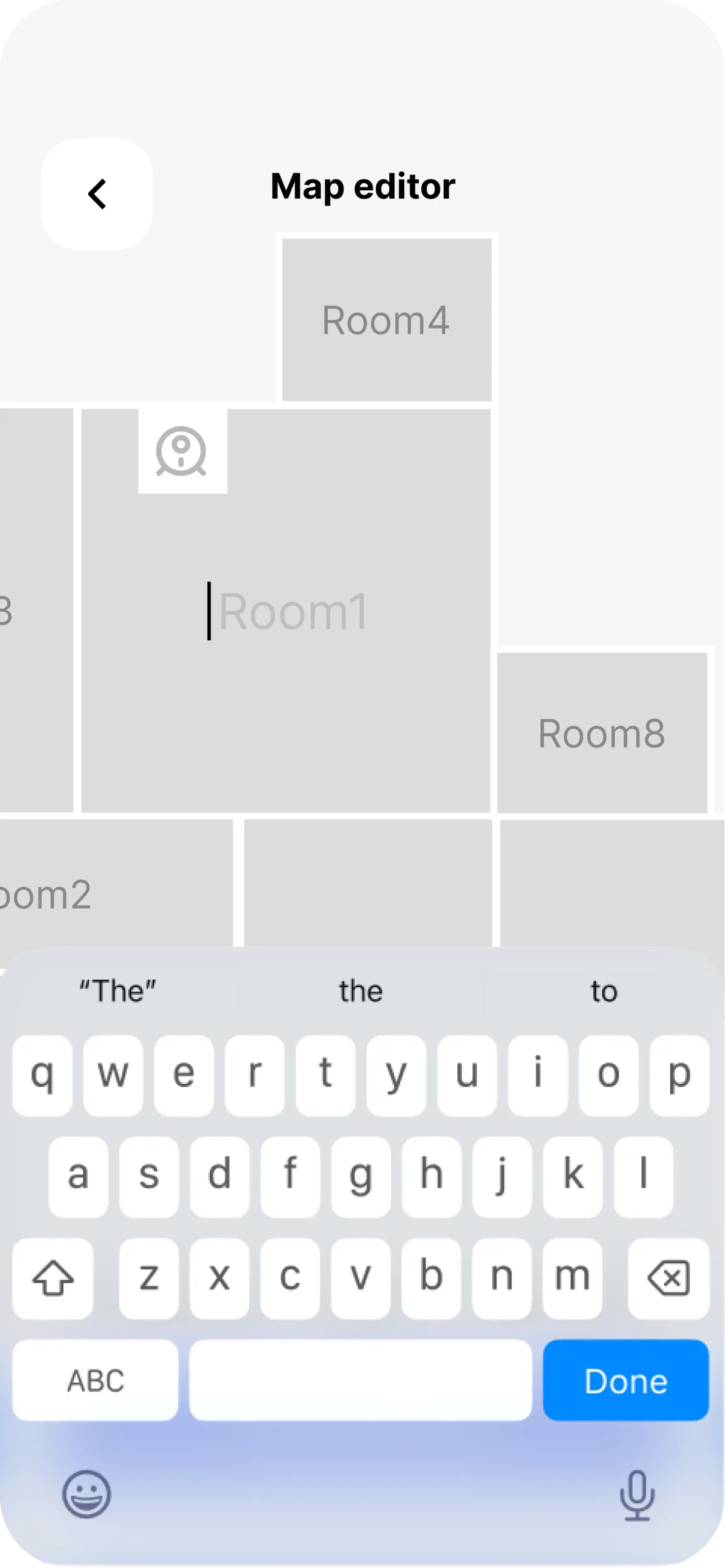
Learning the floor
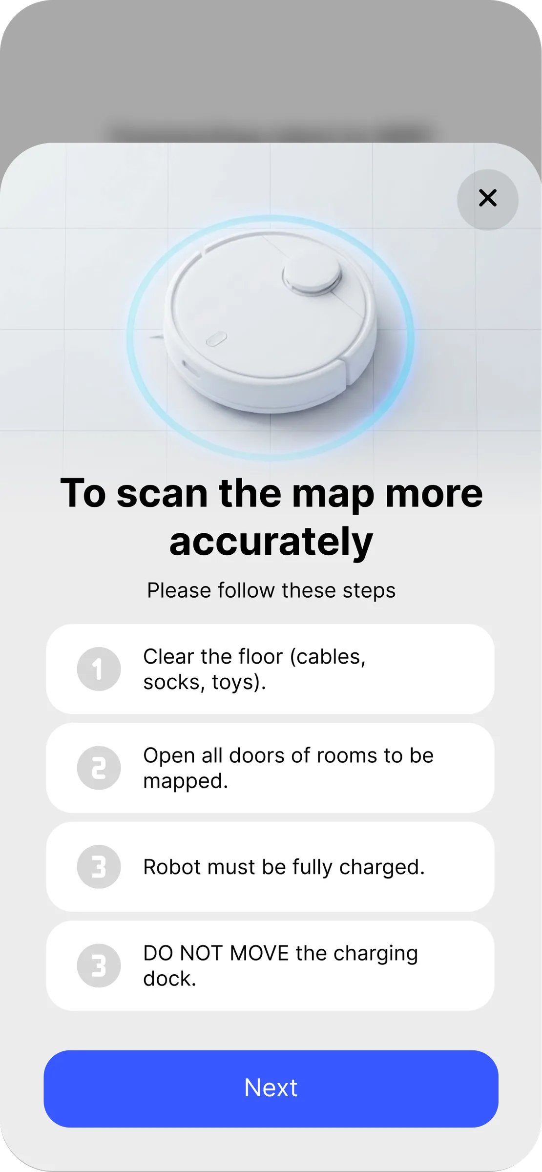
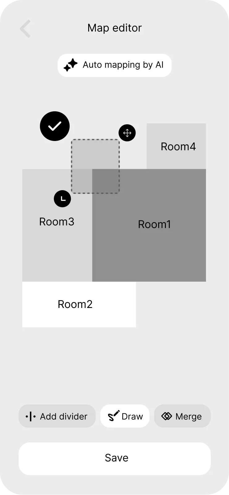
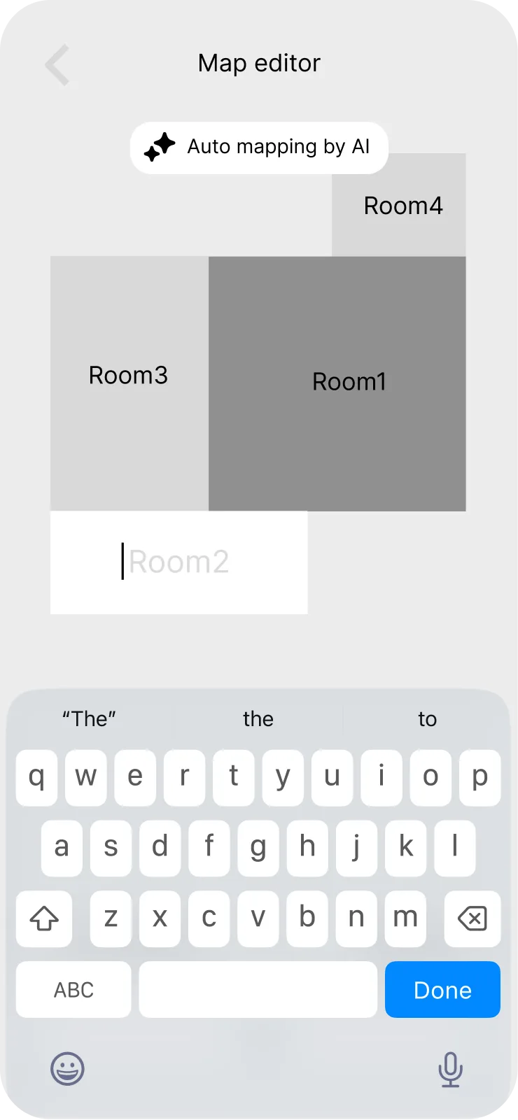
The first map is built once and edited forever. Making the editor part of setup — rather than burying it in settings — means the room names are right before the first real clean.

Choosing the clean
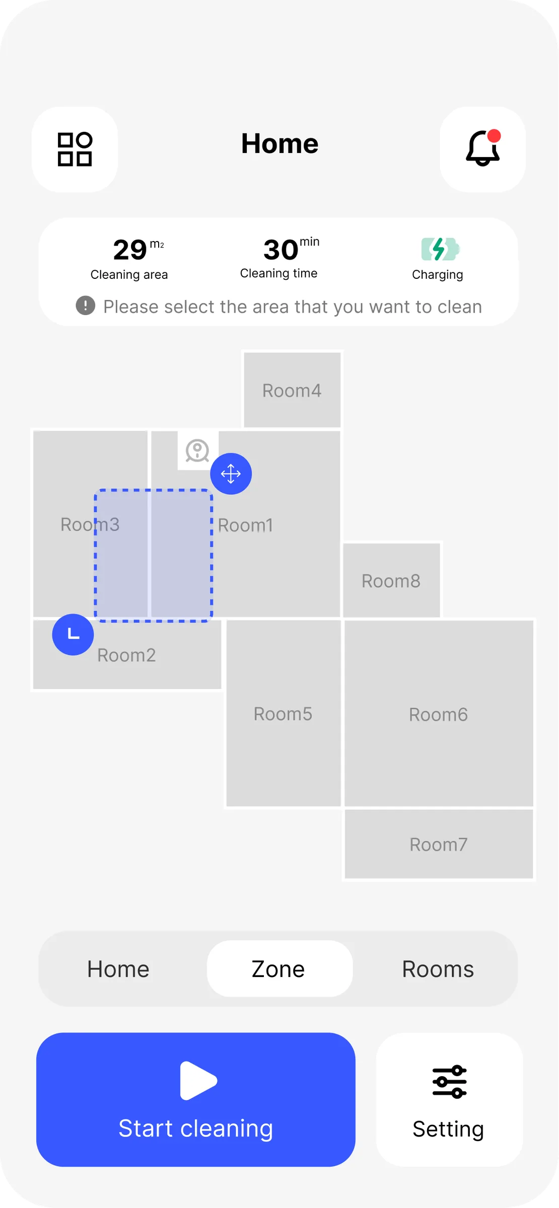
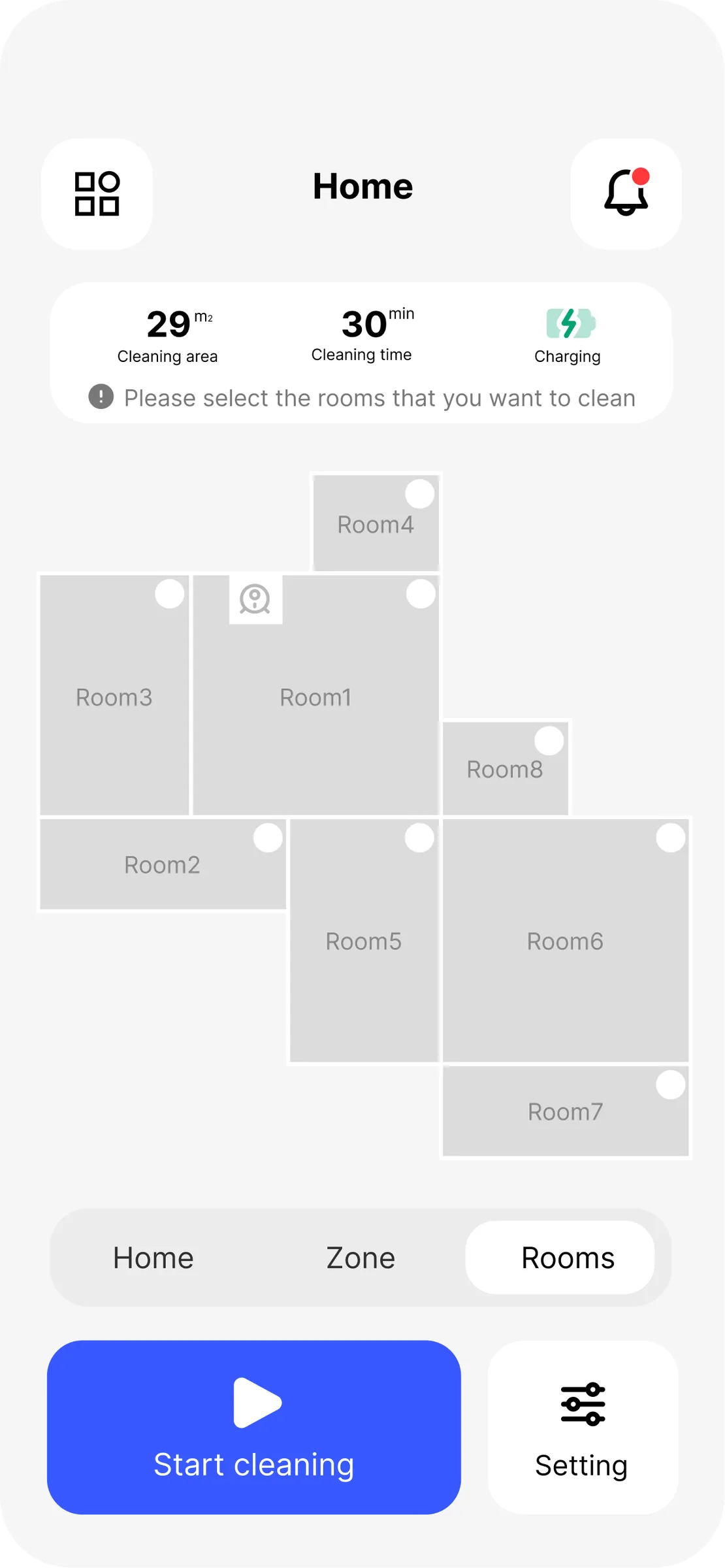
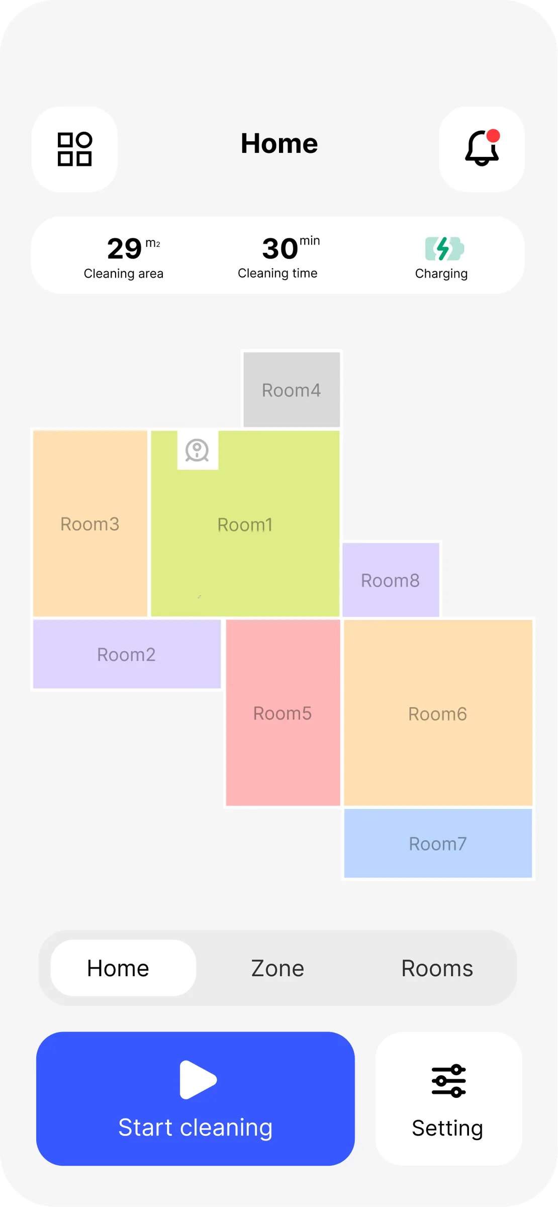
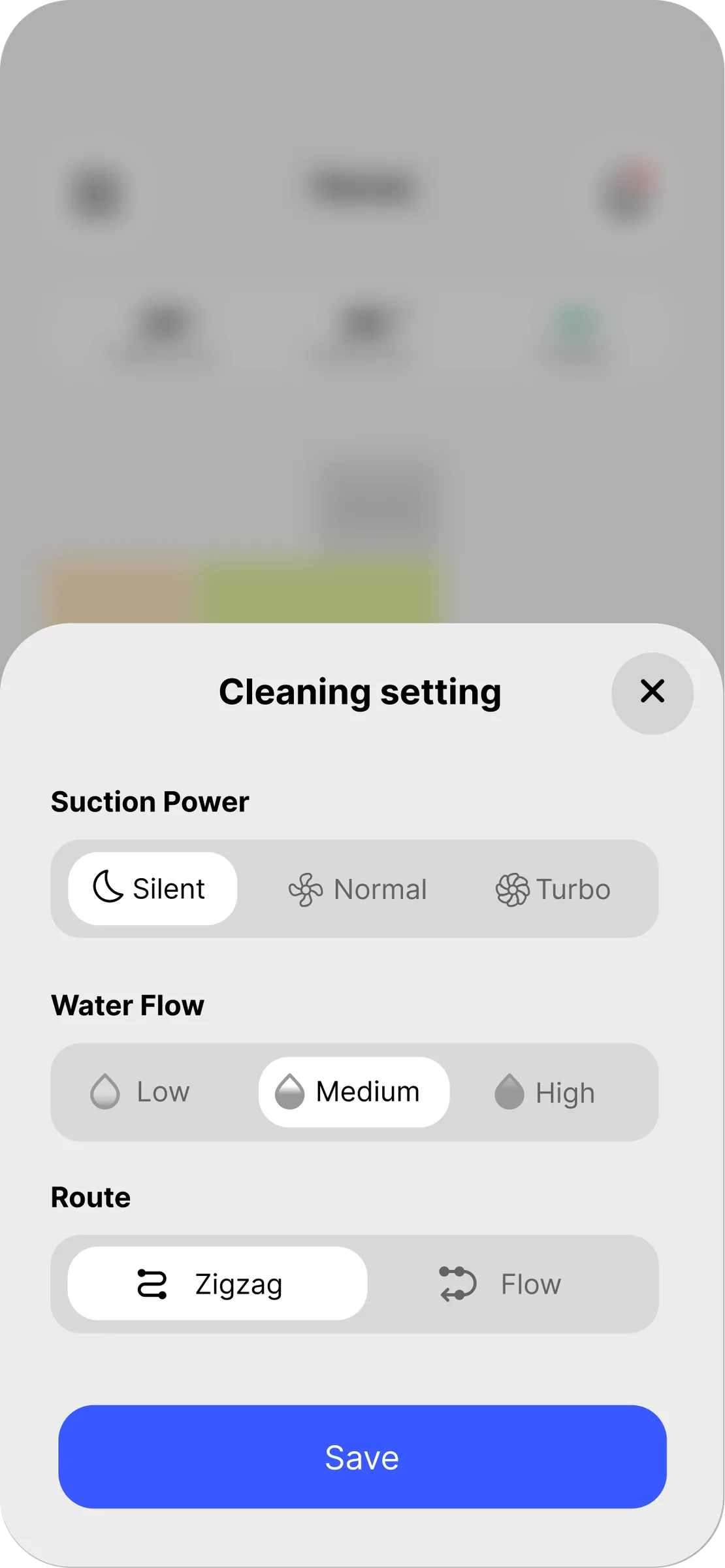
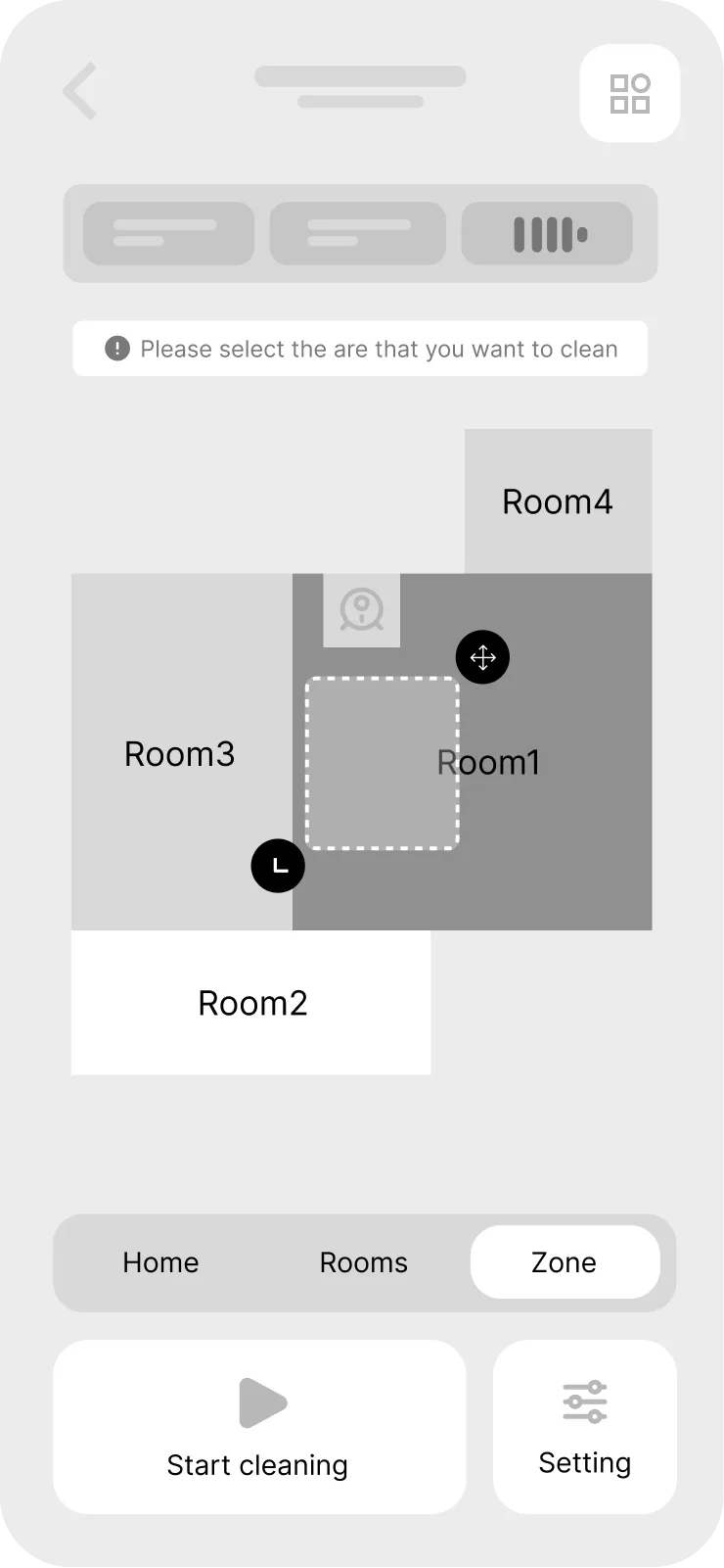
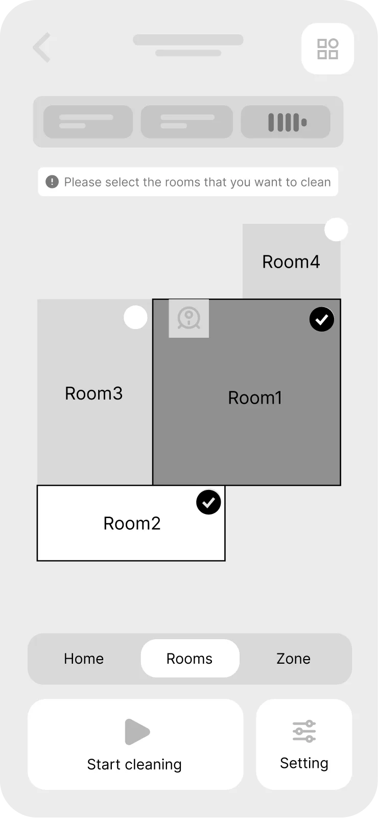
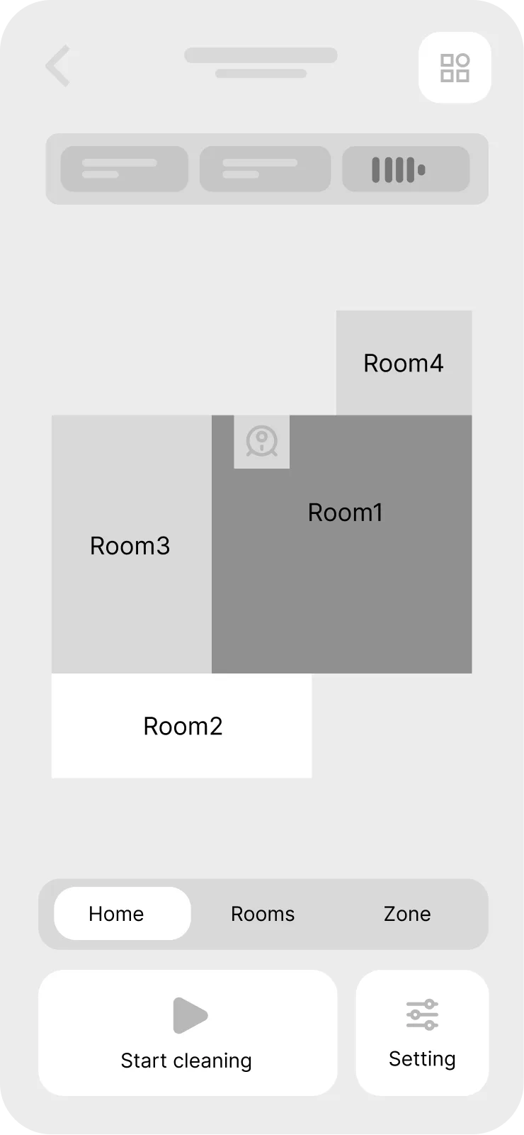
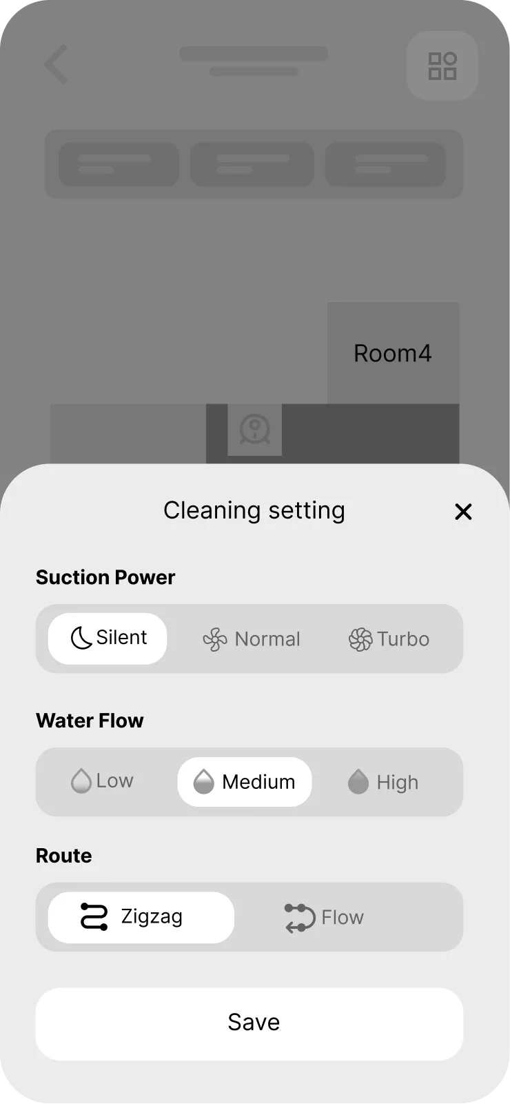
Three ways to say the same thing — the whole home, named rooms, or a box drawn round the thing the dog just did. All three live on one screen, behind a segmented control, with suction, water flow and route on a single sheet.
While it runs
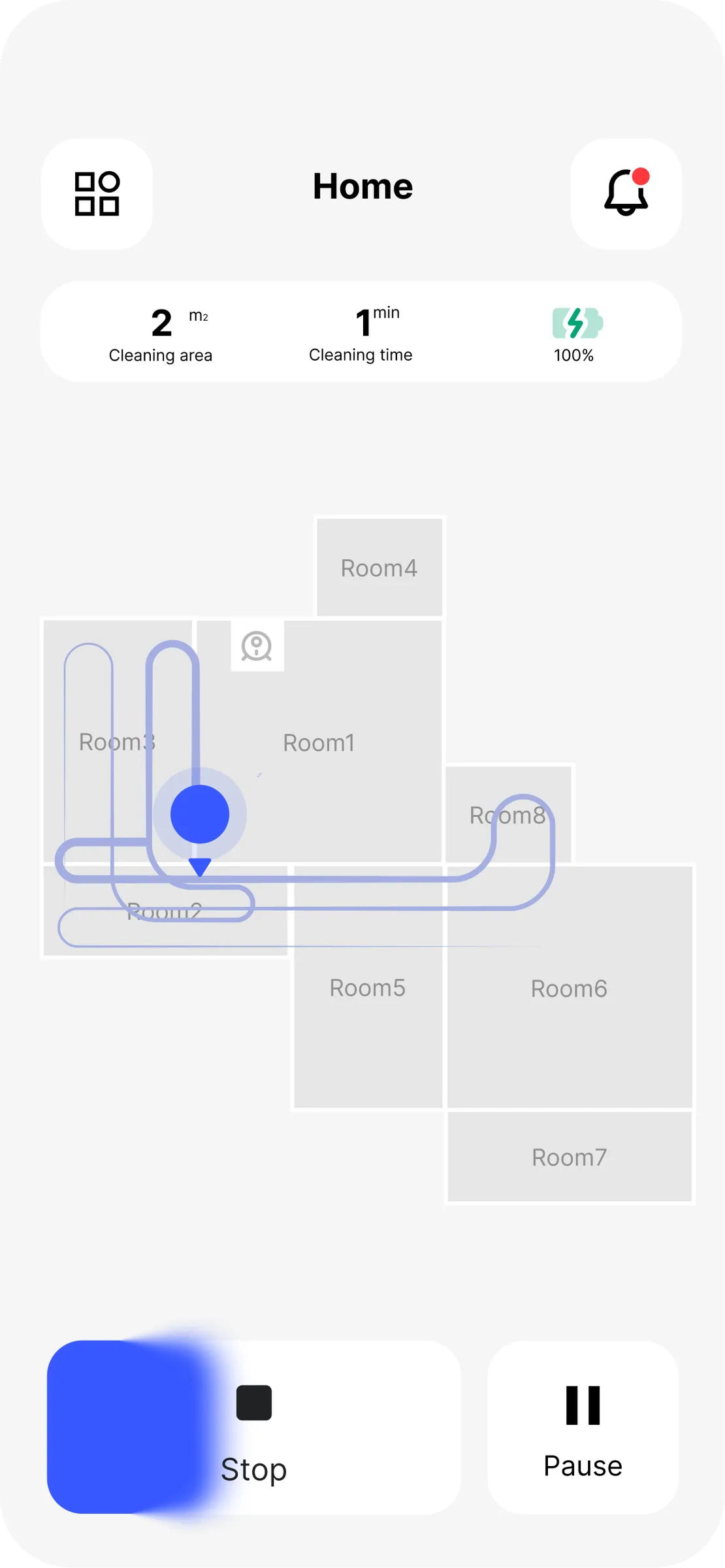
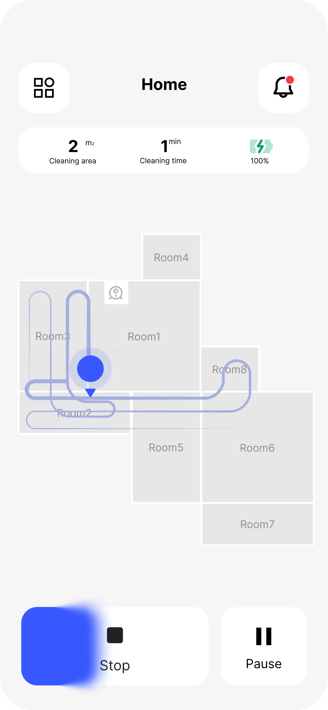
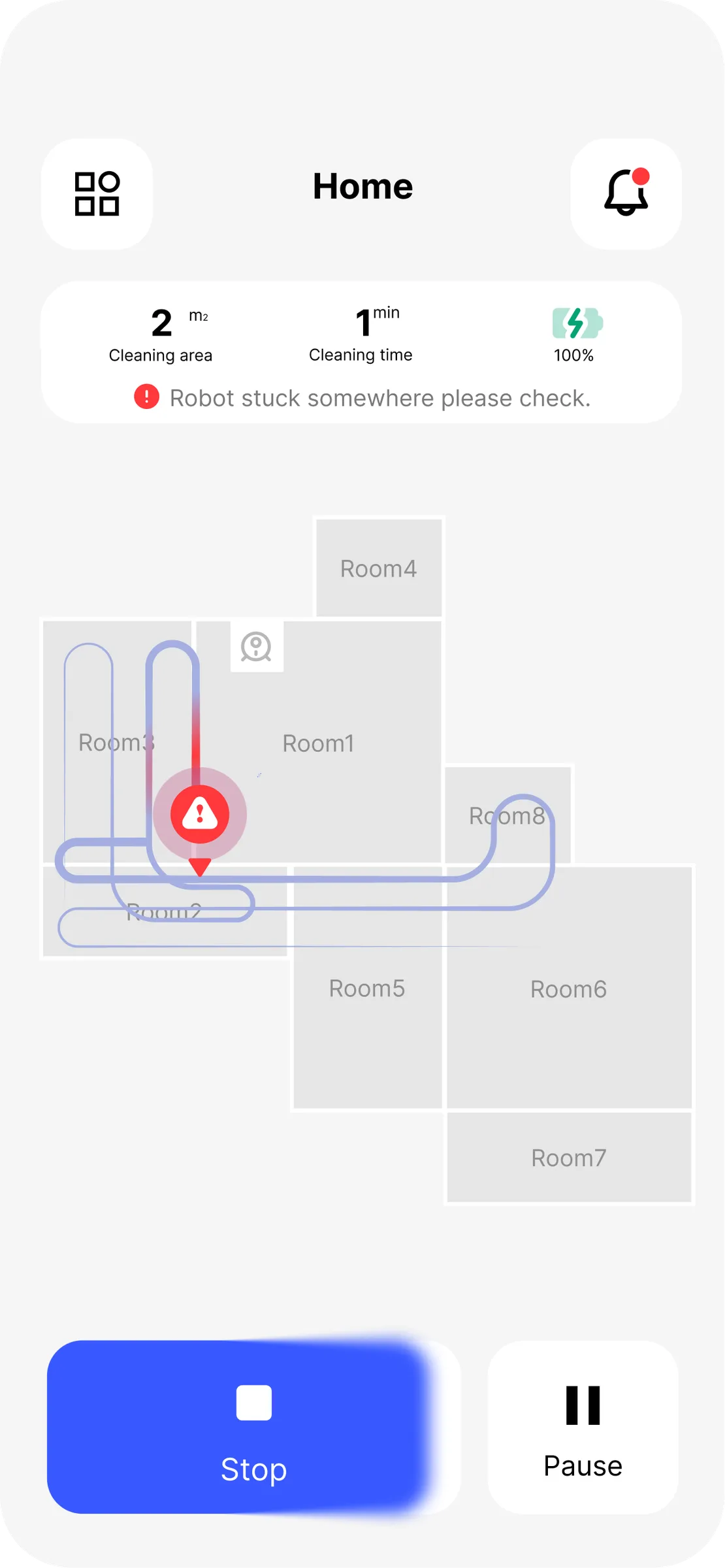
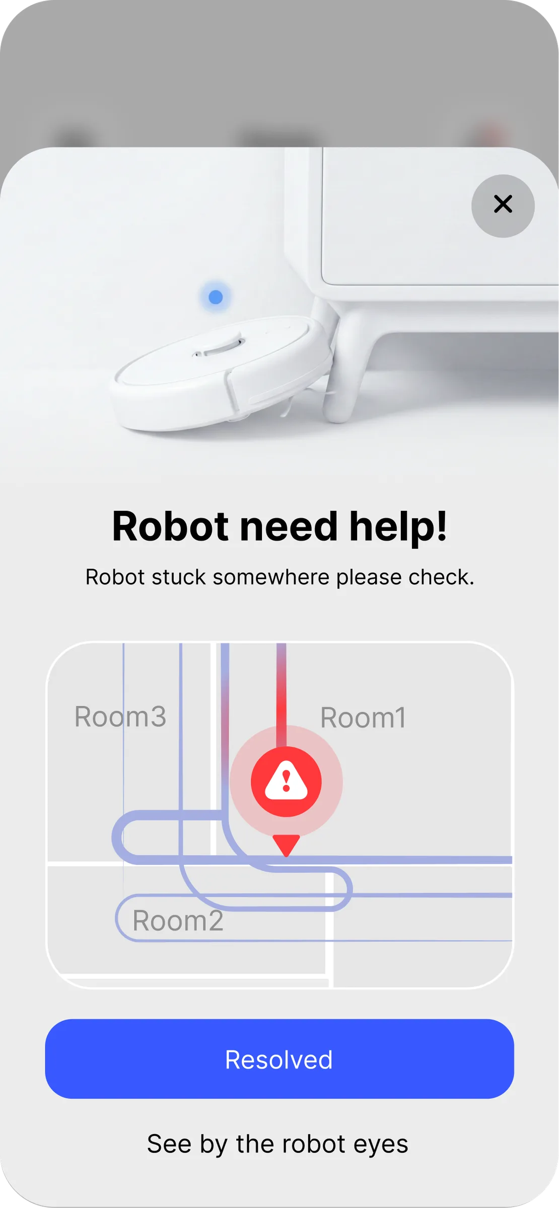
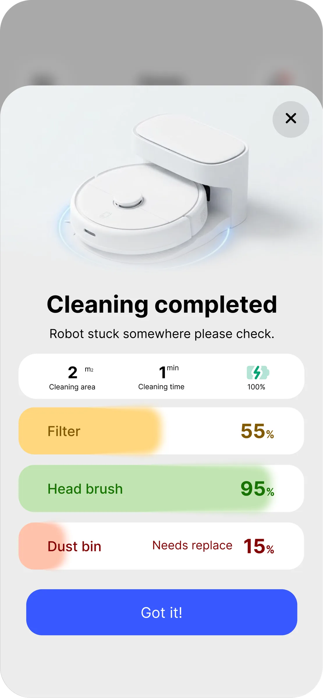
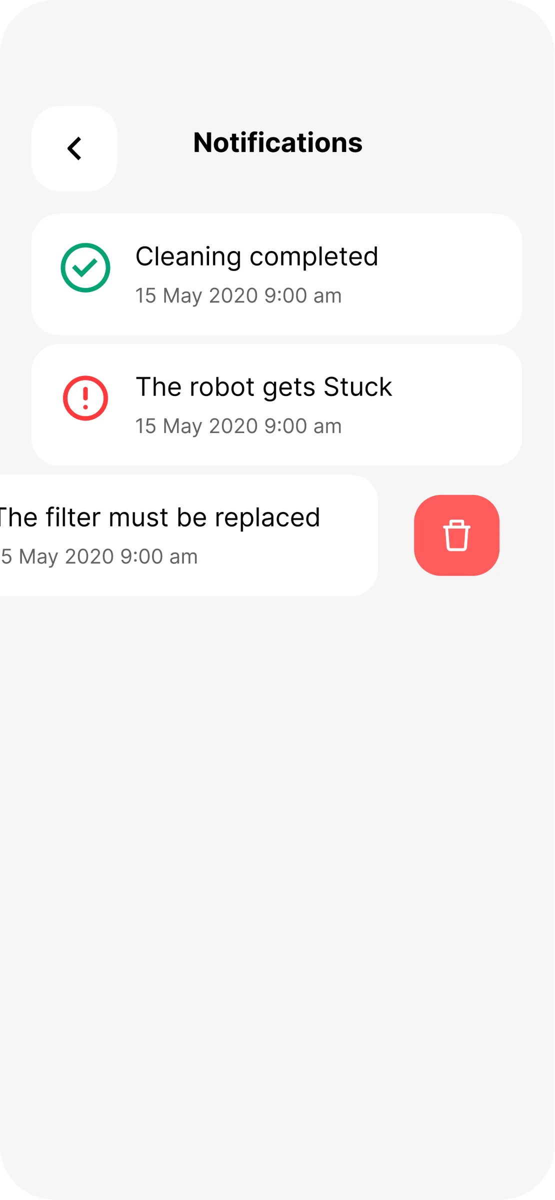
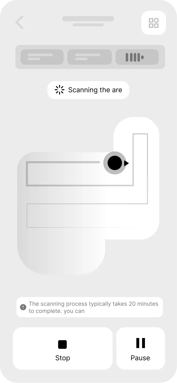
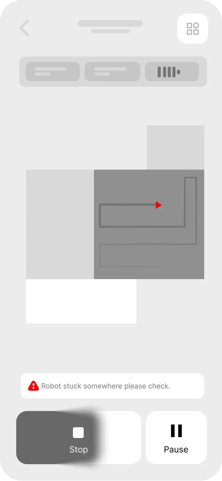
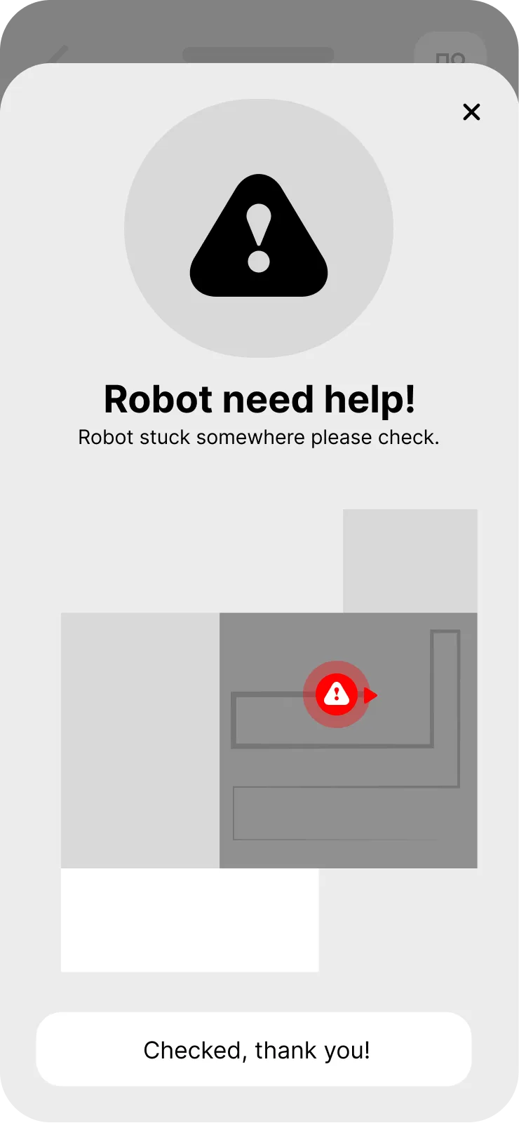
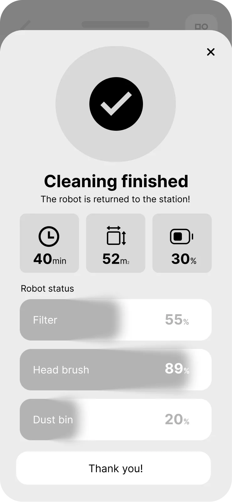
The map keeps drawing itself while the robot works. When something goes wrong, the app says where — a location is more useful than an error code. The clean ends with filter, brush and bin levels rather than a bare number.
Living with it
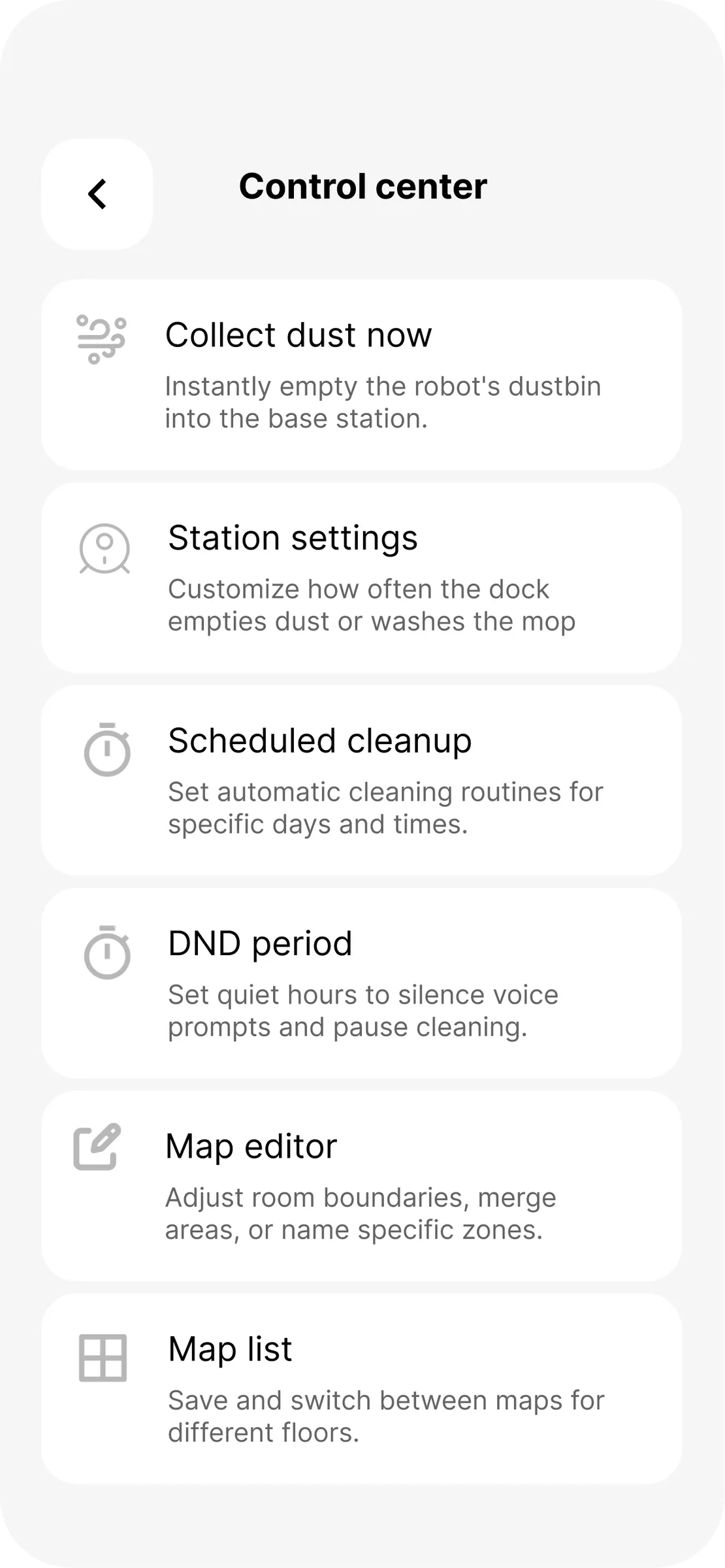
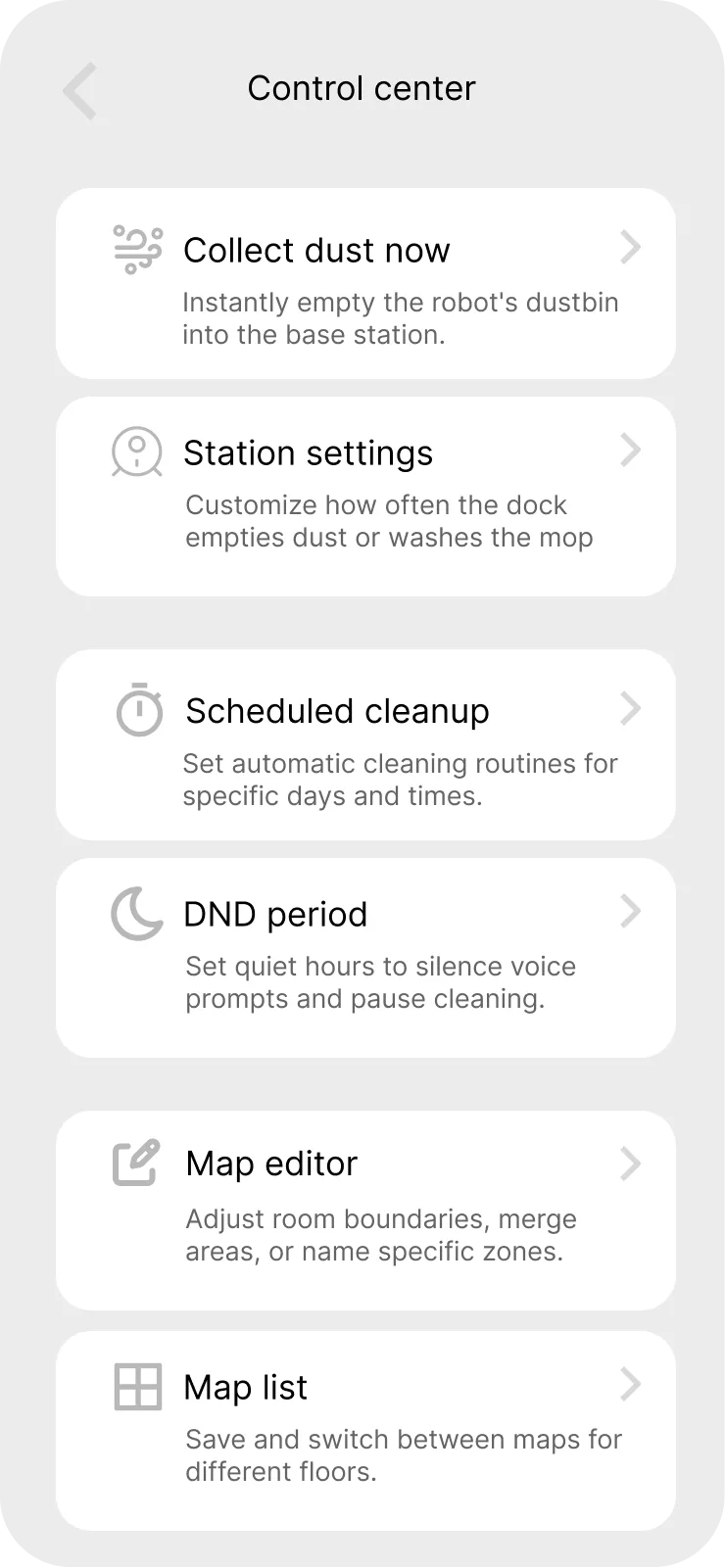
Everything that isn't the clean itself: the dock, the schedule, the quiet hours, and the notifications that should arrive exactly three times a week and never more.
The whole thing, moving
A high-fidelity Figma prototype covering pairing, mapping and a full clean end to end. Static screens can show a layout; only the prototype shows whether the sheet that covers the map is worth what it costs you.
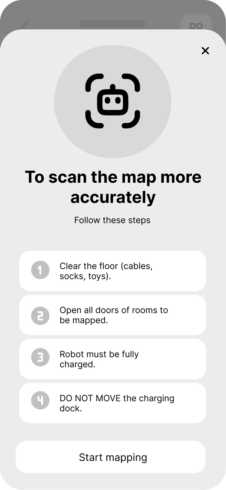
Twenty screens in grey
The whole product was built once in wireframe before a colour was chosen. Structure, hierarchy and flow were argued out here, where changing your mind is cheap — launch through to the dock, in the order an owner meets them.


Legible at arm's length
A light, high-contrast interface so the live map reads at a glance in a bright room, with every control surfaced as a sheet over the map rather than a page away from it.
What I'd do next
Usability-test the pairing flow with someone unboxing a real unit, and design a proper error and recovery state for a robot that is stuck or lost.