Standout
Hand over one résumé. Four agents do the rest.
Product UX · Interface Design · Design Systems · 2026
- Role
- Context
- Team
- Timeline
- Tools
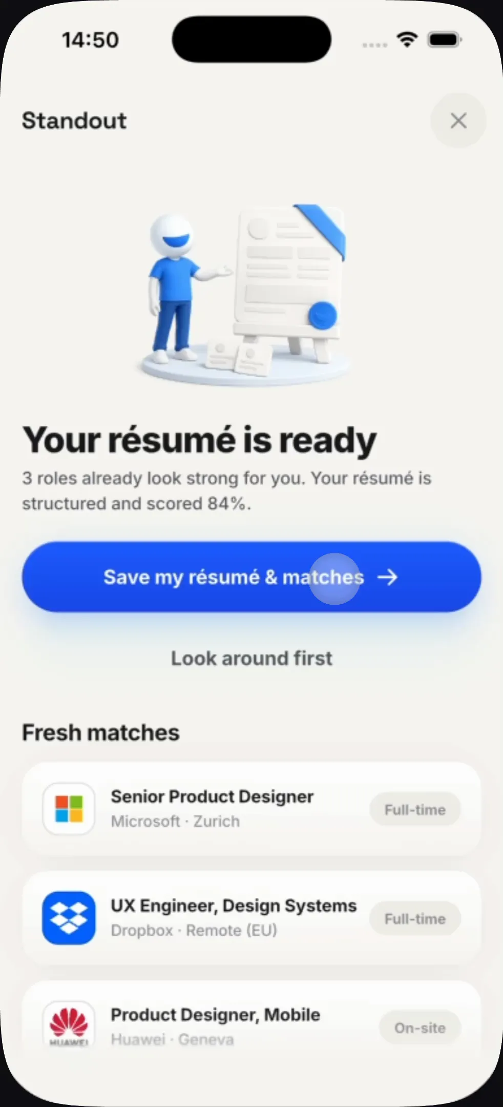
One résumé in, everything else automatic
Job hunting is a dozen disconnected chores — rewrite the CV, rewrite the profile, take the test, prep the interview, remember who you already applied to. Each one is a separate tool and none of them know about each other.
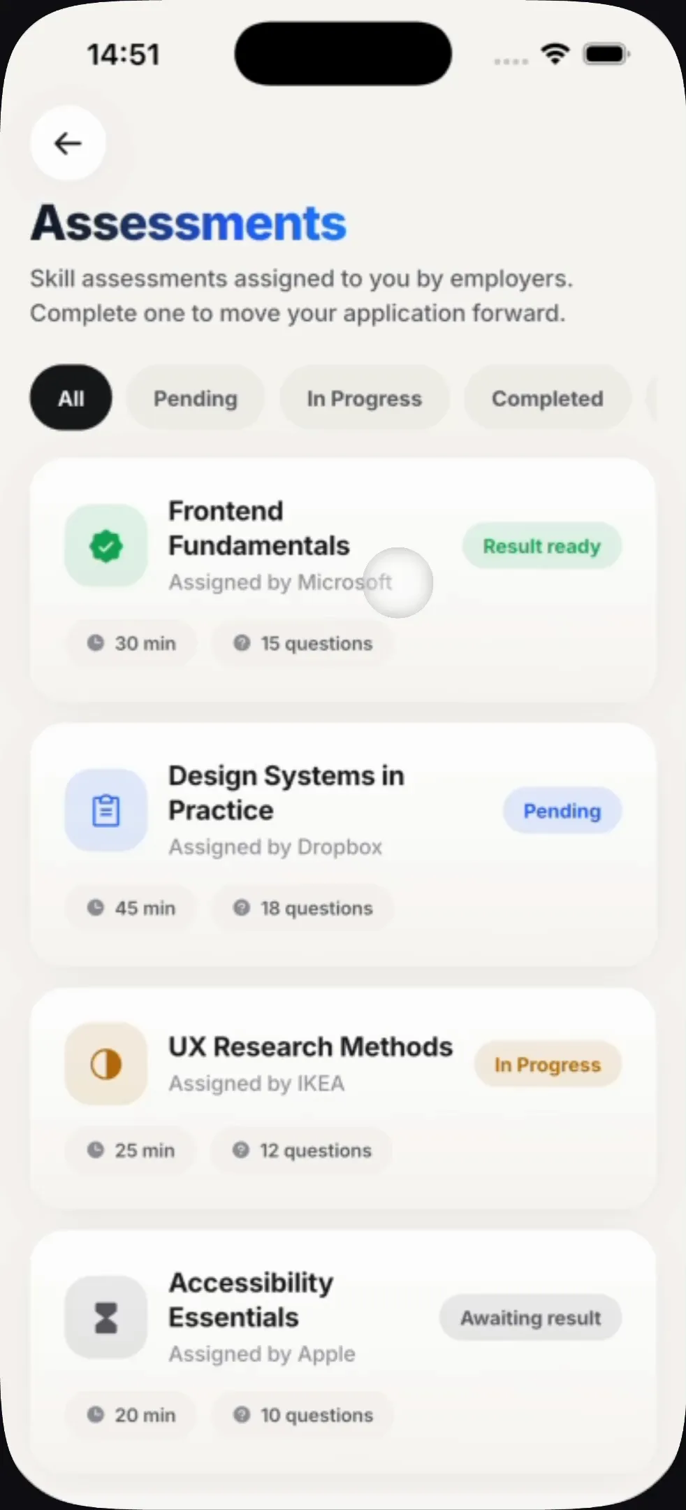
The whole product is bought on one screen, and the promise is stated as a number: your résumé, structured and scored, with roles already matched against it before you have made an account. Every feature after that has to earn its place against that promise.
Every screen below is a frame from the live app, in the order a real user meets them.
Finding the work
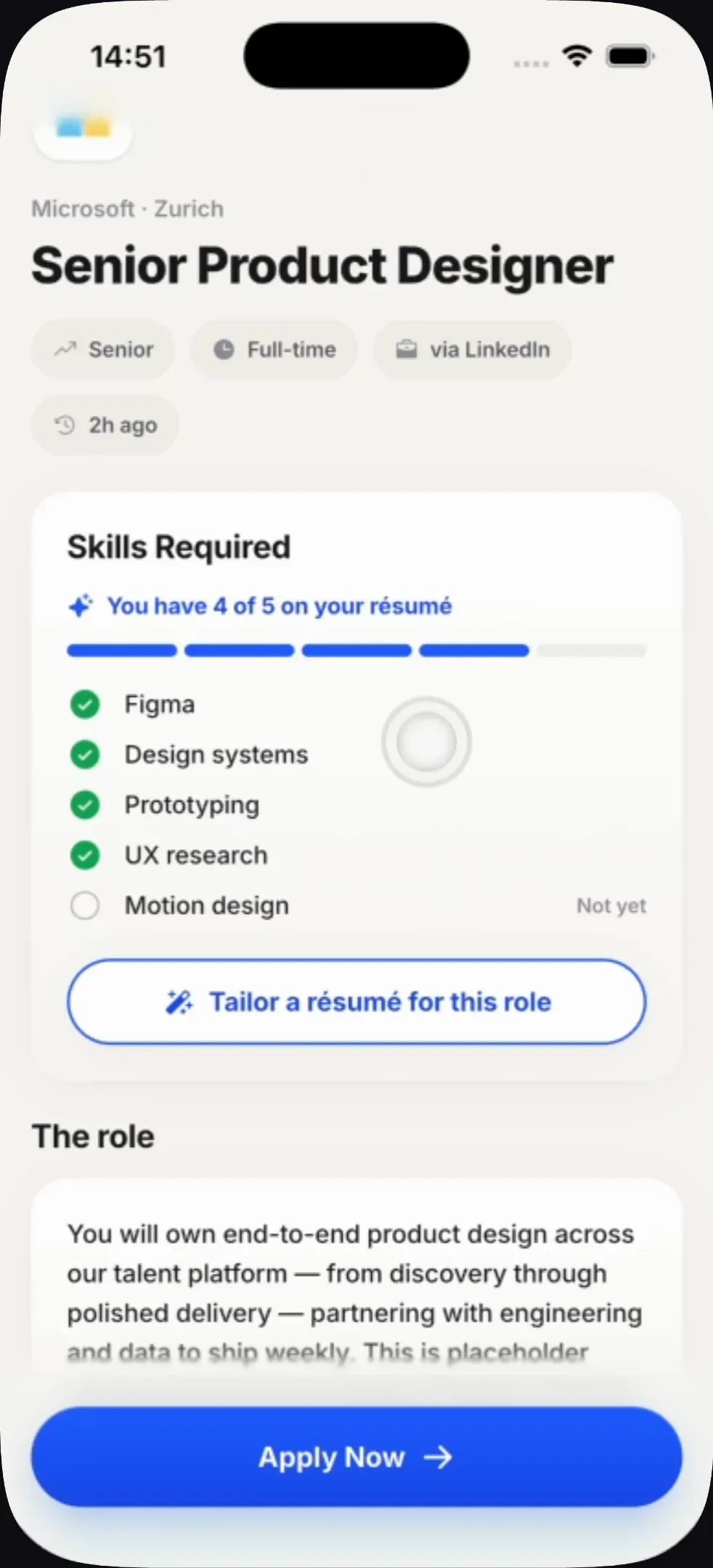
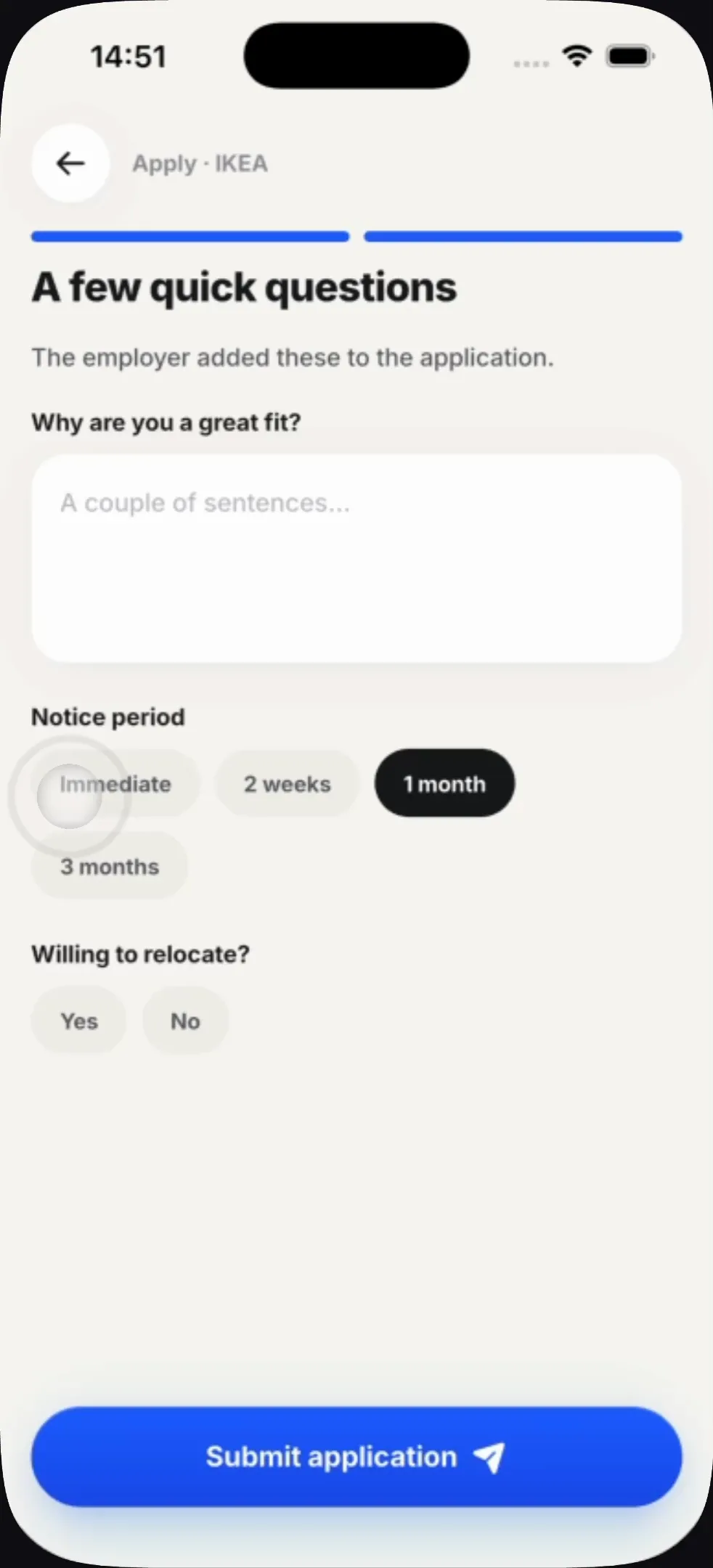
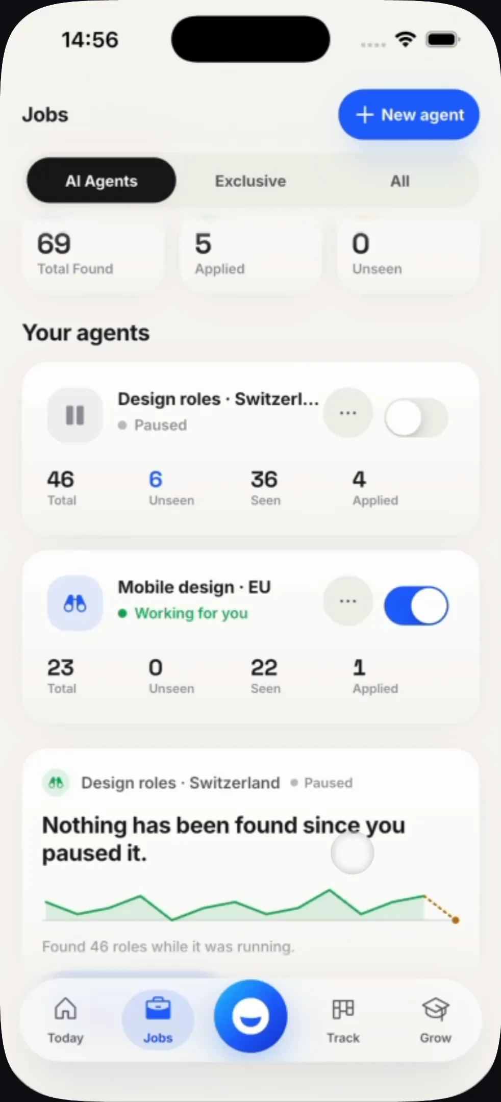
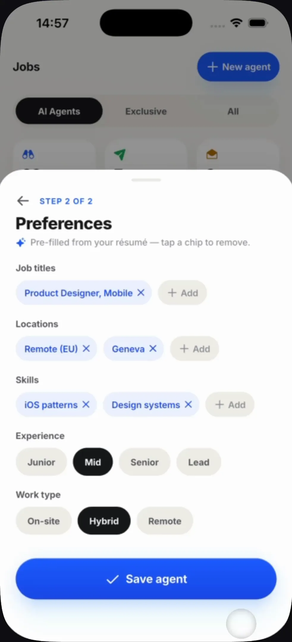
A role is judged against the résumé you already gave, so the match is a fact rather than a filter. Skills you have are ticked, skills you do not are named — and the fix is one tap away. Agents run in the background and report counts; the one that builds them is pre-filled from the résumé, so you remove chips rather than fill in a form.
Proving it
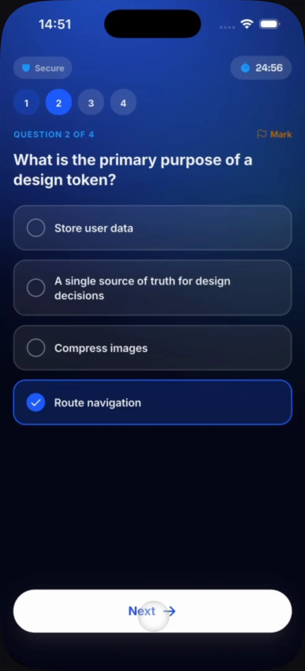
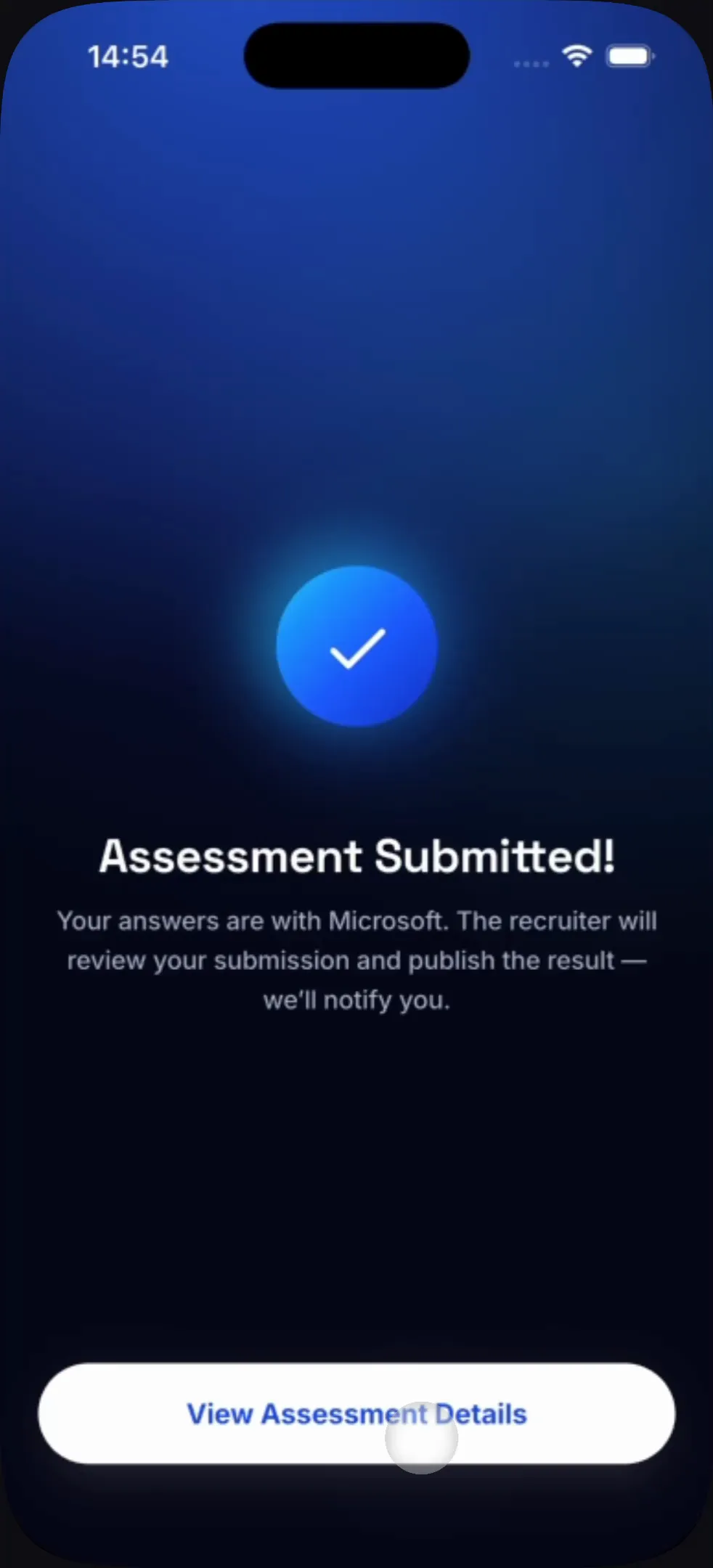
Assessments are set by the employer, not the product, which makes the proctoring rules a trust problem rather than a compliance one. They are stated as four plain sentences before the timer starts — including the one nobody usually admits, that leaving the app is recorded.
Every generated thing arrives as a draft you own
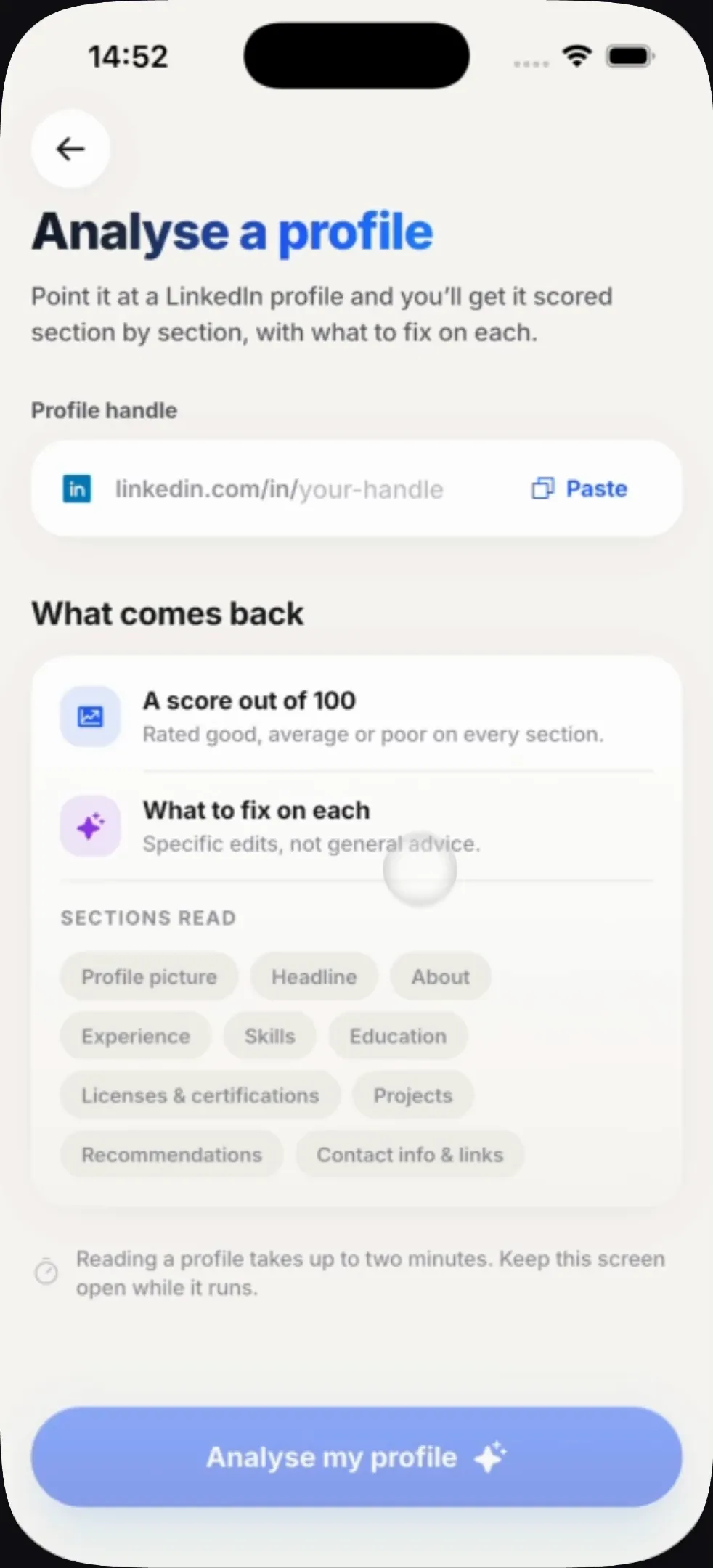
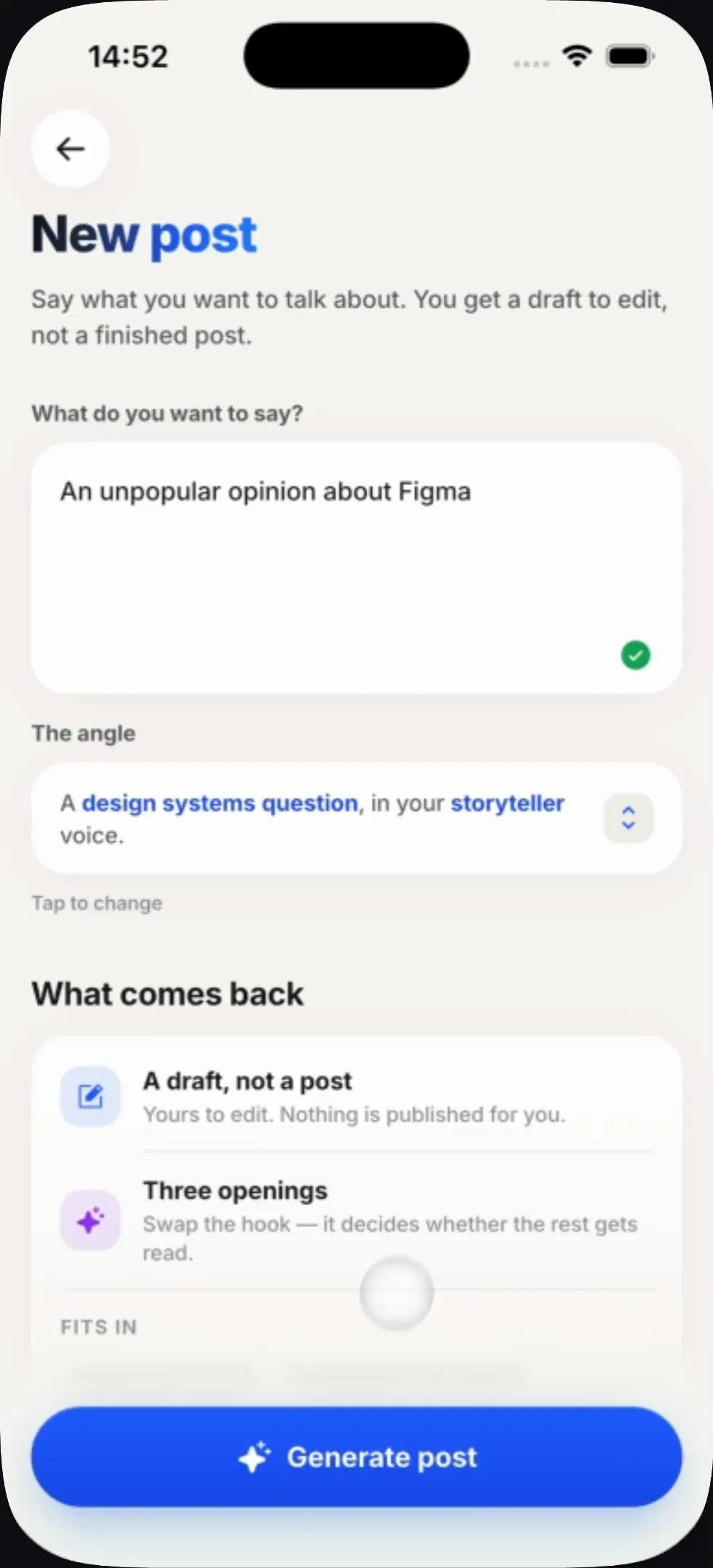
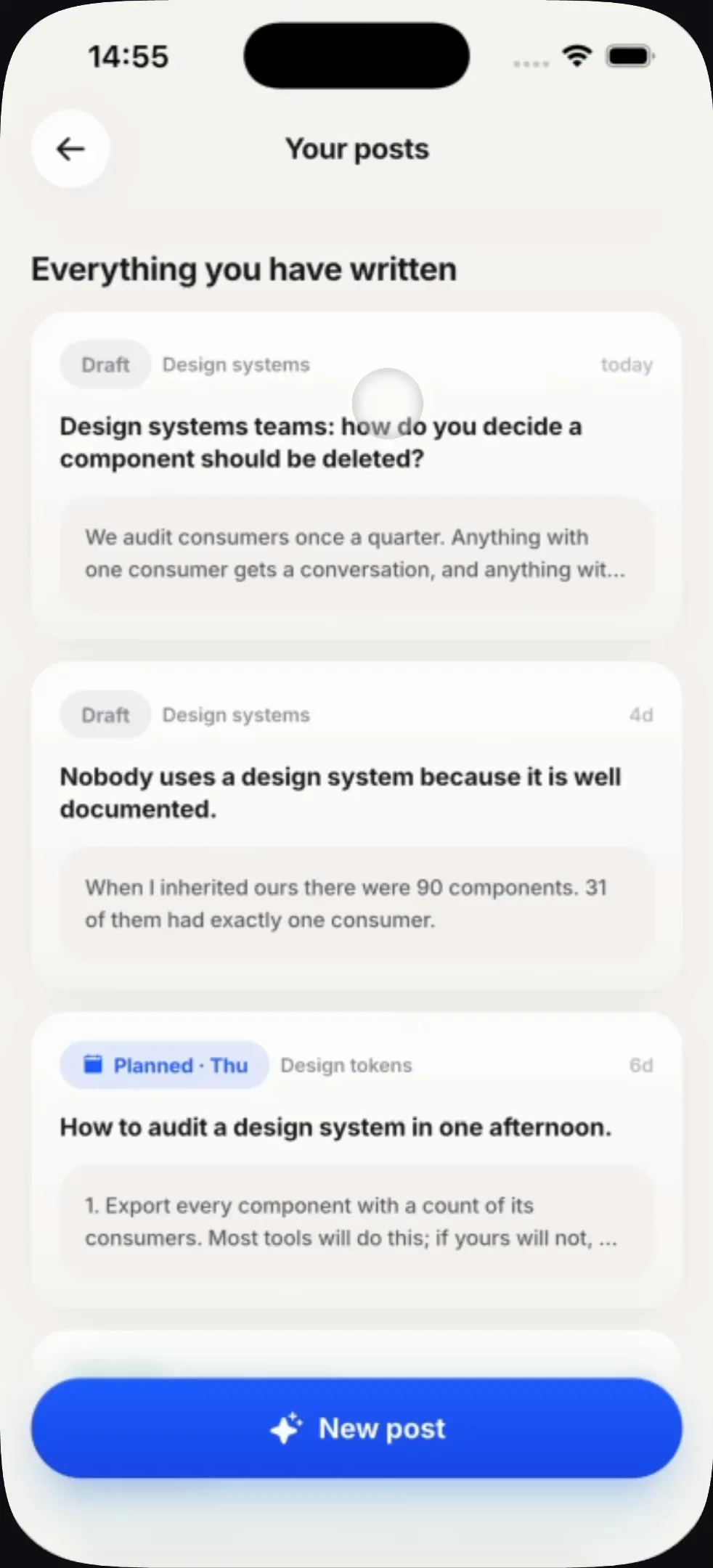
The generative features share one rule, printed on the screens themselves: nothing gets published. The profile analyser scores ten sections out of ten each and hands back copy to paste; the post writer returns a draft and an angle, never a post.
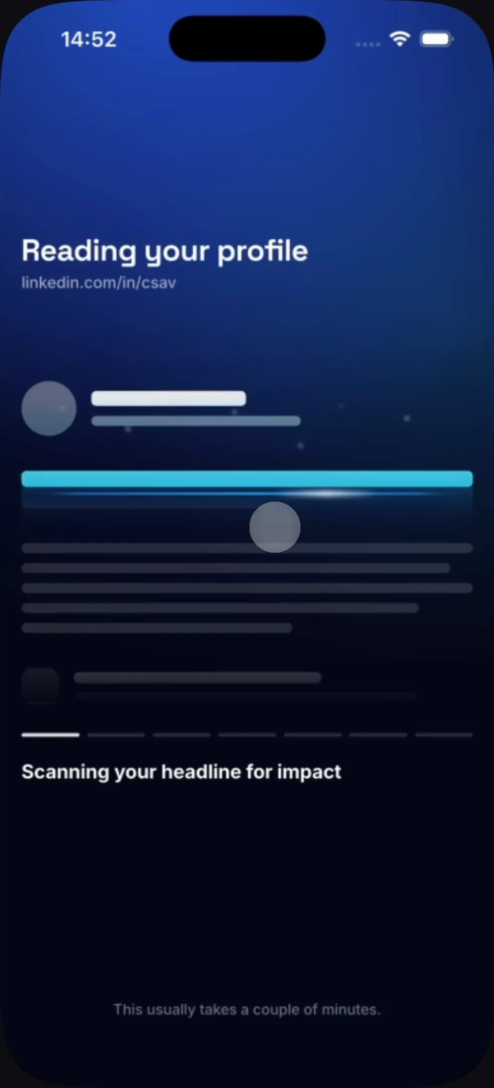
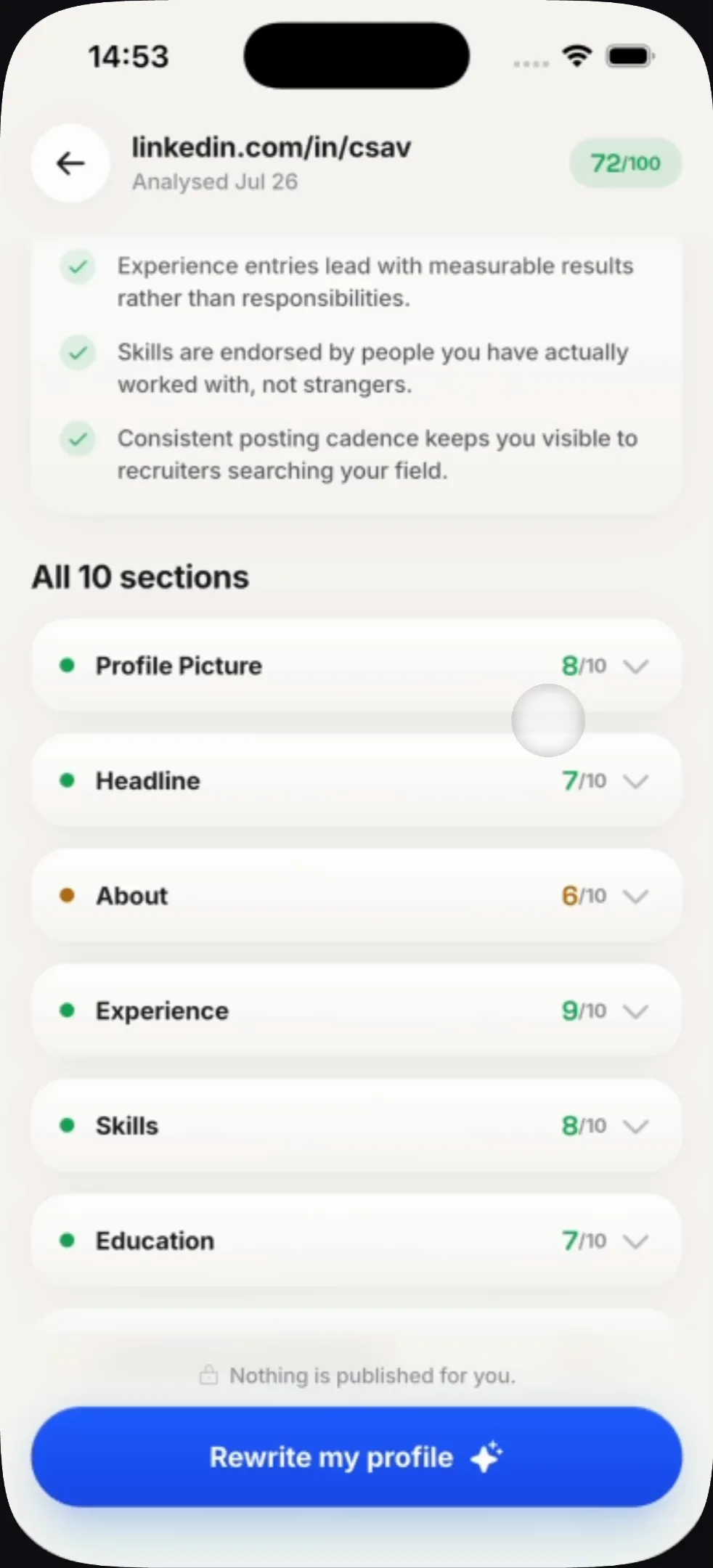
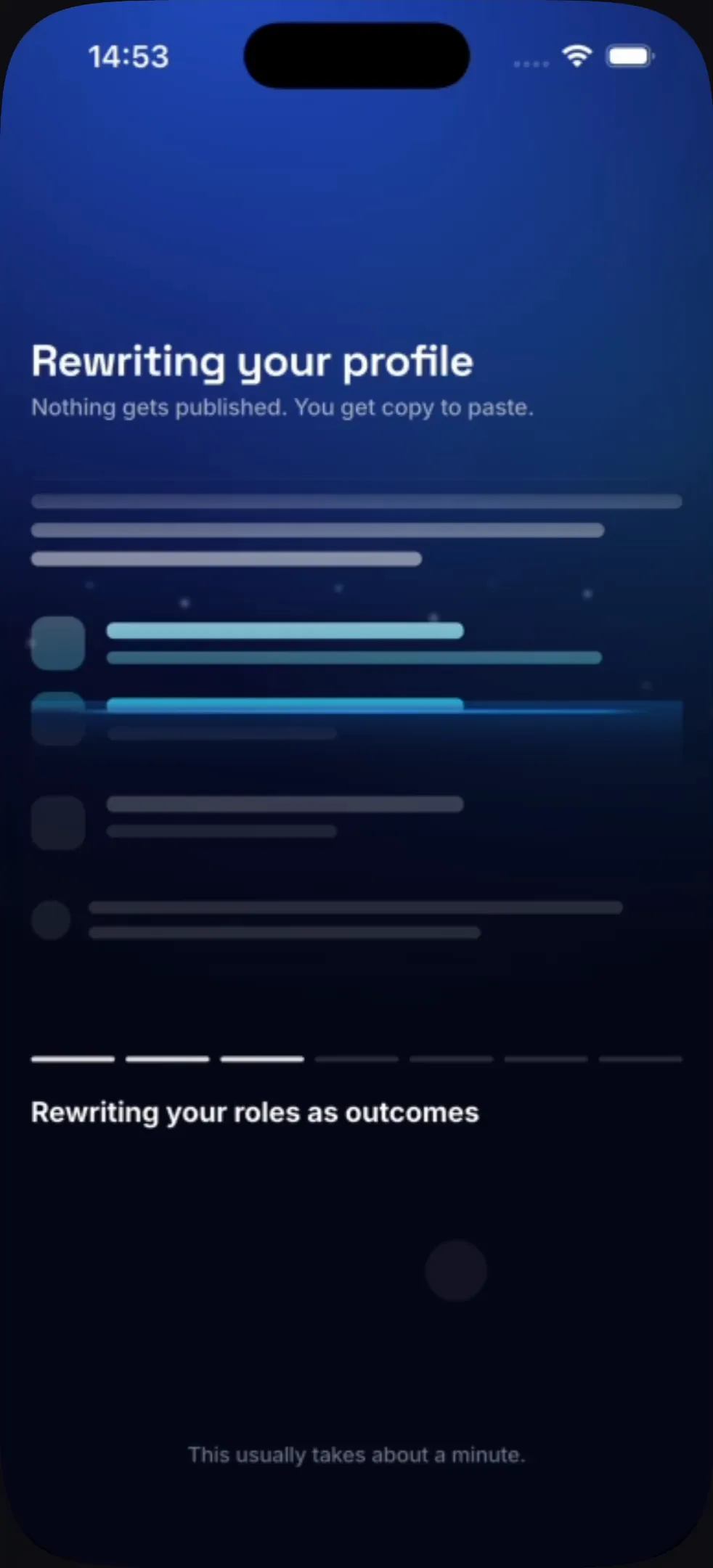
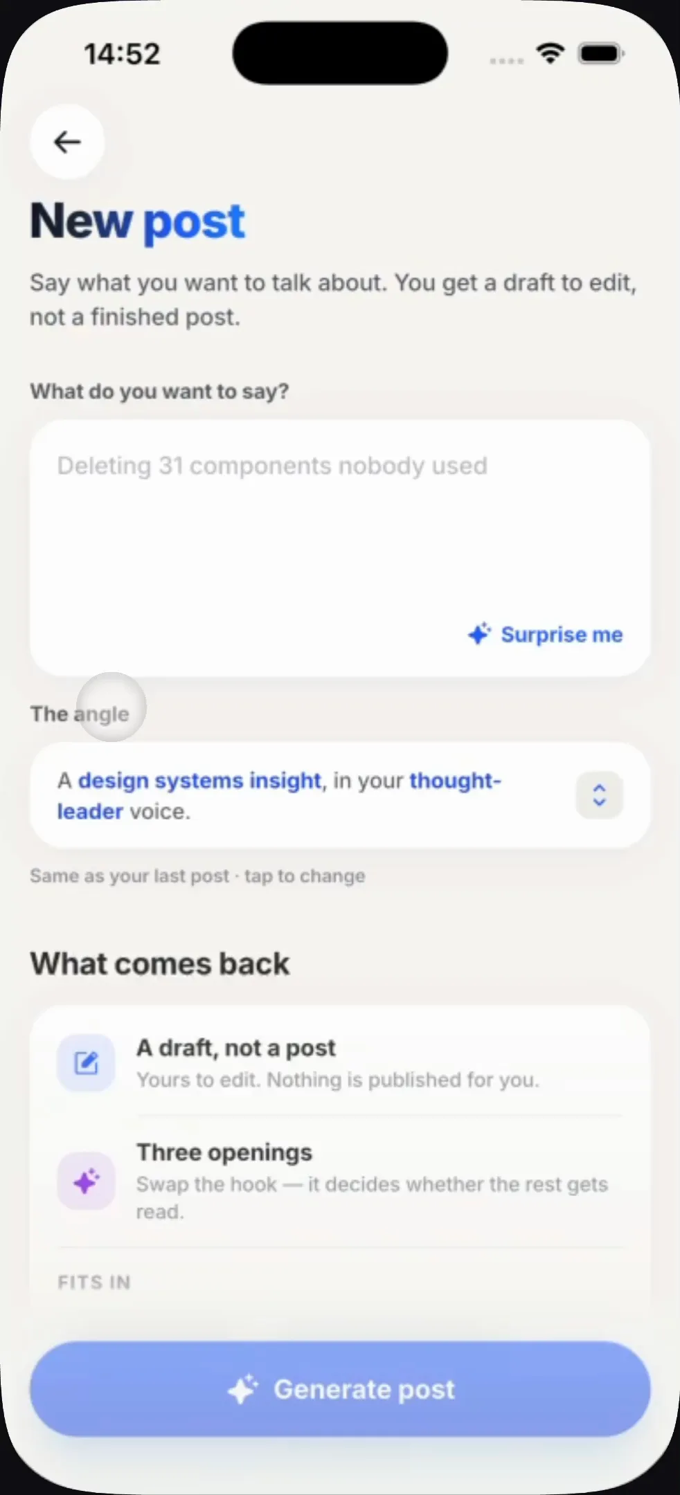
A two-minute wait, designed
Analysing a profile genuinely takes up to two minutes, and a spinner would lose the person. Instead the wait narrates itself — the section being read is named as it is read, so the time is evidence of work rather than an absence of it. This is the kind of moment a still cannot carry.
Interview Buddy
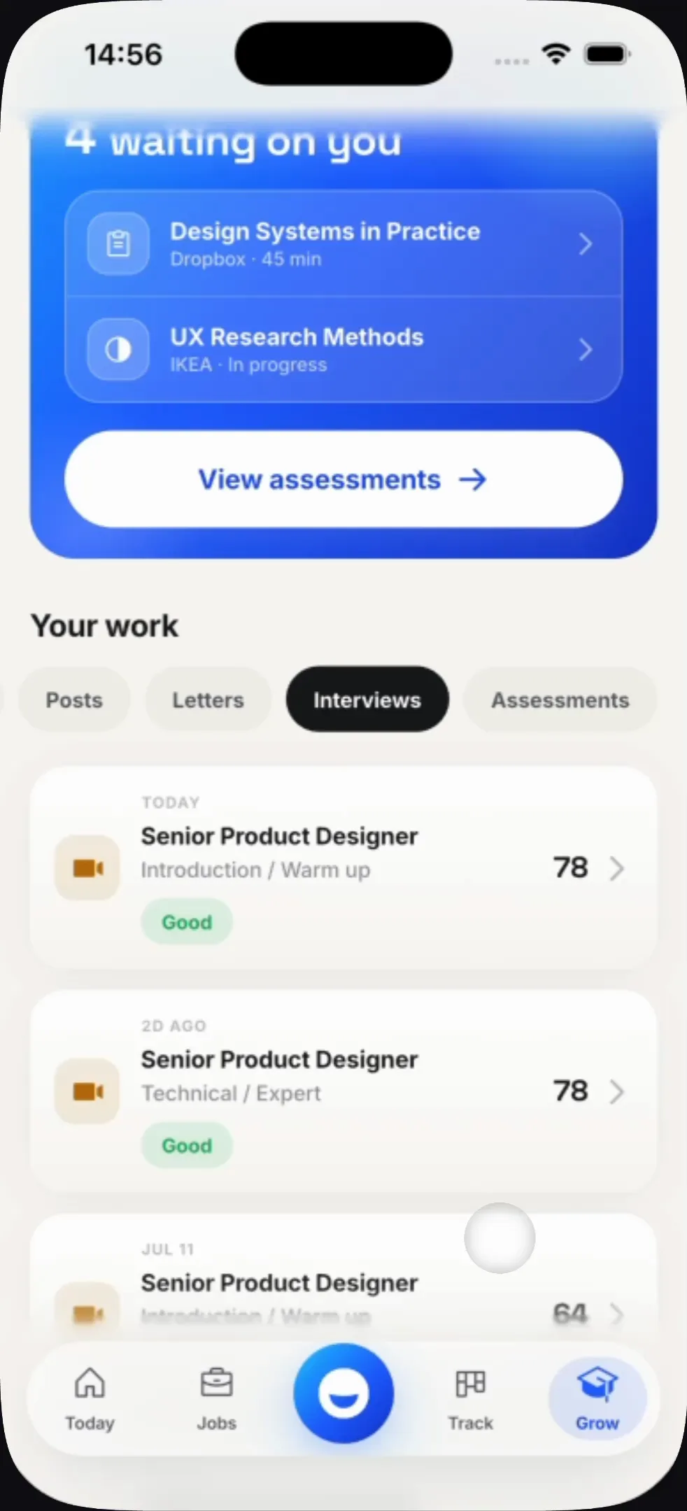
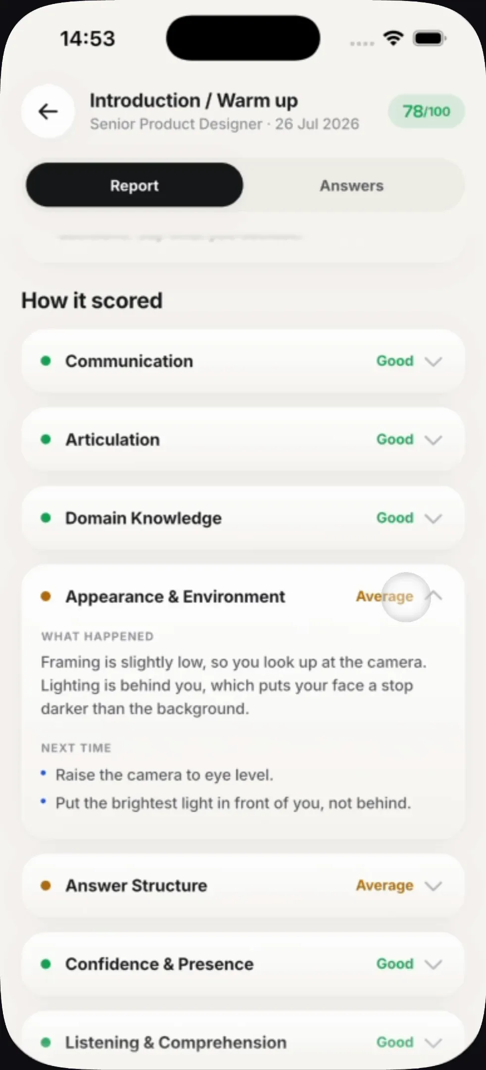
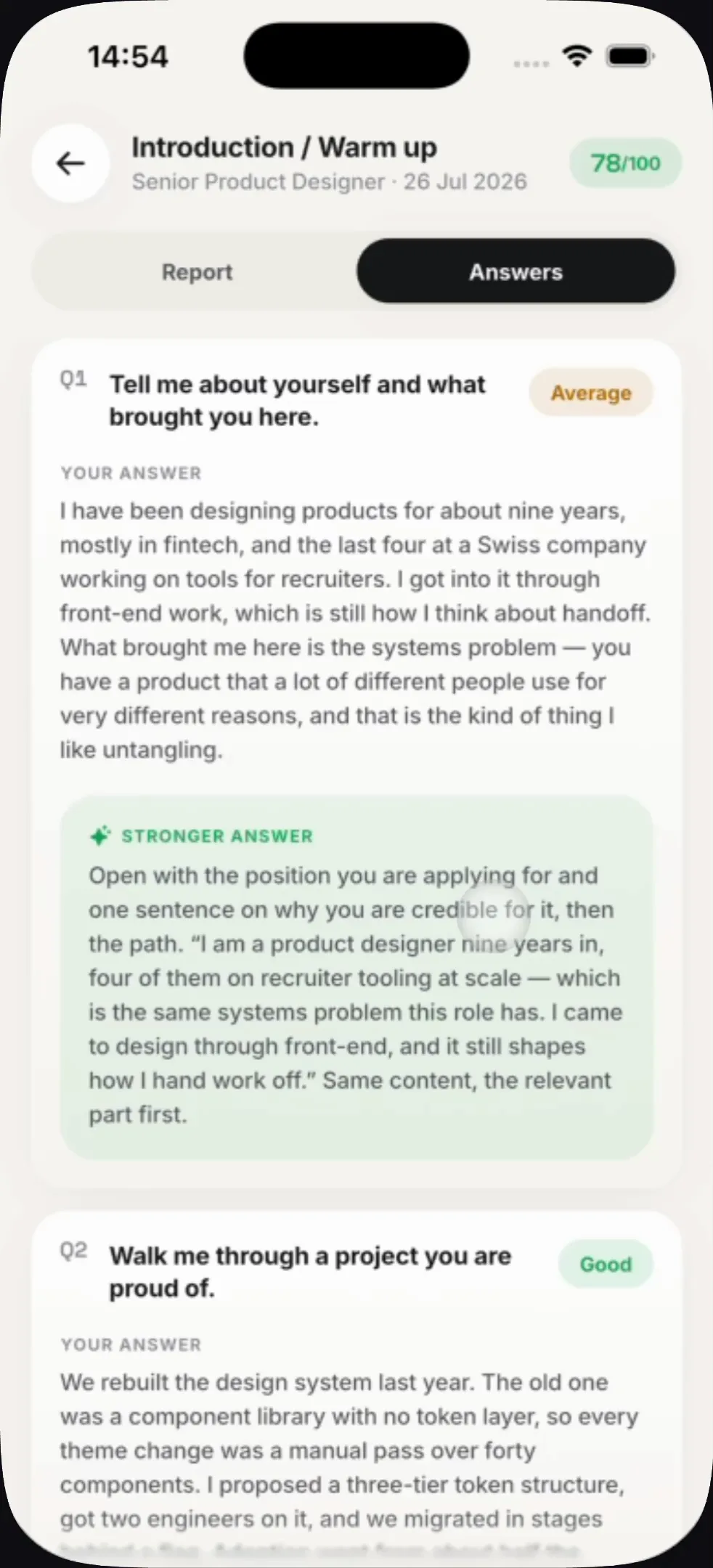
The hardest screen in the product. Scoring how someone comes across — their framing, their lighting, their presence — is easy to get insulting. Every dimension is split into what happened and what to do next time, so a low score always arrives attached to a fix: "lighting is behind you" becomes "raise the camera to eye level". Every weak answer is shown beside a stronger version of itself.
Staying on top of it
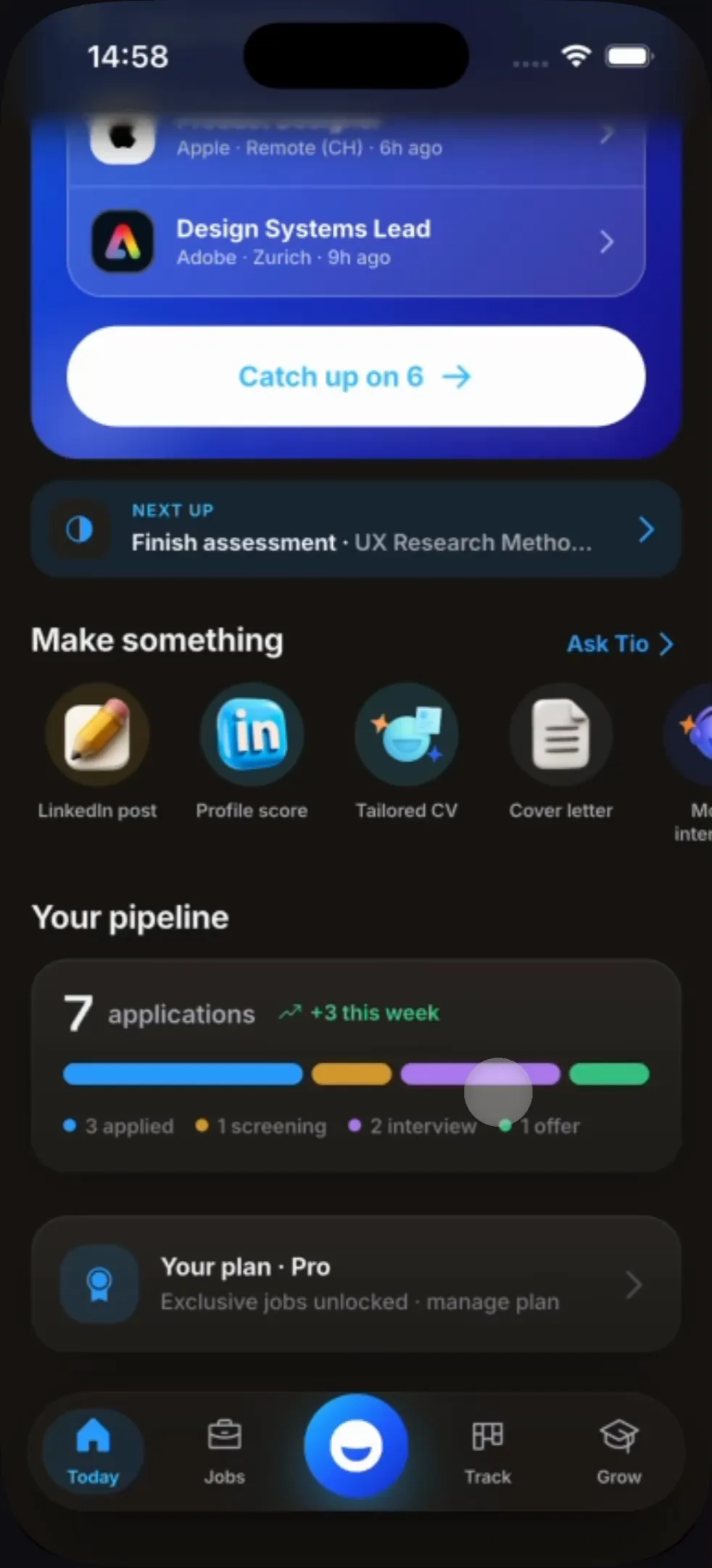
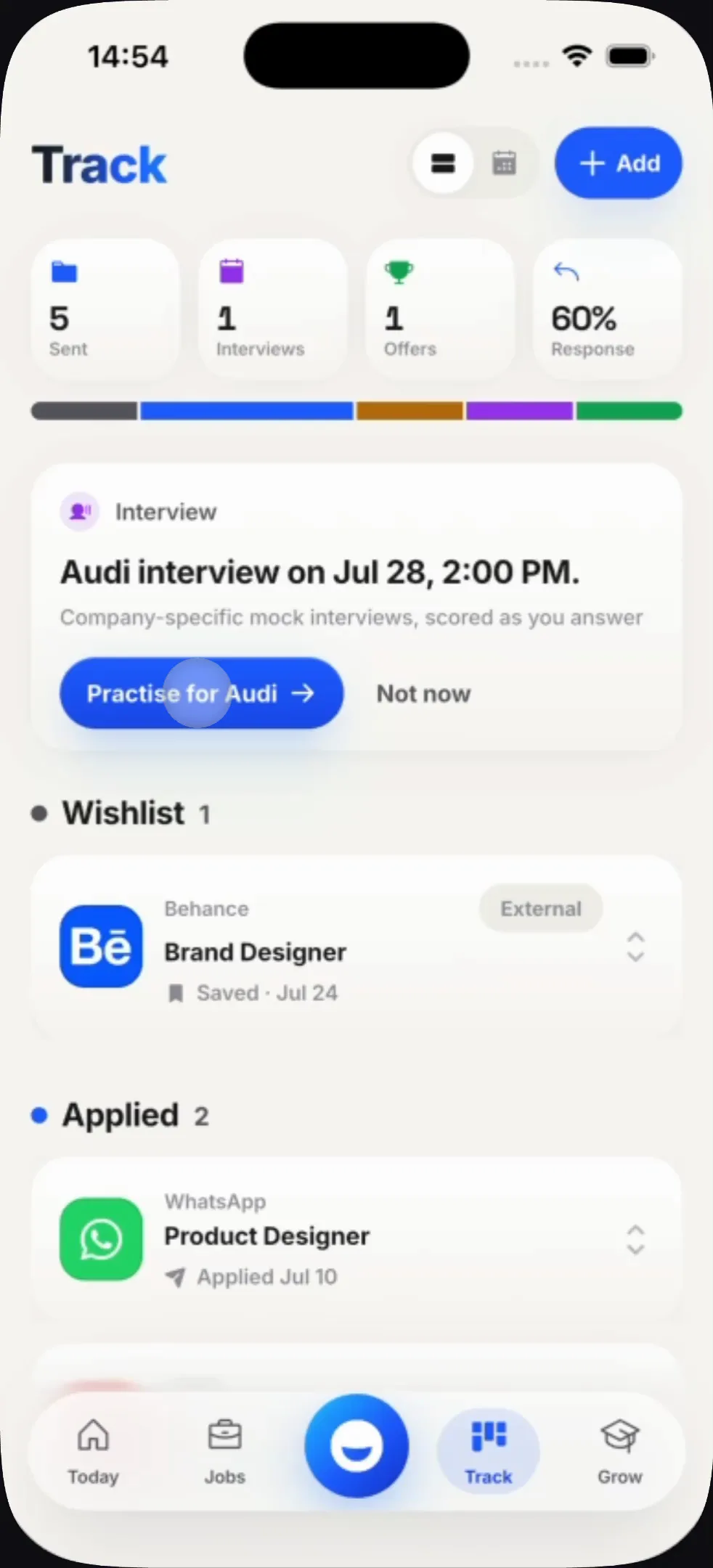
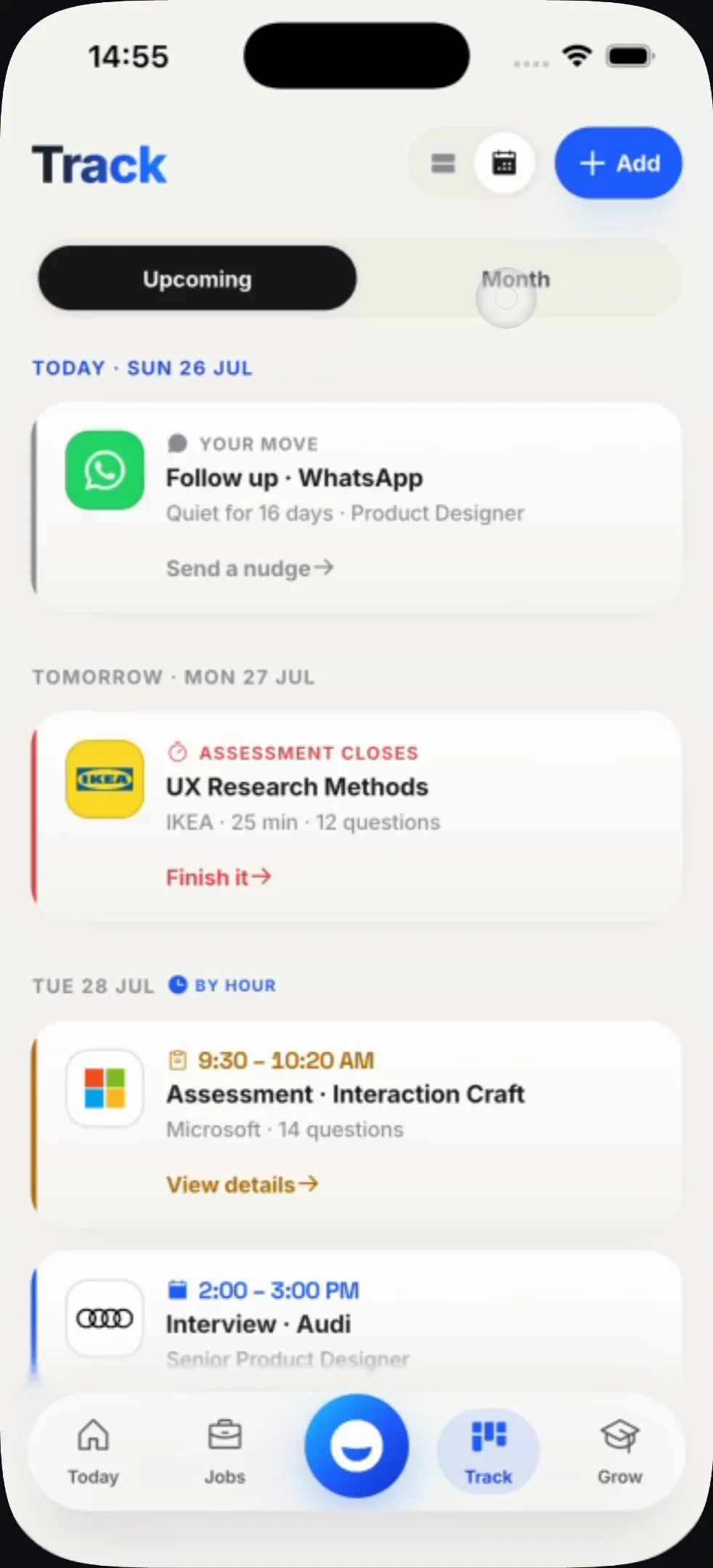
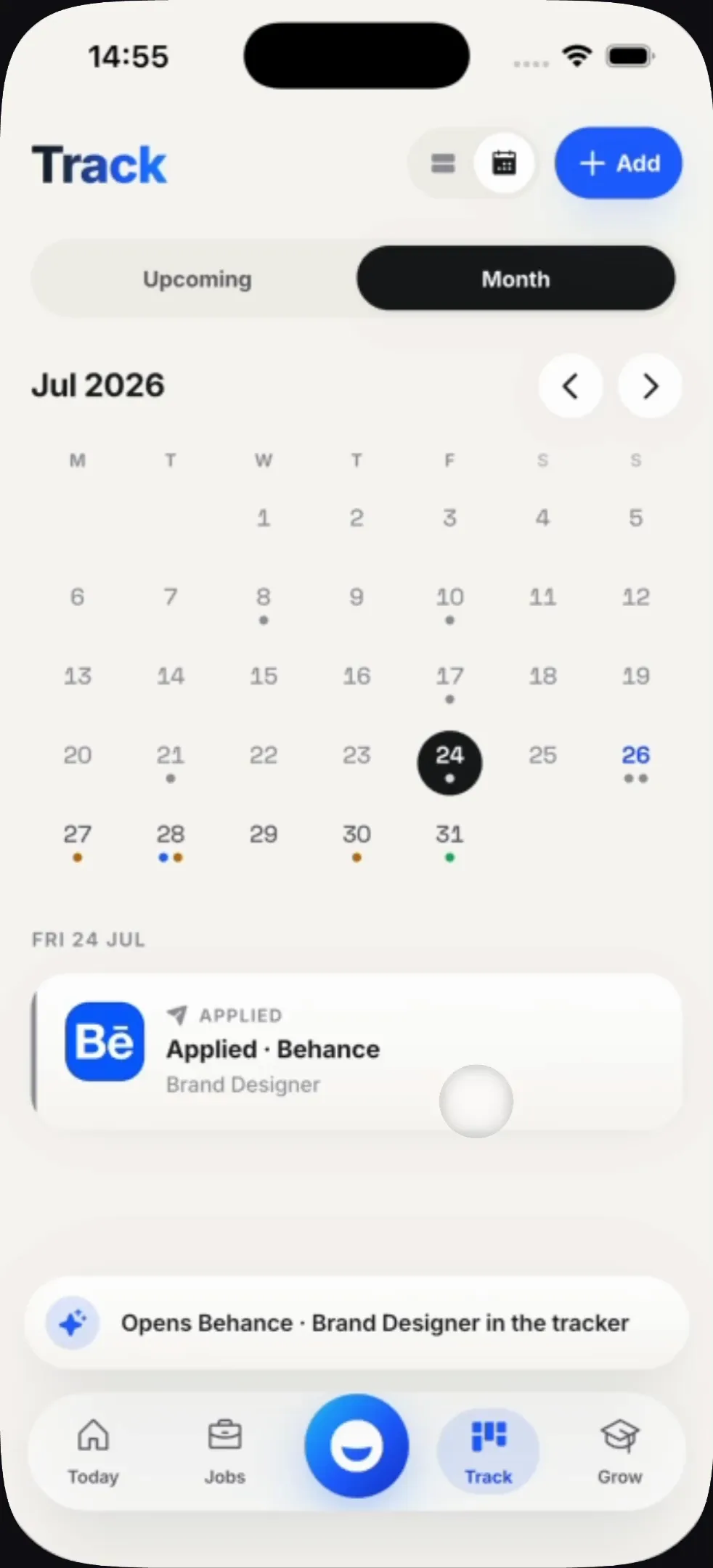
The part every other tool skips. Applications go quiet and people forget which ones — so the pipeline surfaces what has stalled, and the calendar carries assessment deadlines beside interviews, because both are things you can miss.
One system across six surfaces
A single blue carries every primary action and nothing else; state is a chip, never a colour alone; and every generated artefact — CV, post, profile, cover letter — resolves to the same card with the same copy-and-own affordance.
What I'd do next
The wait states. Three features take real time — the ATS pass, the profile analysis, the interview scoring — and each currently explains itself differently. They should share one language, the way the rest of the product already does.