Sow Row
Fresh, in one continuous line.
Brand Identity · Art Direction · 2021
- Role
- Context
- Team
- Timeline
- Tools
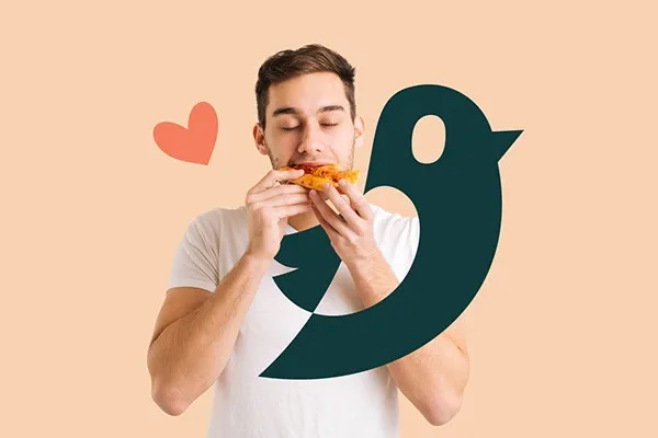
One bird, drawn in a single line
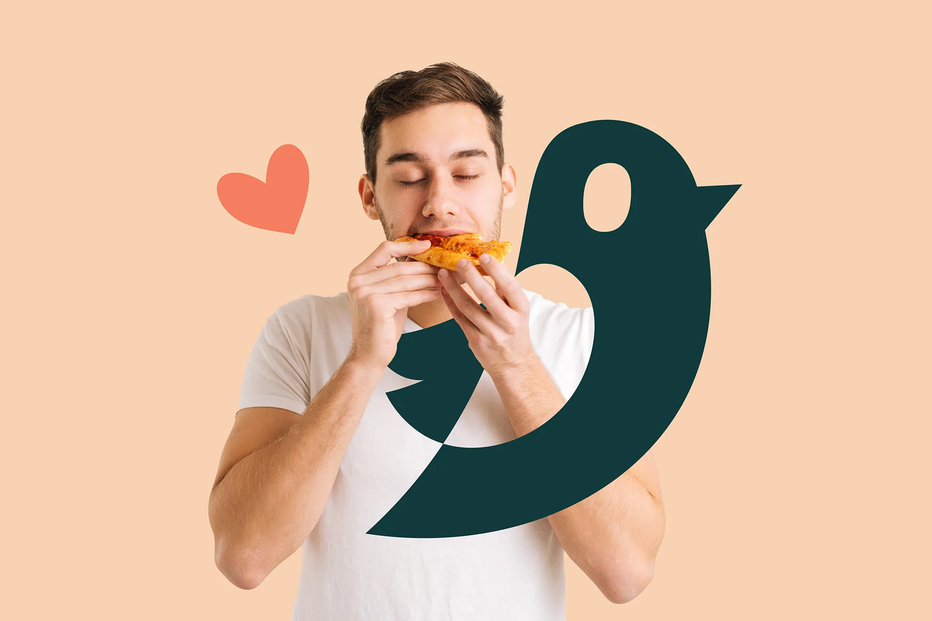
The wordmark and the mark are the same gesture: the tail of the "w" lifts off and becomes the bird. There is no secondary lockup and no simplified version, because the mark already works at every size it needs to.
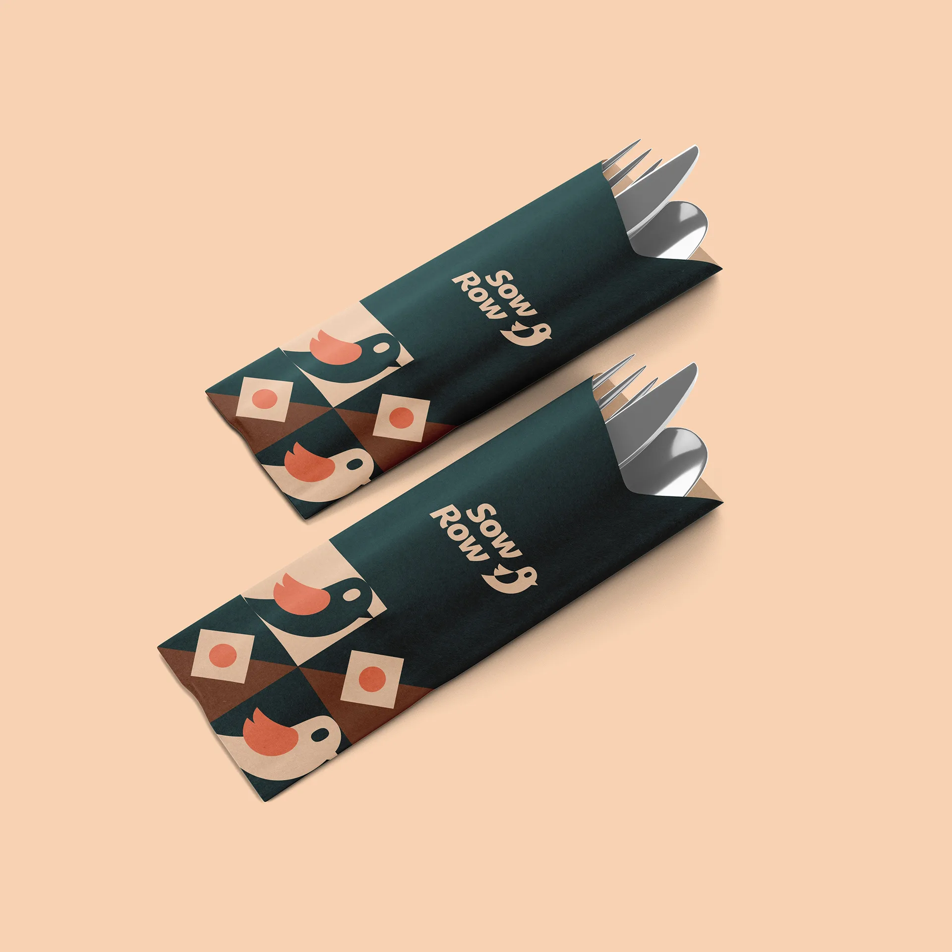
Warm on paper, bold in the street
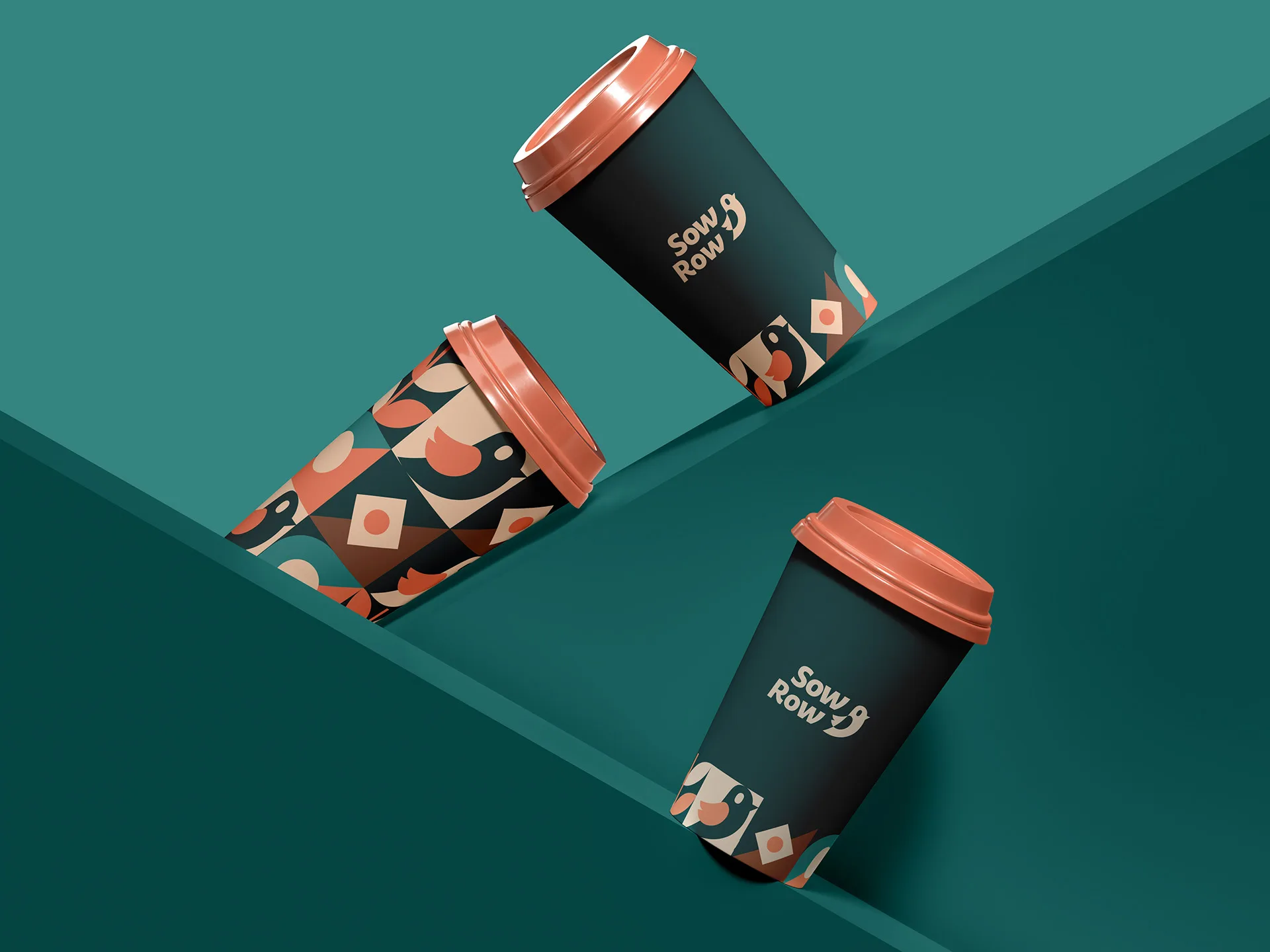
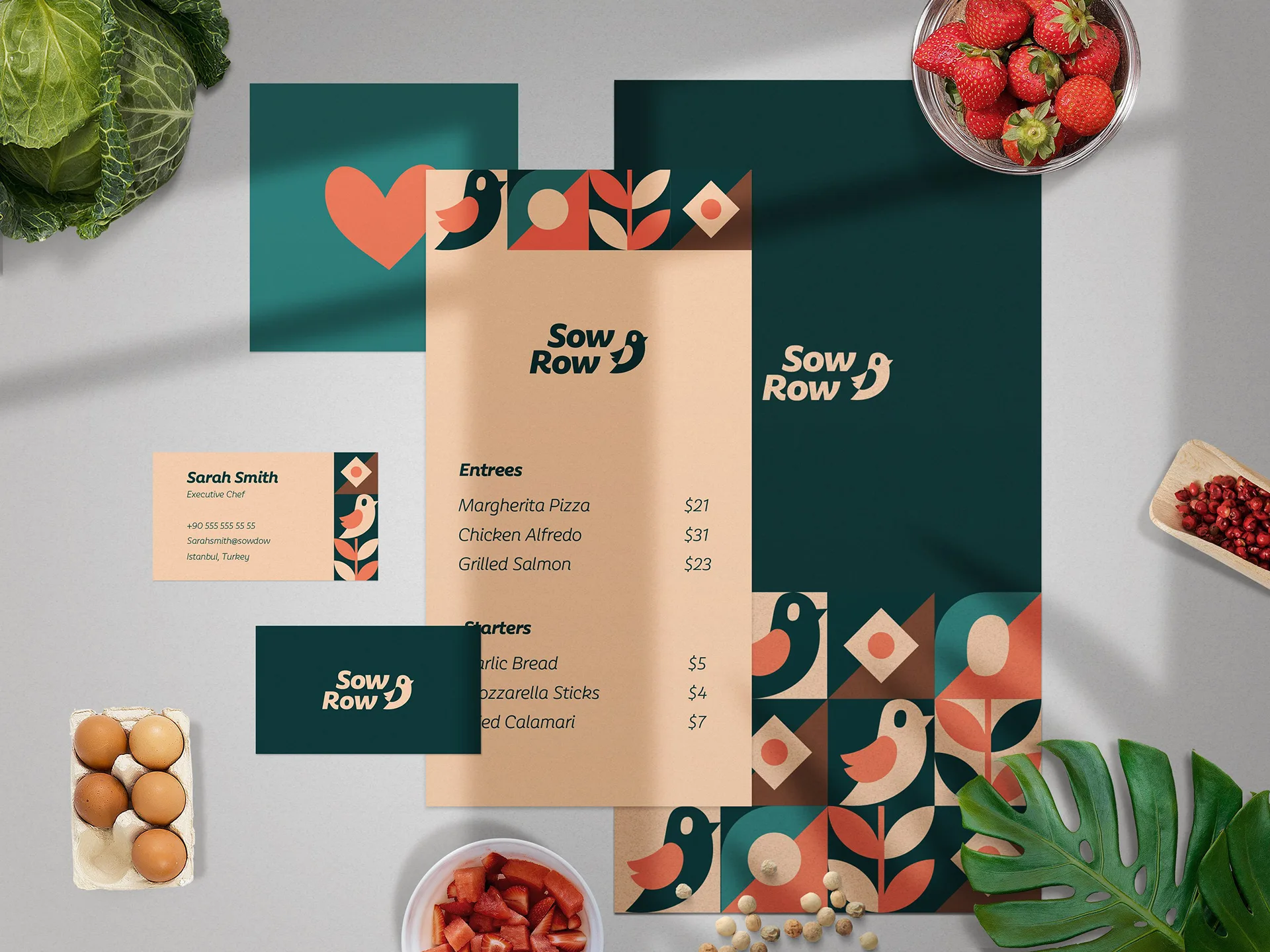
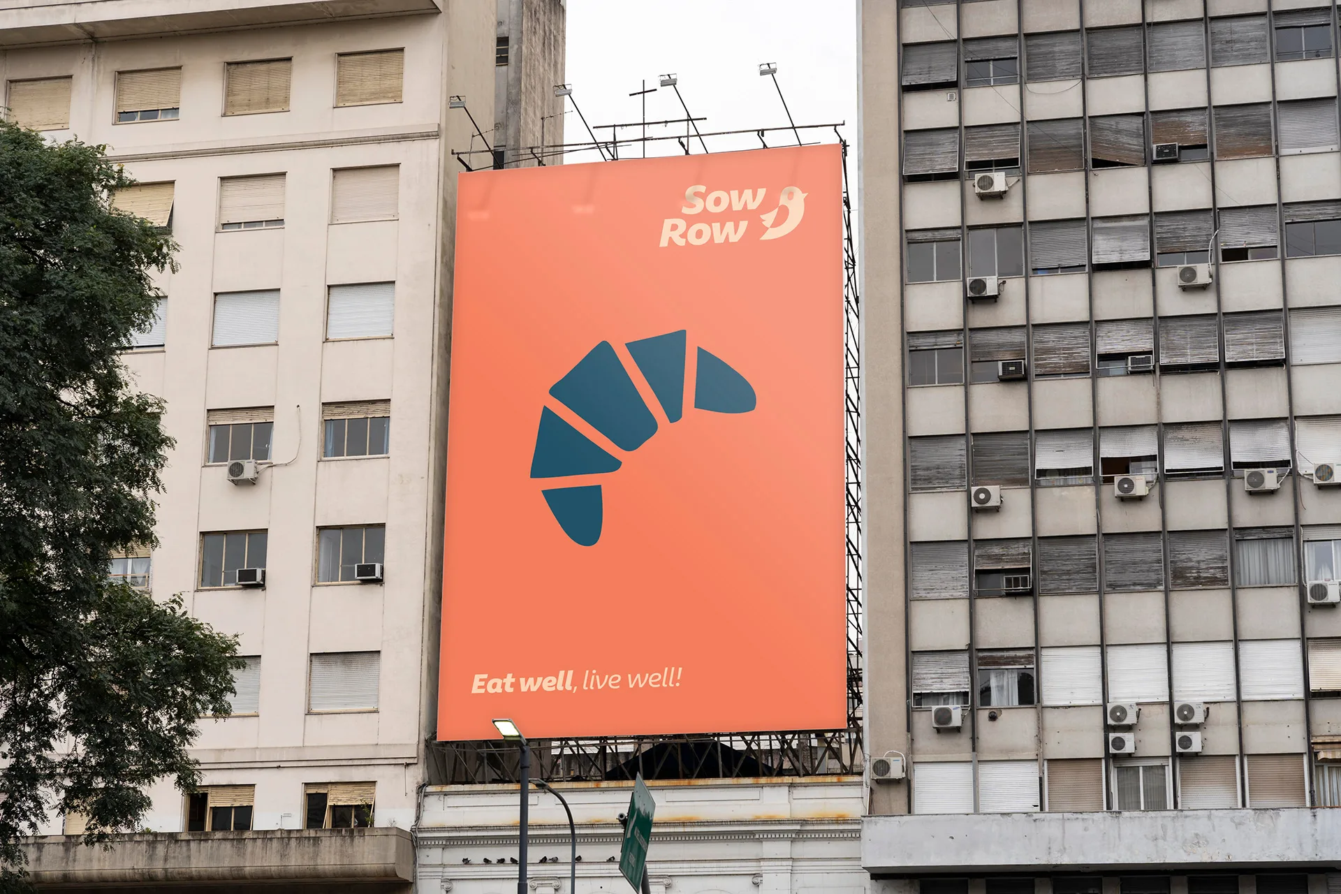
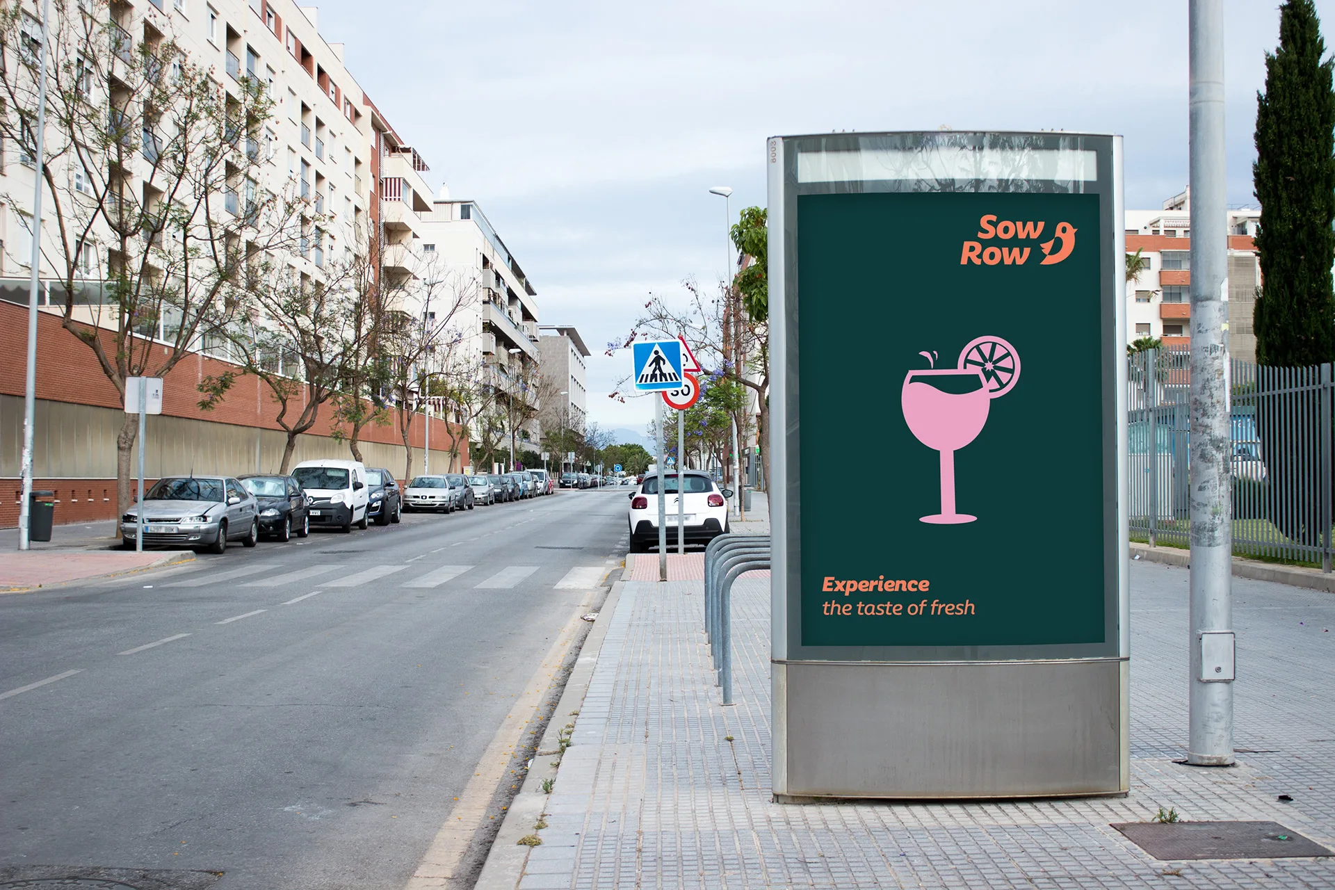
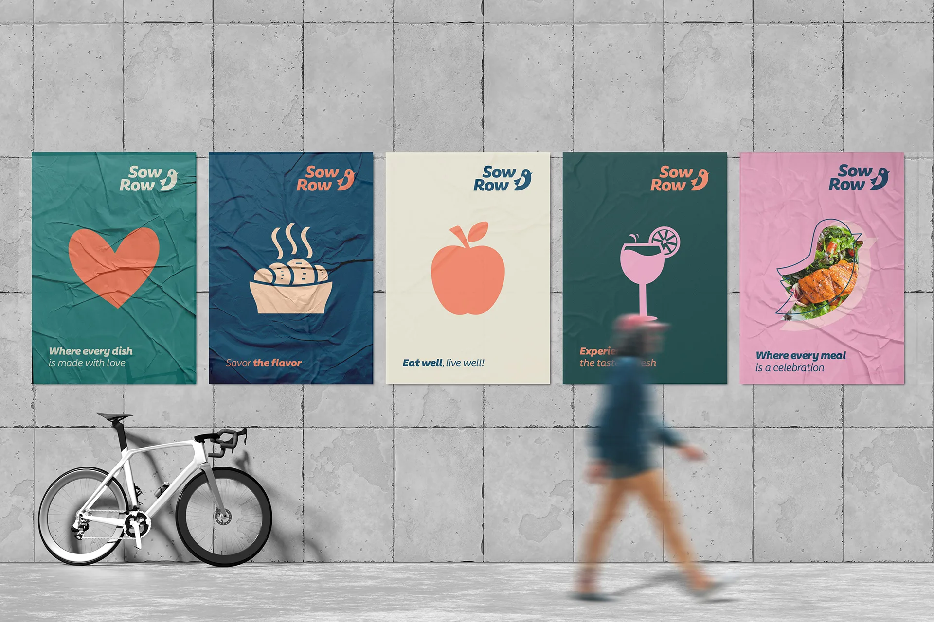
Deep teal carries the mark at billboard scale; cream, coral and blush do the close work on menus and stationery. The same four colours in different proportions is the whole system.

Circle, leaf, diamond — recomposed
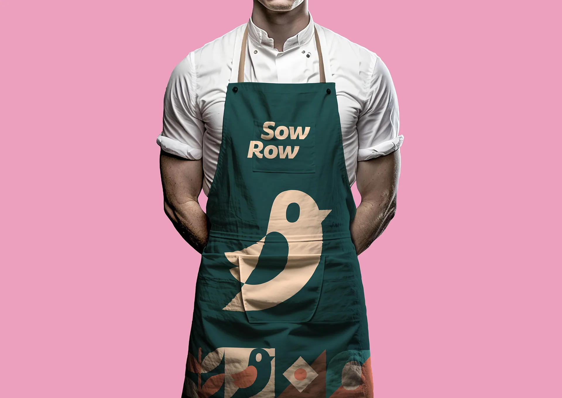
Three tile motifs recombine into a quilt that never repeats the same way twice. It gives the identity somewhere to go on a large surface without ever needing a second logo.
From a facade to an apron
Applications were the real test. A mark that only works on a business card is not a system, so the final proportions were decided by the billboard and the poster wall, not by the letterhead.
The same warmth, backlit
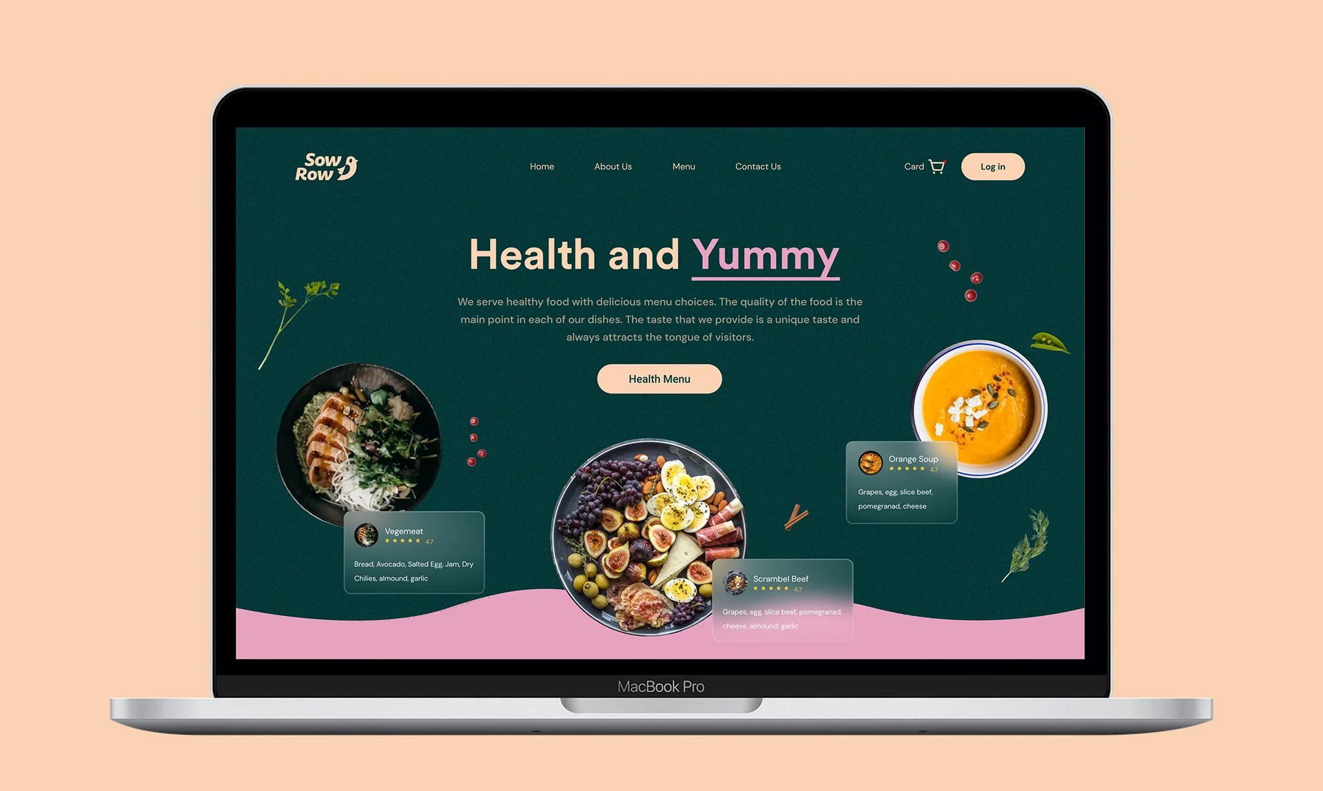
The site takes the cream ground and lets the food carry the colour — the pattern retreats to a border so photography can do the selling.