Flavoy
Colour you can find with your eyes closed.
Brand Identity · Packaging · 2024
- Role
- Context
- Team
- Timeline
- Tools
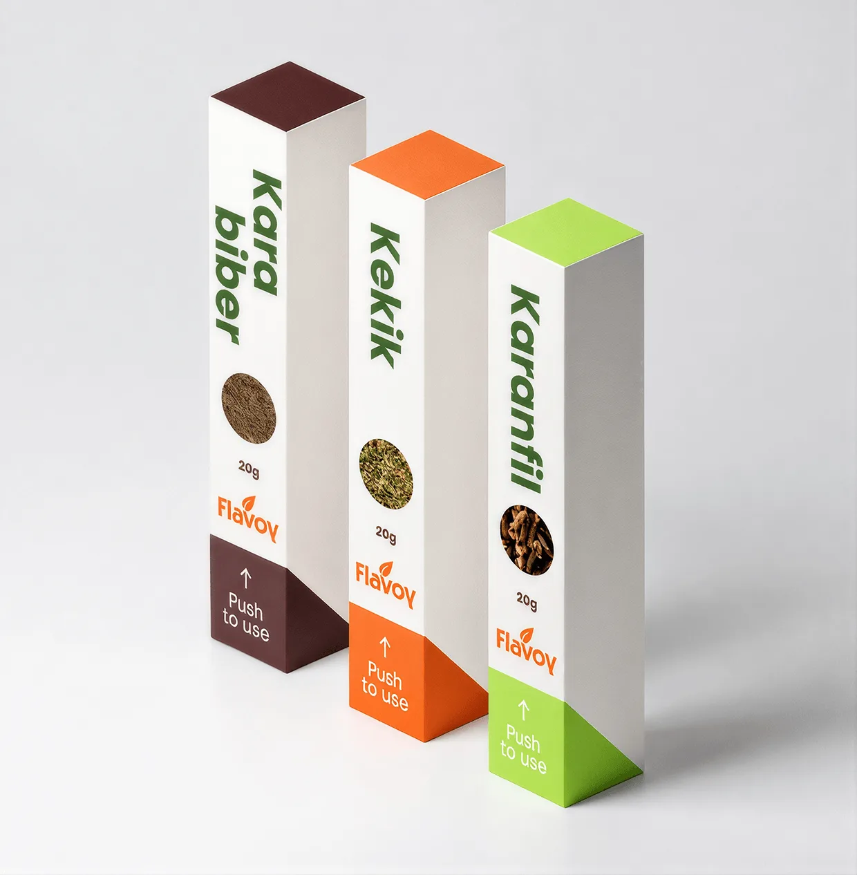
Colour before words
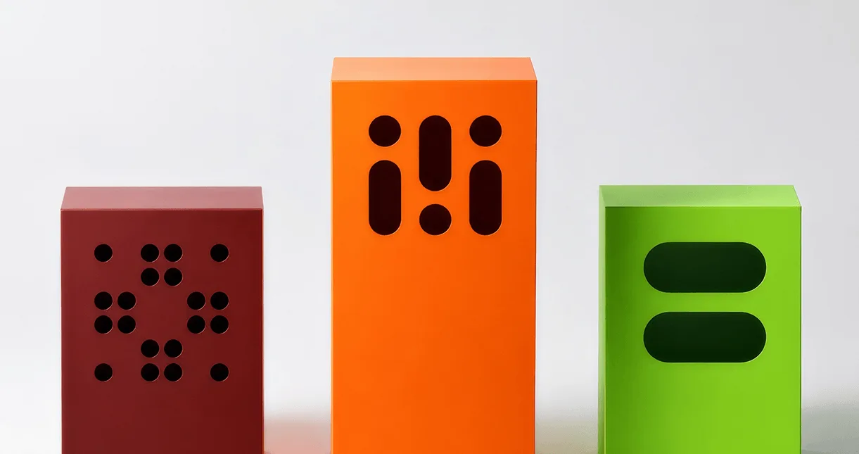
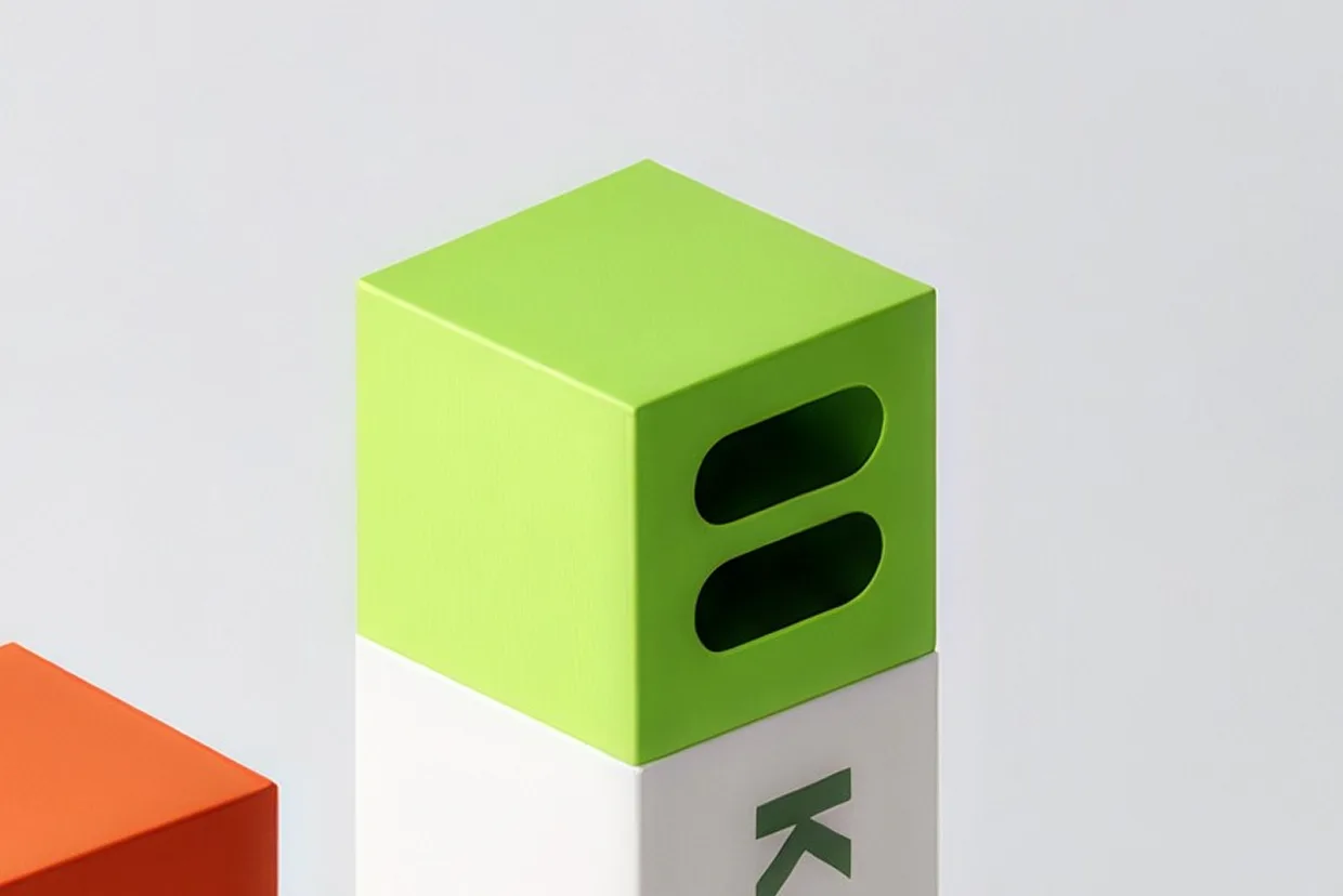
Three spices, three cap colours, one carton. Everything that distinguishes a variant happens in the top third of the pack, because that is the part you see first on a shelf and the part your hand reaches for in a cupboard.
One structure, three caps
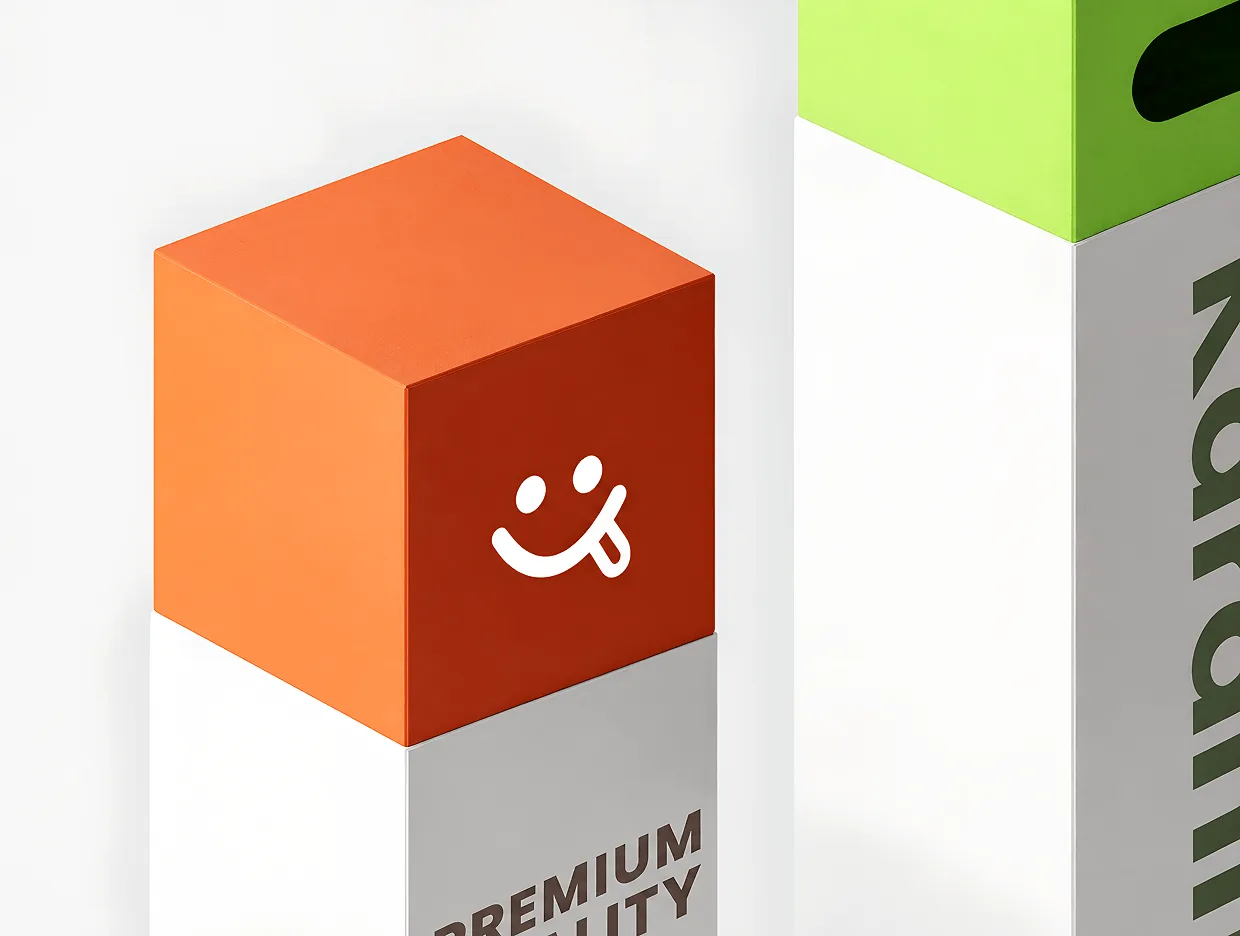
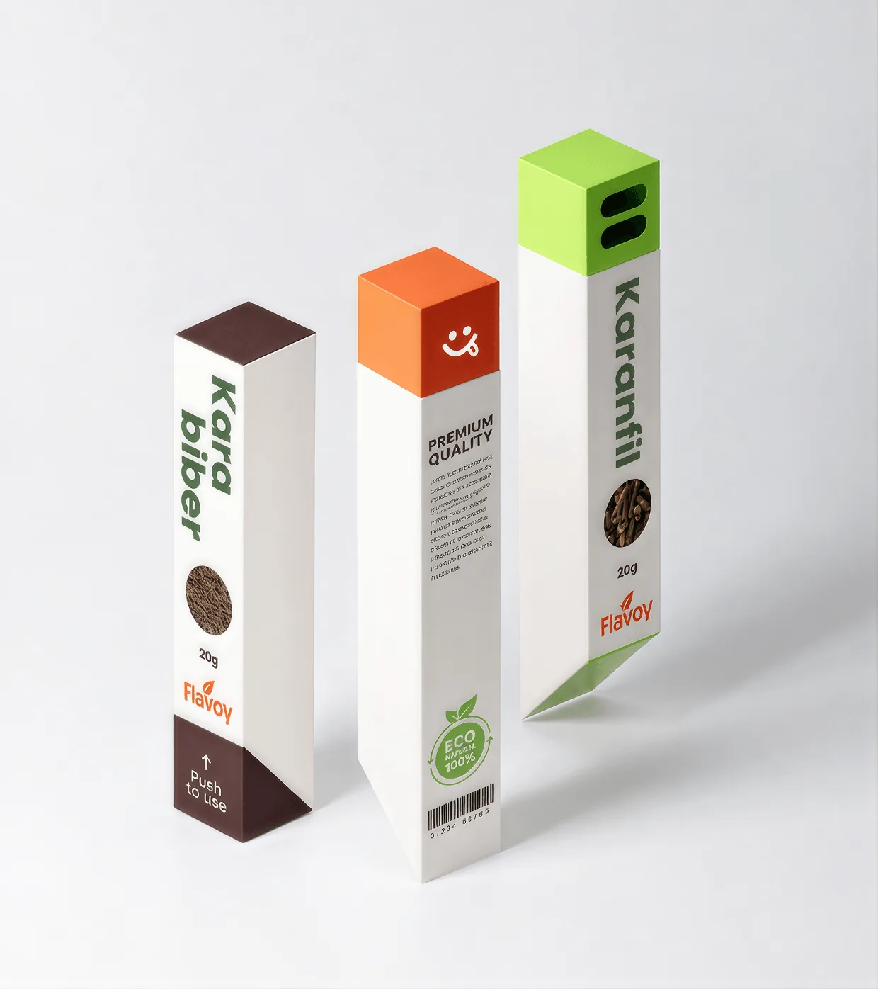
Kekik, Kara biber and Karanfil share an identical triangular carton. Only the cap block and the ingredient photograph change — which keeps the family legible and the print plates cheap.
Push, don't tear
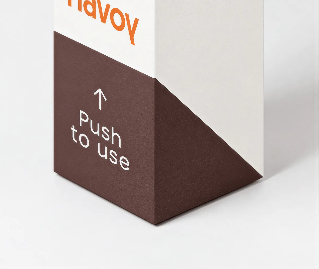
The corner is the whole mechanism. A diagonal push panel opens the carton one-handed and closes again flat — no tear strip to lose, no screw cap to cross-thread, and the same motion every single time. "Push to use" is printed where the thumb lands, on one recycled stock across the range.
A pantry shelf, read at a glance
Shoppers scan colour, then read: the cap block does the sorting well before the type does, which is the only reason a three-variant range needs no shelf-talker.
Most spice packaging assumes two free hands, and cooking rarely provides them — hence one hand, one motion. And the family has to read as one: shared structure with a single changing element keeps three cartons looking like a range instead of three products.
What I'd do next
Test the push-top mechanism through repeat-use cycles, and extend the colour system to a full pantry range.